


Introduction to Time-Series Visualization in CrateDB and Superset


CrateDB is a scalable, open-source database that can handle various data types from time-series, full-text search, geospatial, and structured/semi-structured data. In addition, CrateDB offers SQL compatible interface, easy integration, and the capability to analyze massive amounts of data. These features make CrateDB an excellent choice for data-intensive analytics applications.
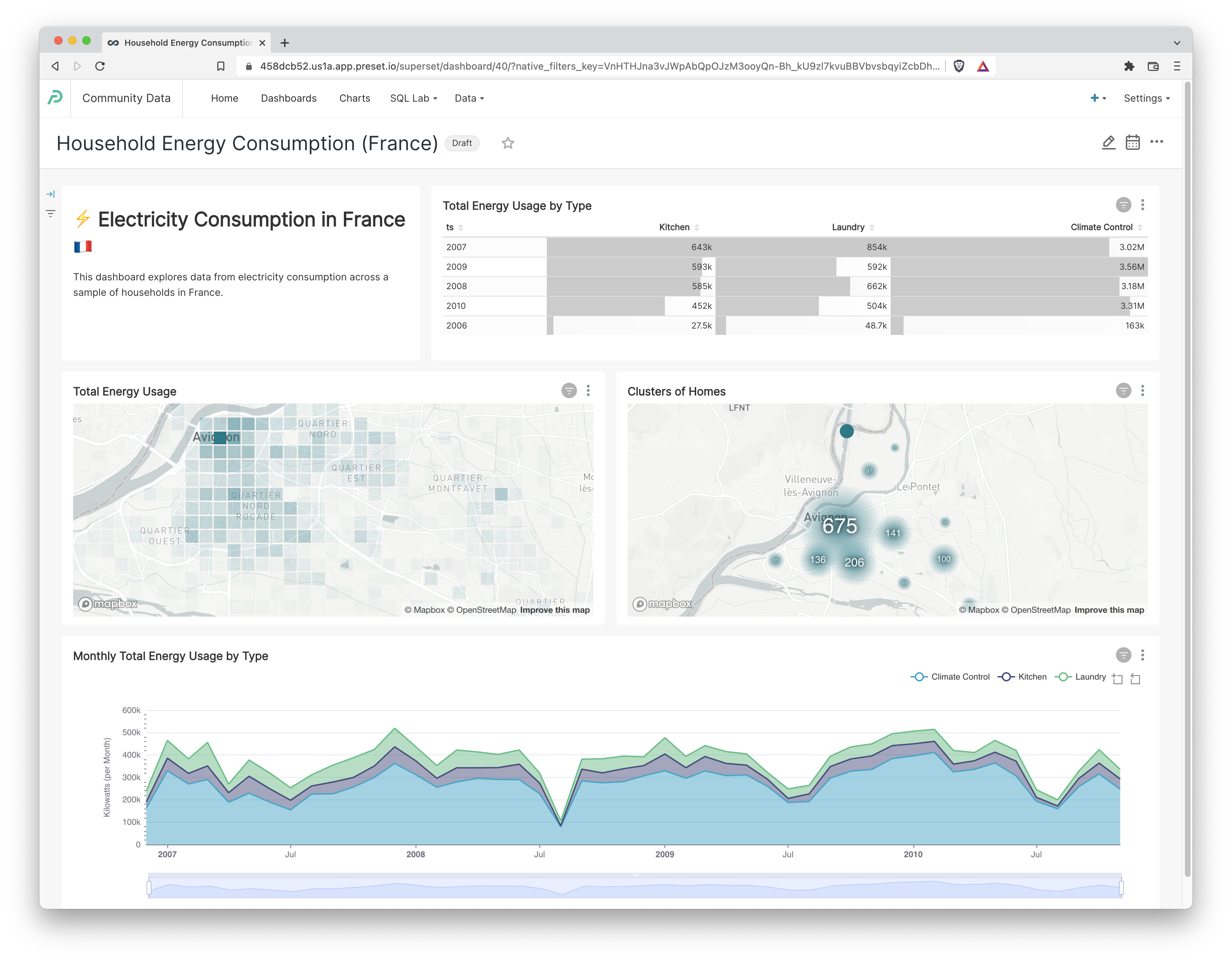
In this tutorial post, we'll showcase how to build the following Superset dashboard powered by data in CrateDB.
Install CrateDB
One of the easiest ways to install CrateDB on your local machine is to run the following command:
bash -c "$(curl -L https://try.crate.io/)"This command downloads CrateDB and runs it from the tarball. It doesn’t require manual installation or extraction of release archives. If you would like to install CrateDB permanently please check out our installation guide .
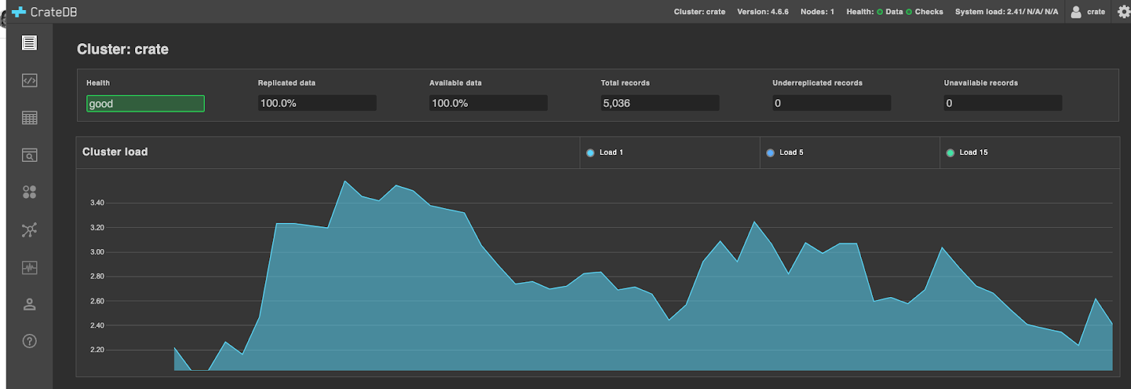
The abovementioned command should open CrateDB Admin UI in your default browser. If this is not the case, access the Admin UI via the following link: https://localhost:4200. You should see the Admin UI as illustrated below:
Import Power Consumption Dataset
In this article, we will explore and visualize the power consumption dataset that contains electricity usage for single houses in the city of Avignon in France. The dataset contains consumption data for several years, and it can be downloaded or used from this link.
The general idea is to explore trends in total energy consumption, differences between several measured utilities, and differences across various locations. But before we show how to import the dataset to CrateDB, let’s take a closer look into columns that describe consumption data:
- ts: the timestamp of data measurement
- global_active_power: household global minute-averaged active power (in kilowatt). Global active power represents the real power consumption i.e. the power consumed by appliances other than appliances mapped to sub-meters.
- global_reactive_power: household global minute-averaged reactive power (in kilowatt). Generally speaking, reactive power is the unused power in the lines (imaginary power).
- voltage: minute-averaged voltage (in volts).
- global_intensity: household global minute-averaged current intensity (in ampere).
- sub_metering_1: active energy for the kitchen (watt-hours of active energy).
- sub_metering_2: active energy for laundry (watt-hours of active energy).
- sub_metering_3: active energy for climate control systems (watt-hours of active energy)
- meter_id: id of the household meter
- location: longitude and latitude
- city: Avignon, France
Dataset provides the active power information as well as some division of the active power: kitchen, laundry, and climate controls systems.
Before we import data to CrateDB, we need to create a table with the schema as follows:
CREATE TABLE IF NOT EXISTS "doc"."power_consumption" (
   "ts" TIMESTAMP WITH TIME ZONE,
   "Global_active_power" REAL,
   "Global_reactive_power" REAL,
   "Voltage" REAL,
   "Global_intensity" REAL,
   "Sub_metering_1" REAL,
   "Sub_metering_2" REAL,
   "Sub_metering_3" REAL,
   "meter_id" TEXT,
   "location" GEO_POINT,
   "city" TEXT
)
CLUSTERED INTO 4 SHARDS
To import power consumption dataset, we use the COPY FROM statement that copies data from a file into the table:
COPY "doc"."power_consumption" FROM 'path/power_consumption.json'This command populates the table that can be further inspected from the Admin UI. To check some of the data samples, click on the power_consumption table in the left navigation bar and then on the Query Table button. The button triggers the SELECT statement and shows the first 100 rows from the resulting output:

At this point the data is ready, and we can do further analysis and visualization with Apache Superset!
Enabling CrateDB Support in Superset
Apache Superset is the world's most popular open-source data visualization and exploration platform. The roots of Superset are in real-time analytics, from the struggles that Max Beauchemin (Preset’s founder and CEO) and his team had at Airbnb.
Ville Brofedlt and I added support for CrateDB in Superset back in 2021. This ended up being an easy task because the CrateDB team had already created a SQLAlchemy dialect for Crate.
Apache Superset
To connect to CrateDB from open source Superset, you need to install the crate Python library in the same Python context as the one that Superset is installed in.
You can read about how to accomplish just that here in the Superset docs. Here's the database specific page for Crate as well.
Preset Cloud
If you're using Preset Cloud, then the CrateDB driver is installed already for you.
Connecting to CrateDB
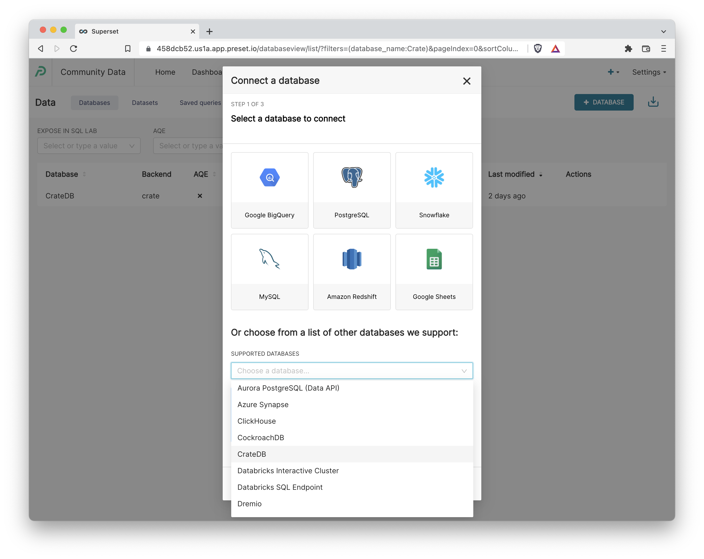
Before we can start crafting charts & dashboards in Superset, we need to make our Superset instance aware of the CrateDB instance by registering the connection details.
- Assuming you have the correct Admin privileges, navigate to Data > Dashboards and then select the +Database button in the top right corner.
- The expected SQLAlchemy URI format is:
crate://<username>:<password>@<url>:<port>Here's an example URI from the documentation:
crate://crate@127.0.0.1:4200- Then, navigate to the Advanced tab, expand the Other category, and add the following text in the Engine Parameters textbox:
{"connect_args":{"servers":["https://<url>:<port>"]}}This is a current workaround to a known issue with HTTPS in CrateDB.
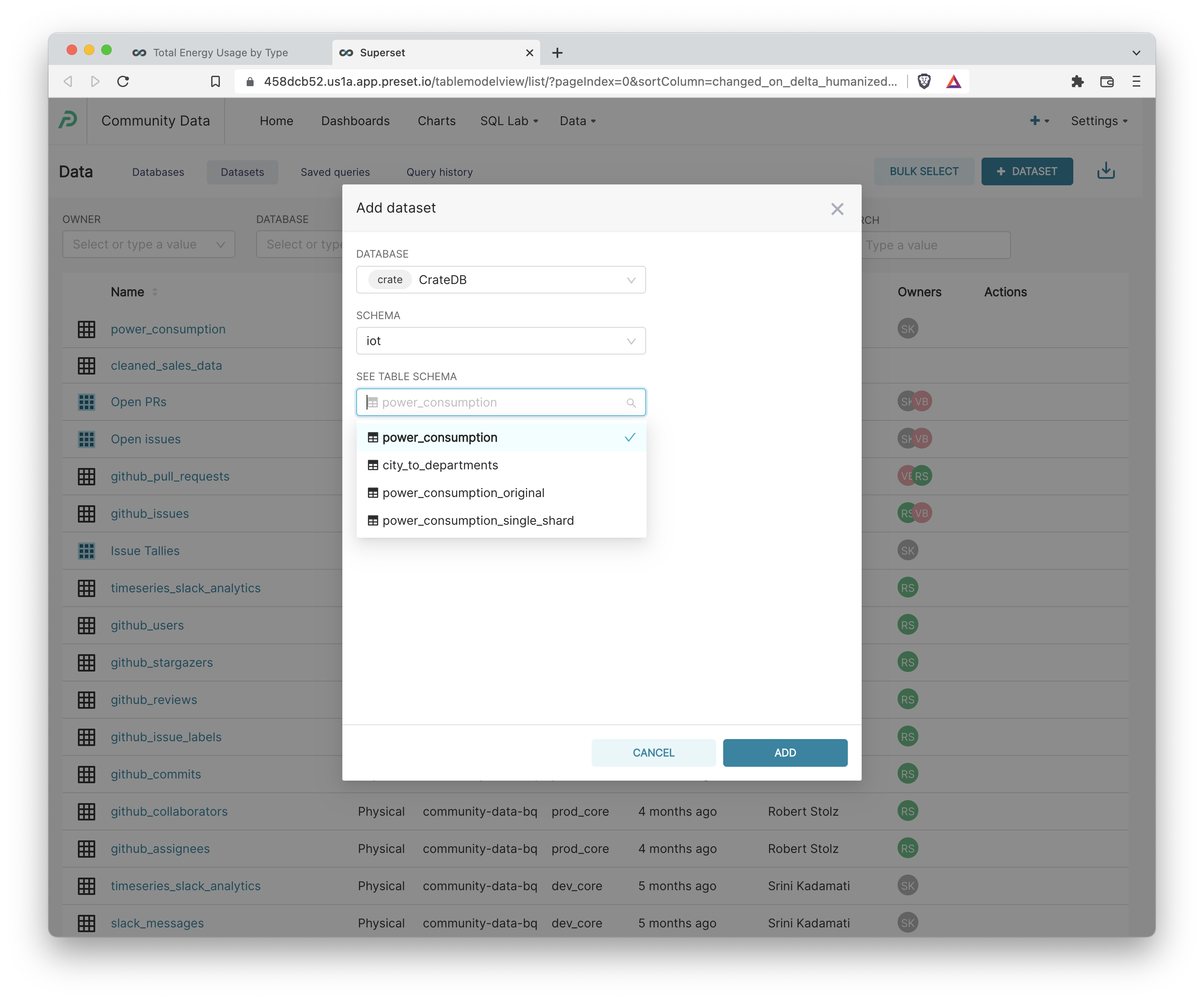
4. To avoid over-populating the available list of datasets in Superset (especially when you have thousands of tables in your database), you have to manually add / register database tables as a dataset in Superset. Click +Dataset++, select your CrateDB instance, select the iot schema, and finally the power_consumption table schema.
Using Calculated Columns to Extract Latitude and Longitude
Superset ships with a diverse set of geospatial visualizations, but many of these chart plugins expect the values for Latitude and Longitude to reside in two separate columns. Currently, these values are represented in a single column titled location set to the CrateDB GEOPOINT data type.
In these situations, we usually have two paths forward:
- Edit the underlying data in the database
- Use the Superset semantic layer to perform last-mile data transformation to prep for visualization
If you find yourself re-using this data often, the better long term solution is to adjust the data schema in the database itself (the first option).
We'll showcase the second option right now, which works well when you're in a pinch. Calculated columns in Superset let you run any non-aggregating SQL statement that normally would go in the SELECT .. clause and have this code augment every query & chart powered by this dataset in Superset. You can learn more here.
- Open the Edit Dataset view for the iot.power_consumption table. You can enter this view either from Explore or from Data > Datasets > Click the Edit pencil for this dataset. Then, navigate to the Calculated Columns tab and add the following entry.
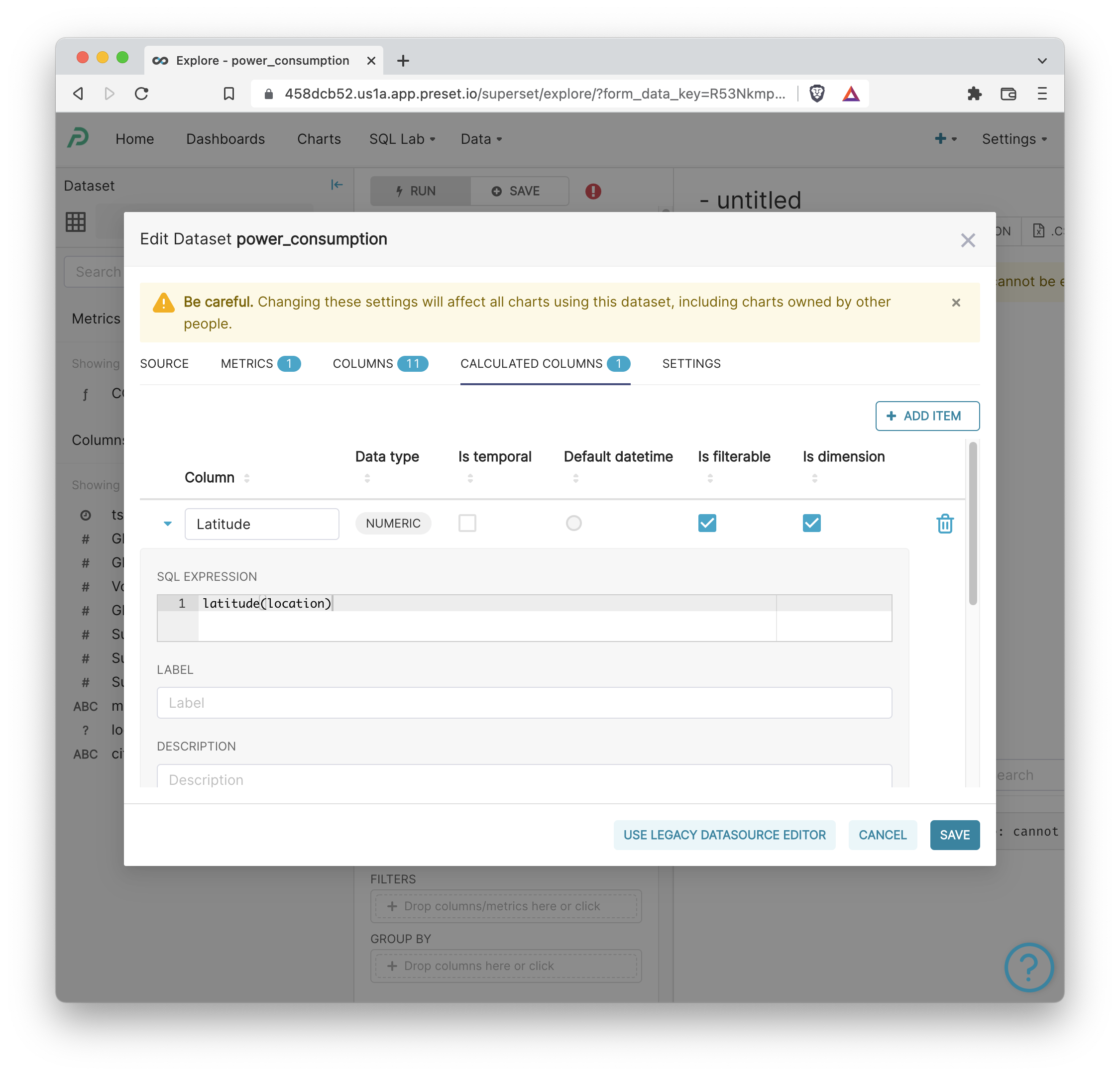
2. Next, add the following entry for Longitude.

3. Then, click Save to publish both of these Calculated Columns.

Visualizing Power Consumption Data
Let's start visualizing the data! To create a chart, click +Chart, choose the chart type, then click power_consumption from the Chose a dataset dropdown.
Map: Cluster of Homes
First, let's visualize the households clusters on a map. Select the Mapbox chart type. Then, select the following values in the Explore workflow.
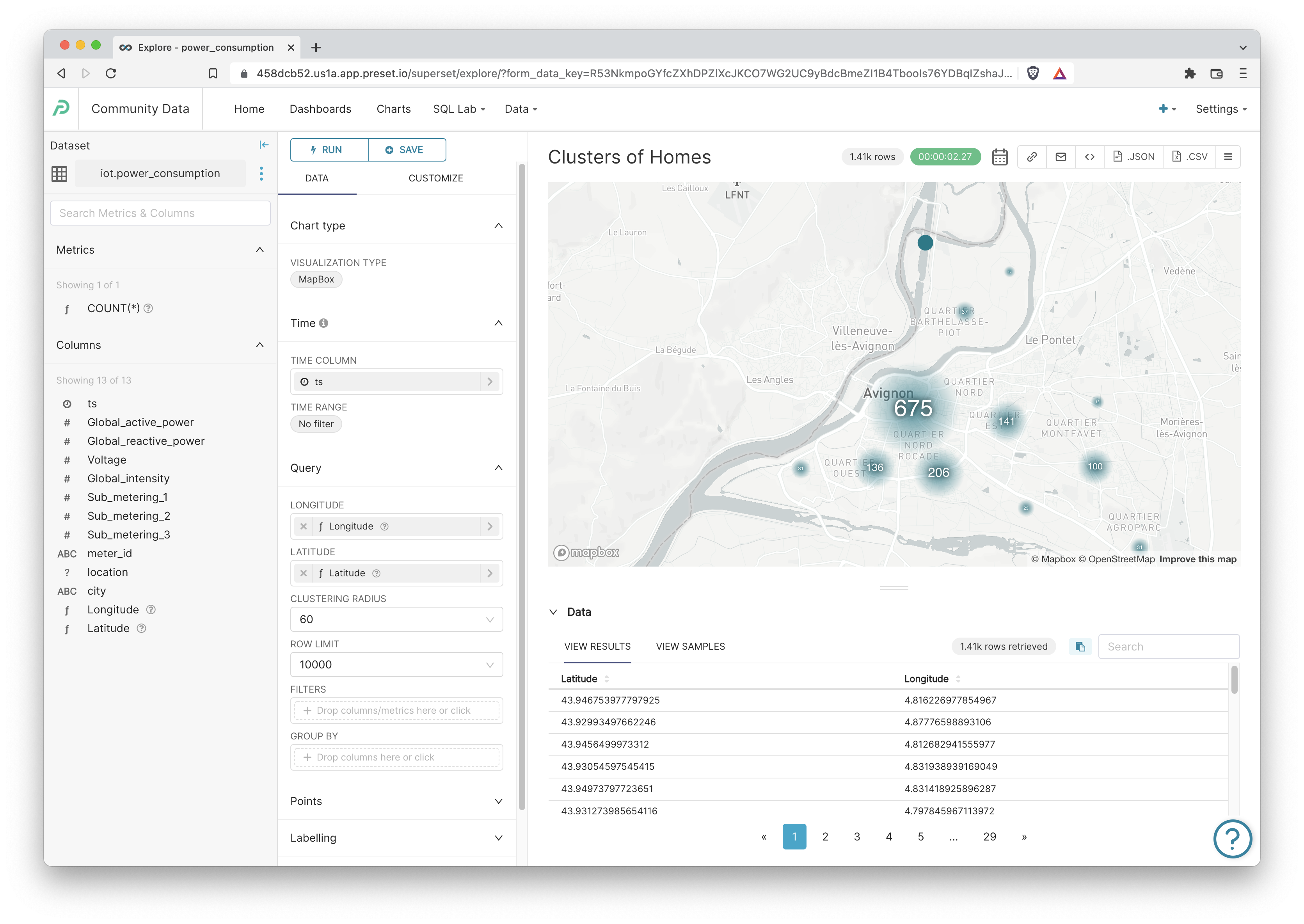
Because the data reflects households in Avignon, France, we should expect the clustering to center there.
Let's publish this chart to a new dashboard by clicking +Save in the top left corner:
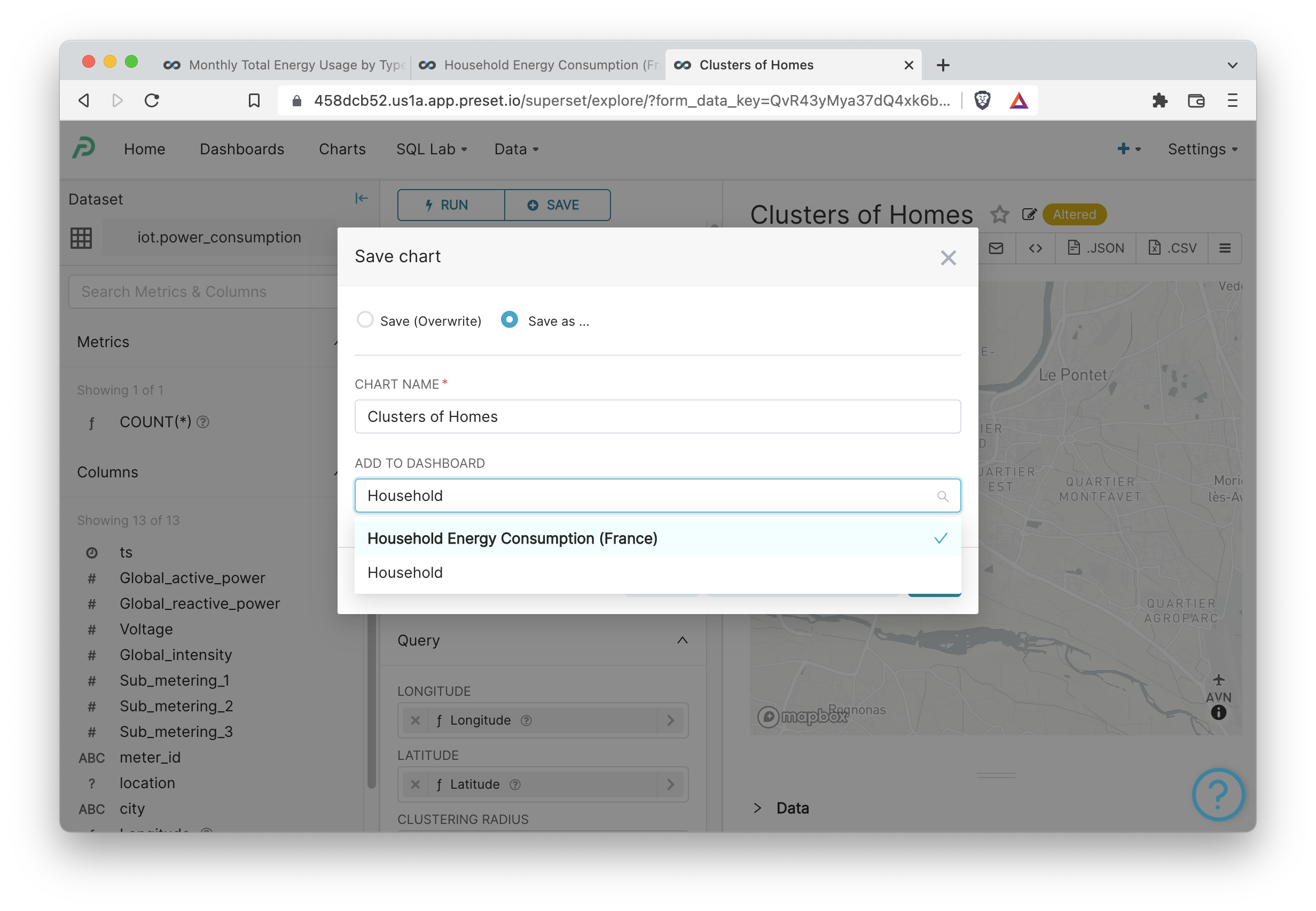
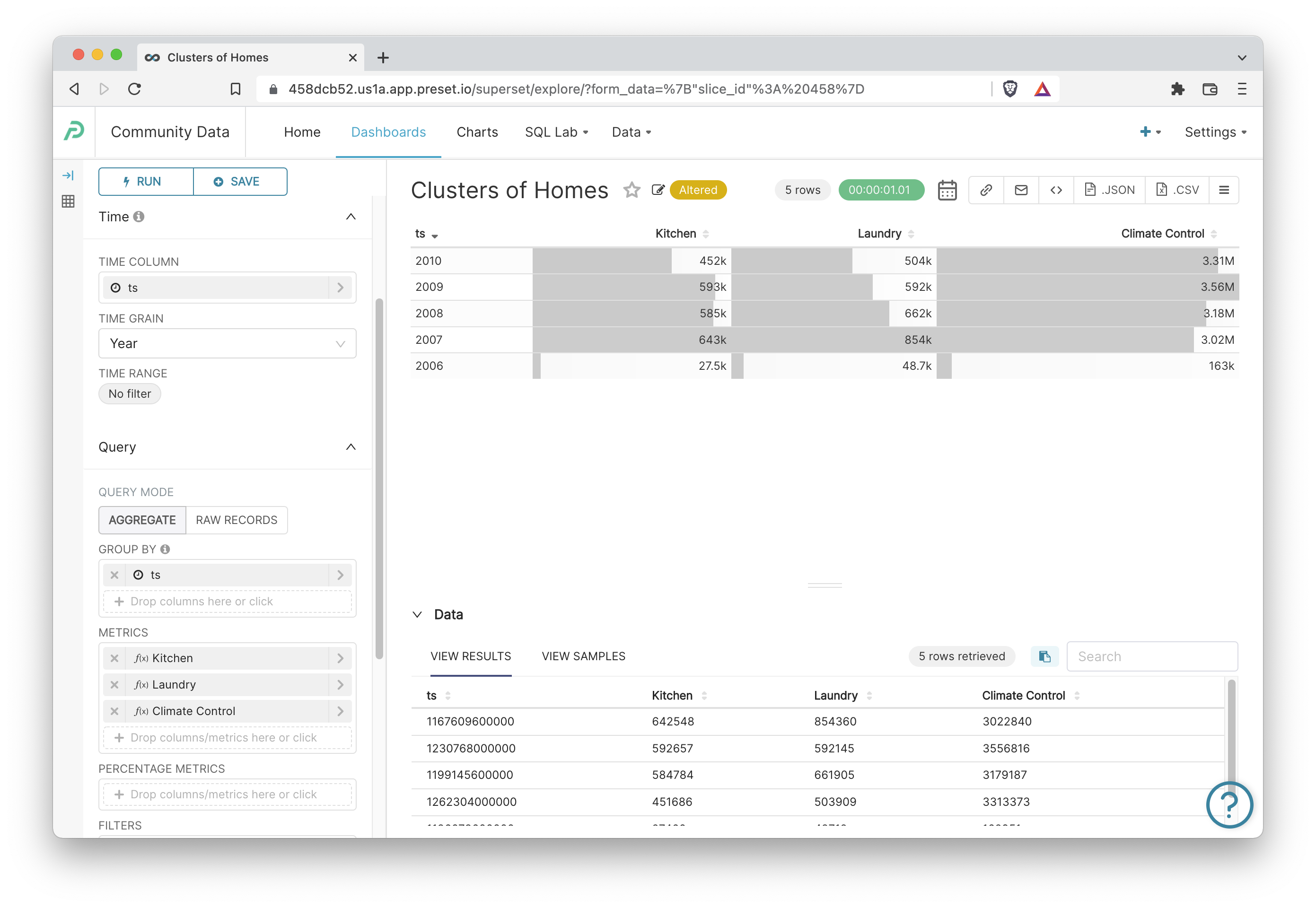
Table: Yearly Total Energy Usage by Type
Next, let's create a Table that totals the total energy usage by sub-meter across all households in this dataset by usage type. Here's a handy reference for the types of usage in this dataset:
- sub_metering_1: active energy for the kitchen (watt-hours of active energy).
- sub_metering_2: active energy for laundry (watt-hours of active energy).
- sub_metering_3: active energy for climate control systems (watt-hours of active energy)
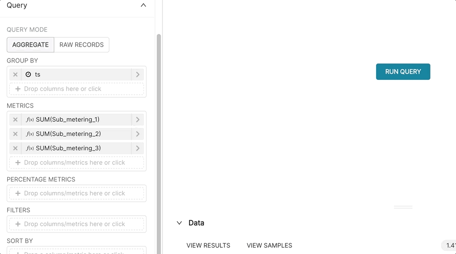
Let's set the:
- TIME GRAIN to Year
- GROUP BY to
ts(for timestamp) - QUERY MODE to
AGGREGATE - METRICS to:
- SUM(Sub_metering_1)
- SUM(Sub_metering_2)
- SUM(Sub_metering_3)
Optionally, we can rename the metrics to assign more semantic context to each one.
Here's what the final Table looks like (sorted by ts descending):
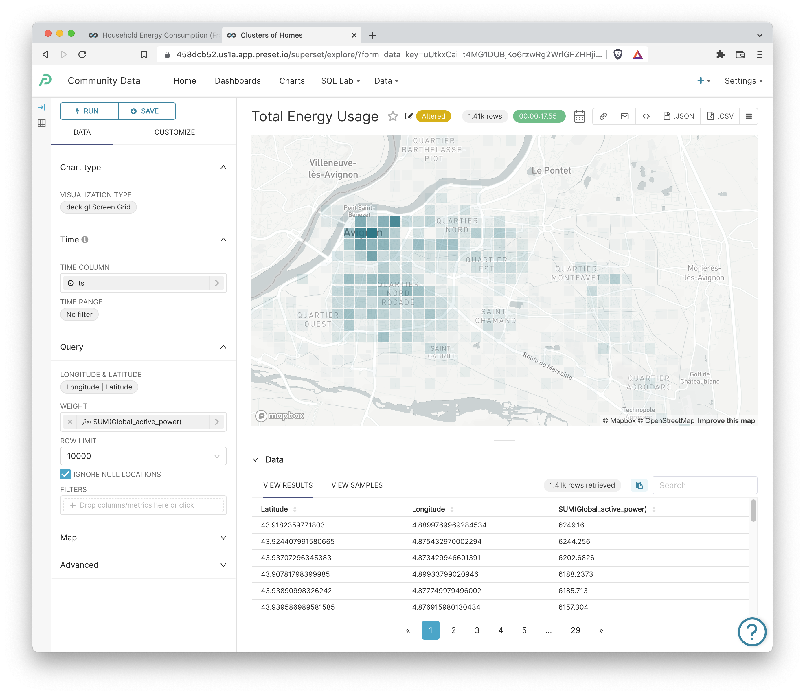
Deck.gl Screen Grid: Total Energy Usage
Next, let's create a map that helps us visualize total energy usage across a zoomable, geographic area.
- VISUALIZATION TYPE: deck.gl Screengrid
- LONGITUDE and LATITUDE:
LongitudeandLatitudecolumns - WEIGHT: SUM(Global_active_power)
Here's the final result:
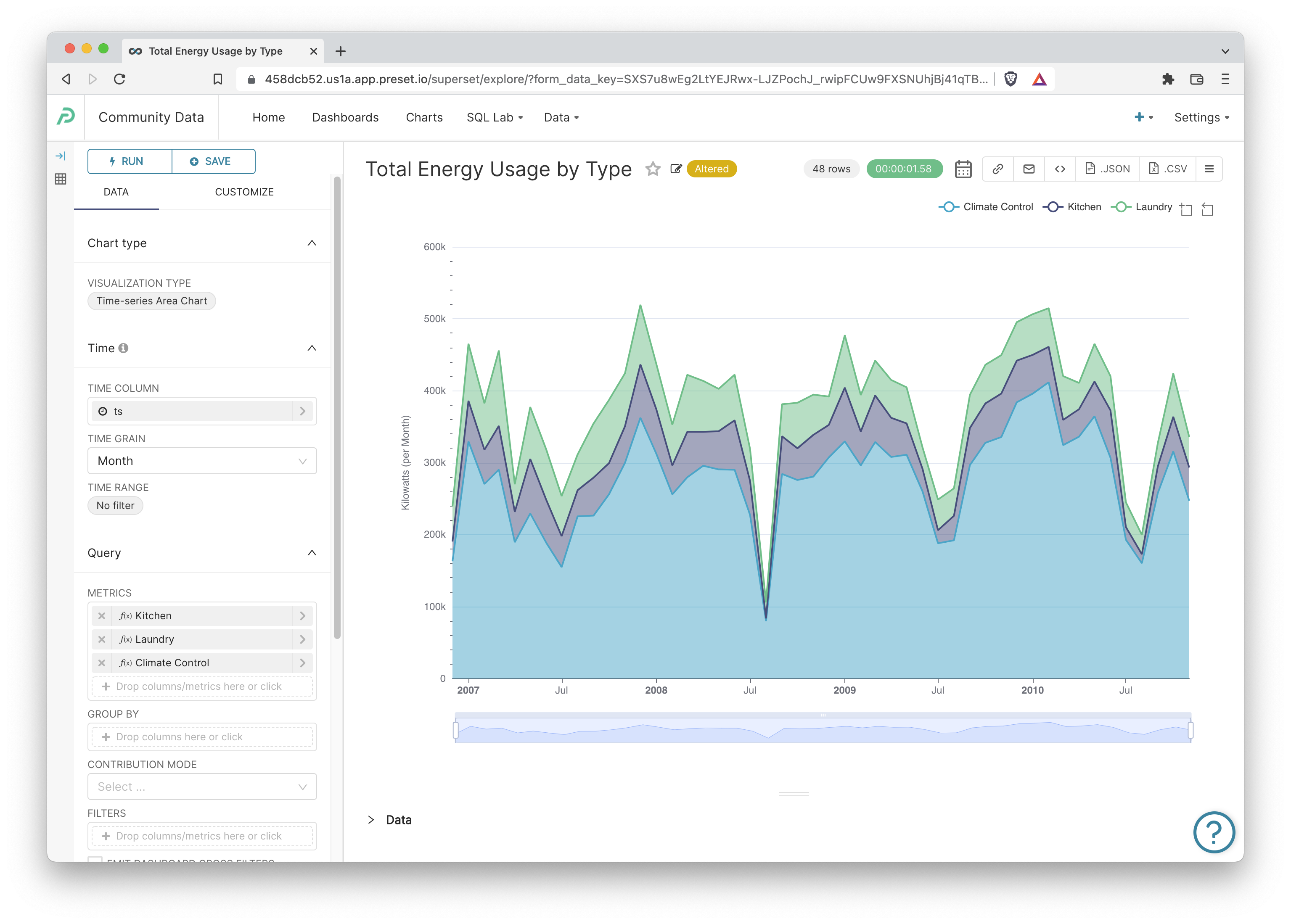
Time-series Area Chart: Monthly Energy Usage by Type
Let's end this tutorial by creating a time-series area chart that colors and stacks each energy graph by usage type.
- VISUALIZATION TYPE: Time-series Area Chart
- TIME GRAIN: Month
- METRICS to:
- SUM(Sub_metering_1)
- SUM(Sub_metering_2)
- SUM(Sub_metering_3)
- In the Customize tab, enable the following:
- Stack Series
- Data Zoom
- Show Legend
- Set the Y-AXIS TITLE to "Kilowatts (per Month)"
- Set the Y AXIS TITLE MARGIN to 50
- Set the AREA CHART OPACITY to 0.5
Here's the beautiful result of these options:
Customize the Energy Dashboard
Your dashboard should resemble the following screenshot:
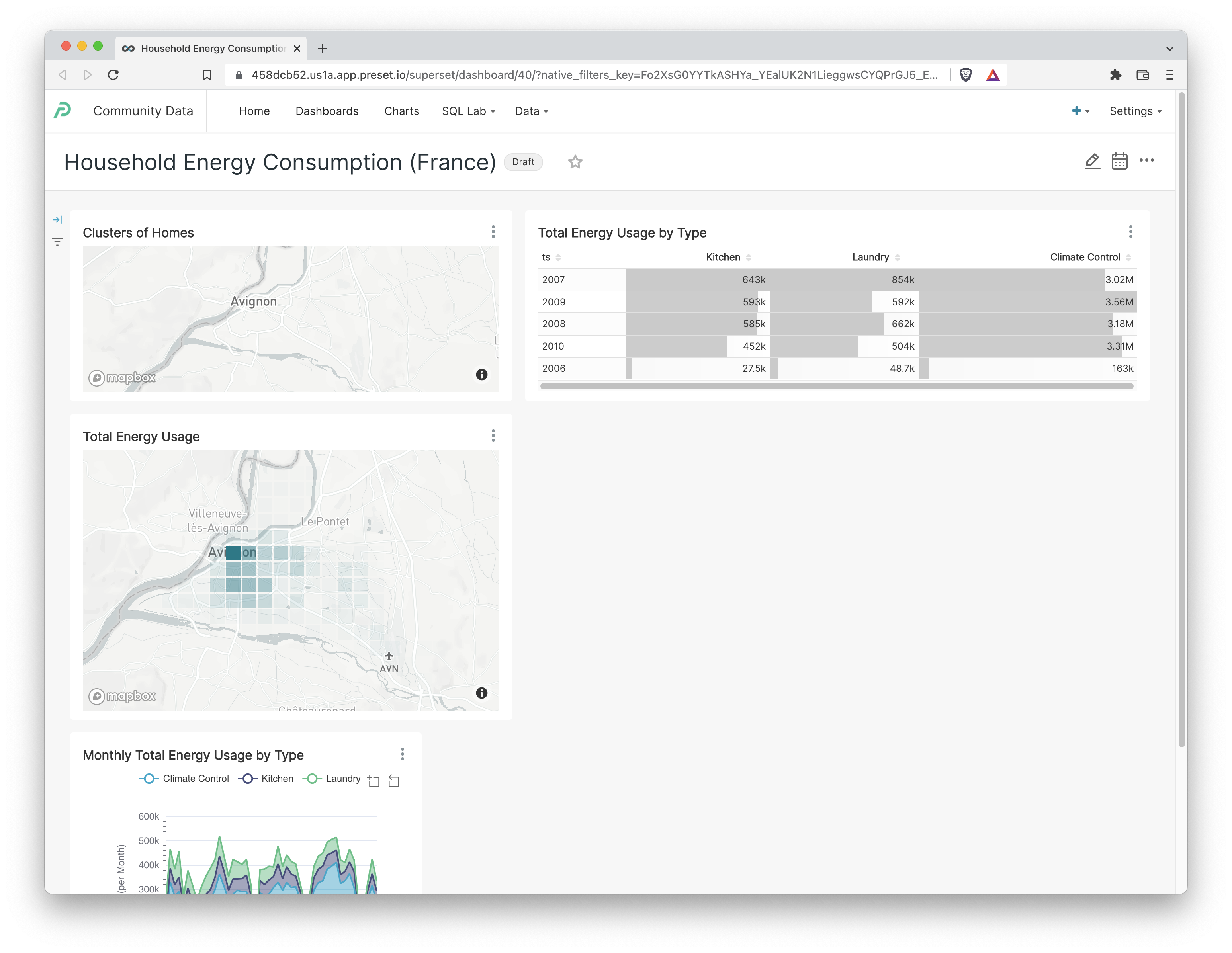
To re-arrange the charts, click the pencil icon in the top right corner which loads the Edit Dashboard view. Then, click and drag from near the bottom right corner of a chart to move or resize it.

Click Save to persist the changes.
Next Steps
Continue to jam on the dashboard!
- You can enter Edit Dashboard view and drag in a Markdown component to add more information about the dataset.
- You can continue to expand the dashboard functionality by adding filters.
Here are some helpful resources to continue your journey:
