


BI Dashboard Best Practices: Create Compelling Dashboards


Business intelligence (BI) and data visualization tools make it easy to create dashboards that let everyone in your organization draw actionable insights from your connected databases. However, building an impactful dashboard requires more than just dragging and dropping charts onto a canvas. Without thoughtful planning and design, dashboards filled with data and charts may fail to convey the insights you want your audience to see.
In this blog, we'll walk you through how to create compelling dashboards that deliver insights and enable data-informed decision-making using Preset.
Note that some techniques discussed will require more advanced knowledge of SQL and CSS. But even if you skip these, you will still be able to build an effective dashboard using our recommendations.
Laying the Groundwork
While it might be tempting to get your hands dirty creating bar charts, custom visuals, and dashboards right away, investing time to plan out how you will structure your dashboard can save you a significant amount of time later on.
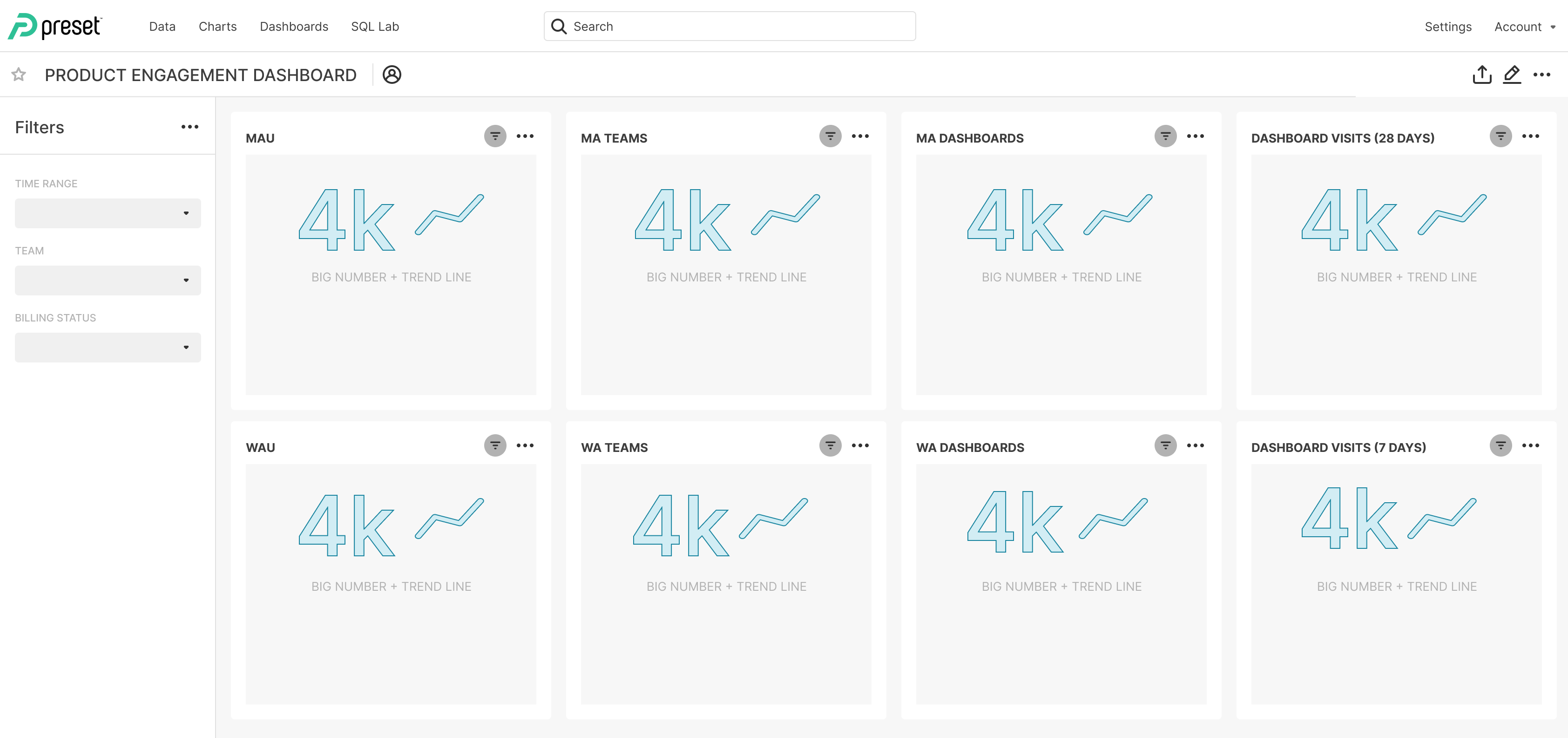
Figure 1: Plan your dashboard by first sketching it out.
Here are some strategic questions to consider as you start your dashboard.
- Know Your Audience: Take the time to understand whom you’re building the dashboard for. Are they familiar with the data collected? Do they need quick overviews or in-depth analysis? Tailor your dashboard's complexity and content to match your users' knowledge and needs.
- Clear Objectives: Define the purpose of your dashboard. What questions should it answer? If you have multiple stakeholders who may be looking at your dashboard, they may want different outcomes when viewing a dashboard.
- Sketch Your Dashboard: Draw out how you might lay out charts and tables in your dashboard before you start building (you could alternatively build a skeleton dashboard as in Figure 1). Create placeholders in your layout and sketch out your ideas. Test these concepts with your stakeholders to refine your approach.
📌 If you need pointers on how to choose the right chart types for the insights you want to present, take a look at the 5 Pie Chart Alternatives post that discusses the pros and cons of popular chart types.
- Create Hierarchy: Generally, the top of the dashboard can show summary metrics visualized in the corresponding chart types (e.g., total revenue visualized in Big Number chart), and later parts of the dashboard can provide details through chart types such as bar charts, area charts, and tables.
- Organize Content: Arrange your dashboard content in a logical manner. Organize charts by themes or topical areas (e.g., by product line, sales region, functional department, etc.) to help users navigate and understand the information. Evaluate if the charts should live on the same page, or across multiple pages or “tabs.” Group related charts and/or filters together to allow for easy data exploration.
- Limit Scope: Resist the urge to overload a single dashboard with too much information. Instead, set up tabs or use multiple dashboards that link to each other. Prioritize expedient consumption — users should be able to find important metrics and information without excessive scrolling or clicking. Large dashboards take longer for internet browsers to load, resulting in a long wait time for your audience.
- Secure data access: If you’re an admin responsible for data access management, determine who should have access to the data. Who is authorized to view and explore the data according to the organization’s data access policy? Who should be granted additional control, such as editing charts and dashboards? In many cases, each “viewer” can see the data presented through visualizations on the dashboard as well as the underlying data through data drilling.
11 BI Dashboard Best Practices
Now it’s the fun part - putting together your dashboard! We will focus on BI dashboard best practices to create a clear, performant BI report using charts and tables that were created already (Figure 2).

Figure 2: A dashboard example for product engagement metrics.
As you drag and drop visualizations into your new dashboard, consider the following.
- Organize and Filter: Group related charts and visualizations together into sections. Setting up dashboard filters enables self-serve analytics and lets users explore data from different angles. Dashboard tabs and dashboard filter dividers create logical separation of the charts and filters (Figure 3a). Note that not every granular detail needs to be visualized in charts - users can always use data drilling features such as Drill By and Drill-to-Detail to explore the data in detail (Figure 3b).
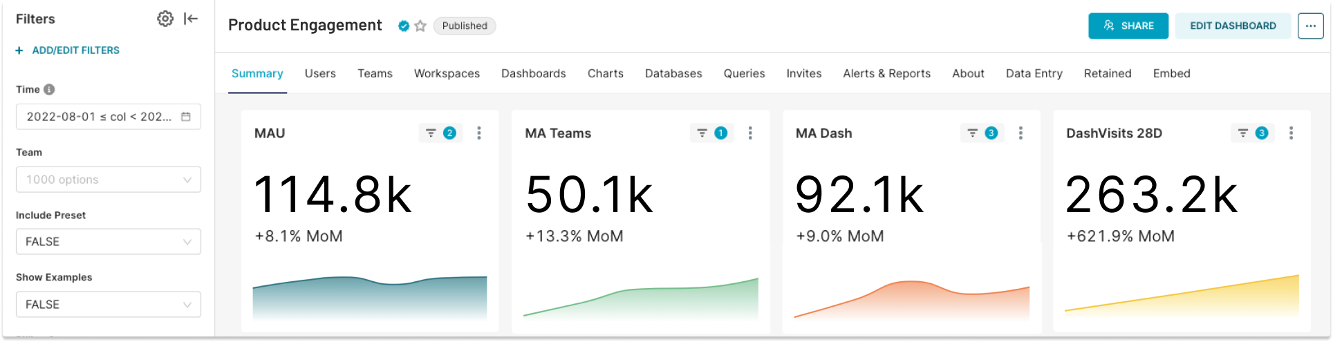
Figure 3a: This dashboard uses tabs to create logical separation (i.e., by product feature) of the dashboard pages. Monthly metrics are grouped together in a row and dashboard filters let users interact with the data on their own.
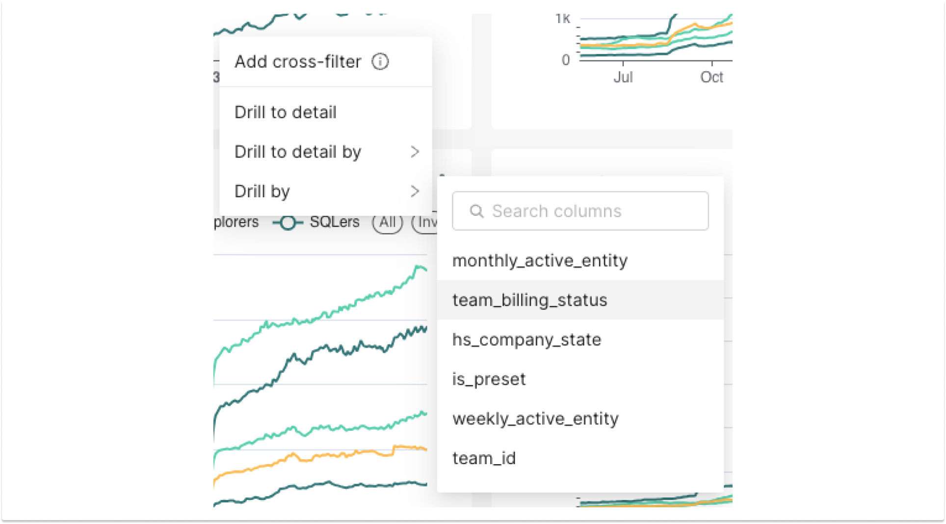
Figure 3b: Interactive features like cross-filters, Drill By, and Drill-to-Detail are automatically available for the corresponding chart types and/or data columns.
- Name with Purpose: Use concise but descriptive titles for charts and sections of the dashboard (Figure 4). Users should be able to quickly understand the content and purpose of each element.
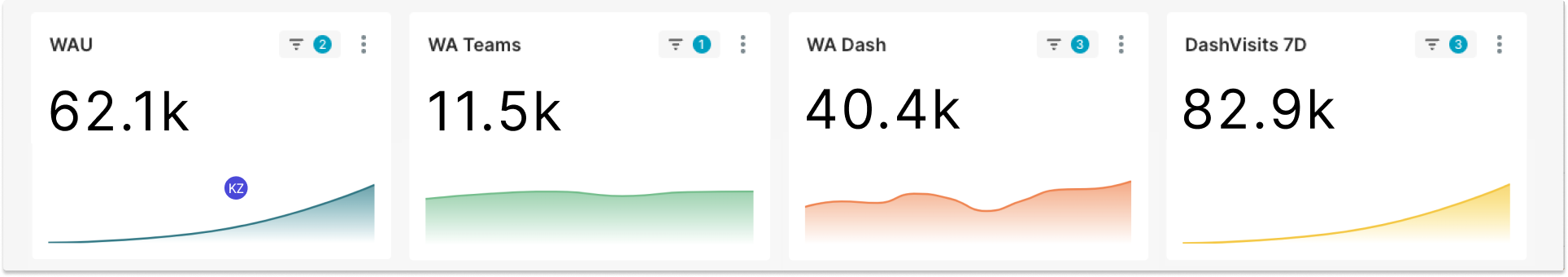
Figure 4: Clear, concise titles.
- Enrich Visualizations with Context: Highlight key insights and provide supplemental information behind the data (e.g., key events that took place when there were anomalies in your charts) using in-product annotations and tooltips (Figure 5).
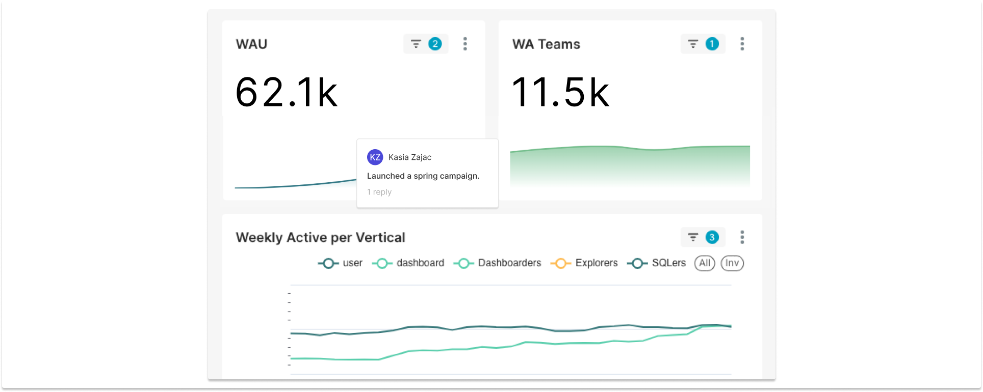
Figure 5: Use in-product annotations to provide additional context.
- Customize Color Palettes: Use sensible colors in chart palettes to tell stories in your dashboard design (e.g., use green for growth and red for decline). Learn how to customize your color palettes here.
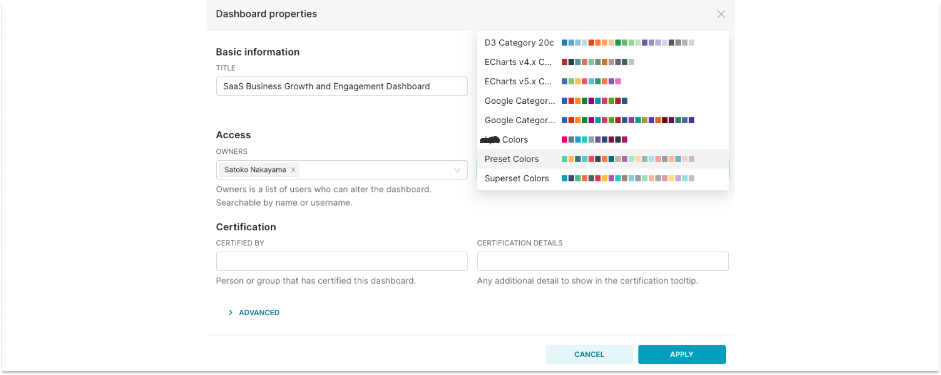
Figure 6: Use your brand’s color palette (usually configured by team admins) or create your own custom color palette.
-
Customize Your Dashboard’s Look and Feel: If you’re an advanced user with CSS skills, you can also customize your dashboard to add thematic elements.
-
Optimize Performance: Maintain a reasonable number of charts to ensure optimal dashboard performance. Consider separating out live/recent data from aggregated storytelling.
-
Data Refresh and Caching: Implement efficient data refresh schedules and caching strategies to keep your dashboard responsive and up to date.
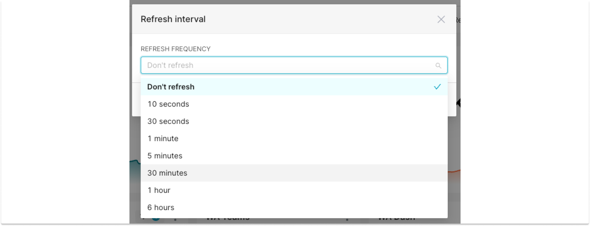
Figure 7: Optimize for cache performance.
- Ensure Data Integrity: Establish proper data governance practices, secure your datasets, and implement robust owner and role-based access controls (RBAC) to prevent unauthorized access and changes that could affect your dashboard.
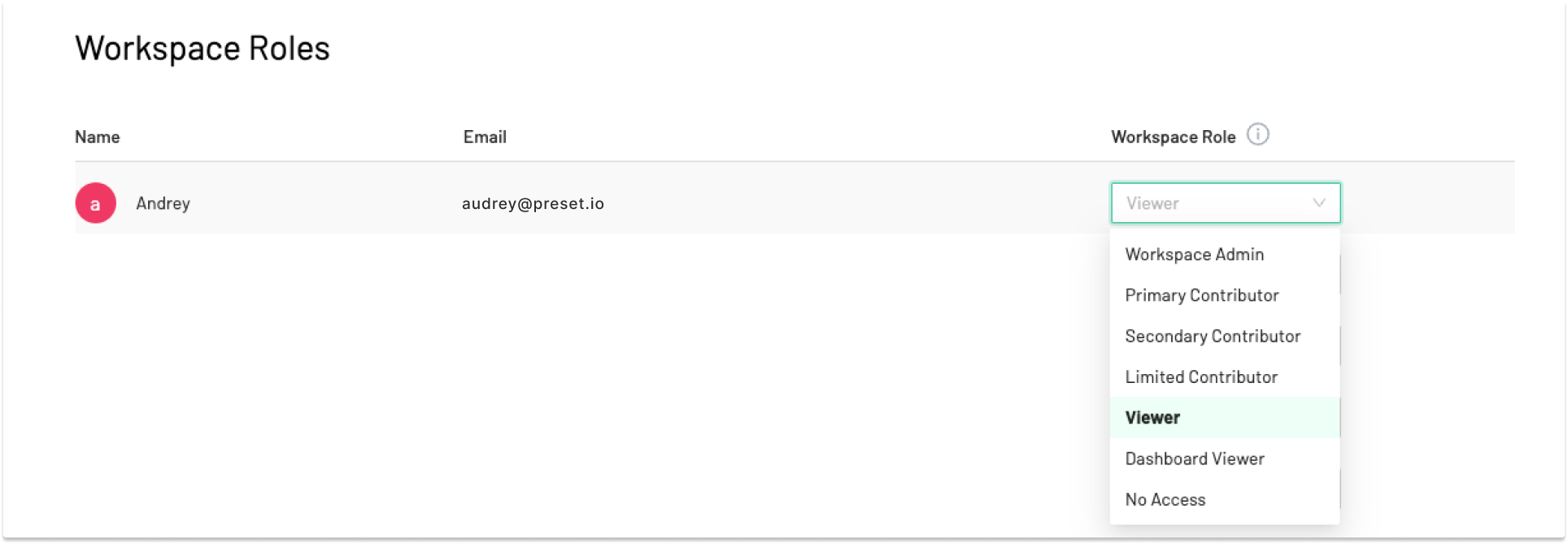
Figure 8: Define each user’s RBAC at the workspace level (the same RBAC settings apply to all dashboards within the workspace).
-
Accessibility Matters: Ensure that your dashboard is usable by individuals with varying needs, such as those with color vision deficiencies. Design with accessibility in mind, such as using high-contrast color schemes and high-acuity charts to ensure that all users can interact with your dashboard.
-
Strategic Linking: Link the related dashboards that allow users to seamlessly transition between different parts of your storytelling while maintaining your dashboard focused and clutter-free.
-
Test and Refine: Before finalizing your dashboard, test it with a diverse group of users. Collect feedback and refine your design. Remember, your dashboard should strive for day-to-day usage and inform workflows and decision-making.
Iteration and Maintenance
Congratulations - now you’ve created and published your dashboard! Here, we talk about the last (and ongoing) step of maintaining your dashboard to facilitate collaboration and continued engagement over your dashboard.
- Set up alerts and reports: Send scheduled reports or notify your stakeholders every time there are updates to the dashboards through Slack or email reports and alerts. You can also use alerts for maintenance (e.g., every time there are potential bugs and errors in your dashboards).
- Solicit Feedback Regularly: Gather feedback from users and stakeholders on the dashboard's usability and effectiveness. Be aware that your audience may have evolving requirements for the dashboard as business priorities change and as they need additional questions answered. Use feedback to make iterative enhancements to your dashboard over time.
- Backup and Documentation: Regularly back up your dashboard configurations and assets using the Preset CLI or other tools. Maintain thorough documentation to ensure easy recovery and collaboration.
Try It Yourself!
Building an effective dashboard is easy once you know a few layout and design considerations discussed above. Log into your Preset account or create an account for free to start building your business intelligence dashboard! For more advanced deployment options, explore Preset's managed private cloud or Preset Certified Superset for customer-managed installations.
