


5 Alternatives to Pie Charts (With Examples)


The year was 1801. Scottish engineer and economist William Playfair used a novel graphical form to represent the area of contemporary empires: a circle, sized by the total area of an empire, and divided into slices representing the portion of its territory lying in each continent. The pie chart had just been born!
Fast forward over two hundred years, and pie charts have earned the title of the most polarizing of charts. Vilified by some, beloved by others, the pie can be found in documents of all shapes and sizes. In this blog we will review both the case for and against it, and we will present five strong alternatives to pie charts that you can easily use in your work. What’s more, we’ll cap off each section by showing how each chart type can be implemented in Superset!
Pie charts: uses, pros and cons
What is a pie chart and what data is it useful for?
A pie chart is suitable for a categorical field that can take a limited number of possible values, ideally no more than 3, such as Yes/No or Good/Bad/Indifferent. When comparing these values, we want to show their relative proportions with respect to a certain numerical field, such as answer counts, or area (as in Playfair’s pie charts).
This makes them useful for illustrating the composition of a dataset, showcasing the distribution of categories, and comparing parts to the whole. Common applications include market share analysis, budget allocation, demographic breakdowns, and survey responses.
The pros and cons of pie charts
Let’s now review the main advantages and disadvantages of the pie chart (note that these can be made extensive to the pie’s close cousin, the donut chart):
Pros
-
They are simple and relatable. This is probably the number one reason that they continue to be so popular - they are perceived as accessible and easy to interpret by a wide audience, as most analysts who use pie charts in their work will confirm.
-
They are visually appealing. Their circular shape and distinct slices make them visually engaging for many.
-
They work reasonably well for a small number of categories. To give credit where credit is due, when the number of categories is small (again, ideally no more than 3) pie charts effectively highlight the approximate relative sizes of each category. So by observing one, we would be able to say whether two categories are more or less equal, and whether one is roughly double another, for example.
Cons
-
They can’t be read accurately. It can be challenging to accurately compare the sizes of different slices, especially if they have similar values. As it turns out, we humans struggle to accurately perceive and compare angles and areas, leading to potential misinterpretations.
-
They can be misleading. The perception of slice sizes can be influenced by the angle or position of the pie chart, also leading to misinterpretations.
-
They are susceptible to data overload. As the number of categories increases, pie charts become cluttered and less readable.
Honorable mention: the donut chart
Donut charts get a special entry in the list as the slightly more acceptable close relatives of pie charts. Now, a donut chart is essentially a pie chart with a hole in the middle, so it shares in all the advantages (it's pretty and popular) and all the disadvantages of pies, and it will definitely guarantee you a frown from the purists. However, the hole in the middle is a valuable asset and the reason that donuts are superior to pies in the eyes of many: as it turns out, it can be used to display a kpi when the donut has just two categories and we're focusing on one (e.g. percent who answered "yes" out of all respondents) or when we're displaying progress towards a target (e.g. percent of target monthly sales achieved so far).
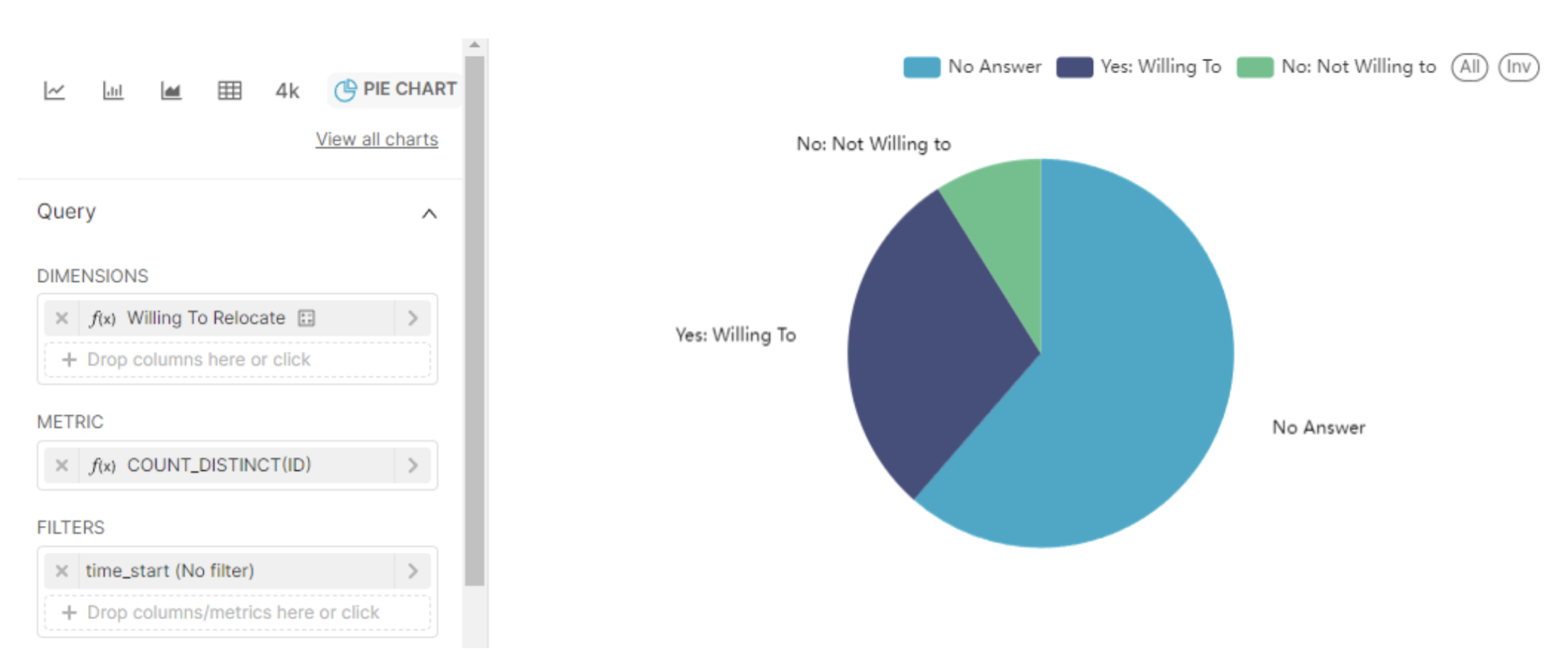
Pie charts in Superset: our starting point
In this section we’ll use the ‘FCC 2018 Survey’ dataset in Superset to illustrate the corresponding chart type. We will begin with the aim of displaying the number of responses for each possible answer of the ‘Willing to Relocate’ field, but our ambitions will grow with the possibilities offered by each chart. To follow along, pay attention to the configuration in the Data pane in each image. Below is the setup for our first example: the pie chart.
Alternatives to pie charts
Bar charts
What are bar charts?
Bar charts need no introduction. They are a staple in any analyst’s data visualization toolbox, and the best cure to the pie chart’s shortcomings. Since we are much better at comparing lengths than we are at comparing angles, bar charts make for a much more accurate read.
In fact, it is often said that there is no pie chart that cannot be better displayed as a bar chart. So you might be surprised to learn that William Playfair is also credited with the invention of the bar chart - check out this interactive infographic for a detailed history of charts.
When are bar charts useful?
Bar charts are a good fit to the exact same kind of data that is suitable for pie charts, with the addition of temporal variables. Hence bar charts are slightly more versatile than pies and can be used to compare categorical data, as well as to display changes over time. They are widely used in market research, sales analysis, survey results, and research papers.
Pros and cons of bar charts
Pros
- They are accessible to a very wide audience.
- They enable an accurate comparison between categories, in direct contrast to pie charts.
- They are universally available in data visualization libraries and software.
Cons
- They are susceptible to data overload. Though much less so than pie charts. To avoid cluttered bar charts, choose vertical bars when the number of categories is relatively small, and switch to horizontal bars otherwise.
- They are very susceptible to adulteration. Examples abound of bar charts that are deliberately designed to mislead (for example, by manipulating the y-axis).
- They are perceived as less engaging. Bar charts get a bad rep for being a run-of-the-mill kind of chart and sometimes, plain boring. We hope our examples below convince you that bar charts can in fact be stunning!
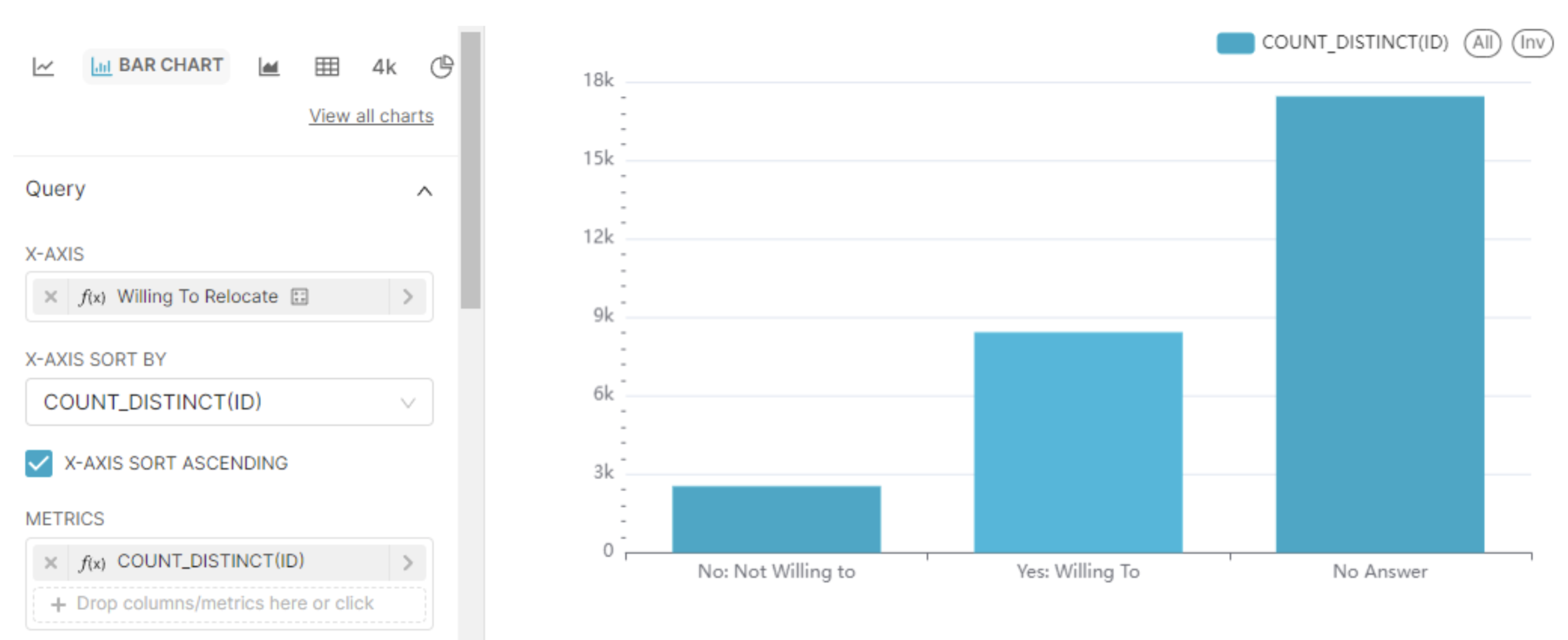
Bar charts in Superset: the best practices alternative
Stacked bar charts
What are stacked bar charts?
A close cousin of bar charts, stacked bars represent multiple categories within each bar, showing both the total and the composition of each category. This means that on top of all the virtues of bar charts, stacked bars can be used to represent not just one, but two categorical variables.
When are stacked bar charts useful?
Stacked bar charts are useful for illustrating part-to-whole relationships while comparing the total contribution of different categories. They are commonly employed in budget analysis, market share comparison, and other scenarios where part-to-whole relationships need to be visualized.
Pros and cons of stacked bar charts
Pros
- Same as the bar chart, plus,
- They allow for the representation of relationships within the data with the introduction of the second categorical variable.
Cons
- Same as the bar chart, plus,
- The second categorical variable can’t be read entirely accurately, and is useful only for approximate comparisons.
- They are susceptible to data overload. Much like the pie chart, stacked bars can become visually cluttered with too many categories.
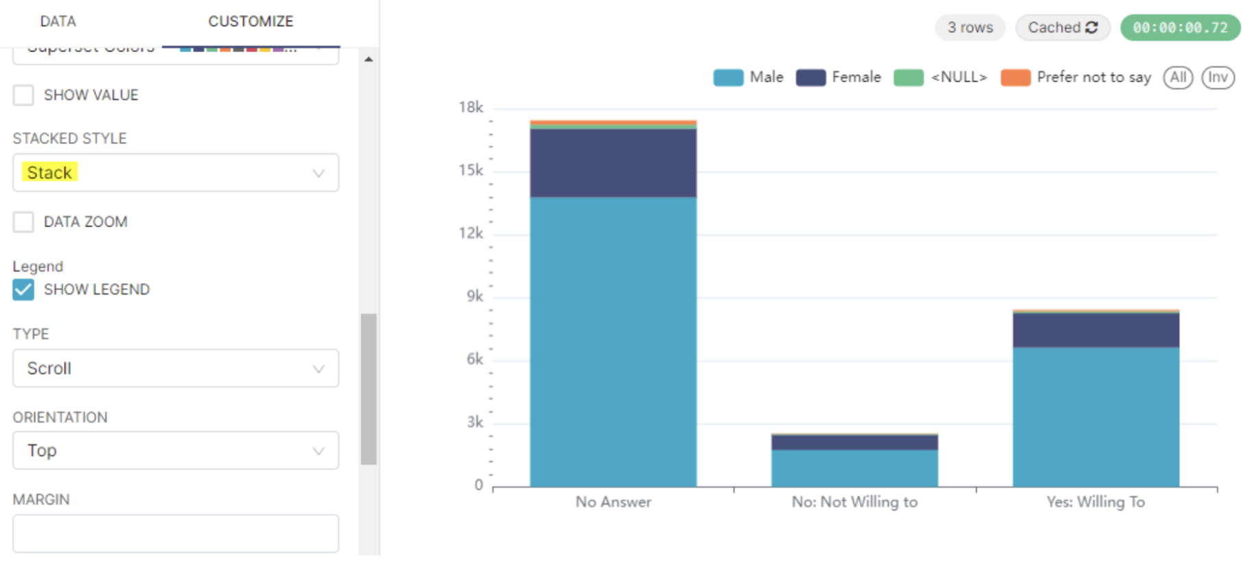
Stacked bars in Superset: we can now add gender to the mix
To reproduce this chart starting with the previous configuration, add ‘gender’ to the Dimensions slot and head to the Customize tab to set the stacked style to ‘Stack’.
Treemaps
What are treemaps?
Treemaps use nested rectangles to represent hierarchical data. They are ideal for displaying large datasets and can effectively compare proportions within categories.
When are treemaps useful?
Treemaps are a great choice when you want to display part-to-whole relationships amongst a possibly large number of categories, but do not care about enabling accurate comparisons between categories, and your data is inherently nested or hierarchical. Some common applications of treemaps include directory structures, disk space usage, and market segmentation.
Pros and cons of treemaps
Pros
- Efficient use of space - they’re rectangular!
- They are perfectly suited to showcase hierarchical relationships.
- They can accommodate a large number of categories.
Cons
- It is challenging to compare values at different levels of the hierarchy.
- It can be difficult to label smaller rectangles.
- They cannot be read accurately. Treemaps use two dimensions to encode data, namely area and color saturation, and we are not good at detecting small variations in either.
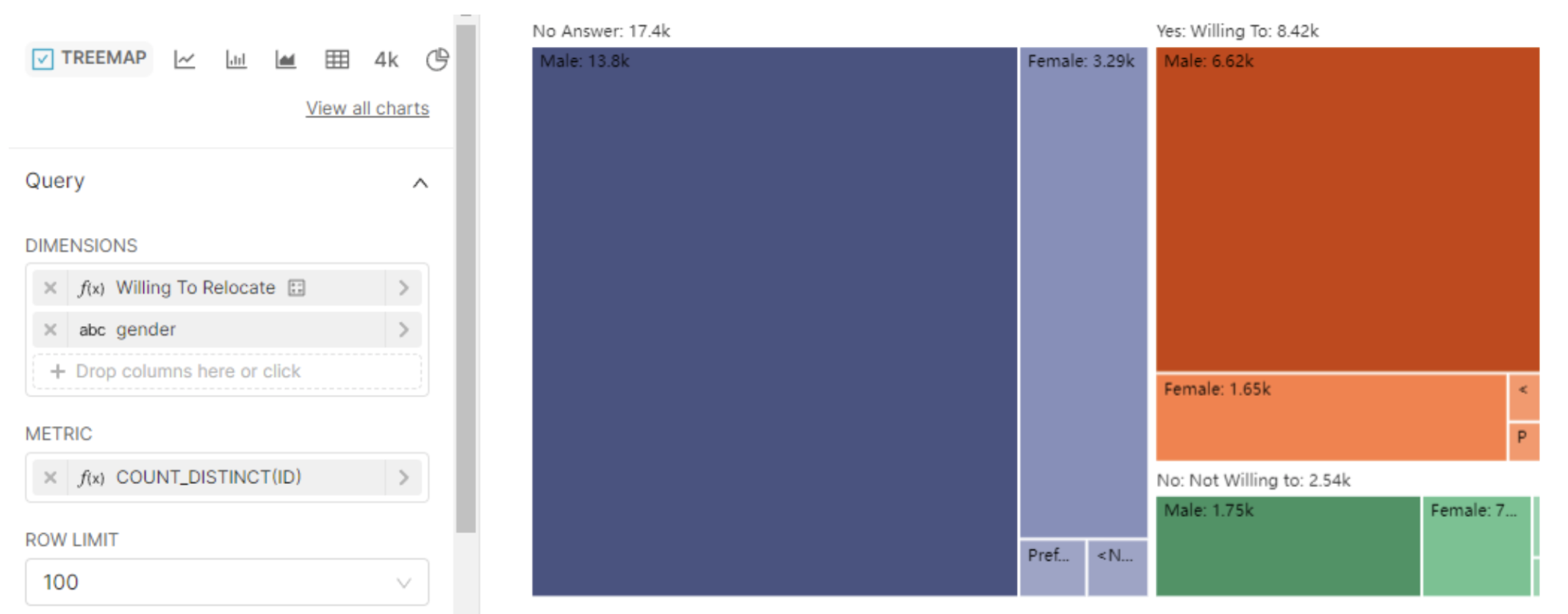
Treemaps in Superset
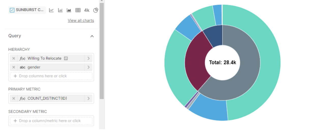
Sunburst Charts
What are sunburst charts?
A sunburst chart, also known as a radial treemap, is essentially the circular version of the treemap for hierarchical data, and a true show stopper! Each concentric ring in the chart represents a level in the hierarchy, with the innermost ring being the root level. Within each ring, the length of the arch of a category represents its part-to-whole relationship with its level.
When are sunburst charts useful?
Sunburst charts are useful when we have data that would be suitable for a treemap (hierarchical, large number of categories) and we’re also looking for a visual display that is stunning and engaging, with which the user will feel compelled to interact.
Pros and cons of sunburst charts
Pros
- They are relatable and easy to understand.
- They are visually appealing. What is it with circular charts?
- They can accommodate a relatively large number of levels, and of categories within each level.
Cons
- They are difficult to read accurately. The same issue that plagues pie charts and any visual representation relying on angles, is also applicable to the sunburst chart.
Sunburst charts in Superset: treemaps on a circle
Check the “SHOW TOTAL” box in the Customize pane for a nice touch!
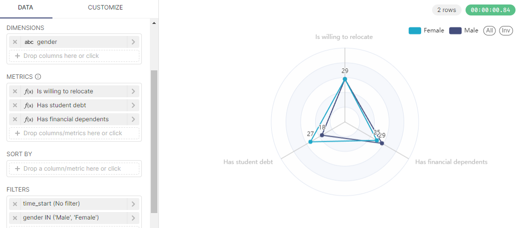
Radar Charts
What are radar charts?
A radar chart displays the results for multiple variables on a circular background with multiple axes radiating from the center. Each axis represents a different variable, and the data points are plotted along each axis. The resulting shape shows the overall pattern or profile of the data.
When are radar charts useful?
Radar charts are a good choice when the data consists of multiple variables that require different quantitative scales, making a bar chart unsuitable, and when your main goal is to make approximate comparisons across categories rather than accurate readings of individual values. Radar charts find applications in sports analysis, market research, and project management, among others.
Pros and cons of radar charts
Pros
- They enable the display of multiple variables on a single chart.
- They highlight patterns and profiles.
Cons
- It is difficult to compare values between different axes.
- They can be potentially misleading due to the irregularity of their polygon shapes.
- They are susceptible to data overload if the number of variables becomes too large.
Radar charts in Superset: let’s visualize 3 variables!
After choosing the radar chart type, create the following three percent-of-total metrics, then copy the configuration in the image below:
-
Is willing to relocate:
SUM(CAST(CASE WHEN job_relocate=1 THEN 1 ELSE 0 END AS INT)) *100
/ CAST(COUNT(1) AS INT) -
Has student debt:
SUM(CAST(CASE WHEN student_debt_has=1 THEN 1 ELSE 0 END AS INT)) *100 / CAST(COUNT(1) AS INT) -
Has financial dependents:
SUM(CAST(CASE WHEN has_finance_depends=1 THEN 1 ELSE 0 END AS INT)) *100 / CAST(COUNT(1) AS INT)
Conclusion
Here ends our discussion on the alternatives to pie charts. We hope to have clarified the uses and limitations of this uber controversial chart type and given you ideas with which to add variety to your own work. Head over to this page to read about pie charts in more detail, or here if you wish to learn more about chart colors customization in Superset and Preset. Ready to try these charts yourself? Get started with Preset Cloud for free. Happy charting!
