


Customizing Chart Colors with Apache Superset & Preset


Customizing Chart Colors with Superset & Preset
Following up on the CSS customization post from last week, I wanted to dive into another frequently-discussed area of customizing your dashboards in Apache Superset: chart color palettes!
There are a few distinct areas we’ll be covering today, each providing some particular things you might need to know to get the most out of this area of customization.
- Creating custom color palettes (with code on Superset, and with Preset’s UI)
- How color palettes interact with Charts within Dashboards (and the chart builder UI)
- How to define custom series-specific colors (or “label colors”)
Getting started with Superset chart color palettes
First off, it’s important to clarify that there are two main types of color palettes in Superset. Each has distinct use cases throughout the product.
The first is categorical, where colors are typically discrete and well-differentiated from each other. This distinction between color values allows charts like bar/line/area/pie charts to have more easily interpretable color values that you can quickly locate or differentiate.
The second category is sequential color schemes. These allow you to define a range of variable colors. This might be a two-color gradient such as blue-to-green, a status spectrum like red-yellow-green, or a hot/cold spectrum like red-white-blue.
You can apply either type of color palette to charts/visualizations in Superset (which ones are applicable varies chart by chart), usually by selecting it on the “Customize” tab of the chart builder.
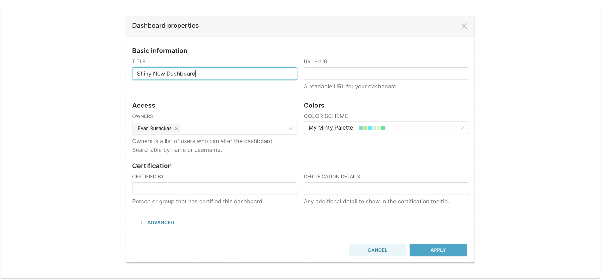
You can also add a palette to dashboards as well, by going into Edit mode and selecting “Dashboard Properties” from the menu with the three vertical dots.
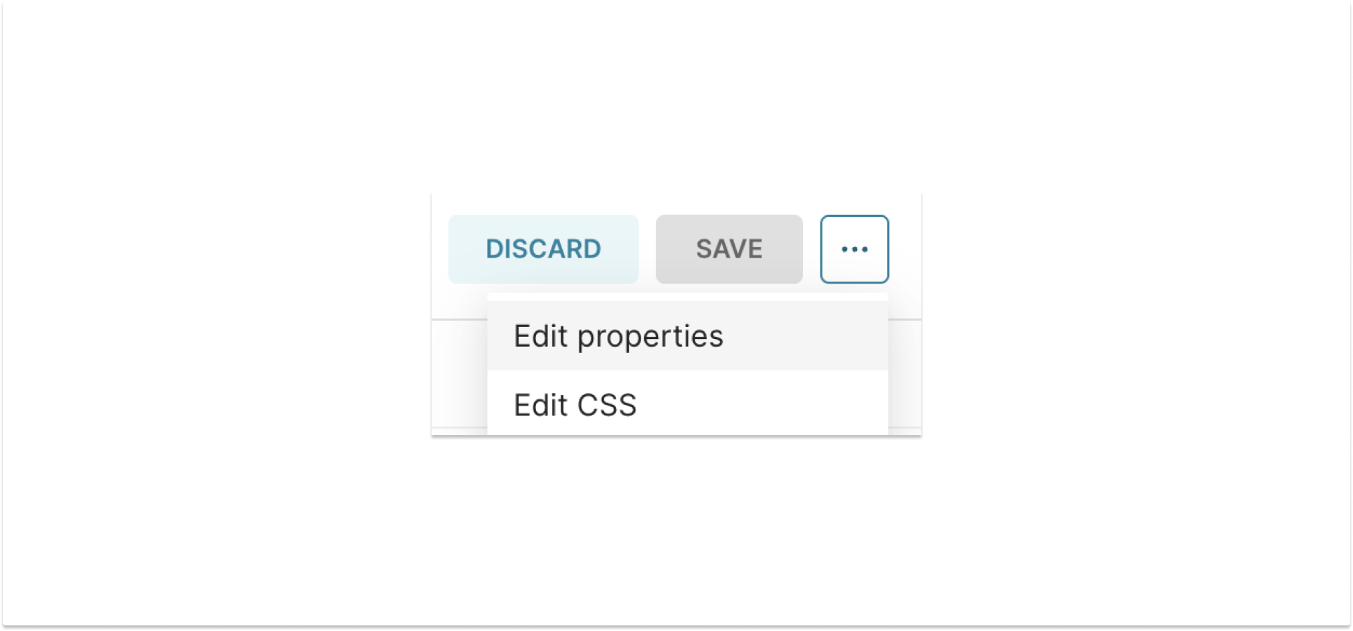
Note that you can only select categorical color palettes for dashboard-wide applications and that the palette only applies to charts that use categorical palettes.
Creating custom color palettes
Defining color palettes with Open Source Superset
With open-source Superset, this requires a config change… these are defined in code (or config), in your [config.py](http://config.py) file. You’ll create some palette definitions, replacing the default (empty) set of overrides that are included by default.
For categorical color palettes, you’ll want to look at lines 560-574 for the EXTRA_CATEGORICAL_COLOR_SCHEMES setting. Line 574 is an empty array of color schemes, and the lines of comments preceding it provide an example of how you can configure your palette.
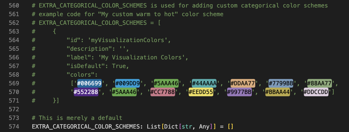
You can simply comment out the last line, and un-comment the prior block if you want to start experimenting that way. Note that this example is one color palette, but you can add as many as you’d like in the array/list. Note that each must have a unique id value, and only one of them should have the isDefault value set to True.
For example, two color palettes might look like so:
EXTRA_CATEGORICAL_COLOR_SCHEMES = [
{
"id": 'olympicColors',
"description": '',
"label": 'Colors of the Olympic Rings',
"isDefault": False,
"colors":
['#4594CC', '#FAD749', '#353535', '#43964A', '#BB3D37']
},
{
"id": 'xylophoneColors',
"description": '',
"label": 'Colors of a typical toy Xylophone',
"isDefault": True,
"colors":
['#FF0000', '#FFA500', '#FFFF00', '#008000', '#0000FF', '#000080', '#663399', '#FFC0CB']
}
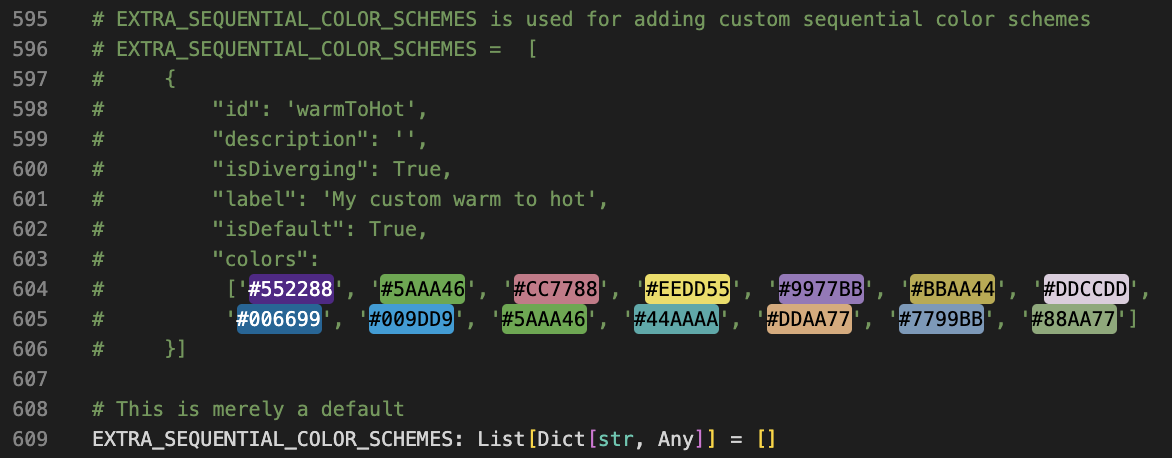
]Similarly, you can add one or more palette definitions in the EXTRA_SEQUENTIAL_COLOR_SCHEMES setting. The colors in the commented-out example aren’t actually a sequential scheme, but that’s the format they’d take. In this case, you will want to set (in most use cases) either two or three color values to represent your spectrum, sometimes more if you wish to add color-stops along the spectrum. If you set the isDiverging option to True that indicates that the palette has a midpoint to the range, which is useful for several chart types like choropleth maps where you might have a meaningful color range with distinct endpoint and middle colors for the range.
For both categorical and sequential color schemes, you can refer to (or edit!) the built-in color schemes in /superset-frontend/packages/superset-ui-core/src/color/colorSchemes/ which are stored in sequential and categorical subdirectories
Designing color palettes with Preset
Since Preset is a hosted SaaS version of Superset, we obviously can’t let people go wild with the source code. We do, however, get requests for custom viz color palettes. typically from our Enterprise customers. To support this, we’ve developed a point-and-click color palette builder, available to customers on our Enterprise tier.
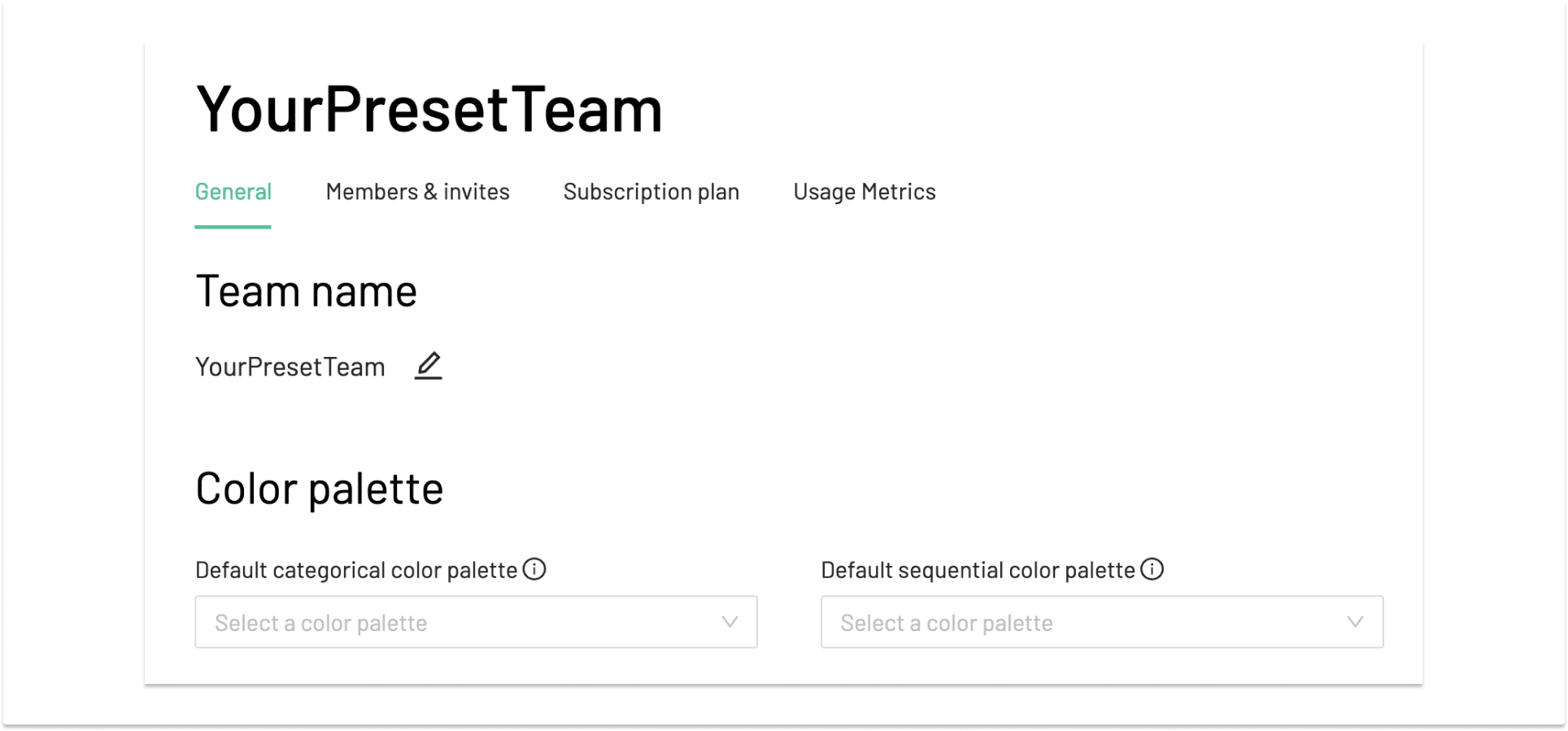
To get started, go to your Team on Preset Manager, and click the “Manage Team” button.

In there, you’ll see the Color Palette section in the “General” tab. The top two select menus allow you to set the default color palettes for both categorical and sequential types. These will automatically be applied when creating a new chart.
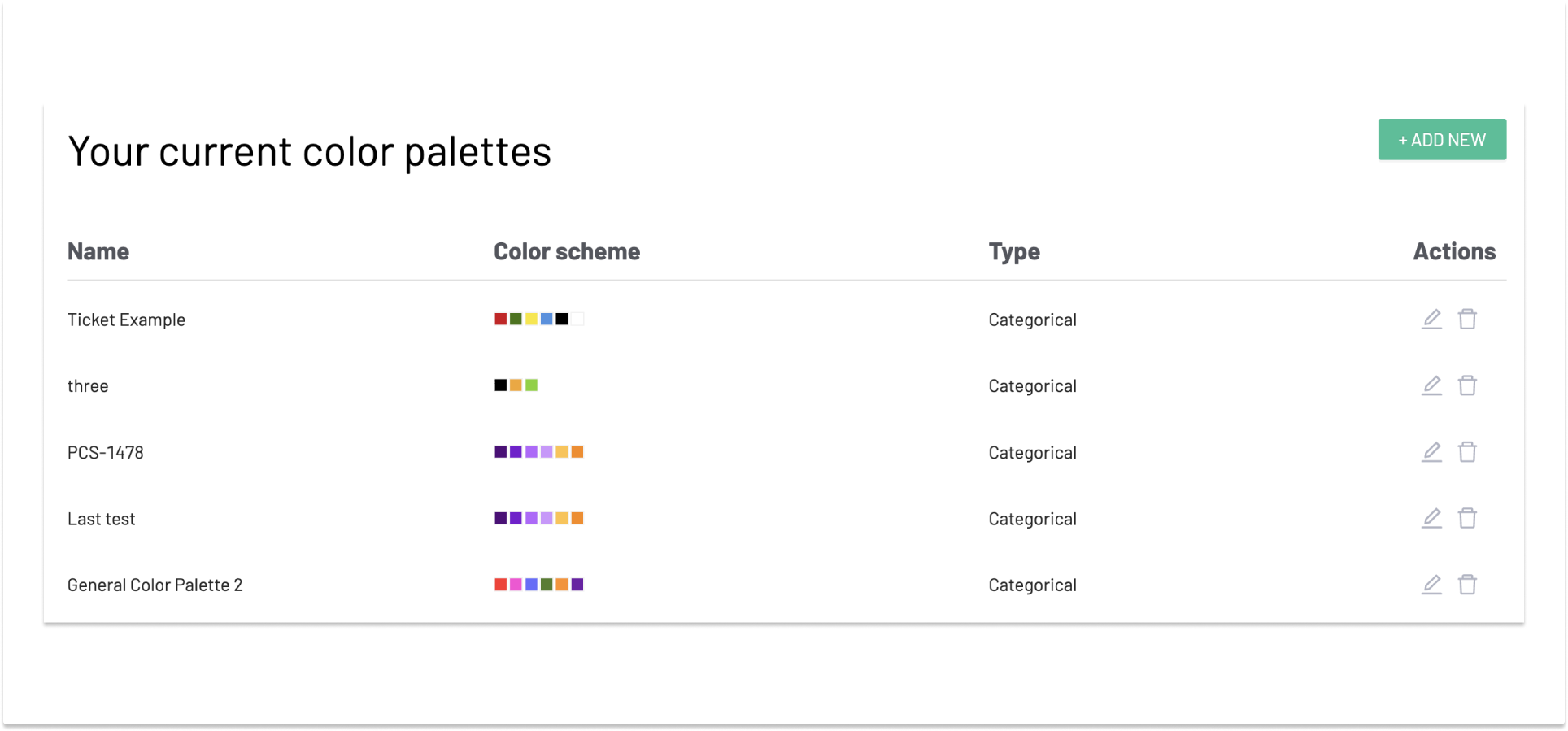
Below that, you’ll see a list of the existing custom color schemes available to your Team, with actions to edit or delete, and a button to add additional new palettes.
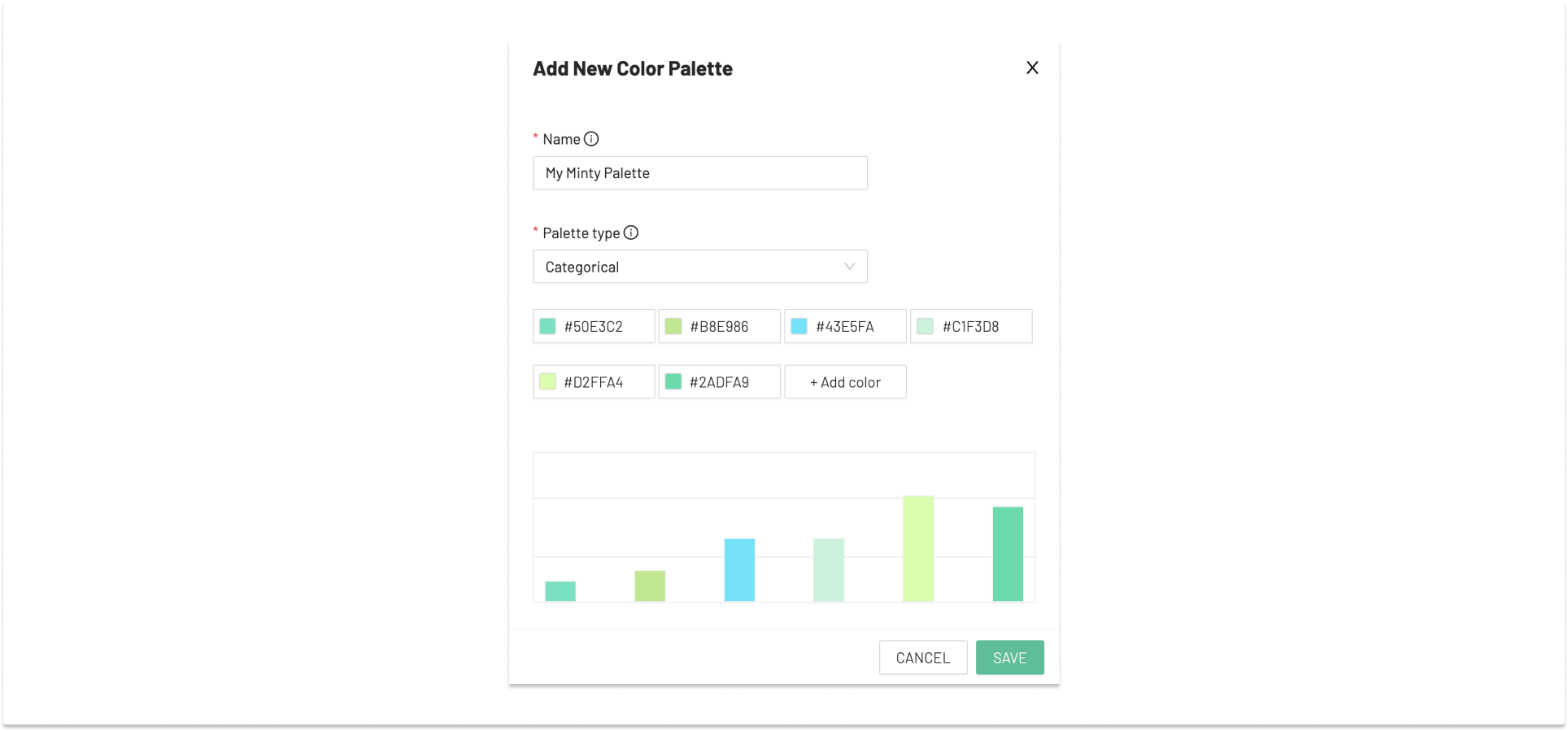
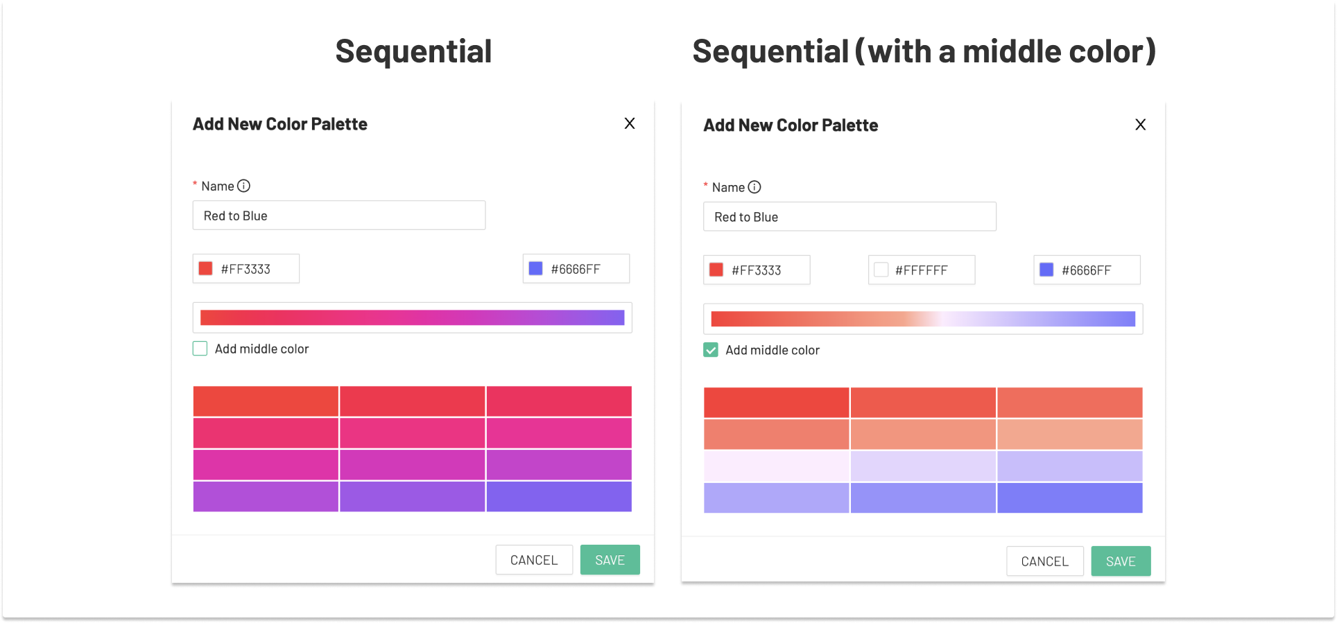
The UI allows you to give the palette a name. You can then pick between Categorical and Sequential palette types, and the UI will update accordingly to facilitate these palette types. Let’s start by selecting “Categorical” as the “Palette type.”
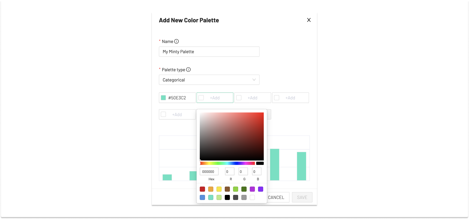
Once you reach a minimum of six colors, you’ll have the opportunity to save your color palette. Note that the editor also shows you a simple bar chart to help illustrate what your palette might look like in-situ on a data visualization. As you can see, the colors in this example are not exactly discrete/distinguishable so further editing might be warranted, especially since we’re all keeping accessibility in mind for those with lower color acuity, right?
Once your palette is saved, you can set it to be the default palette.
You can then set your new color palette as the default, which will then be automatically selected when creating a new chart, as seen here in the chart builder UI’s “Customize” tab.
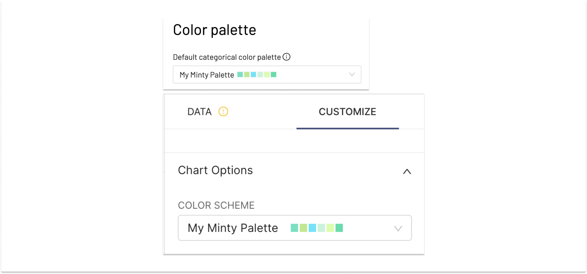
The palette is also available to apply to any new or existing dashboard as well. They are not applied by default when creating a new dashboard, but are available to select manually.
Similarly, you can select “Sequential” as the “Palette Type” and the builder UI changes both the inputs/options and the example data viz preview accordingly. In this case, I’m creating a red/blue spectrum for use in a US political map (left). With this simple gradient, you get a magenta color in the center, which doesn’t work for our use case. If I enable the “Add middle color” option, we have a clearer (even if unfortunate) separation along party lines (right).
Setting Dashboard color palettes and color consistency
A lot of effort has been put into how colors are applied to charts in dashboards over the last year or so. This “color consistency” effort was made to solve two often-reported issues, in that colors weren’t used consistently for series/dimensions across a dashboard, and that these palettes were not taken into account when editing a chart from the dashboard context, often confusing users.
In a nutshell, when a categorical color palette is applied dashboard-wide, a map of shared-series labels is generated, and the color palette is distributed across these shared series. This makes sure that the colors are consistent from chart to chart. Efforts are made to reduce duplicate neighbor colors in chars like area/pie charts along the way. If you DO NOT wish to have colors repeat at all in your dashboards, you may enable the USE_ANALAGOUS_COLORS feature flag which generates distinct colors on-the-fly, based on your initial palette. This is useful in some dashboards, but may lead to a proliferation of colors in other dashboards (such as those with a lot of maps), as well, so your mileage may vary.
When you’re on a dashboard that has a color palette applied, the chart will carry this palette into the chart editing experience. This happens from any and all dashboards the chart may be used in, and the underlying color palette is not overwritten in these cases.

As you can see, the chart in the Chart Builder looks exactly like the dashboard you came from.
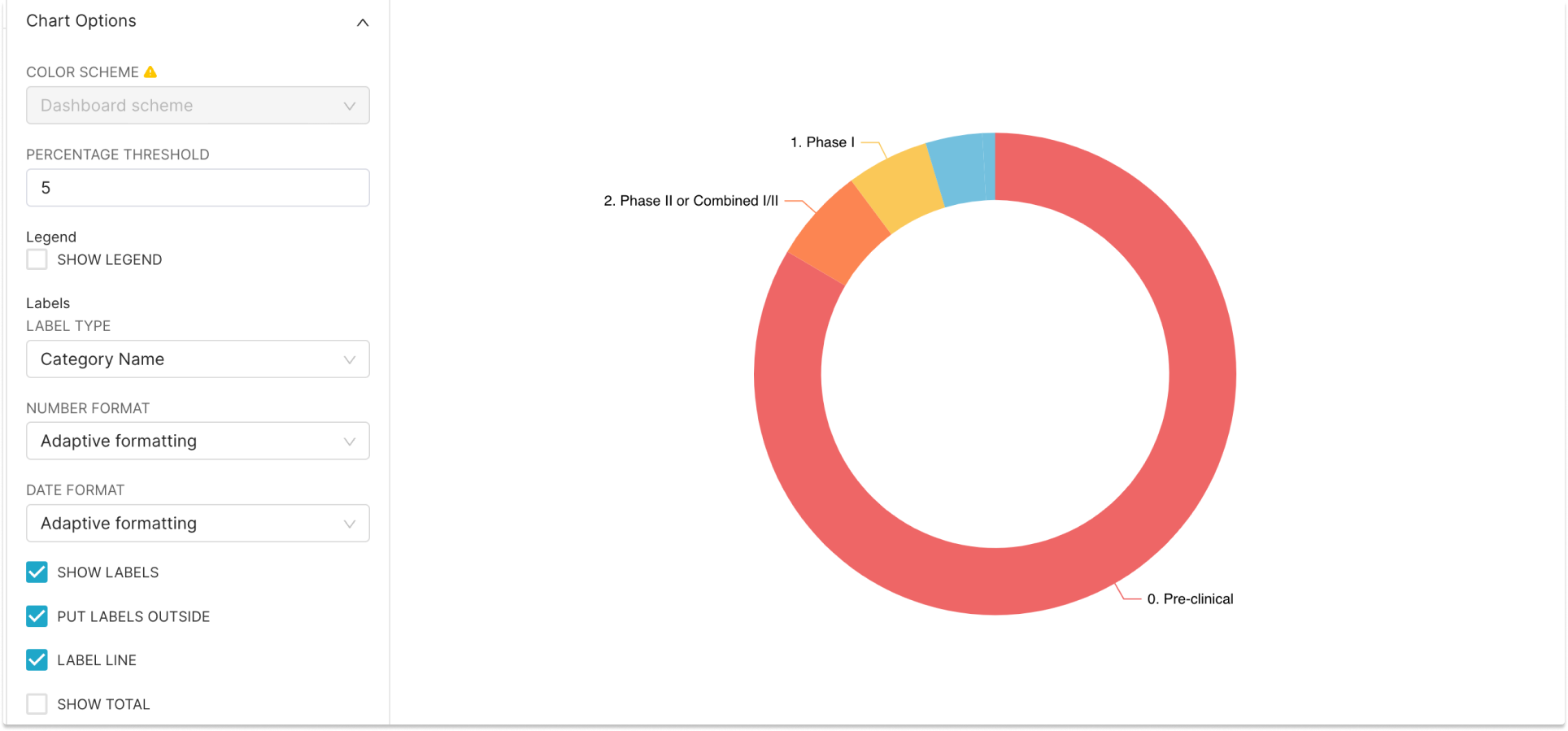
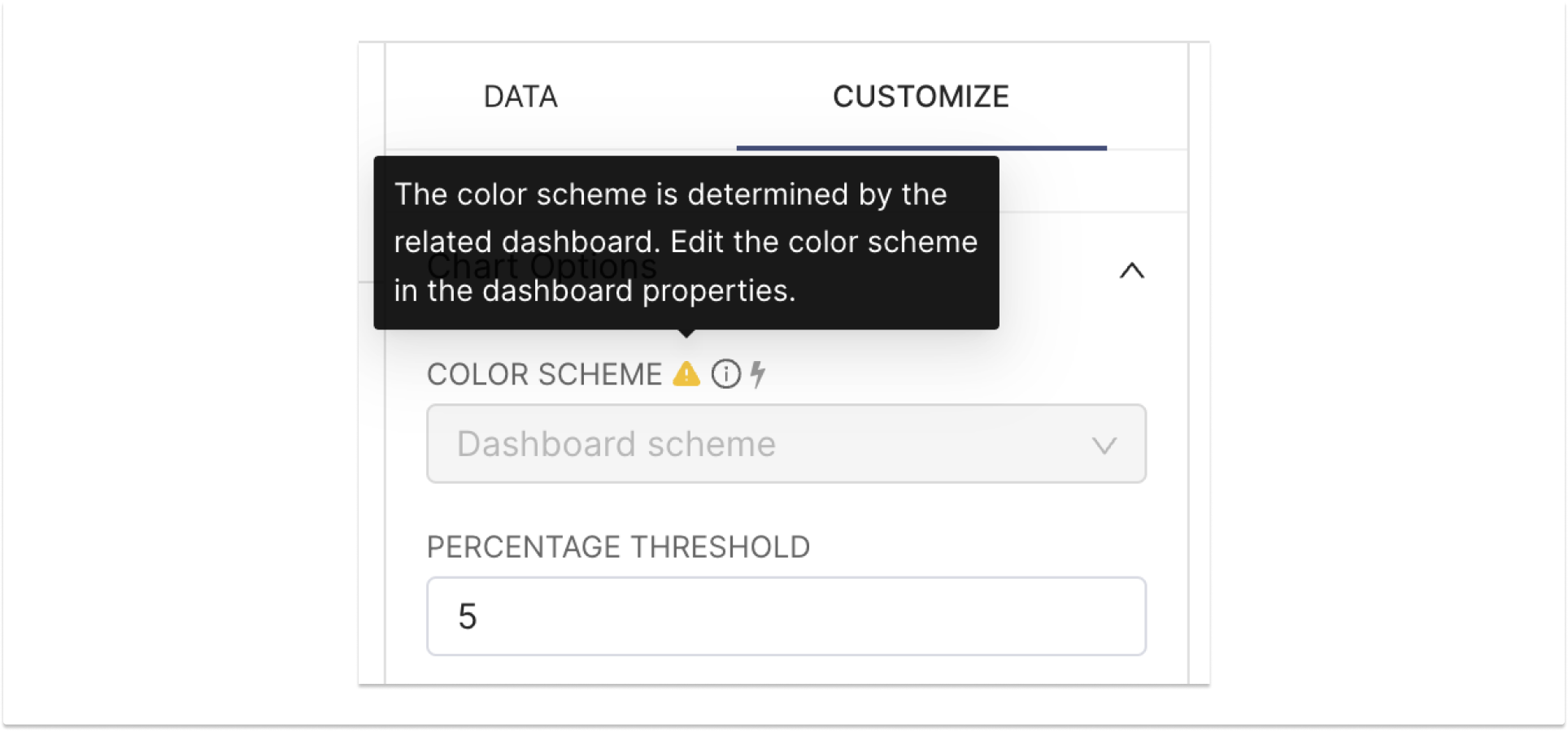
The Color Scheme control is disabled, with a tooltip indicating that the color palette is inherited from the dashboard.
If you want to see the underlying (original) chart color palette without the dashboard theme applied, you can simply navigate to the chart directly from the Charts tab in the top navigation bar.
Note that there are a few edge cases when revising charts within a dashboard can cause colors to be more redundant that you would prefer. If you run into one of these cases you can always re-open the dashboard properties modal, remove the color palette, and re-apply it. This resets the color assignment algorithm, giving your dashboard a fresh start.
Custom series colors
There are numerous use cases where you might want to show a particular color on a particular series (a.k.a. label) on a dashboard. A color may have a particular semantic meaning (i.e. flag colors on a map, blue for boys, brand colors, etc.) and you want to apply it with intent rather than letting the dashboard make assignments.
To do so, again open the Dashboard Properties modal, and at the bottom, toggle open the “Advanced” button to reveal the JSON metadata editor. There might be a lot of content in there (perhaps including the dashboard color_scheme if you’ve applied one). Here you can add a top-level property in this JSON object called “label_colors” in which you will enumerate the labels you want to specify color for, and their color values.
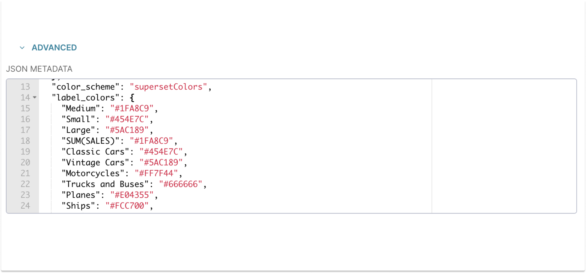
While these settings are usually populated by hex color values, they also support other formats like RGB, HSL, etc. One word of caution: it’s quite possible to pick a label color that’s close (or identical) to a neighboring palette-derived color inadvertently, so choose carefully!
A word on accessibility
There’s arguably nothing more important in the world of data visualization than your consumers being able to accurately interpret a chart or dashboard. Keep in mind that not all retinas are created equal! A world of tools exist to help build or check color palettes such as ColorBrewer can be of great utility here.
Conclusion
I hope that this primer on customizing your chart colors helps you create more beautiful and more meaningful dashboards, whether you’re using Preset’s tooling, or customizing Superset’s code and configuration. Coming soon, there will be one more (perhaps more forward-looking) blog post on customizing Superset’s colors and styling… please check back for an update, or sign up for updates below!
