


Theming Superset — Progress Update


Building on recent blog posts around customizing Apache Superset (and Preset) including CSS and Chart Color Palettes, I wanted to give everyone an update on where Superset is in terms of the “holy grail” of customization: theming. Questions such as “When will there be a dark mode” or “How do I make Superset look like my website/brand” are asked frequently by many in the Superset community, and I assure you, I’m right there with you with this at the top of my wish list. I look forward to the day I can circle back here to mark this post as obsolete, but in the meantime, I wanted to address this constant question regarding the status of this effort, what you can play with today, and how you might be able to contribute to the effort.
What exactly do we mean when we say Theming?
First off, I want to disambiguate what we call Theming from a couple of other related initiatives. Theming is not custom CSS templates, which are used to customize dashboards with CSS. Theming is not custom color palettes used by charts in Superset, though you can customize those too.
Instead, Theming, as it pertains to Superset, is essentially a set of variables. These variables (or sets of variables) are (or at least will be) used throughout Superset’s codebase as fundamental building blocks of Superset’s design system. Once these are implemented everywhere in the product, you’ll be able to start tweaking them, and seeing the effects ripple throughout the entirety of Superset. This dream is very real, but it’s a tectonic shift. While there indeed are some big moves ahead that will make great strides in this direction, let it be clear: the intent of this blog post is to draw your attention to two key points:
- This will take time, we’re not there yet!
- We can sure use your help!
How we got here
Before we get into the weeds of how we can apply theming systematically throughout Superset, I thought it might be worth a quick mention of how we got into the position in which we find ourselves.
Superset was originally written using Flask (and Flask-AppBuilder) to generate both APIs as well as server-generated views using Jinja templates. These pages were styled using some baked-in CSS, as well as additional layers of styling using Bootstrap, with layers of Bootswatch themes on top of that. All of this was using LESS, and it worked fairly well. As React was added to the application, it was built upon these individual pages, with each of them being its own App. The React components were not consistently styled or consolidated between these applications, which led to three large efforts on our roadmap: a shared component library, moving all views into a React single-page application (SPA), and creating a Superset design system.
Those three large projects have a lot of cross-over, but the TL;DR here is that we needed to move away from LESS in favor of a CSS-in-JS approach (we picked the Emotion library), move to a shared component library (we picked Ant Design, or “AntD” for short), and to a core visualization library (we picked Apache ECharts). All of these could build on the new Emotion-based styles, and Emotion itself provides a ThemeProvider component wherein the shared theme could be mutated or overridden.
So… the possibility of theming was suddenly very real, but what was laid before us was a list of long-tail engineering efforts. This begs today’s question: where are we in this effort?
Where we are in this effort
We’ve actually made a TON of progress on all fronts in the effort toward themability over the last couple of years or so, compared to where we started.
- There’s less LESS. The bulk of LESS styles has been migrated to Emotion styling within the components that use them. What remains are largely there for the sake of Flask/FAB-generated pages that will eventually be migrated, one by one, into a React Single-Page Application. You can read more about our path to Emotion in the original proposal and Superset’s approved best practices.
- There’s a React Single Application! So far a whole slew of pages have been converted to React, and subsequently added to the Single Page App (a.k.a. “SPA”). You can keep tabs on these in
superset-frontend/src/views/routes.tsxbut there are still many more to be converted to React (adding or enhancing APIs along the way to support this). There are proposals to move some key areas like SQL Lab into this app, but there are other views out there as well such as the RBAC controls and the user profile page. The major obstacle to this SPA project was not only re-architecting a lot of the front end but the requirement for a more consolidated frontend component system. - We have a component system! Many redundant components have already been consolidated from similar but different components into shared, reusable components that are either pulled in from AntD, or are opinionated and stylized thin wrappers around AntD base components. To make sure that these are properly themeable, we need to make sure they not only utilize shared variables but adhere systematically to a shared design system.
- There’s a design system! It’s still early in this process, but as core building blocks of superset evolve, they’re properly maintained as design assets in Figma, and all their features (props, styling options, and related documentation) are available to experiment with in React Storybook.
As you might surmise by these (fairly simplified) project descriptions, theming is dependent on a whole pile of migration/refactor/redesign/testing tasks that represent a giant pile of engineering work.
There are a few additional key dependencies that are hard requirements for theming to work through in Superset. Success here requires a lot of testing (for both visual/cosmetic and functional fallout), but we’re steering toward both:
- AntD upgrade and theming. Superset adopted AntD quite a while ago now, and we need up upgrade to the latest versions to take advantage of the latest CSS-in-JS theming advantages which will be compatible with Superset’s theme.
- Theme reorg and expansion. Right now, Superset’s theme is based on some very core elements (colors, font faces/sizes, corner radii, etc.). We’ll be adding a few key thematic elements based on surfaces a la Material Design, as well as consolidating certain style groupings like typographic styles into more compound styles. In a way, we’re making a move from atoms to molecules, in terms of these variables.
- ECharts theming. The Apache ECharts library has its own theming object. Once the theme re-org is complete, it should only be a matter of mapping the Superset Theme parameters to the relevant ECharts theme parameters.
You can read more about the above in the related SIP-82 (SIP being a Superset Improvement Proposal) that outlines these efforts in greater detail.
Can I tweak it? How do I tweak it?
Well, “can you” and “should you” are two different questions. I’ll just say now that while theming a few odds-and-ends is safe enough to experiment with, I wouldn’t go crazy. This is not ready for prime time… yet. But if you do want to tweak things, who am I to stop you? Read on!
Let’s start with how you can adjust these themes today if you want to make some light tweaks like making the primary button color (and other elements that use it) match your branding.
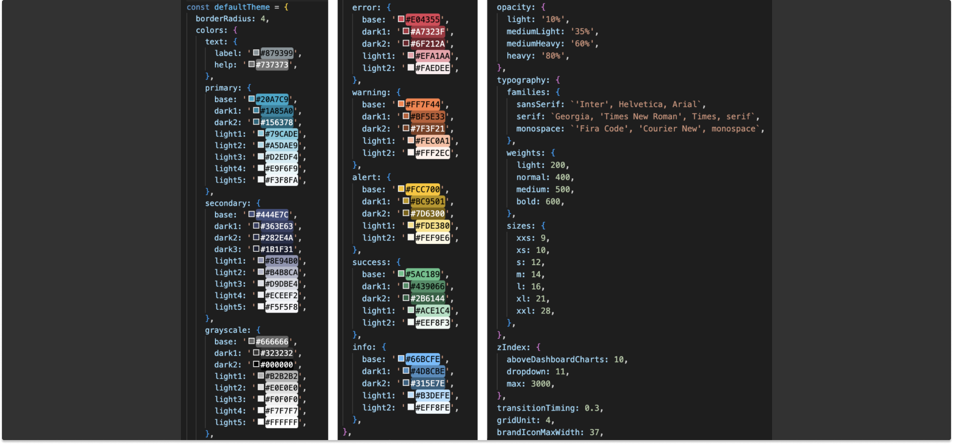
If you want to edit the Superset-UI npm module directly, it’s available in the superset-ui/core package found in /superset-frontend/packages/superset-ui-core/src/style/index.tsx You can tweak values directly in there. This is fine, if you want to make tweaks like this semi-permanently on your own fork. As you can see, there are a lot of values in there to play with:
But wait… while that’s where the base theme lives, there’s another door there’s a better way to tweak things! As of recently, you can adjust THEME_OVERRIDES in your [config.py](http://config.py) file as well. By updating these with any object of theme overrides, the theme is merged into the default theme using Lodash's merge utility and then fed into Emotions ThemeProvider component. Pretty neat!
In these settings, you’ll see an example in the following commented-out code block:
# THEME_OVERRIDES is used for adding custom theme to superset
# example code for "My theme" custom scheme
# THEME_OVERRIDES = {
#   "borderRadius": 4,
#   "colors": {
#     "primary": {
#       "base": 'red',
#     },
#     "secondary": {
#       "base": 'green',
#     },
#     "grayscale": {
#       "base": 'orange',
#     }
#   }
# }

THEME_OVERRIDES: Dict[str, Any] = {}
If you comment out that last line, and un-comment the example theme object, you’ll be able to see the difference upon refresh. Primary action buttons and pagination turn red, and various elements using orange instead of the frequently-used baseline grayscale shade.
Gorgeous, no? Well… once you start playing with it, you’ll probably find that the wheels fall off pretty quickly, due to that long-tail of unfinished projects listed above. Let’s say for example we want to be a little more cavalier, and invert the grayscale range of colors to make an instant dark mode! While this is basically what we’re all dying to do, you can see pretty quickly that if I convert our Theme overrides as follows…
# THEME_OVERRIDES is used for adding custom theme to superset
# example code for "My theme" custom scheme
THEME_OVERRIDES = {
  "borderRadius": 16,
  "colors": {
    "grayscale": {
      "base": '#666666',
      "dark1": '#F7F7F7',
      "dark2": '#FFFFFF',
      "light1": '#E0E0E0',
      "light2": '#B2B2B2',
      "light3": '#666666',
      "light4": '#323232',
      "light5": '#000000',
    }
  }
}

# THEME_OVERRIDES: Dict[str, Any] = {}
This seems just crazy enough to work, right? Well, it looks like this…
As you can see, there are a lot of elements where the style isn’t being carried through. Some of these are the base styles of AntD components that haven’t been touched up with Emotion. Some are Canvas/SVG elements in charts that aren’t applying theme variables. A few are just legacy LESS styles that have yet to be stripped out and replaced. In a nutshell, this is our roadmap, in plain black and white. We have work ahead.
A call to arms
A lot of people do indeed ask for the status of all this, thus today’s blog post. If you’re one of the brave that want to start customizing your Superset instance, we’d love to hear about how it goes in the #customizing-superset channel on Superset Slack. If you want to contribute code toward these efforts, please join us in the same channel, or #improving-superset, or just join some of our Operational Model meetings like the Superset Town Hall to get involved in SIP-82 and numerous other efforts and projects the community is undertaking to make the product better every day. When Superset finally has a true dark mode, rest assured I’ll be the first to pop the champagne. Maybe with your help, we can get there sooner.
