


How to Choose the Right Data Chart Types


We live in a glorious time for data visualization. Data visualization is used frequently in products, news articles, and even in politics. Visualization creators have a wide array of tools, techniques, and philosophies to draw on.
When consumers or users suddenly have a large number of choices to make, they encounter decision fatigue. The important challenge now in data visualization now is actually selecting the right chart type for your use case.
In this blog post, we'll organize the space of potential charts into a few, focused categories and the data questions they map to. This will help you select the right chart and help you and the viewers of your charts draw the right conclusions.
The chart examples in this post are all from Apache Superset, but the categories generalize to all tools.
Time Series Charts
Question: How does these variable(s) change over time?
Time series charts help you understand the role that time plays in influencing one or more metrics.
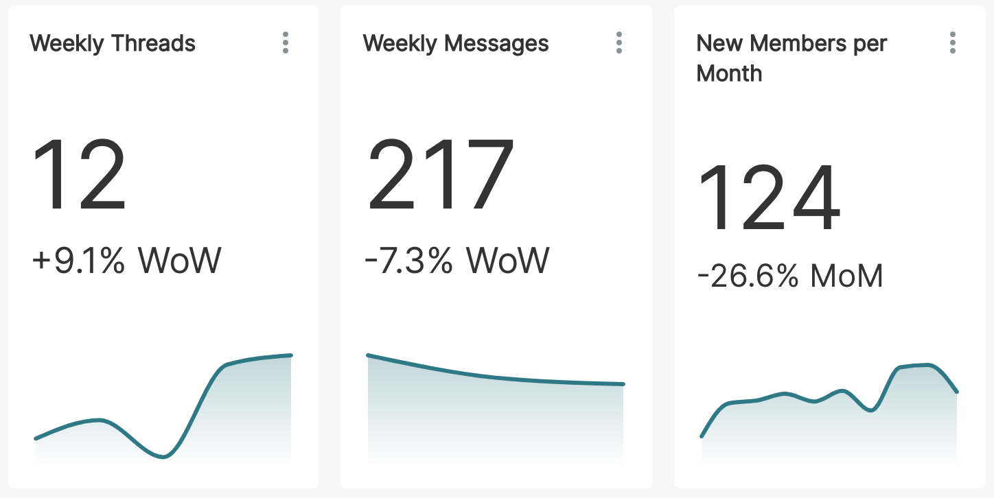
The following big number charts visualize how a single metric, each a metric of a Slack community, vary over time:
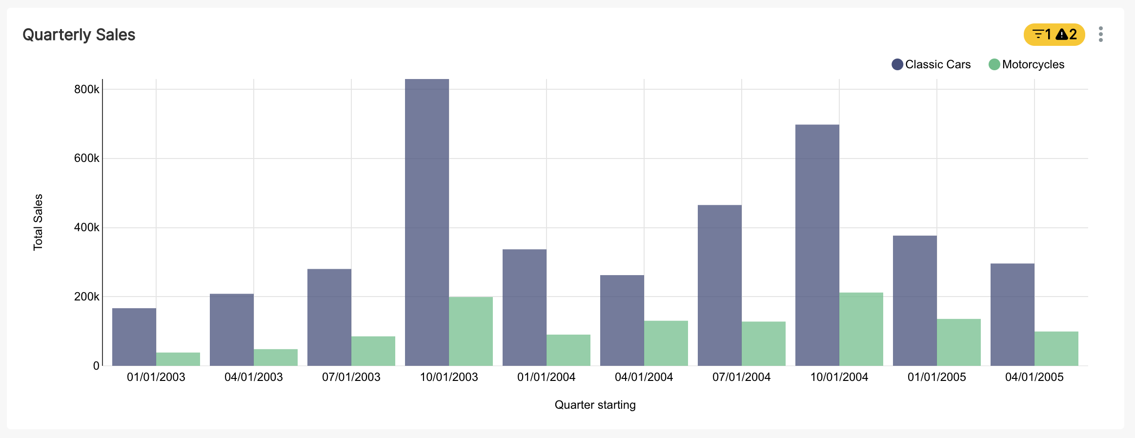
The following time series bar chart visualizes how two metrics, sales of different product categories, vary between each quarter.
Time series charts help you internalize:
- trends: which direction is the data going (e.g. weekly sales of video games trend downwards for older consoles)
- patterns: are there repeated patterns in the data corresponding to a certain time period (e.g. sales spikes during holiday seasons)
- variability: does the data contain lots of sudden spikes and dips or is it smoother (e.g. daily usage of a meditation app could be low variance for some segment of the user base)
You can read more about the time series charts Superset supports here.
Composition Charts
Question: How do parts of the data fit into the whole?
The classic composition chart is the humble pie chart. While pie charts are controversial, elegantly configured pie charts provide a universally understood way of visualizing the different segments or groups and their corresponding proportions.
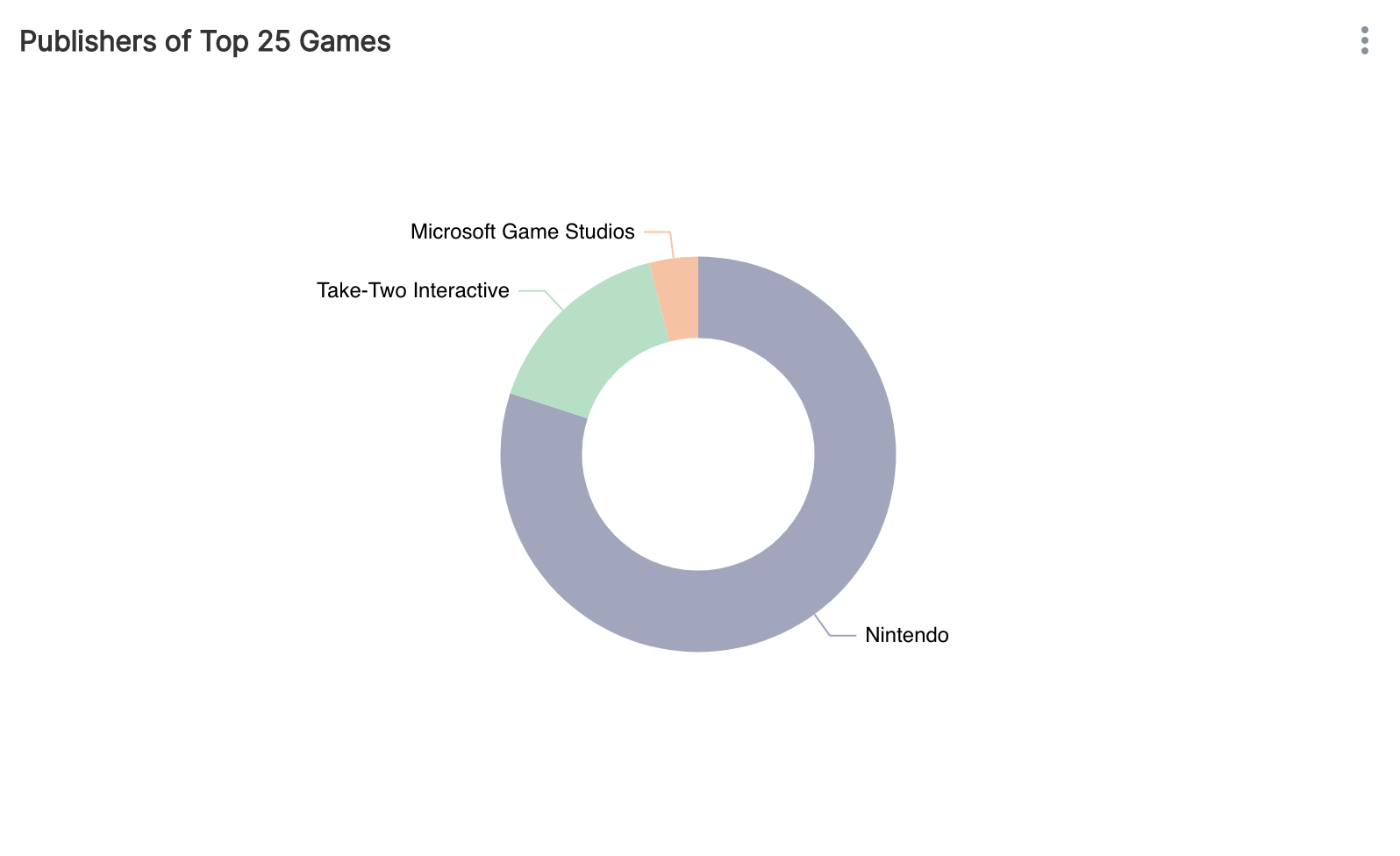
In the following pie chart, you can understand in just a few seconds how dominant Nintendo is among the top publishers:
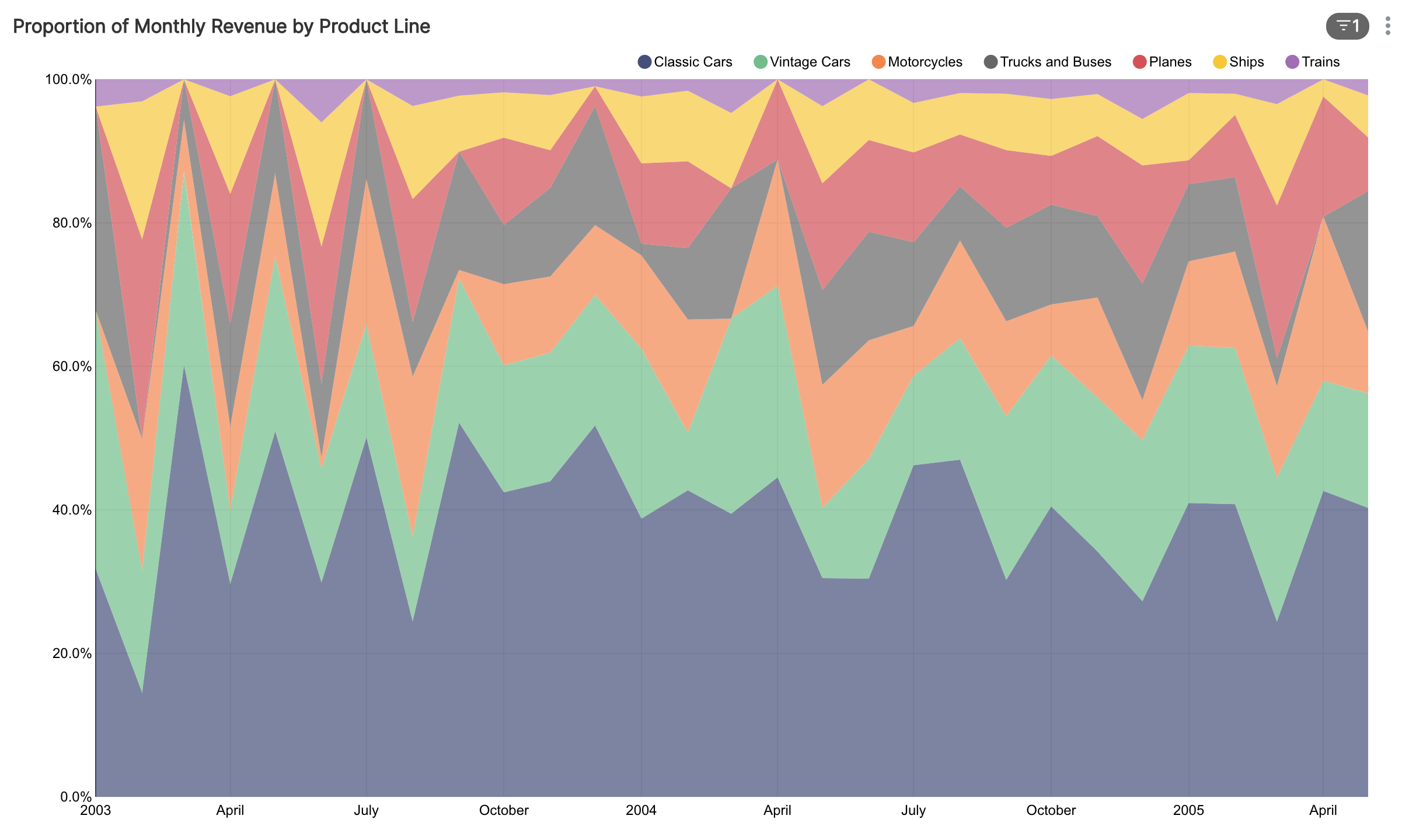
Composition charts can also contain a time element, to help you understand how proportions change over time. The following example is an area chart that does just that:
Composition charts help you internalize:
- proportions: what are the most common values and their corresponding percentages of the whole?
- important segments: are there specific segments that are dominant?
- quantity of segments: composition charts can help quickly provide context on the number of different segments that exist
- change in proportions over time: some charts combine the best of time series and composition charts to help you understand how proportions of a variable change over time
Distribution Charts
Question: What are the most common values, their relative proportions, and the skewness in one or more variables?
A frequency distribution breaks down the full range of values observed for a given variable into common values and how frequently they occur. Distribution charts are the most effective when you want to really zoom in & drill down the full range of outcomes for a specific variable.
The simplest and quickest way to visualize the frequency distribution is with a table:
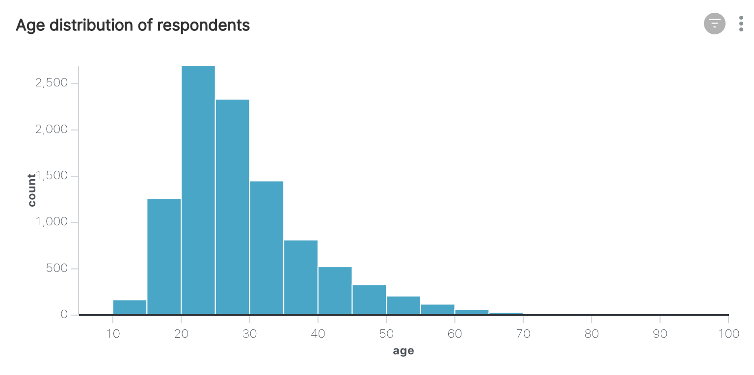
Histograms are everywhere in scientific field and are an effective way to dive deeply into a single variable:
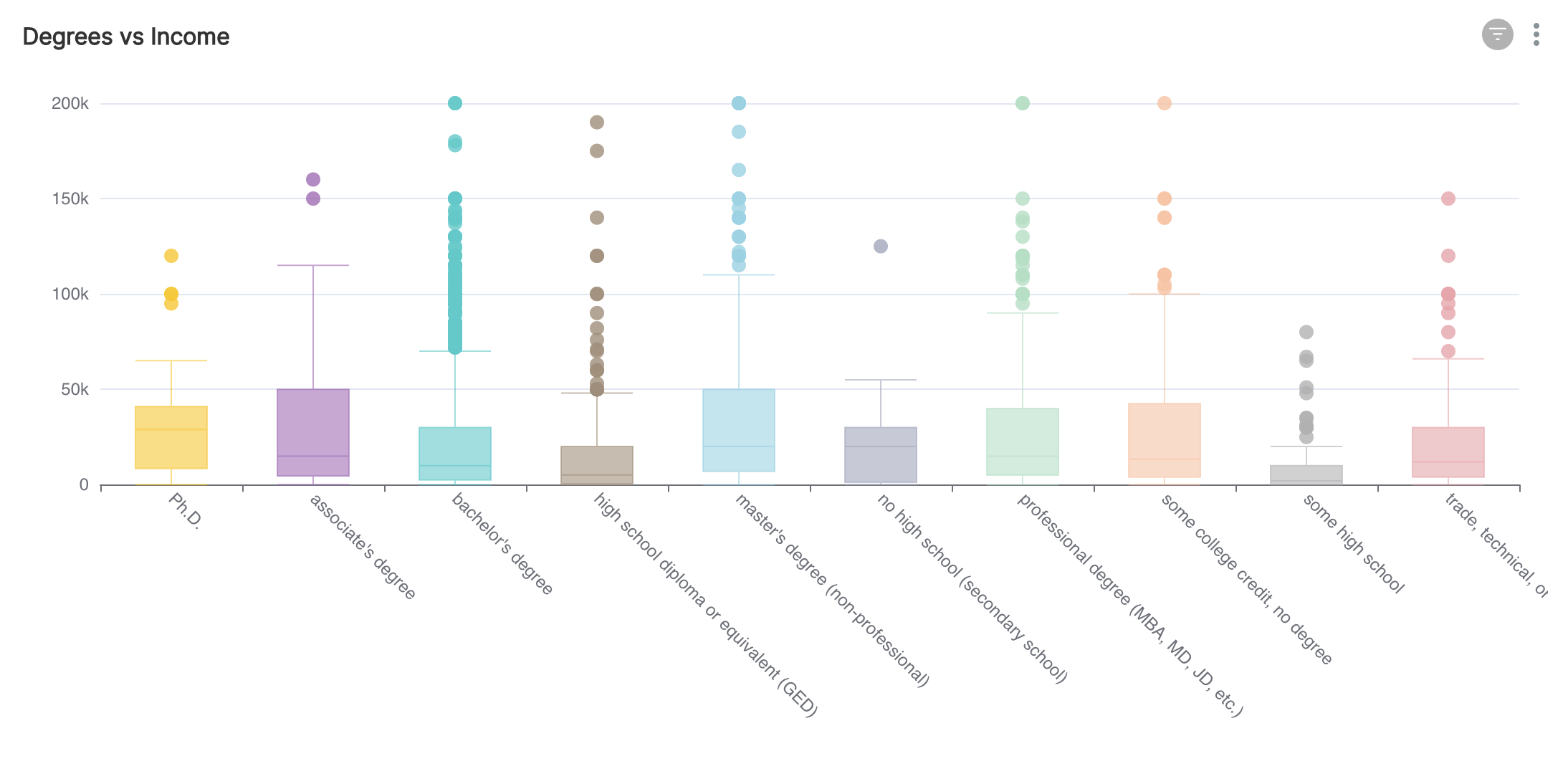
Another very common distribution chart is the box plot. Box plots help you understand quartiles, median values, mean values, and outlier values in the dataset:

Box plots can also be in conjunction with another variable to group distributions into different segments.
Distribution charts help you internalize:
- proportions: what are the most common values and their corresponding percentages of the whole?
- outliers: does the variable contain outliers that can influence the conclusions drawn from the data?
- concentration or skewness: does the distribution of a variable skew towards the higher or lower end of the spectrum?
You'll notice that distribution and composition charts often overlap in use cases.
Relationship Charts
Question: How do two or more variables relate to each other?
Data analysis is often a means to an end. Specifically, teams employ data analysis to understand how they can influence the variable they really care about (e.g. tons of CO2 polluted, gross revenue or profit, or NPS score). It's not unusual for the datasets that people work with these days to contain 50 to 100 columns (or variables).
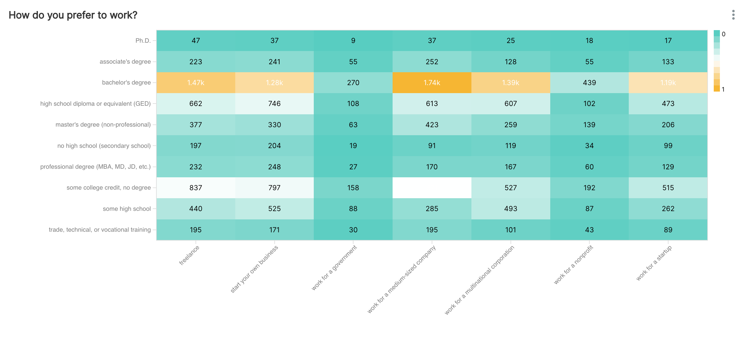
The following example is a heatmap that visualizes the overlap in segments for survey responses along two questions (education level & work preference):
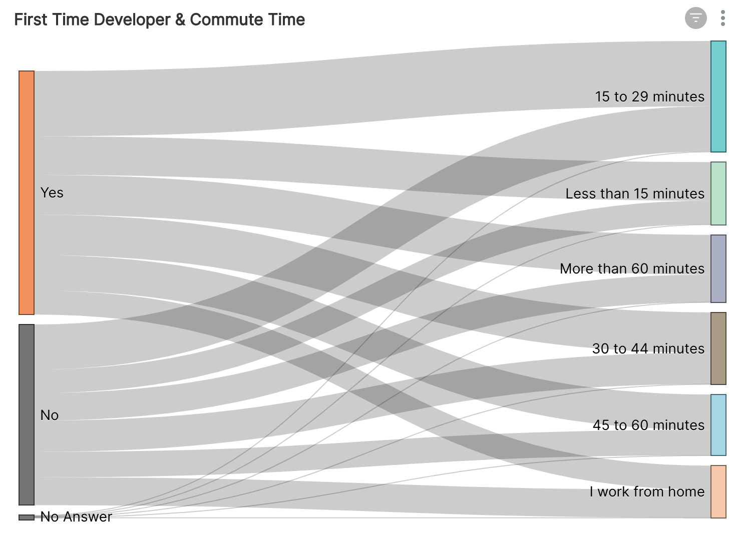
Sankey diagrams are another popular way of visualizing overlap in segments between two variables (in this case, also between two survey questions):
Relationship charts help you internalize:
- correlation: how strongly are 2 variables correlated with each other?
- predictive power: how effective can you predict the value of one variable if you know the values for a few of the other variables?
- overlap in segments: which segments of each variable are linked in an important way?
Geospatial Charts
Question: How are values of a variable distributed across geography?
Many insights become illuminated when we layer in geospatial context. The main challenge with using geography as the layer for charting is that the underlying boundaries are usually uneven (e.g. areas of states, countries, and continents).
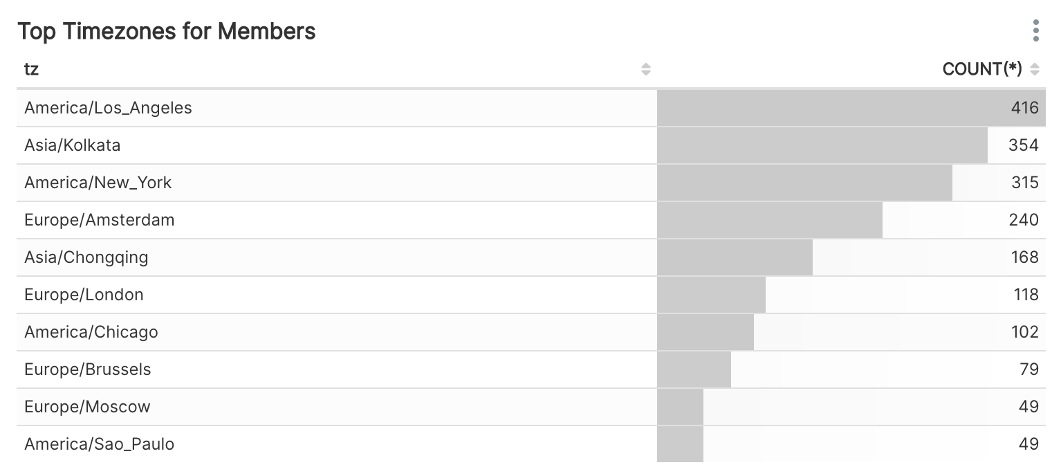
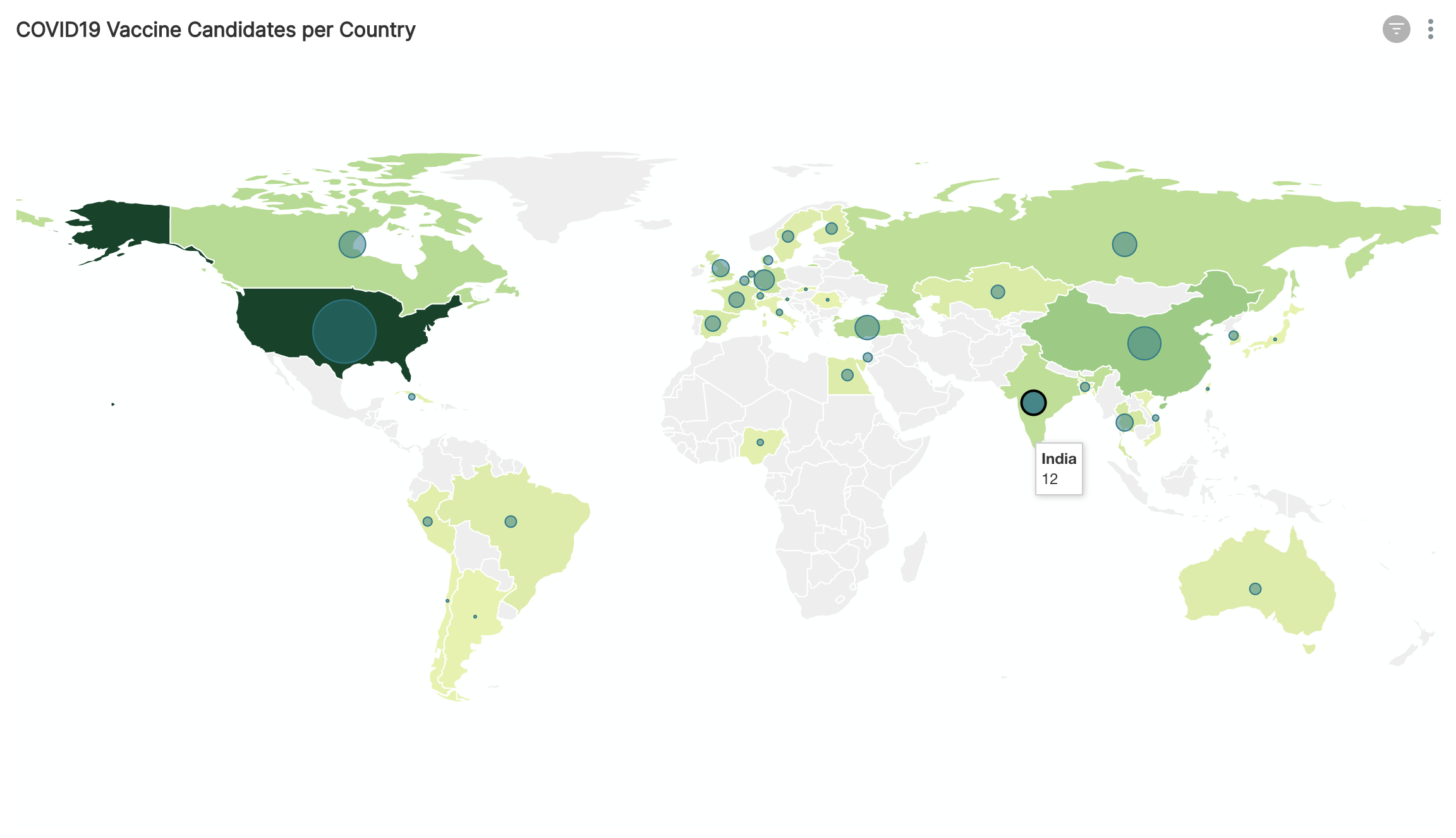
Adding markers when using geospatial charts is one way to help provide a more uniform way to compare different states or countries. The following example is a world map that uses bubbles scaled to the counts:
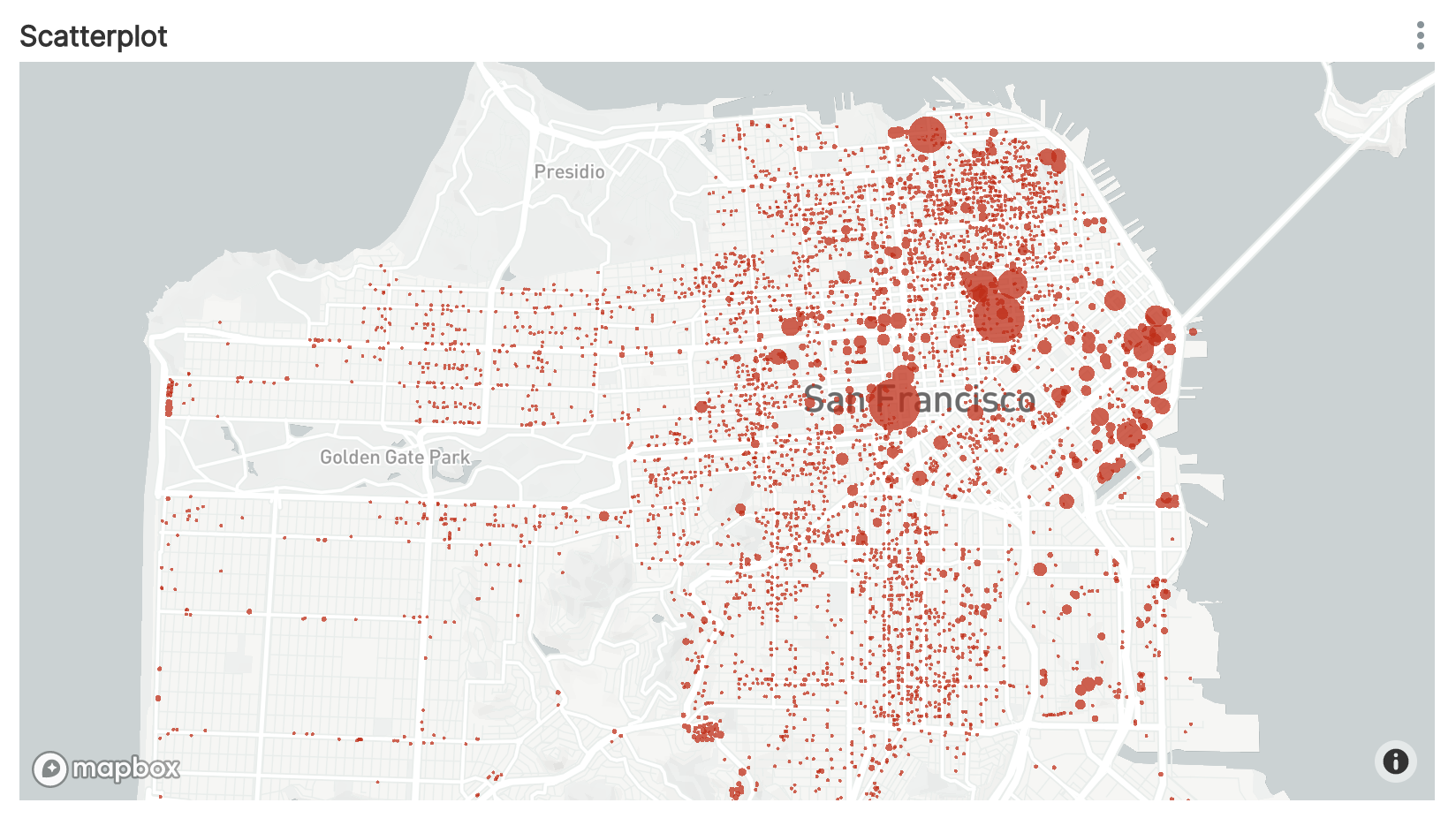
Mapping counts to geography is one of the most common use cases of geospatial charts. Here's a geospatial scatterplot where counts are visualized within a city:
Geospatial charts help you internalize:
- geographic trends: are there dips or spikes near the coasts of a continent?
- outliers across geographic bins: which geographic regions contain outlier values?
Conclusion
We hope this guide helped provide some structure into the vast space of visualizations. If you want to improve your visualization skills, the best way is to get hands on experience crafting dashboards.
