Time-Series Bar Charts in Apache Superset
Apache Superset is an open source, end-to-end business intelligence application that integrates with most databases / data engines.
In this post, we'll explore how to:
- shape your data for time series line charts
- create time series line charts using the Superset UI
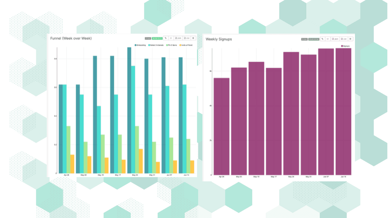
Time-series bar charts are a common way to visualize some outcomes as they vary over time. A time-series bar chart in Superset is very similar to a regular bar chart, but the overall chart design factors in time more effectively by default.
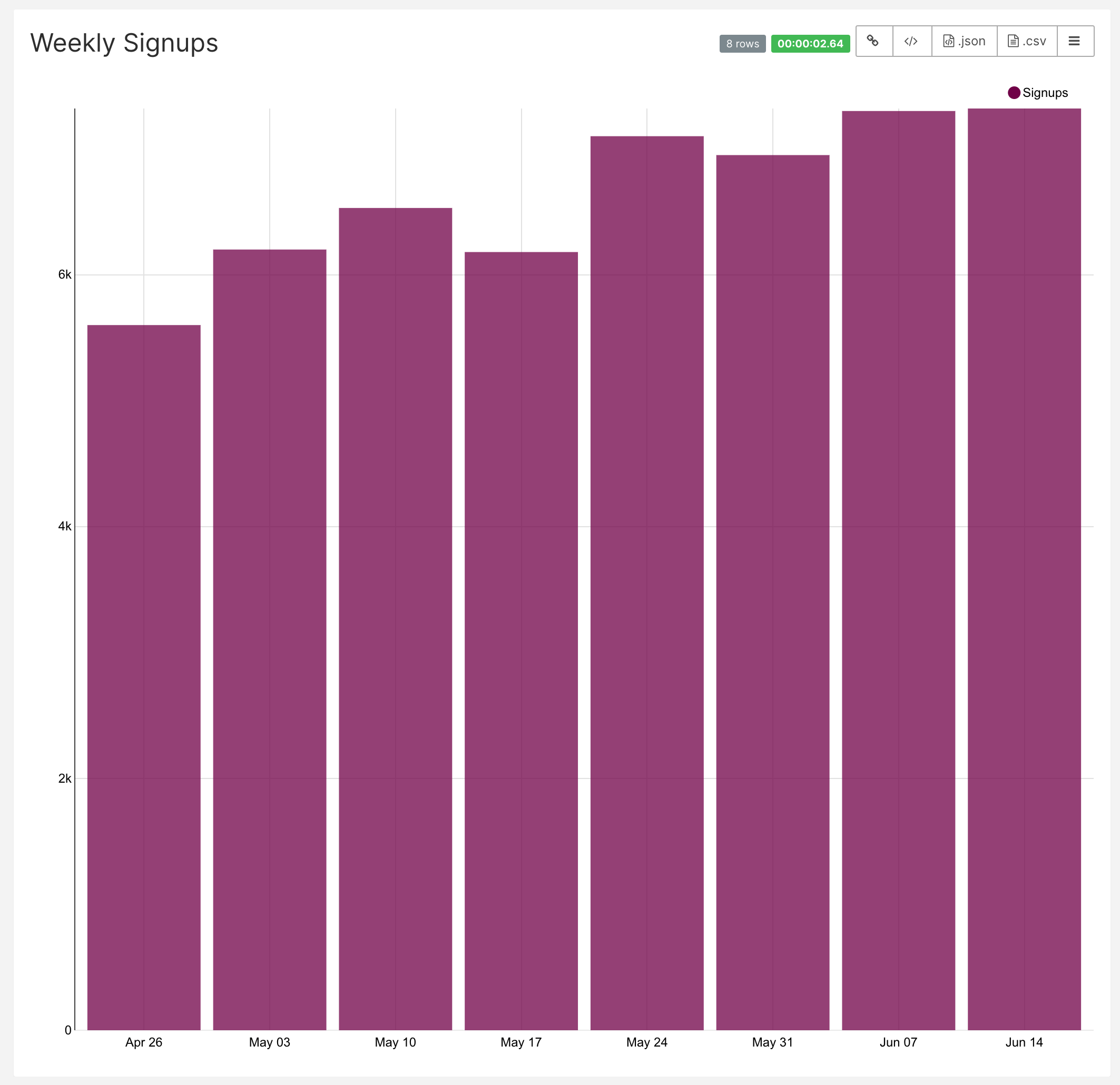
Visualizing a single variable across time.
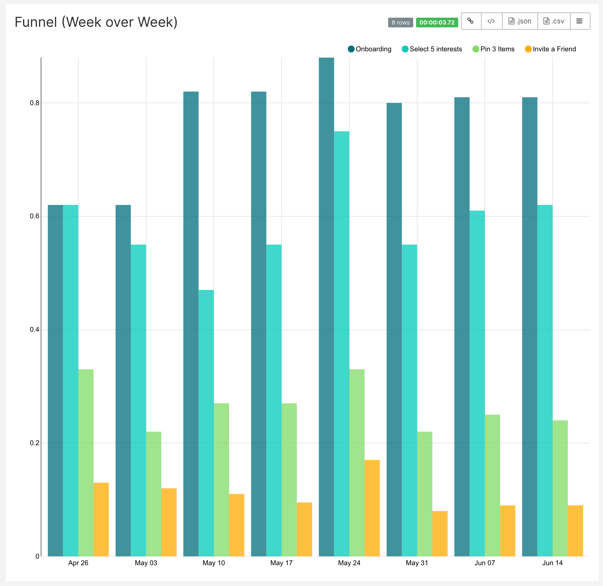
Visualizing multiple variables across time
Shaping Your Data
One of the design goals of Superset is to empower everyone in an organization to create charts and dashboards without having to be experts in data infrastructure, SQL, and visualization grammars. Knowing about the data you want to visualize it and how you want to visualize it should be enough.
With that context in mind, here's what the data powering the 2 charts above looks like.
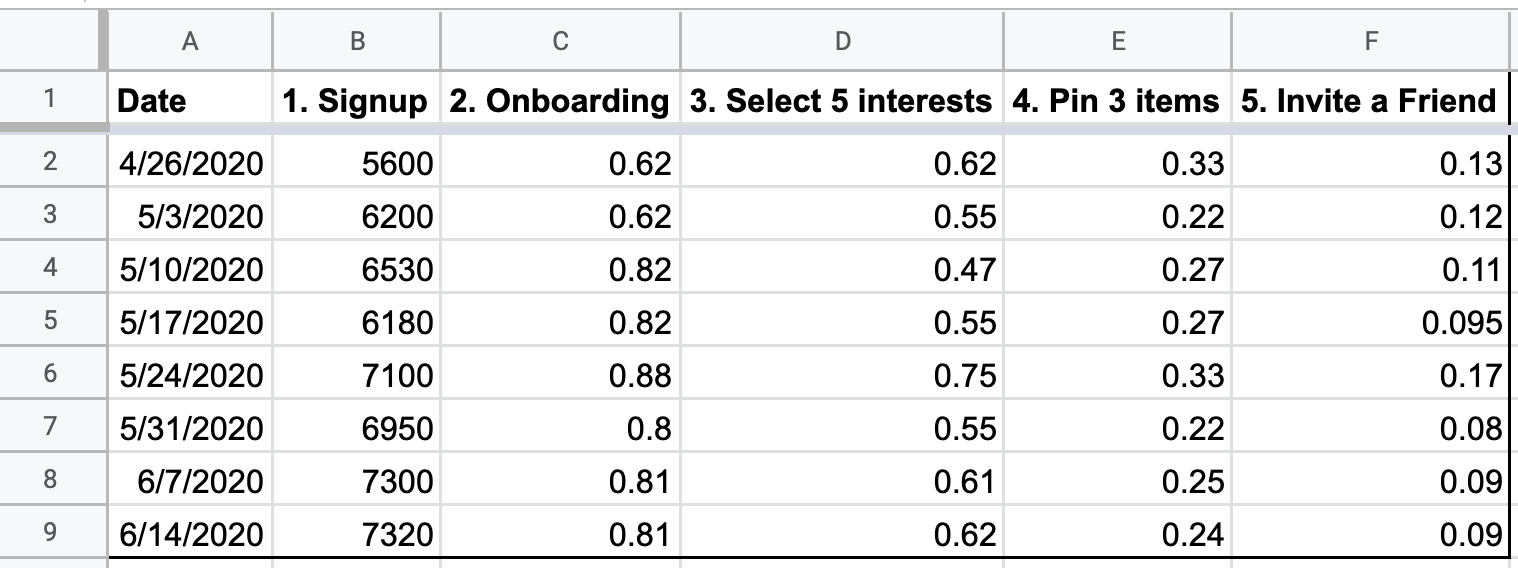
If you can point Superset to a table or a view from a supported RDBMS that's shaped this way, then you can quickly create the time-series bar charts above. If you need help reshaping your data so it matches this general structure, we encourage you to read this tutorial [coming soon: tutorial on using Superset views to reshape raw event tracking data]
Superset can also use Google Sheets as a data source (tutorial here: https://preset.io/blog/2020-06-01-connect-superset-google-sheets/). If you'd like to use the example spreadsheet above, add this Google Sheet to your data sources. Please note that support for Google Sheets is still in beta!
We will use the data in this Google Sheet as the guiding example for the rest of the blog post. This way, you can follow along and practice creating visualizations even if you don't have your actual data sources setup.
Introduction to the Explore UI
To create a time-series bar chart, first select the +New button in the top right corner of Superset.

Then, select your datasource and select Time-series Bar Chart in the Choose a visualization type drop-down.
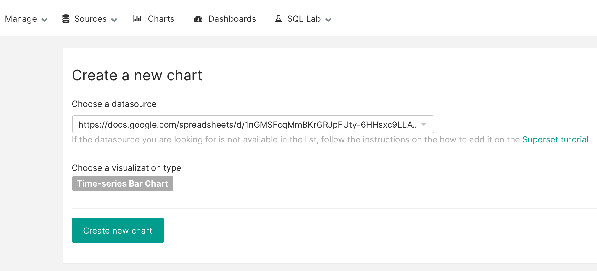
When everything looks right, finish by selecting the Create new chart button. You'll be taken to the Explore UI, where you can customize the visualization you're creating. Here's a quick tour of the main options in the Explore UI.
Datasource & Chart Type
This section contains the data source and visualization type you selected in the earlier screen. These options are available here to help you quickly swap out data sources or experiment with different visualization types.
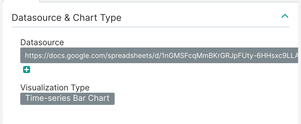
Under the hood, Superset generates SQL and queries your data source to create your chart. The Time and Query UI panes let you control many aspects of the underlying query through a friendly GUI.
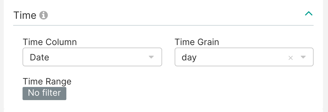
Time
The Time pane lets you filter the data you want queried and visualized. This can not only speed up processing time when working with large datasets but can also help you create more focused visualizations (e.g. a bar chart for just the last week of data).
Query
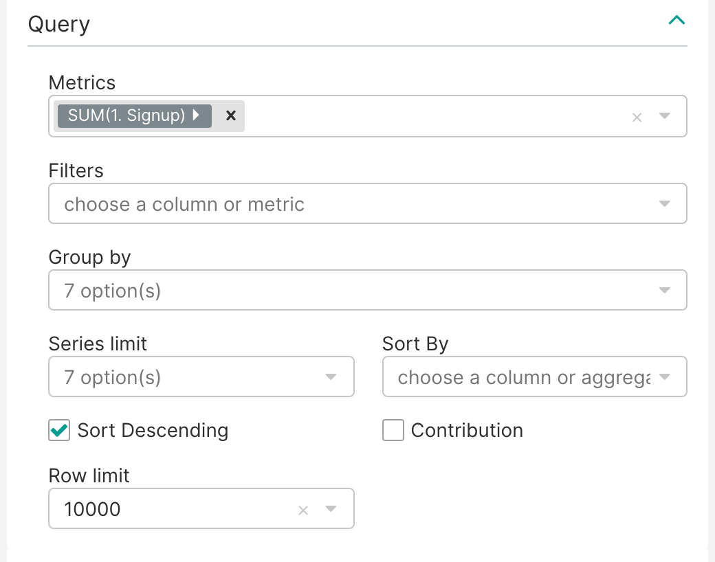
The Query pane lets you:
- select the columns you want visualized (Metrics)
- specify any filters you want to apply to your data (Filters)
- select columns to further pivot your data by (Group by)
- limit the number of time series queried (Series limit)
- sort by a column or a calculated metric (Sort by)
- set a row limit for data queried (Row limit)
We'll cover the Advanced Analytics and Annotations and Layers panes in a future post.
Creating A Single Variable Time-series Bar Chart
Now, let's create the a single variable time-series bar chart.
- Start by removing the values for Time Range and Time Grainm. The date range in the data from the Google Sheet we're using is limited already and already formatted as weekly dates, so we don't need this.

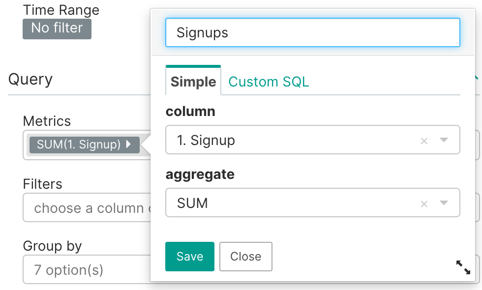
- For Metrics, we selected the 1. Signups column and set the Aggregate to SUM(). In our case, our data is already aggregated at the date level so this isn't technically needed. However, Superset by default requires an Aggregate function for improved clarity. Lastly, we renamed the column label to Signups.
- Change the chart title to Weekly Signups by double clicking the text - untitled at the top of the chart view.

- Finish by selecting the Run Query button and watch Superset prepare and create your visualization.

Note that the color of your bar chart may be different, as it's randomly generated each time you click Run Query.
Creating A Multiple Variable Time-series Bar Chart
The chart we just created visualizes how a single variable (Signups) varies week over week. A common way to share context on funnels is to visualize how multiple stages in a funnel vary week over week. We can treat each stage in a funnel as another variable (or Metric, to user Superset terminology).
To visualize the funnel stages for users that signed up, we just need to select these columns in the Query pane as Metrics.

Here's the resulting visualization when you click Run Query.
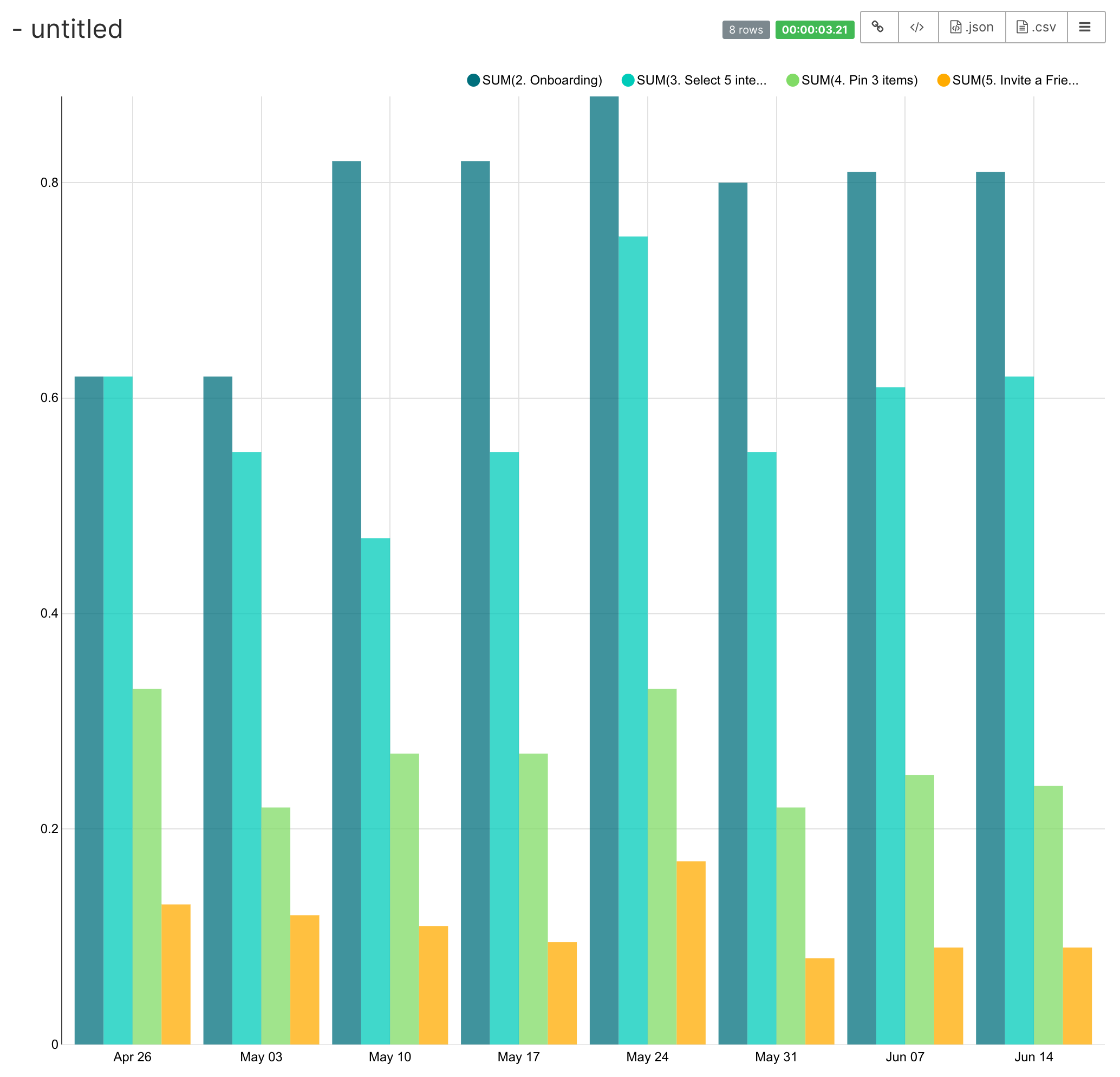
Lastly, we recommend setting the chart title to Weekly Funnel and renaming the column names.
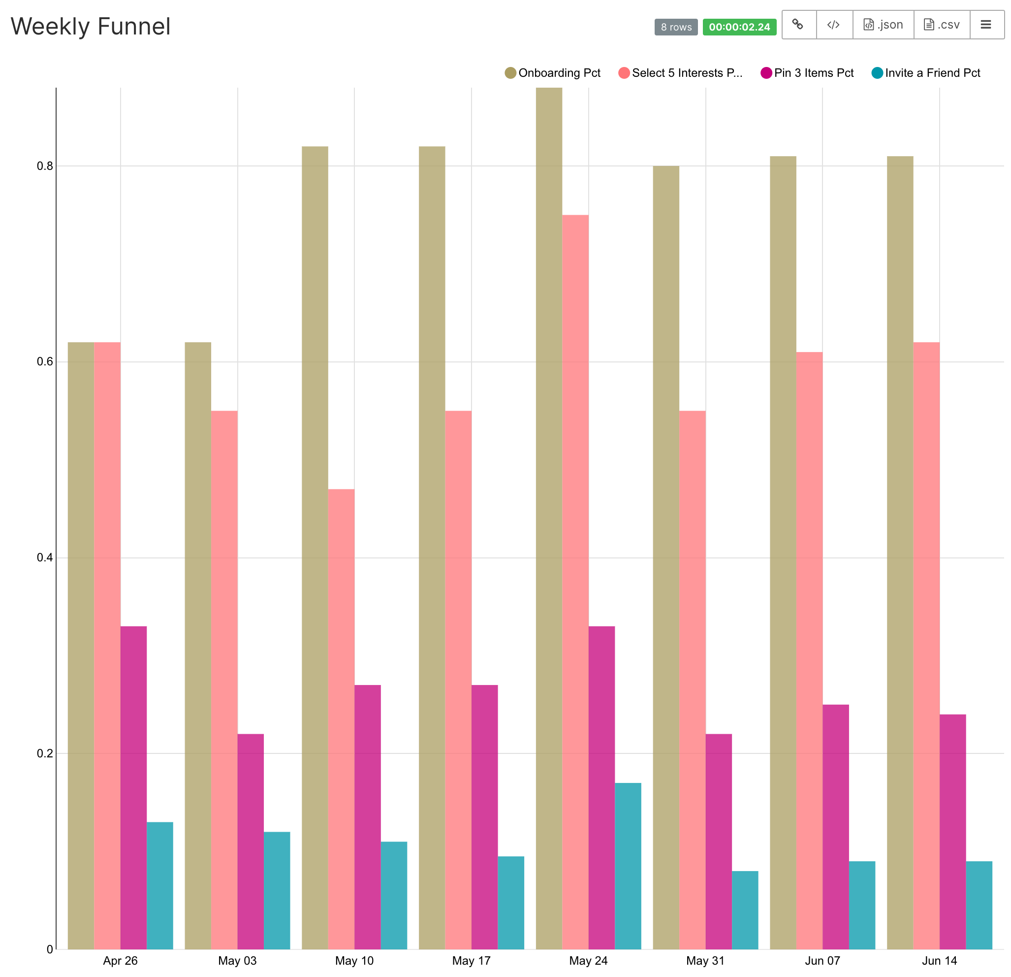
Beautiful! We hope you enjoyed creating these visualizations.
Concluding Thoughts
Running queries against Google Sheets is significantly slower than against a database such as PostgreSQL or MySQL so you should only use this approach for smaller datasets.
If you'd like a more production-ready setup for Superset, you can sign up for a hosted Superset solution here. Influence our ambitious Superset roadmap, and access Preset’s expertise as an extension of your team.
If you have any other questions, reach out to us at contact@preset.io or join our community Slack channel here.