Mixed Time-Series Data Visualization in Superset


Data visualization in Superset has always been deeply rooted in time-series visualization. When the Superset core contributors started to migrate chart plugins from NVD3 to Apache ECharts, they ported the time-series visualizations first.
The mixed time-series visualization in Superset helps take these charts to the next level by enabling you to combine and situate two of these charts in a single chart container.
The mixed time-series visualization was first released in Superset 1.2 and has enjoyed a number of improvements since then.
What is Time-Series Visualization?
Time-series visualization is the representation of data points that are ordered chronologically. It involves the use of charts, graphs, and other visual aids to help illustrate how a particular metric changes over time.
In a time-series visualization, the x-axis typically represents a temporal column, while the y-axis represents the variable being measured. This can be used to track changes in variables such as stock prices, temperature, sessions, and more.
Time-series visualization can help to identify trends, seasonality, patterns, and anomalies, while offering insights that can predictively forecast future values based on historical data. Time-series visualization is a valuable tool for anyone looking to analyze time-based data and gain insights into how variables change over time.
Why Combine Time Series Charts?
Starting from first principles:
- Why would we want this capability at all?
- What new capabilities does overlaying two time-series charts give us?
The short answer is: to expand our visualization canvas and facilitate more comparisons. When designed effectively, charts enable us to compare large quantities of datasets using our eyes and help us to determine actionable insights.
In Edward Tufte’s own words: “Visual displays, if they are to assist thinking, should show comparisons.”
Mixed time-series visualizations allow us to overlay charts on the same axes, which is useful for elevating a few specific types of comparison that would be challenging as standalone charts.
In this post, I'll showcase three powerful use cases where Mixed Time-Series charts really shine and walk through the steps to create each one.
Comparing Subsets with the Full Population
Let’s say that we’re managing a growing community and we want to understand the proportion of the community that’s regularly engaging. Specifically, we want to understand the rhythms of daily active users (DAUs) and weekly active users (WAUs) as they relate to the total number of users.
Without the Mixed Time-Series chart
Before Superset supported the Mixed Time-Series chart, we had to create multiple time-series graphs and place them side-by-side to attempt to enable the viewer to compare.
Visualizing time-series data in this way has a few key disadvantages:
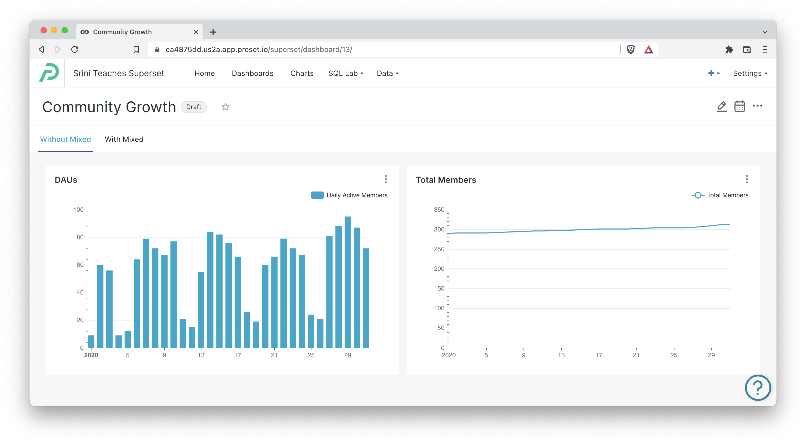
This layout has a few key disadvantages:
- Comparing values is discouraged between DAU’s and the total members because of how incredibly cumbersome it is.
- The y-axis ranges default to the ranges specific to each column, so we need to do some extra customization work in Explore to force the ranges to match.
With the Mixed Time-Series Chart
Using the mixed time-series chart in Superset, we can combine both of the charts and plot them within the same charting area:
- Line graph for current number of members in a community
- Bar graph for daily active members in a community
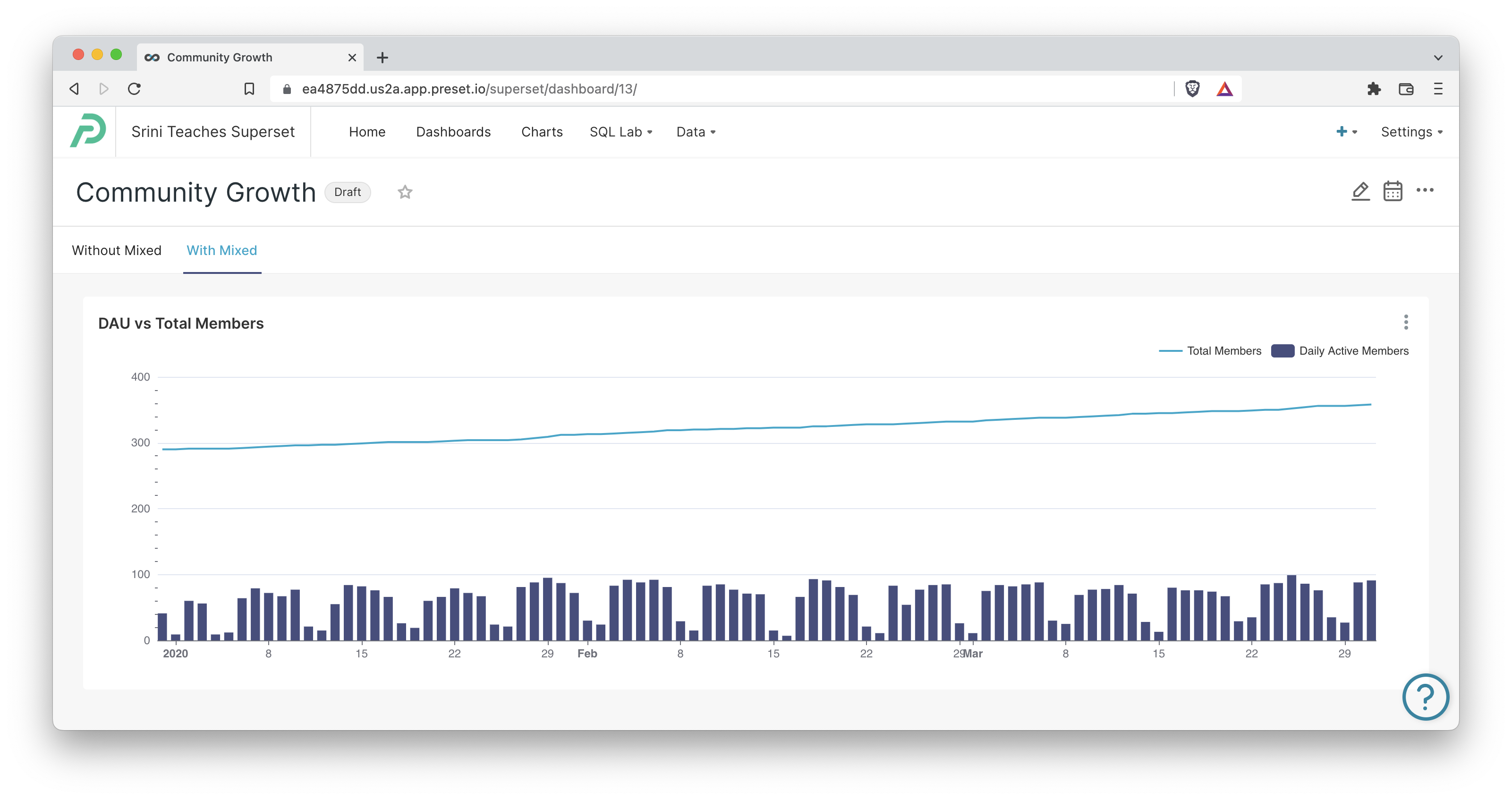
This combo chart has a few key advantages:
- Comparing daily values with the total number of members is encouraged because of the shared axis and charting.
- The y-axis scale factors in the ranges of both charts and has expanded to accommodate both data ranges.
- The shared chart container uses less horizontal space, enabling us to expand the date range from one months to three months of data without any loss of comparison fidelity.
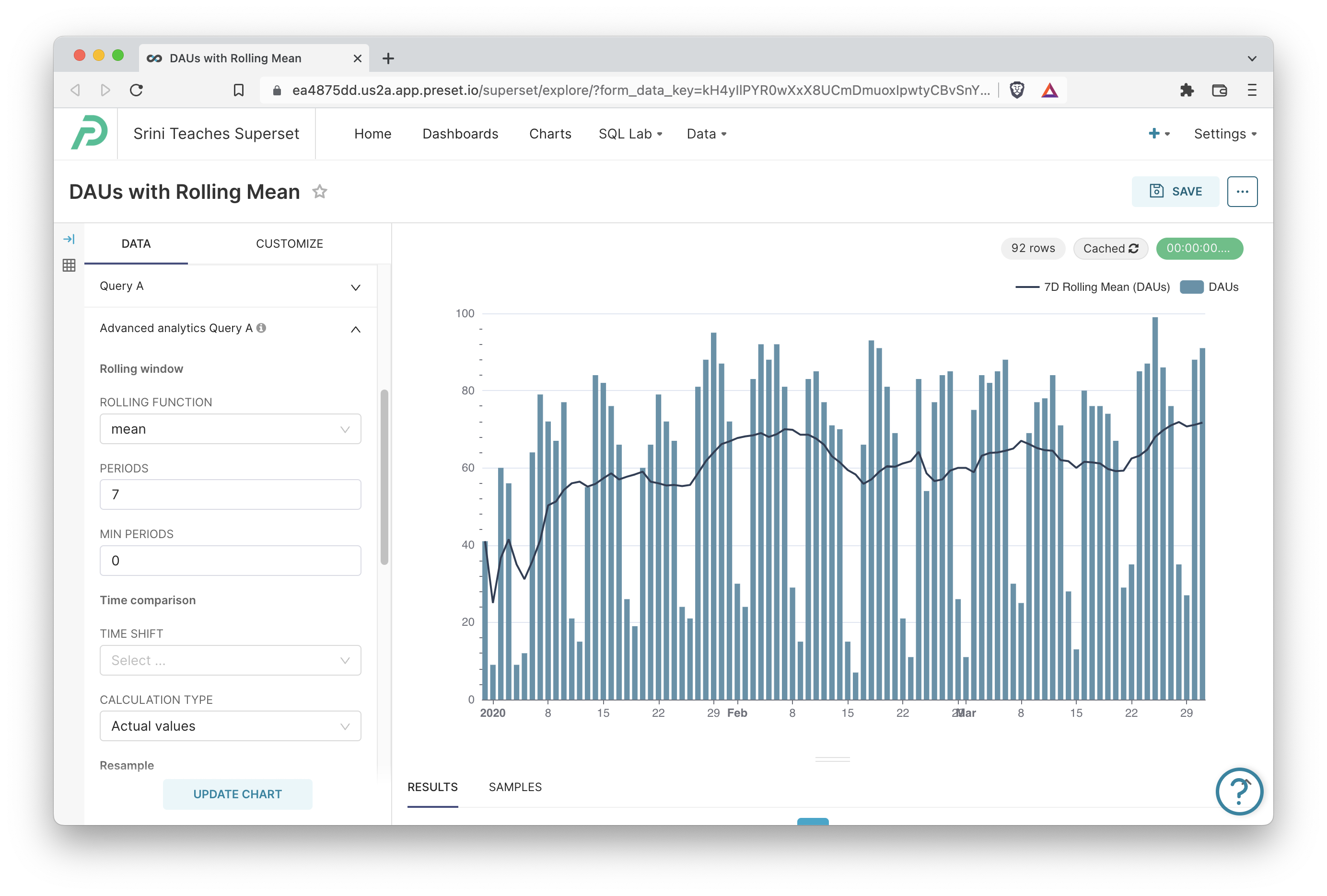
Comparing Counts with Rolling Mean
Combining the DAU bar chart with the Total Member line chart helps the viewer understand the proportion of users that are engaged daily. The next question a viewer may have is, how are DAU’s actually trending?
This is a bit difficult to answer from just the daily bar chart because there’s tremendous variation. Typically, the next step would be to apply a rolling mean to stabilize the data points into a smooth line chart.
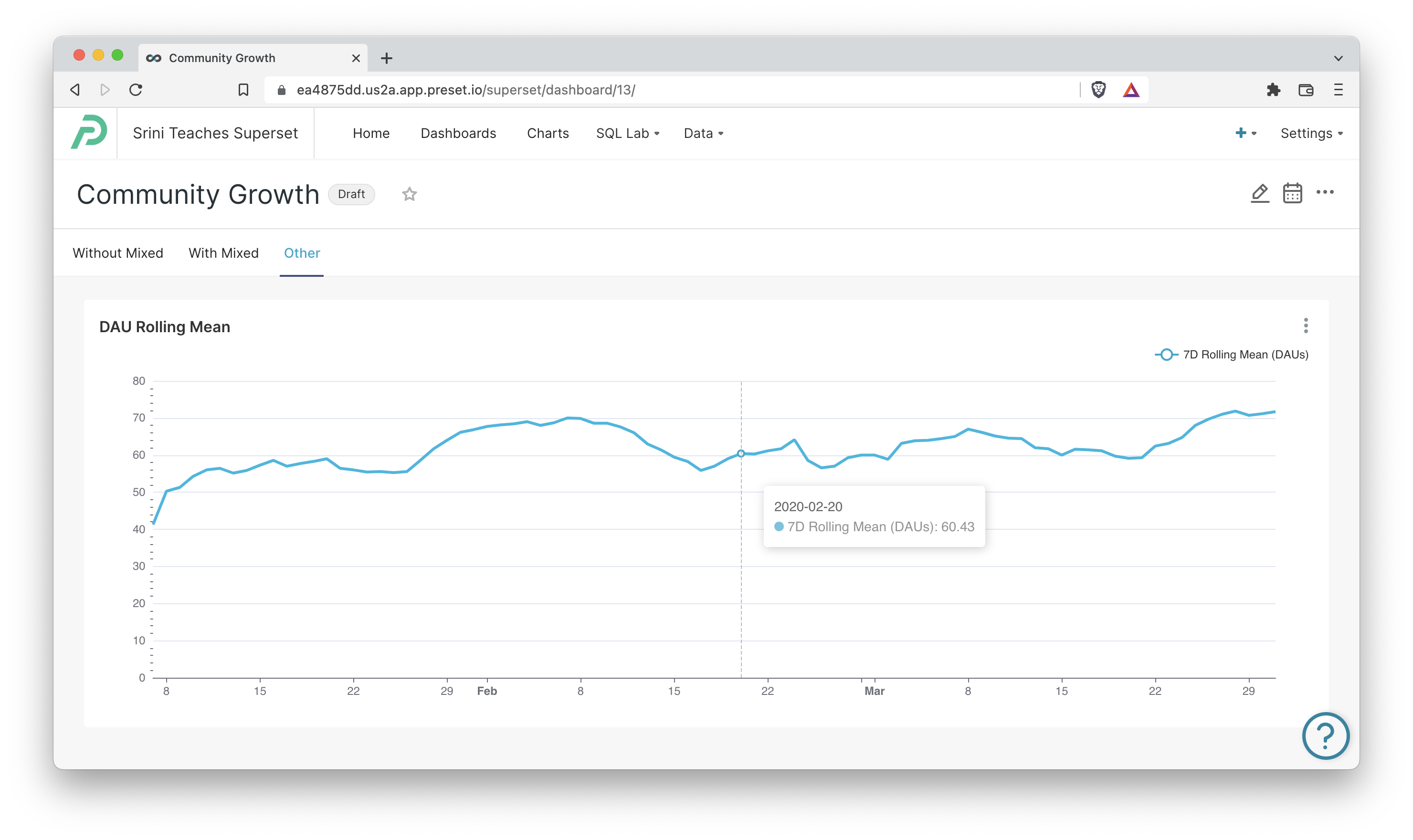
Mix of Line Chart and Bar Chart
At the same time, there’s tremendous value to keeping the daily context so we can understand early (earlier than the rolling mean period!) if an intervention we made was potentially having an impact. In addition, it’s always interesting to gain insight into the weekly rhythms (dips on weekends, spikes on weekdays) and how those may change over time.
We can combine the best of both worlds by creating a mixed time-series graph with:
- A line graph visualizing 7-day rolling mean of daily active users
- A bar graph visualizing daily active users
Here’s this chart in action as a combo, using the same dataset and time interval.
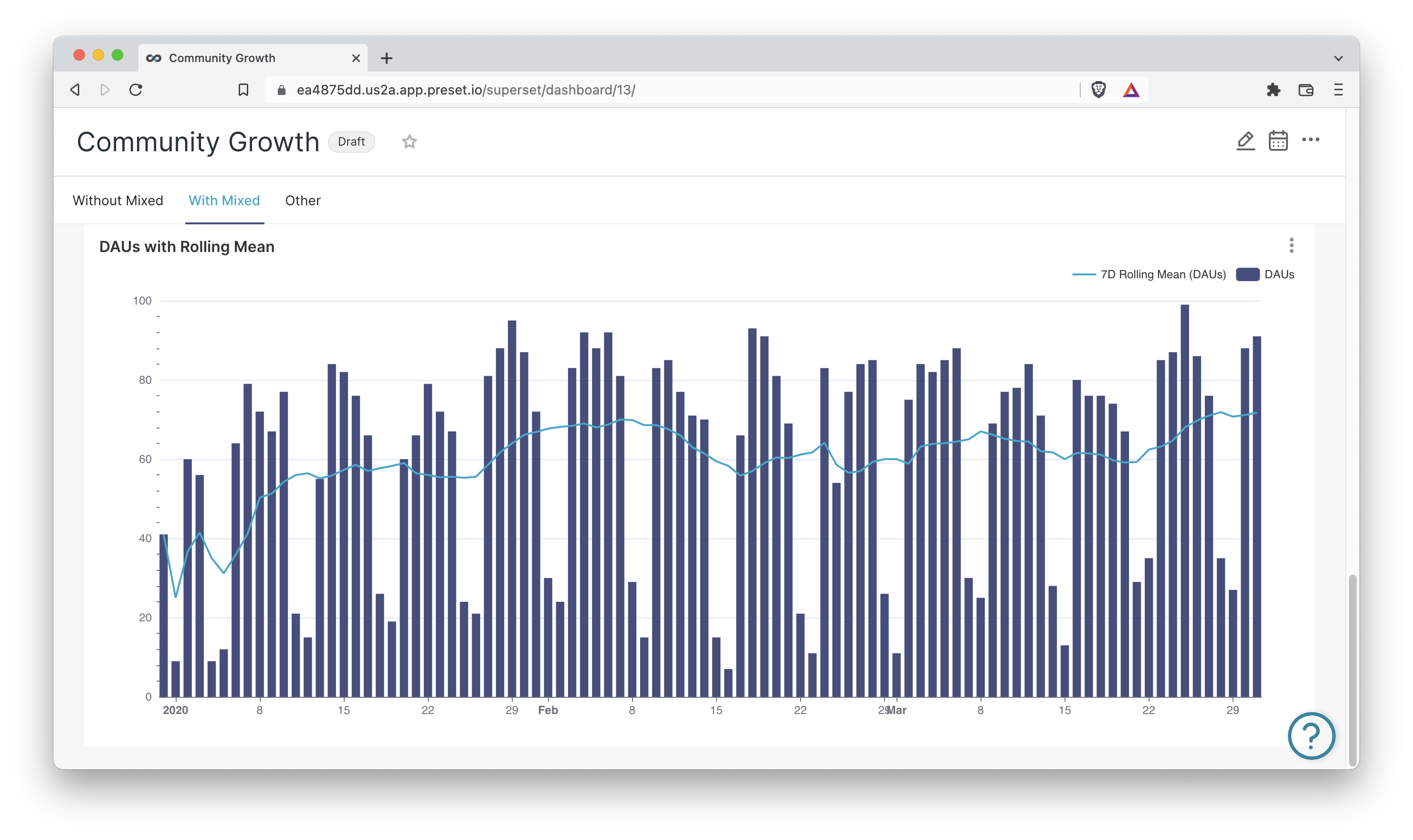
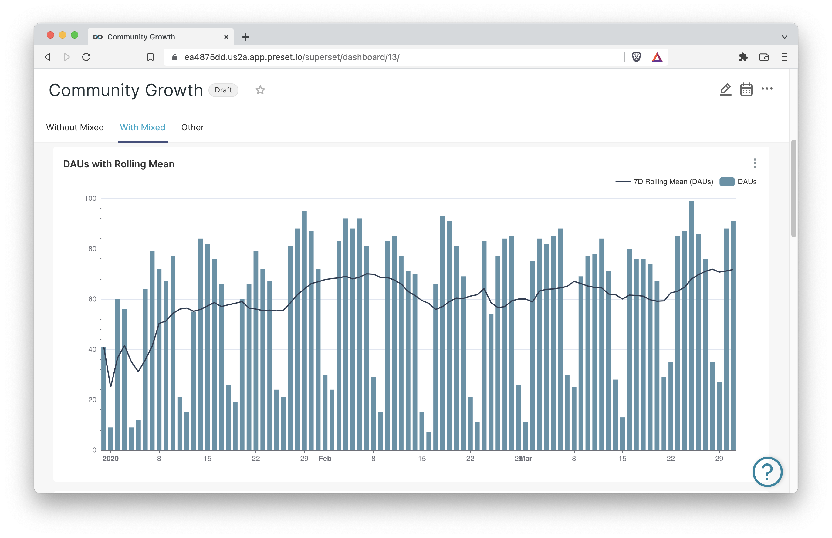
However, out of the box the bars dominate the line plot. We can highlight the line more by enabling the area chart customization for that plot and tweaking the opacity.
Alternatively, you can switch the color scheme so the line is more pronounced.
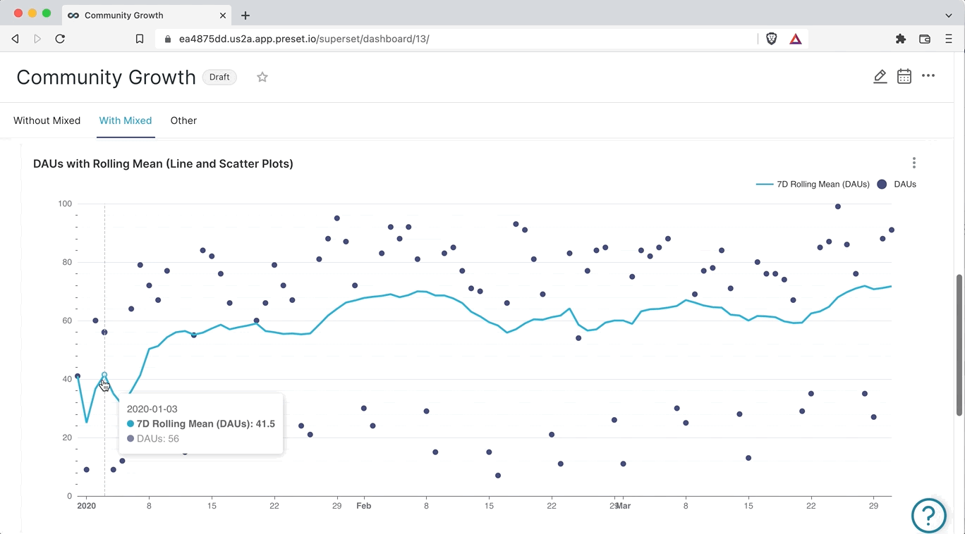
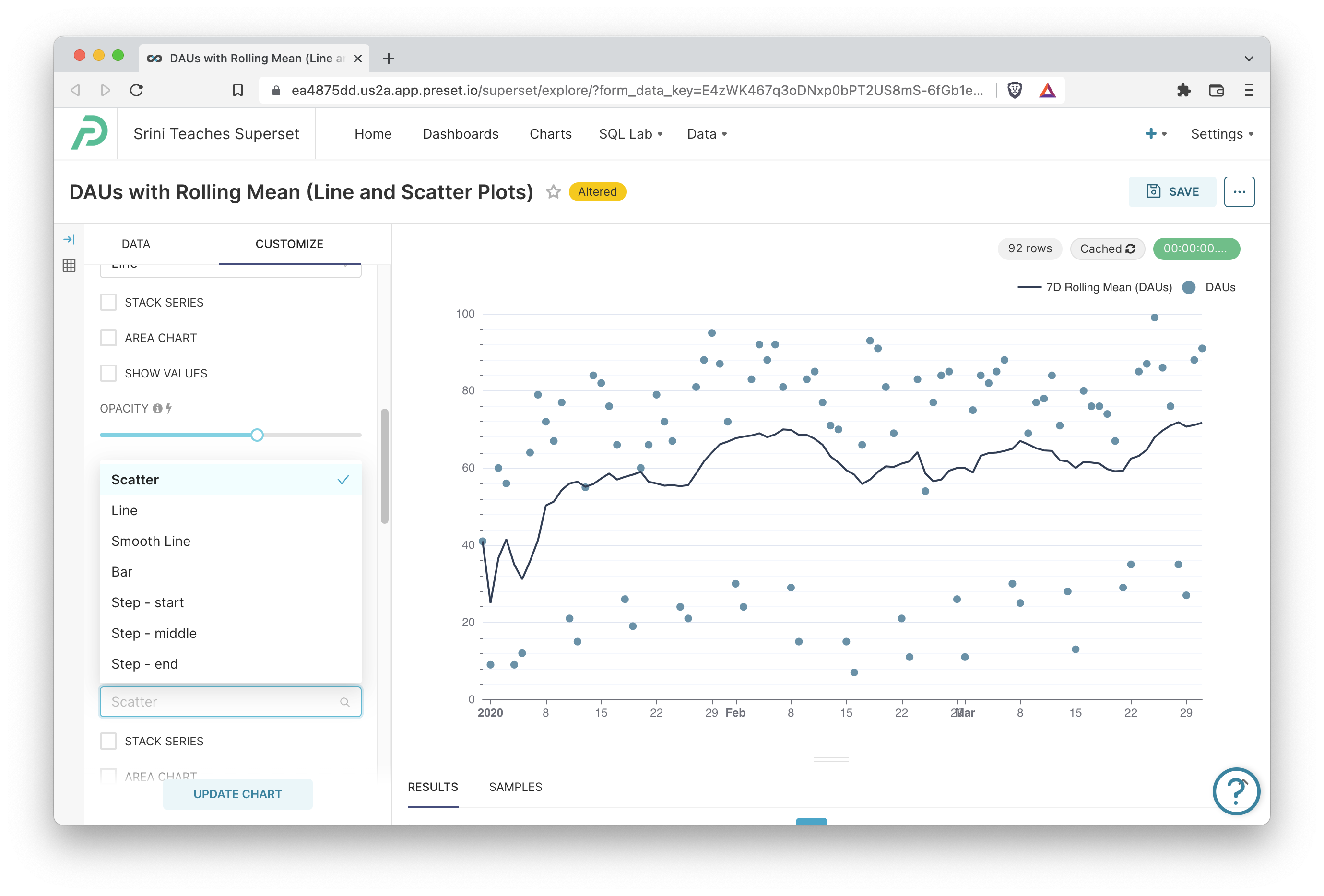
Mix of Line Chart and Scatter Plot
If we wanted to take things one step further and highlight the 7-day rolling mean over the daily active user counts, one option is to replace the DAU bar plot with a scatter plot instead.
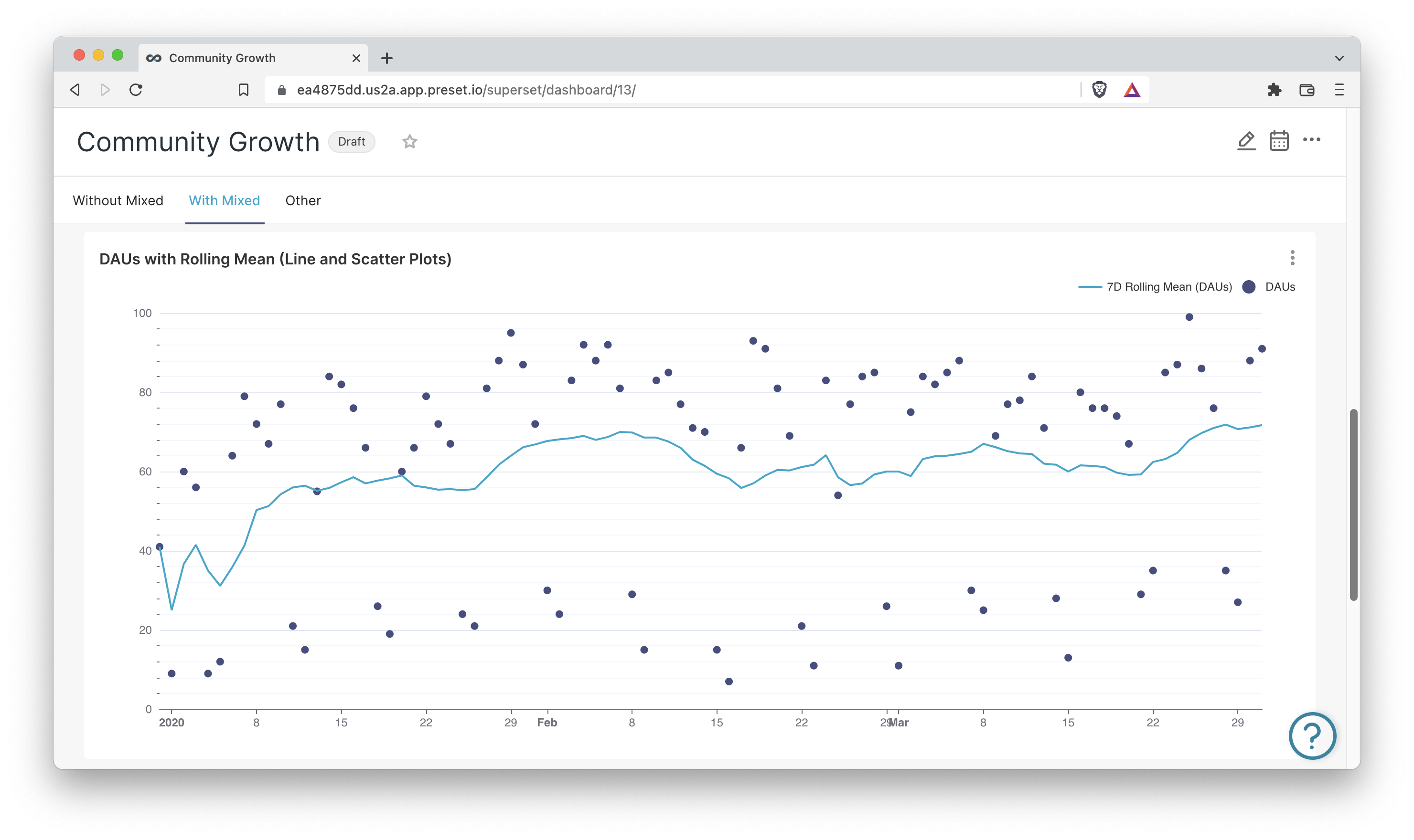
This preserves our ability to look up specific DAU values for specific days while trading off our ability to easily compare between days (or groups of nearby days even).
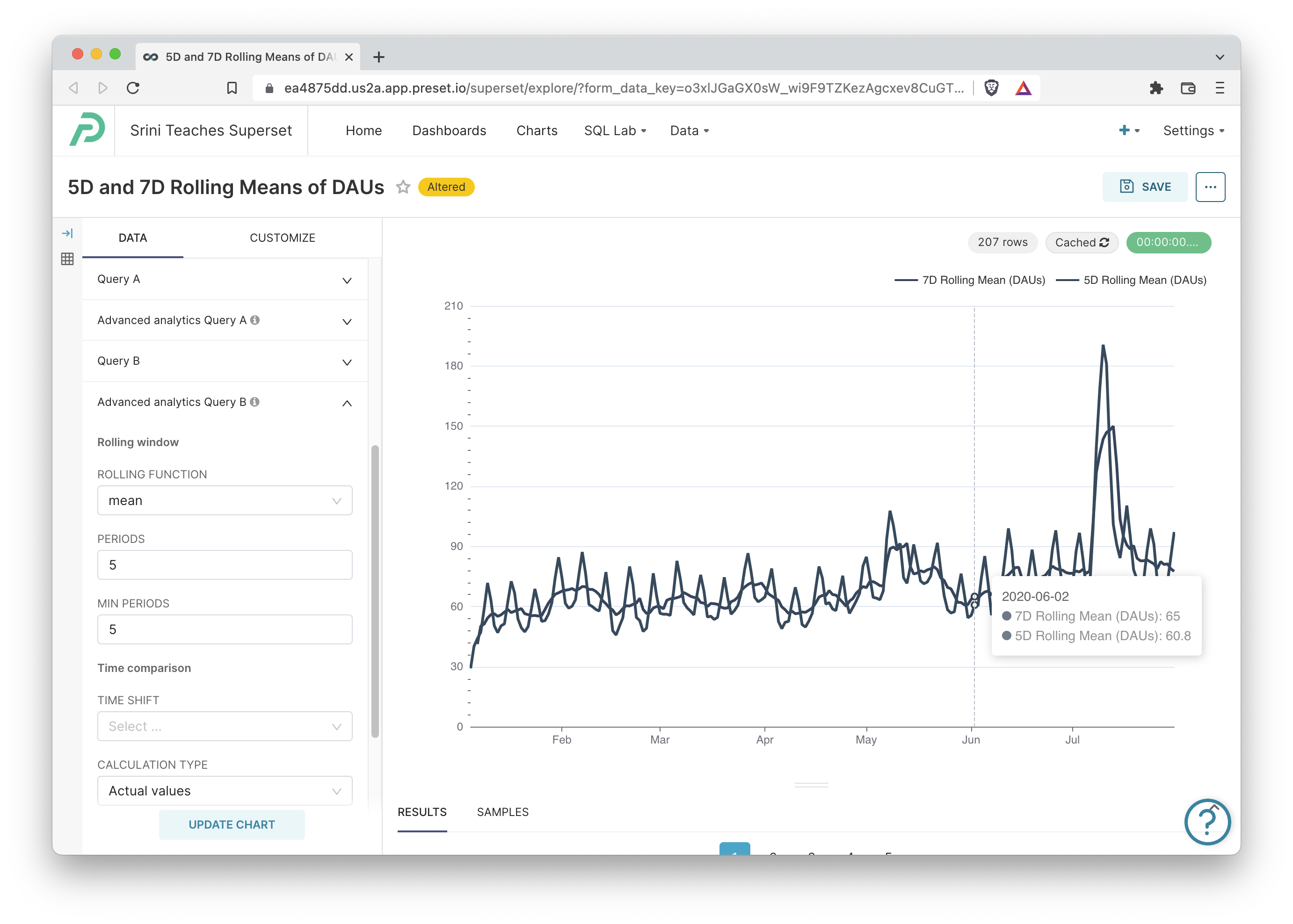
Comparing Rolling Windows
Currently, mixed time-series charts in Superset let you combine two charts as long as they share the same time range and time grain. However, you can change the rolling window applied to each chart.
This unlocks the ability to plot two rolling sum plots within the same chart container. In the following chart, we plot the 5-Day and 7-Day rolling mean as a mixed time-series chart:
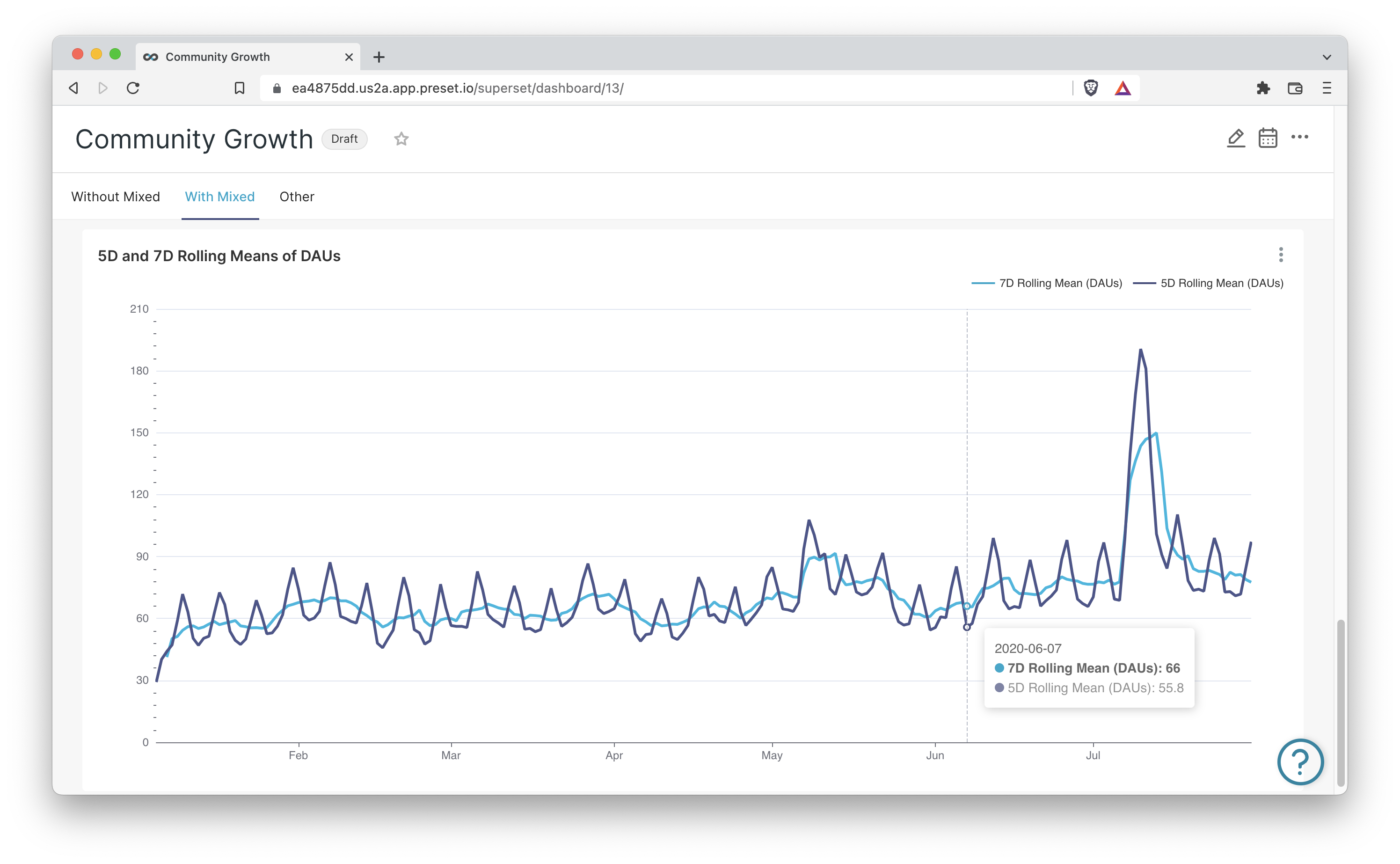
By plotting both the 5-Day and 7-Day rolling means, we preserve the weekend dips that the daily bar chart was showcasing.
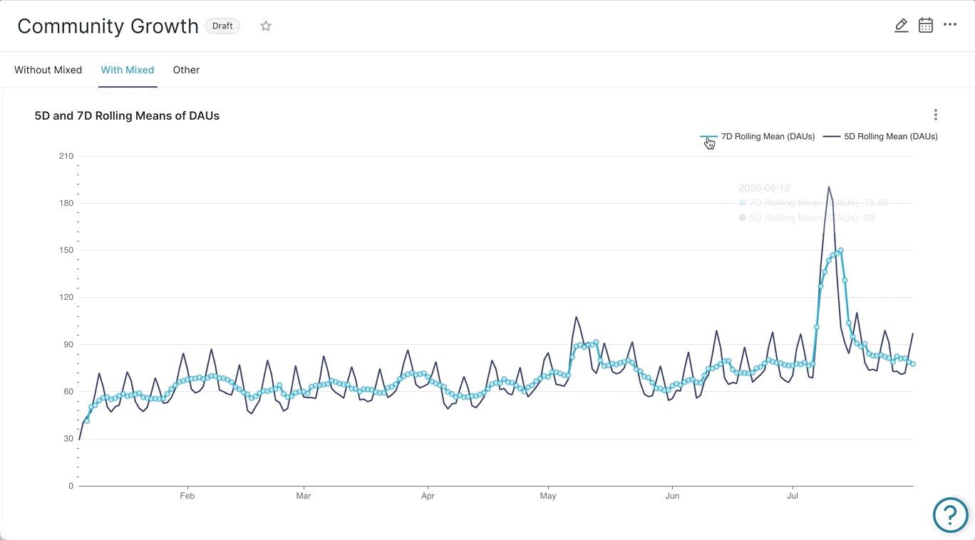
Hiding a Chart
Some viewers may be overwhelmed by this chart, because comparing 5-Day and 7-Day rolling means requires either previous exposure to this type of chart or some deeper introspection and exploration to really internalize it.
If you enabled the legend in a mixed time-series plot (or really in most plots in Superset), then a viewer can hide a plot just by clicking its name in the legend.
How Mixed Time-Series Charts Work in Superset
Querying
At its core, the mixed time-series chart in Superset works by generating and running two separate SQL queries and using a shared datetime range and grain to merge the data for visualization.
For example, here are the two queries generated for the chart covered in the next section in this blog post:
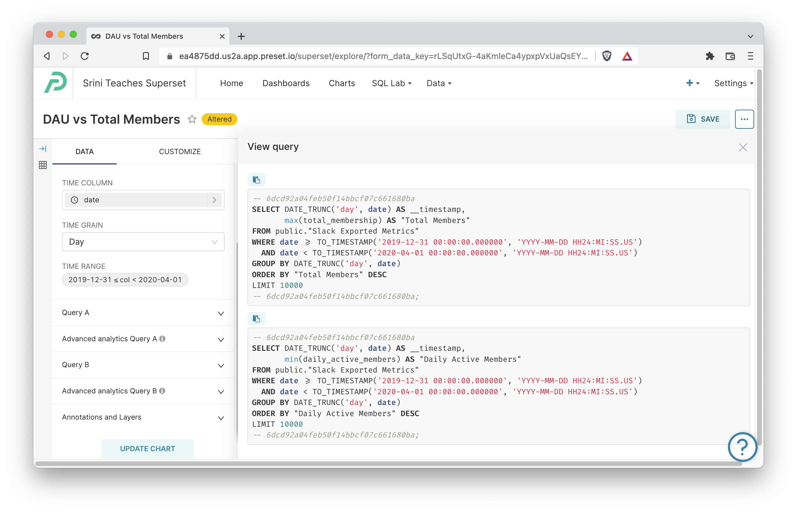
To choose the metrics, filters, etc for each query, you expand Query A and Query B.
Time
Currently, mixed time-series charts in Superset must share the same time range and grain. In the screenshot above of Explore, you'll notice that the Time section sits at the top before the Query A and Query B sections to indicate that these settings are shared across both queries.
Tutorial: Simple Mixed Time-Series Chart (Bar and Line)
Now I'll walk through how to create the first chart that combines a bar chart and a line chart so you can craft something similar with your own data.
-
Create a new chart by clicking the Charts tab, then the +Chart button, choose your dataset, and then search for and select the Mixed Time-Series Chart in the visualization picker.
-
Choose a Time Range (ideally 3-4 months) and set the Time Grain to Day.
-
Expand the Query A section and drop in the column for Total Members or equivalent column in your dataset. Set the Aggregate to MAX if your data is pre-aggregated or choose the relevant function to aggregate otherwise.
-
Expand the Query B section and drop in the column for Daily Active Users or equivalent column in your dataset. Set the Aggregate to MAX if your data is pre-aggregated or choose the relevant function to aggregate otherwise.
-
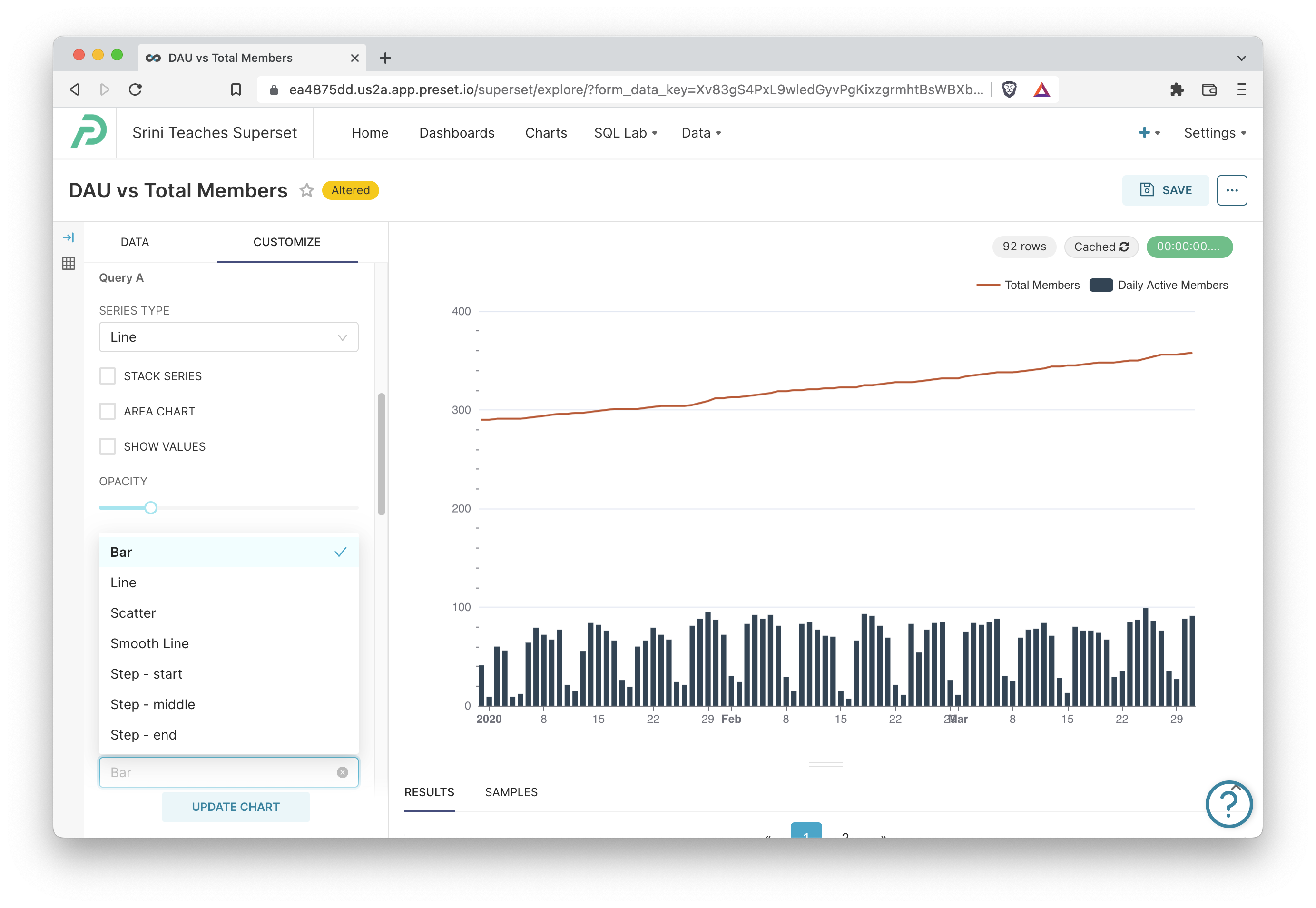
Click the Customize tab. First, under Query A, set the Series Type to Line. Then, under Query B, set the Series Type to Bar.
-
Click Update Chart at the bottom to watch your chart get created!
Tutorial: Mixed Time-Series Chart with Rolling Mean
-
Create a new chart by clicking the Charts tab, then the +Chart button, choose your dataset, and then search for and select the Mixed Time-Series Chart in the visualization picker.
-
Choose a Time Range (ideally 3-4 months) and set the Time Grain to Day.
-
Expand the Query A section and drop in the column for Daily Active Users or equivalent column in your dataset. Set the Aggregate to MAX if your data is pre-aggregated or choose the relevant function to aggregate otherwise.
-
Expand the Advanced Analytics Query A section and set:
- Rolling Function to mean. This means that Superset will compute the average for the last n periods at the time grain you set earlier.
- Periods to 7. If we set time grain to Day, rolling function to mean, and periods to 7, then Superset will compute the 7-Day rolling mean.
- Min Periods to 0 or 7. This describes the minimum number of periods needed to show computed values. If 0, then even a 7-Day Rolling Mean will just use the first day to calculate and visualize the mean. If 7, then a 7-Day Rolling Mean will only be shown after 7 days of observed data.
-
Expand the Query B section and drop in the column for Daily Active Users or equivalent column in your dataset. Set the Aggregate to MAX if your data is pre-aggregated or choose the relevant function to aggregate otherwise. Don't configure advanced analytics for this query
-
Click the Customize tab. First, under Query A, set the Series Type to Line. Then, under Query B, set the Series Type to Bar.
-
Click Update Chart at the bottom to watch your chart get created!
To swap out the bar plot portion with a scatter plot, change the Series Type for Query B (raw DAU values) to scatter:
Tutorial: Mixed Chart with Multiple Rolling Windows
-
Create a new chart by clicking the Charts tab, then the +Chart button, choose your dataset, and then search for and select the Mixed Time-Series Chart in the visualization picker.
-
Choose a Time Range (ideally 3-4 months) and set the Time Grain to Day.
-
Expand the Query A section and drop in the column for Daily Active Users or equivalent column in your dataset. Set the Aggregate to MAX if your data is pre-aggregated or choose the relevant function to aggregate otherwise.
-
Expand the Advanced Analytics Query A section and set:
- Rolling Function to mean. This means that Superset will compute the average for the last n periods at the time grain you set earlier.
- Periods to 7. If we set time grain to Day, rolling function to mean, and periods to 7, then Superset will compute the 7-Day rolling mean.
- Min Periods to 0 or 7. This describes the minimum number of periods needed to show computed values. If 0, then even a 7-Day Rolling Mean will just use the first day to calculate and visualize the mean. If 7, then a 7-Day Rolling Mean will only be shown after 7 days of observed data.
-
Expand the Query B section and drop in the column for Daily Active Users or equivalent column in your dataset. Set the Aggregate to MAX if your data is pre-aggregated or choose the relevant function to aggregate otherwise.
-
Expand the Advanced Analytics Query B section and set:
- Rolling Function to mean. This means that Superset will compute the average for the last n periods at the time grain you set earlier.
- Periods to 5. If we set time grain to Day, rolling function to mean, and periods to 5, then Superset will compute the 5-Day rolling mean.
- Min Periods to 0 or 5.
- Click the Customize tab.
- First, under Query A, set the Series Type to Line.
- Then, under Query B, set the Series Type to Line. (so both line plots)
- Click Update Chart at the bottom to watch your chart get created!