How to Use a Time Series Chart - Getting Started
Analyzing Time Series data with Superset
In the previous blog post, we learned how to start to create charts in Superset and specifically how to create a composition charts to understand how data is formed. This, in turn, can be used to determine which chart type is the most appropriate.
In this blog article we will explore the topic of time series data, visualization options, and how to best represent time series data in order to facilitate trend analysis. Data used in the examples below is available in a GitHub repository — you can also view instructions on how to import the file into your own database.
Why Time Series Charts
Time series data is important because it is used to understand and analyze data behavior over time. Using historical datasets, time series plots enable companies to spot trends, changes in behavior, and compare different metrics to visualize correlations. Examples of time series analysis include website visits, sales trends, and IoT (Internet of Things) data.
In a time series chart, you represent an independent variable (time on the X axis) vs. dependent variables (metrics on the Y axis) to analyze behavior over time.
In the example of Covid-19 data, a time series graph will enable you to answer critical questions, such as:
- Are the number of Confirmed Cases decreasing? (trend)
- Did we flatten the curve? (trends)
- Is there a correlation between confirmed cases and deaths?
Times Series Analysis with Superset
Superset has a rich library of time series charts for different use cases, such as: Line Charts, Area Charts, Time Series Bar Charts, Dual Line Charts, Calendar Heat Maps, Horizon Charts, and more. In this article, we will show examples of some of these charts and how changing a visualization type can dramatically change how a data set is displayed for trend analysis.
Data Requirement for Time Series Charts
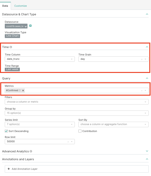
Time Field: This is an independent variable and is represented on the X axis. Options in the Time Column drop-down are fields that have the option temporal in the Columns field within the data source. The Time Grain drop-down indicates the data aggregated label used when displaying the metrics.
Metrics: This is a required field and represents the dependent variables that will be displayed on the Y axis.
All the other fields are optional, but it is important to keep in mind that an efficient chart is a simple chart — therefore, be sure to reduce the use of filters, granularity, and limit the series represented in the Group By and Series limit fields. By default, the Series limit field uses the first metric value to cut off values but, alternatively, the Sort By field allows you to filter data with an additional data point.
Time Series Bar Chart
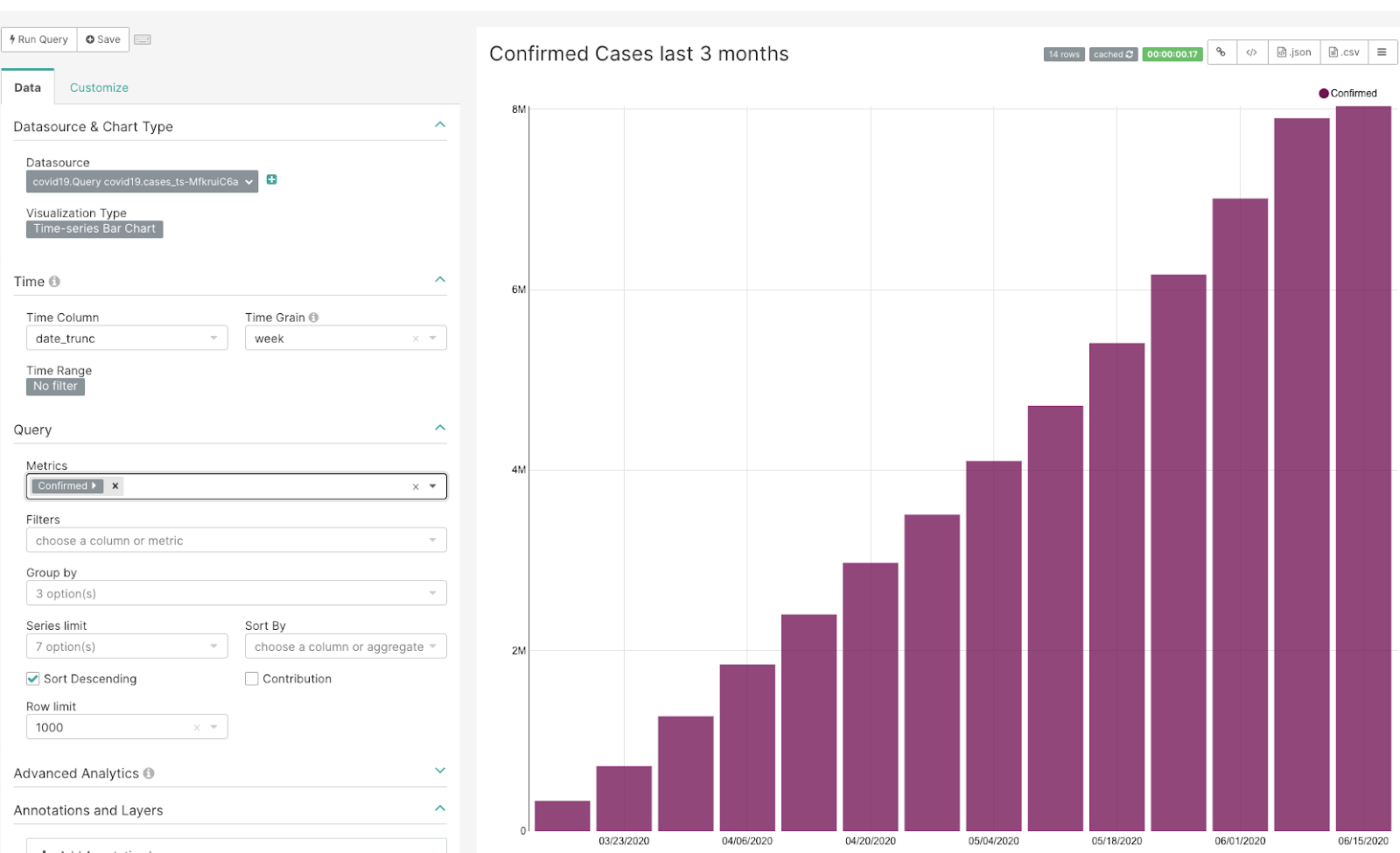
Time series bar charts represent categories by vertical charts.
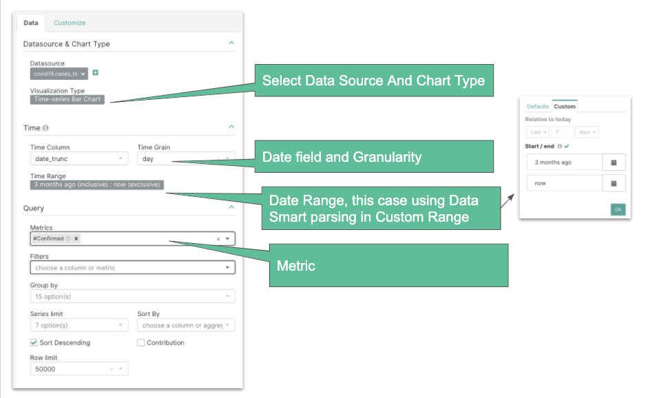
In this example, you can see that the numbers of dates (time period of last 3 months ~90 bars) are too wide to be represented on the screen — this is a good opportunity to reduce the date granularity in order to reduce the data points on the X-axis.
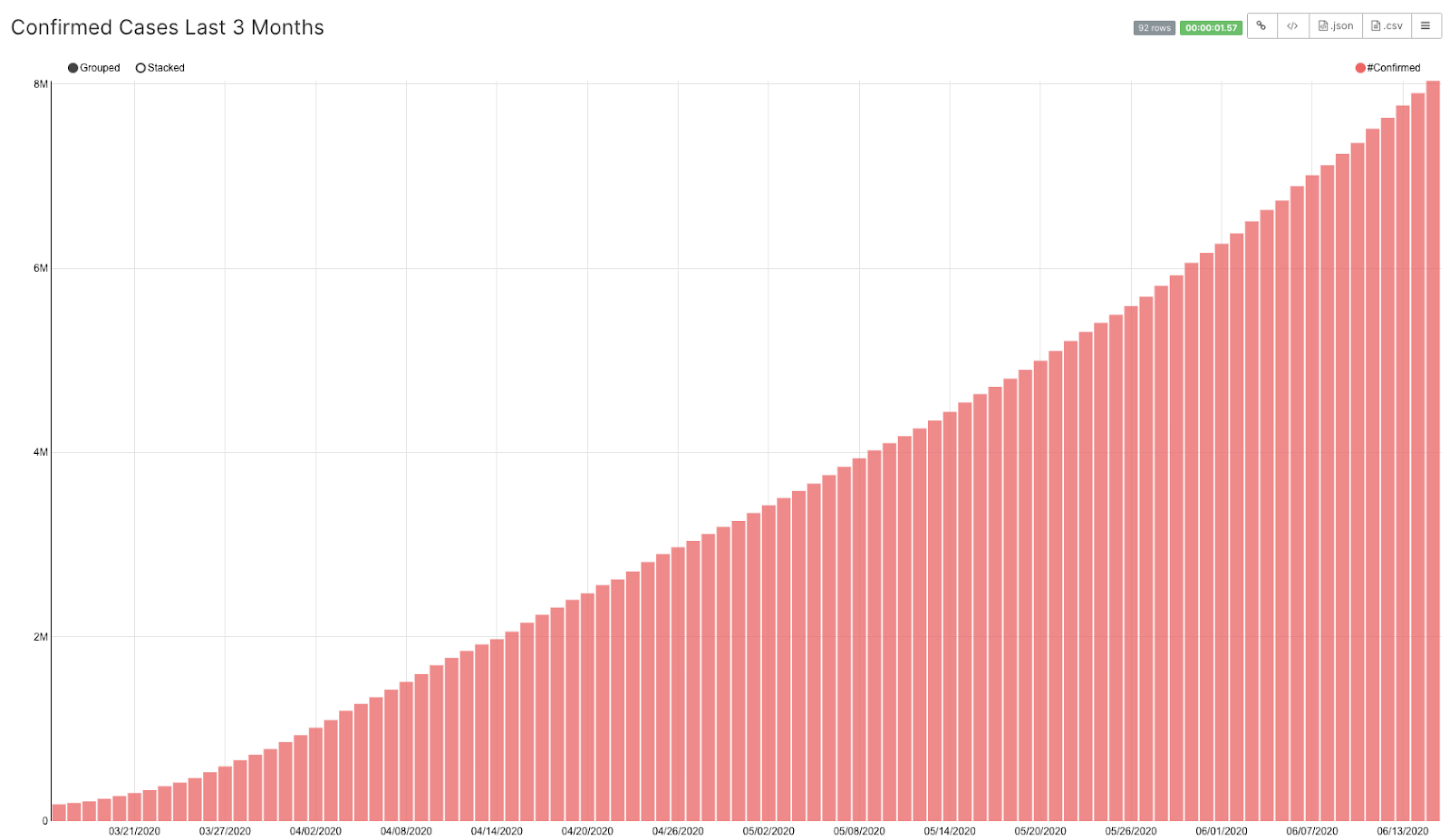
Changing granularity to Week will reduce the number of data points on the X-axis and will make the graph clear to follow and integrate in a dashboard.
Line Chart
Line charts are used if you want to compare several series at the same time.
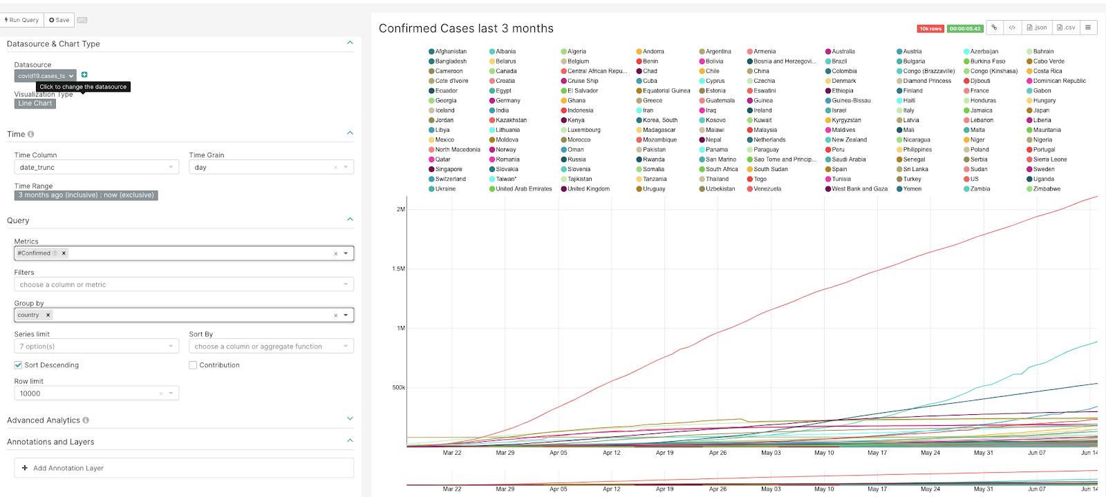
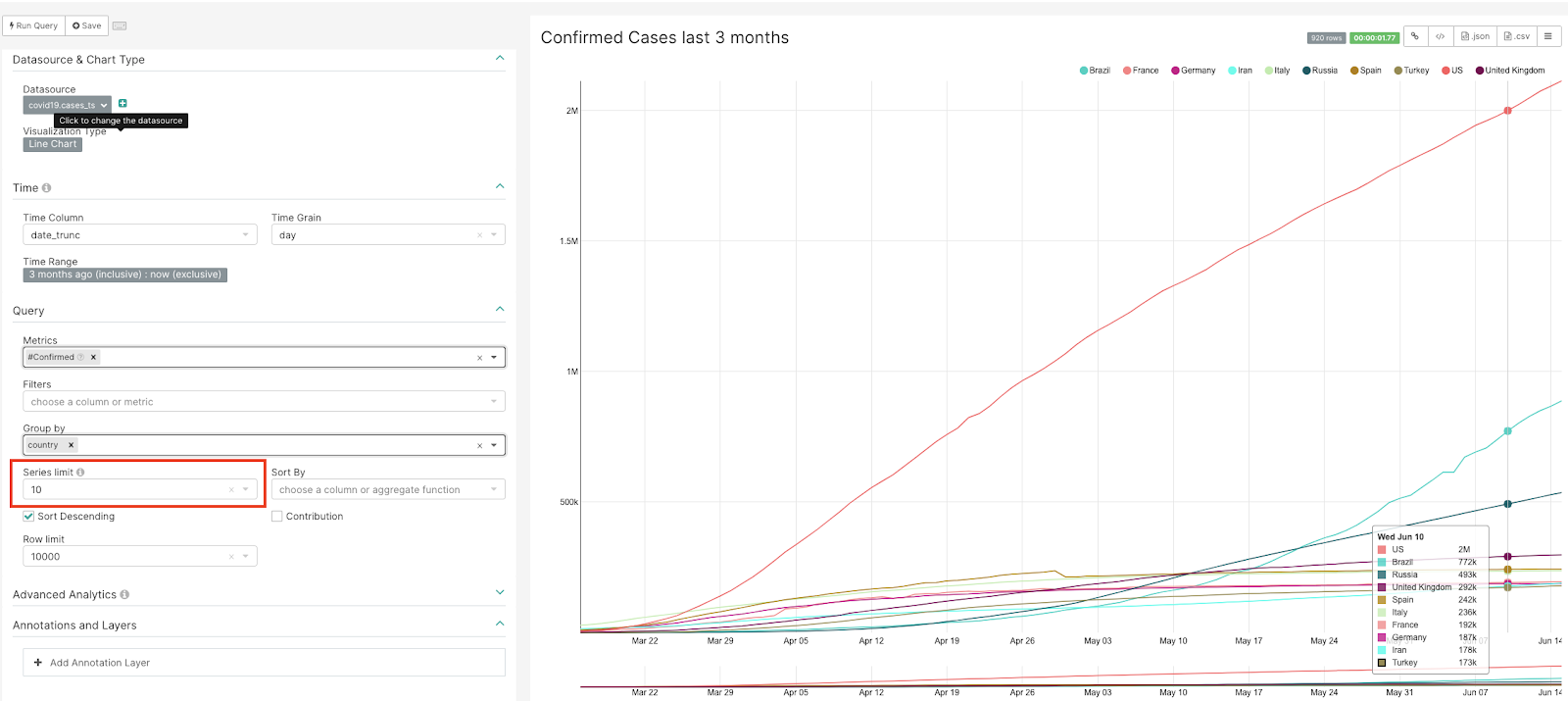
However, adding too many series (e.g., many distinct values in the Group By field) could make it difficult to understand and conceptualize the series. In this case, it is useful to use Series Limit to reduce the number of series.
Area Chart
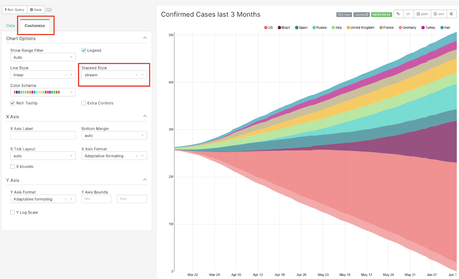
An area chart is a similar plot to the line chart in that they represent variables with the same scale, but area charts stack the metrics on top of each other. An area chart in Superset can be stream, stack, or expand.
By simply changing the Visualization Type, we can display the line chart above as an area chart
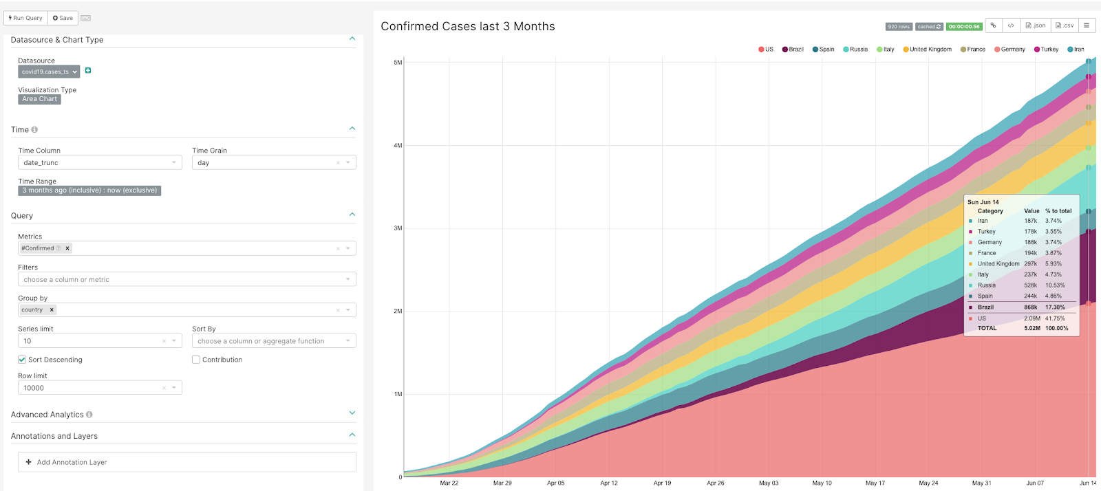
By customizing the chart, we can view different variations. Here is a Stream Area Chart (Customize → Stacked Style → stream):
...and this chart is customized as an Expanded Area Chart (Customize → Stacked Style → expand) where the Y values are not the metrics value, but the % of contribution on the total of the metric:
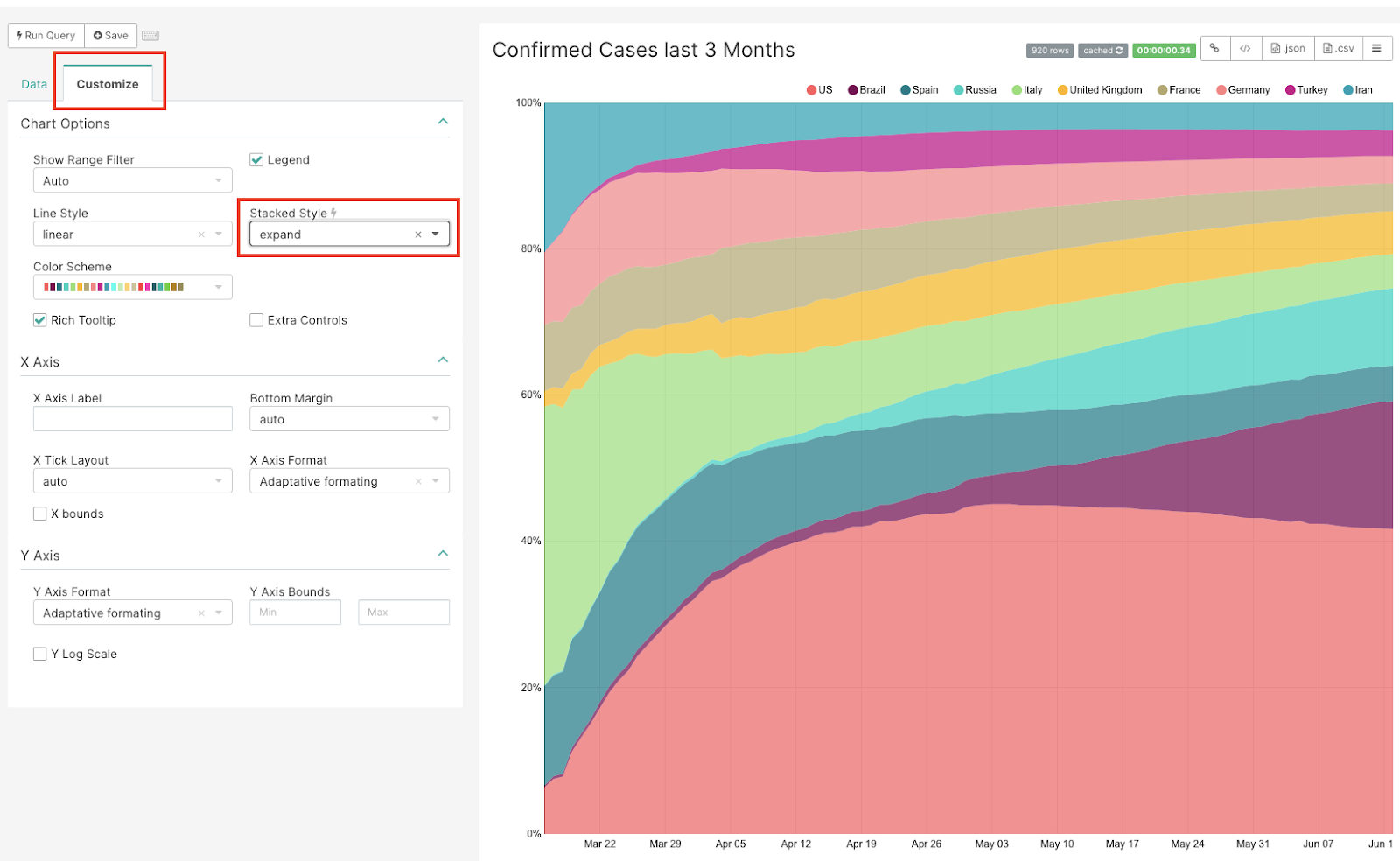
Chart with Two Metrics of Different Scales
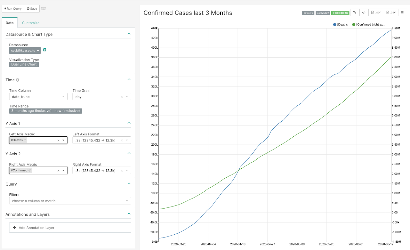
In many cases, you may want to compare two or more metrics of different scales; consequently, there is need for a second Y-axis. Provided that the data source is the same, the Dual Line Chart in Preset is ideal in such a scenario where you want to visualize multiple series.
Smoothing the Curve
Sometimes when looking at data points on a per day basis, it is difficult to determine trends and data variance. For example, the chart below shows the top American states with new Covid-19 cases on a per day basis (taken over the last month). This view makes it difficult to discern a clear trend.
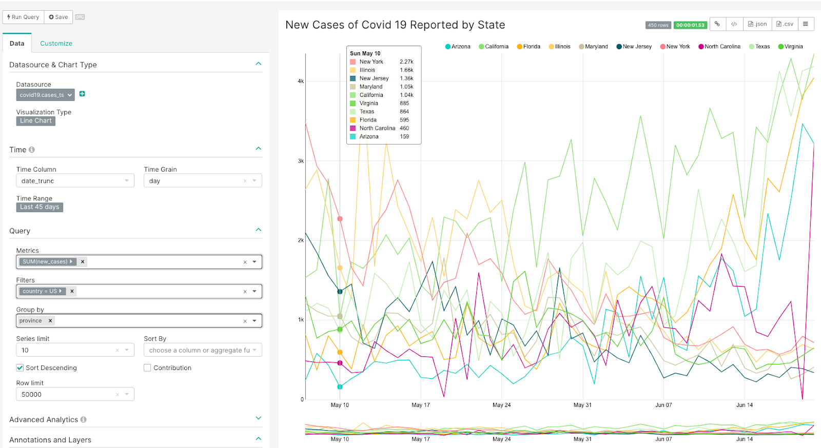
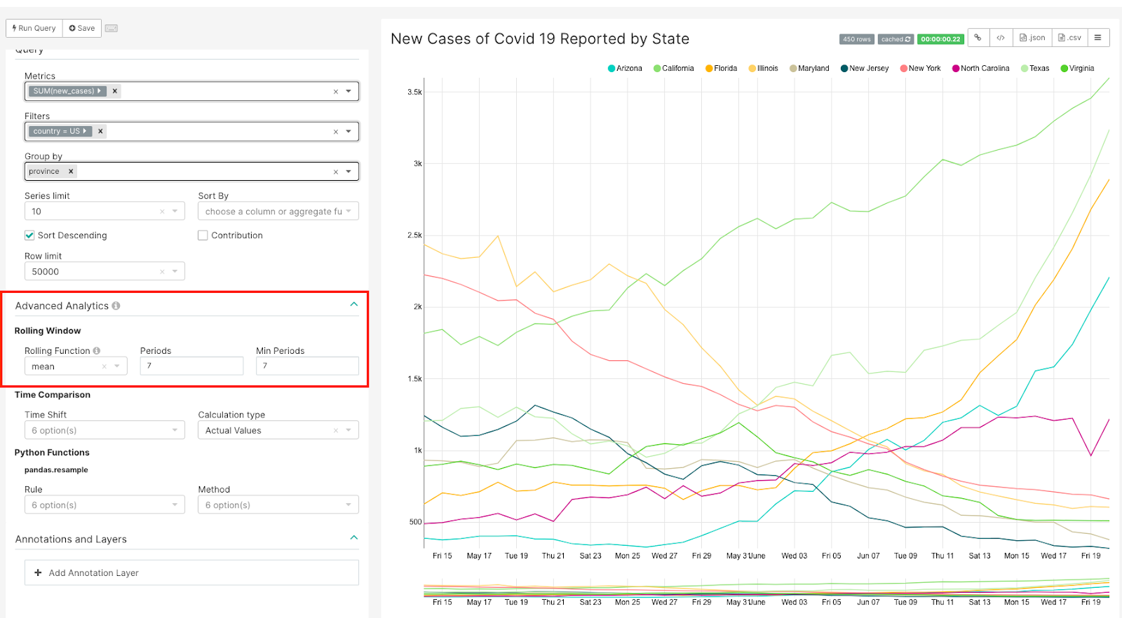
In order to gain a greater insight into this data, we recommend smoothing out the short-term fluctuations between data points by applying a moving average. The moving average—available in the Advance Analytics function—applies the average between defined X periods (on the horizontal axis) instead of marking actual data points by date.
If we apply this technique to the previous chart by using the moving average over the last 7 days, the lines in the chart will be smoothed out and facilitate the recognition of trends.
Time Comparison
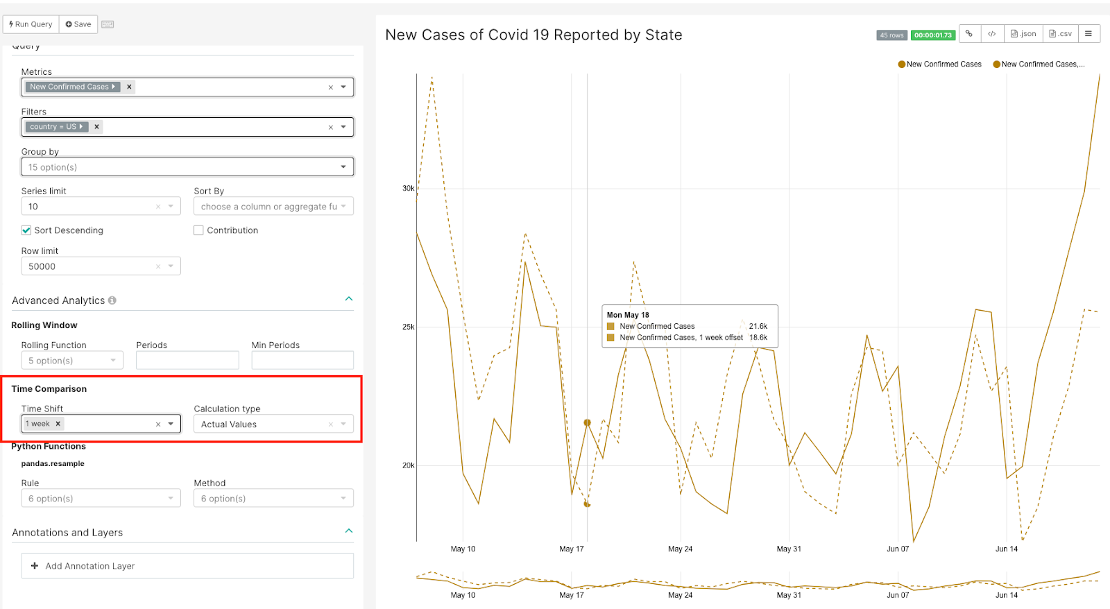
Sometimes looking at a trend is not enough to see how the data values are changing. In those cases, we recommend using the line chart count with Time Comparison function. This creates a second dotted line in the chart that shifts the time as specified.
Summary
In this article we summarized the importance of Time Series Visualizations and how powerful they are in terms of visualizing time series data. There are many other visualizations in Superset for your time series data — as a first step, try changing the visualization type to see the different representations available to you. You can also use the Mixed Time series chart to visualize mutiple series for equal intervals of time.
In the next blog article we will discuss Geospatial Visualization Types.