Getting Started - Build your first Charts
Getting Started : Creating your first Chart
Apache Superset makes it easy to create beautiful, interactive charts from your data. If you have followed the Getting Started with Superset series, by now you have already...
- Set up a Superset instance and have it up and running;
- Set up your database; and,
- Have a table and datasource ready.
If those three items are completed, then you should be ready to build your first chart.
The most important part of a chart is to understand your data and what you would like to convey. Think about a chart as an answer to your questions. For example, a familiar topic is Covid-19 cases in the U.S. — this blog will help you to use this specific source data and process it to create an effective visualization.
The data available in my datasource for Covid-19 cases includes the following:
| Field | Type | Description |
|---|---|---|
| province | varchar(50) | States where cases are reported. tde only countries tdat have states are tde U.S. and China. All otder countries are NULL. |
| country | varchar(50) | Country of reported cases. |
| latitude | float | Geo location: latitude. |
| longitude | float | Geo location: longitude. |
| date_trunc | timestamp | Date when cases were reported. |
| confirmed | int | Confirmed cases (accumulative). |
| deaths | int | Confirmed deaths (accumulative). |
| recovered | int | Confirmed recoveries (accumulative). |
| new_cases | int | New cases (i.e., difference in confirmed cases between a date and previous date). |
| new_deaths | int | New Deatds (i.e., difference in confirmed deatds between a date and a previous date |
You can use this data to formulate questions that you would like to answer — Superset provides the ability to answer those questions in graphical or text form. Some examples of questions based on U.S. data are:
-
What are the top 10 states with the most confirmed cases?
-
What are the top 10 states with the most confirmed deaths?
-
Has the number of confirmed cases declined?
-
Has the number of deaths declined?
-
Is there a correlation between confirmed cases and deaths?
-
I would like to see geographical cases reported in my State to see if any are reported in my town.
-
Can I see the details of the latest reported cases?
-
And more..
Once you know the questions, then you can categorize them in order to determine the best chart to use to answer the questions.
Data Composition Questions
Let’s take, for example, questions 1 and 2: “What are the 10 states with the most confirmed cases?” and “What are the 10 states with the most confirmed deaths?” These are composition questions that are designed to show how data is distributed.
In Superset, examples of charts used to answer composition questions include: Bar Chart, Word Cloud, Pie Chart, and Treemaps (just to name a few). Once you build one chart, you can change the visualization type to see which one fits your goal specifically.
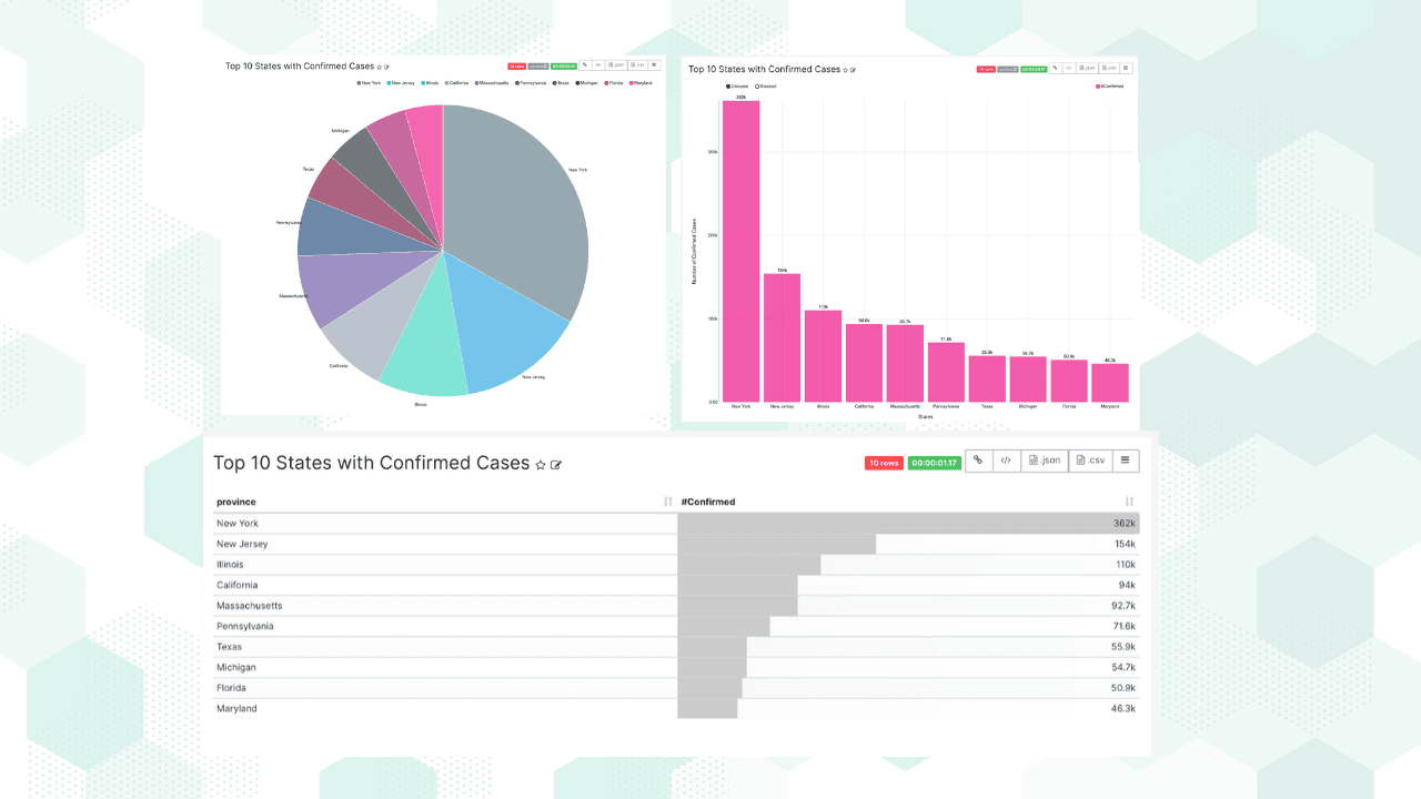
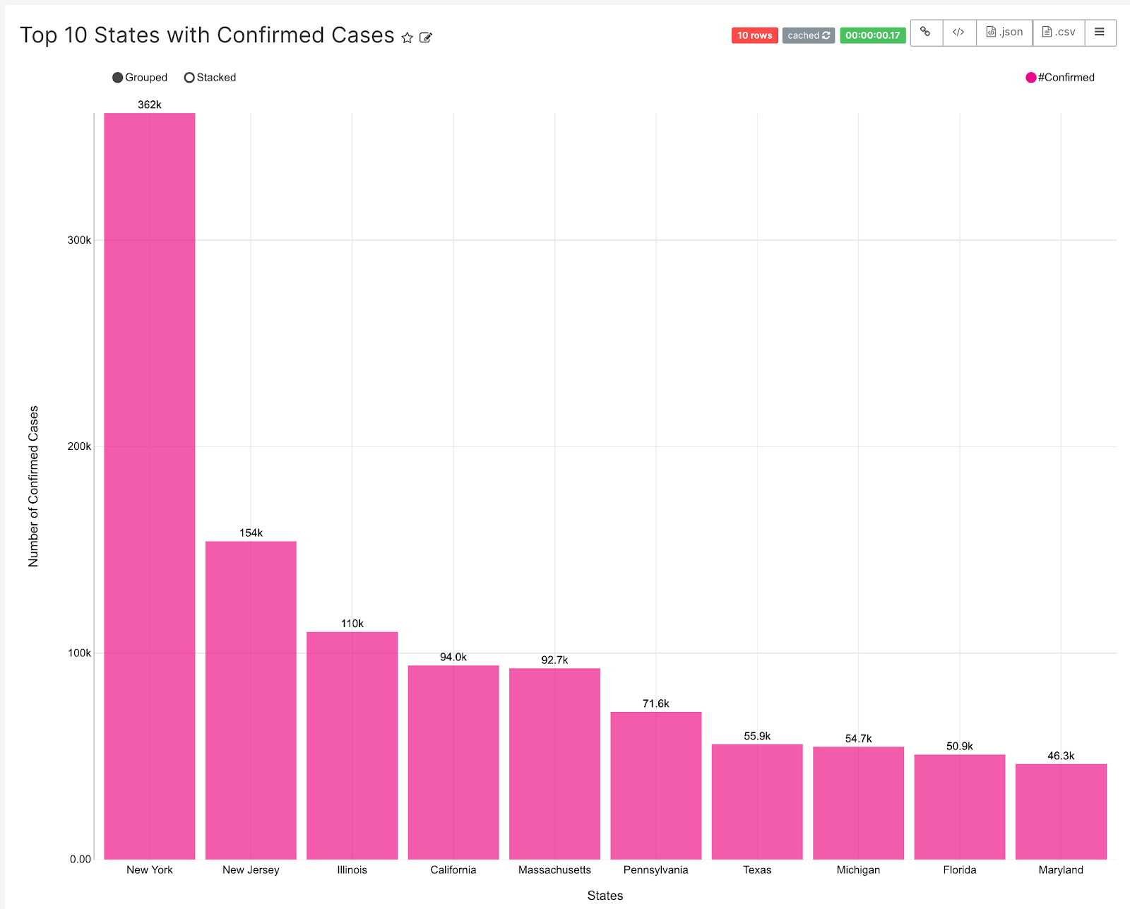
Let’s answer the question: What are the top 10 states with the most confirmed cases?
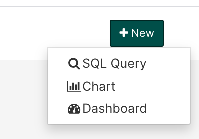
Start by selecting New and then select Chart.
In the Create a new chart screen, select a data source and a visualization type.

In the Chart screen select things that you would like in your chart. For example:
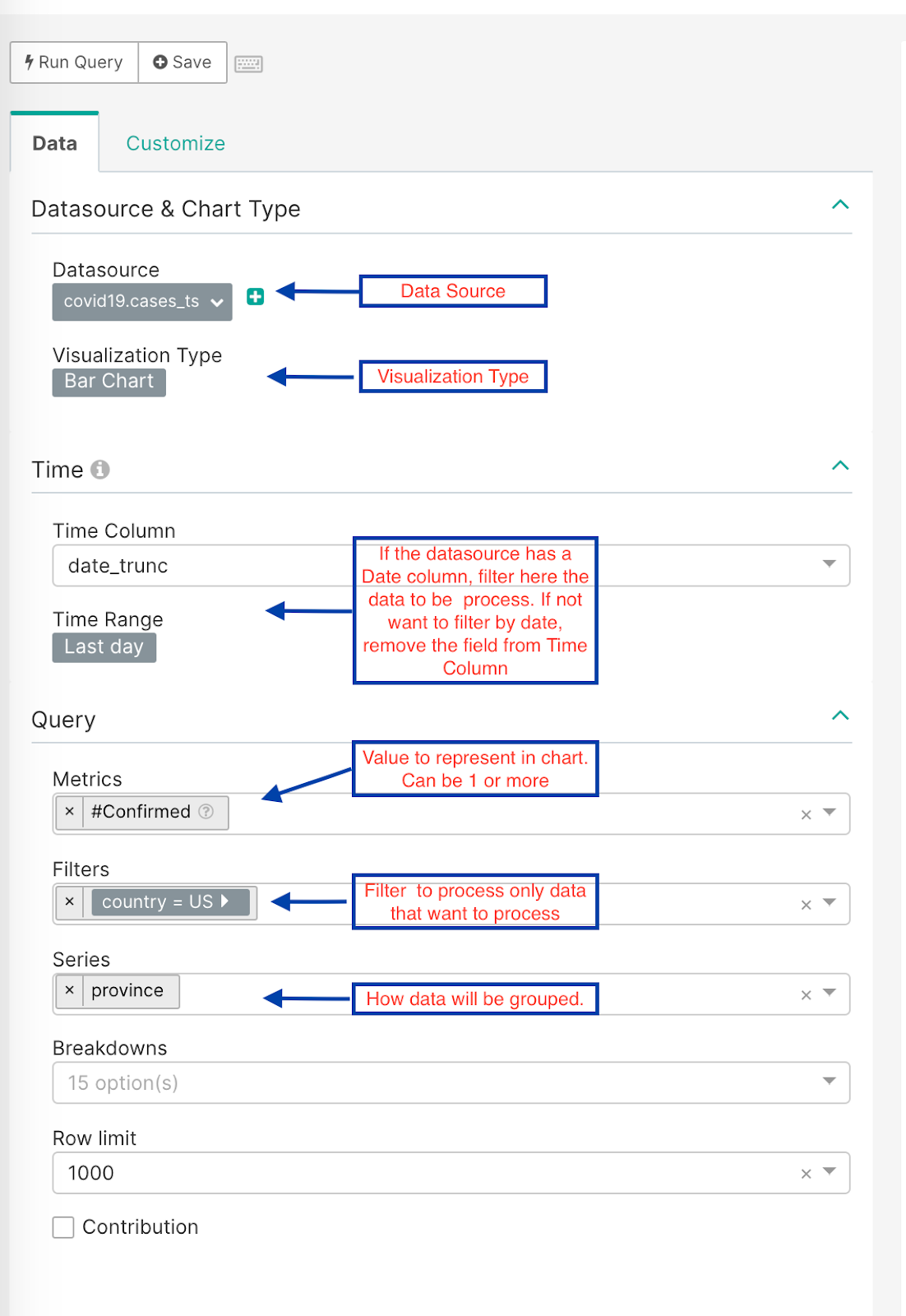
With this information, the chart that Superset will process looks like this:
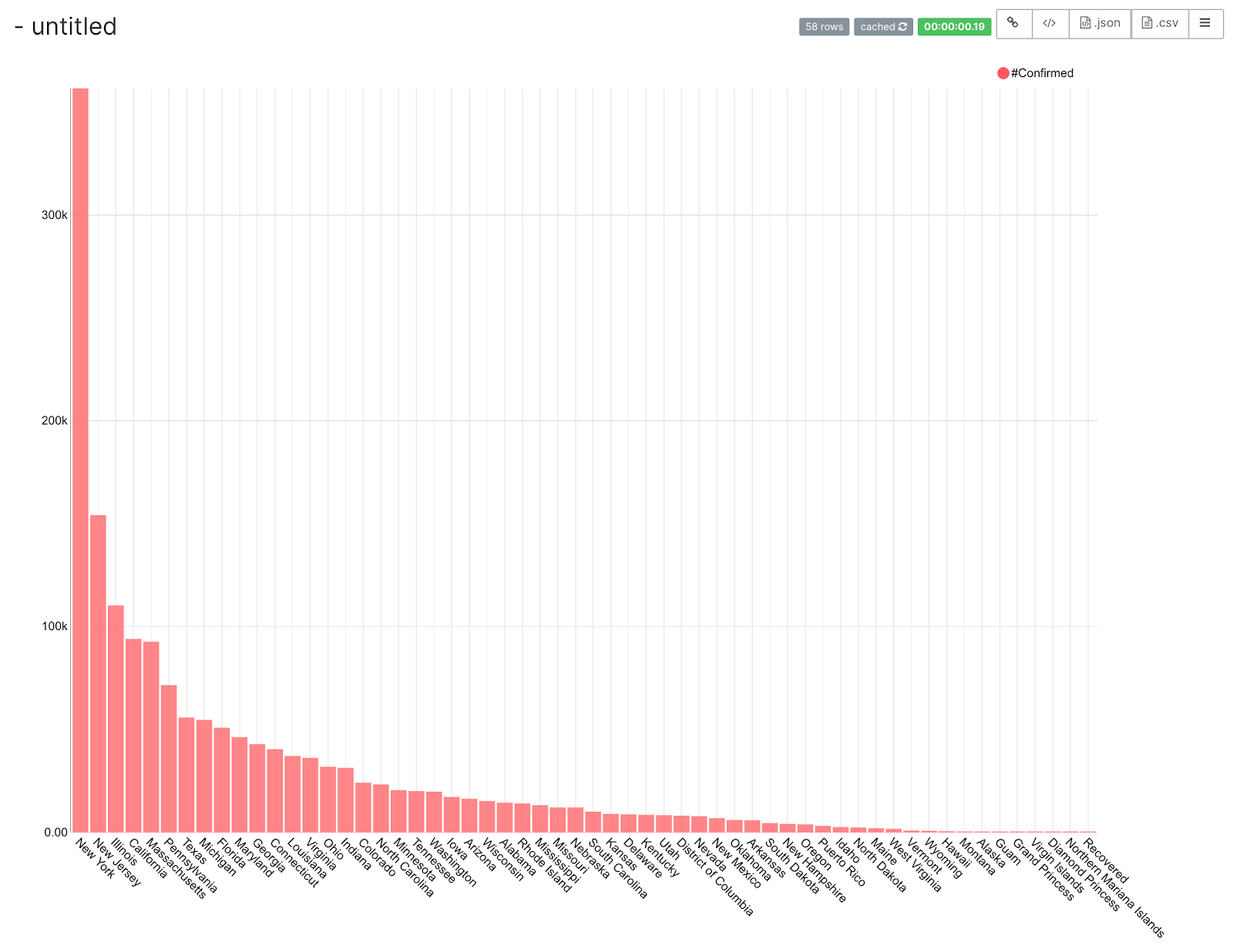
This chart is difficult to read because there are too many values in the series. To reduce the series to a Top 10—as the question suggests—change the Row Limit to 10.
In the Customize tab you can work on your chart’s appearance. For example:
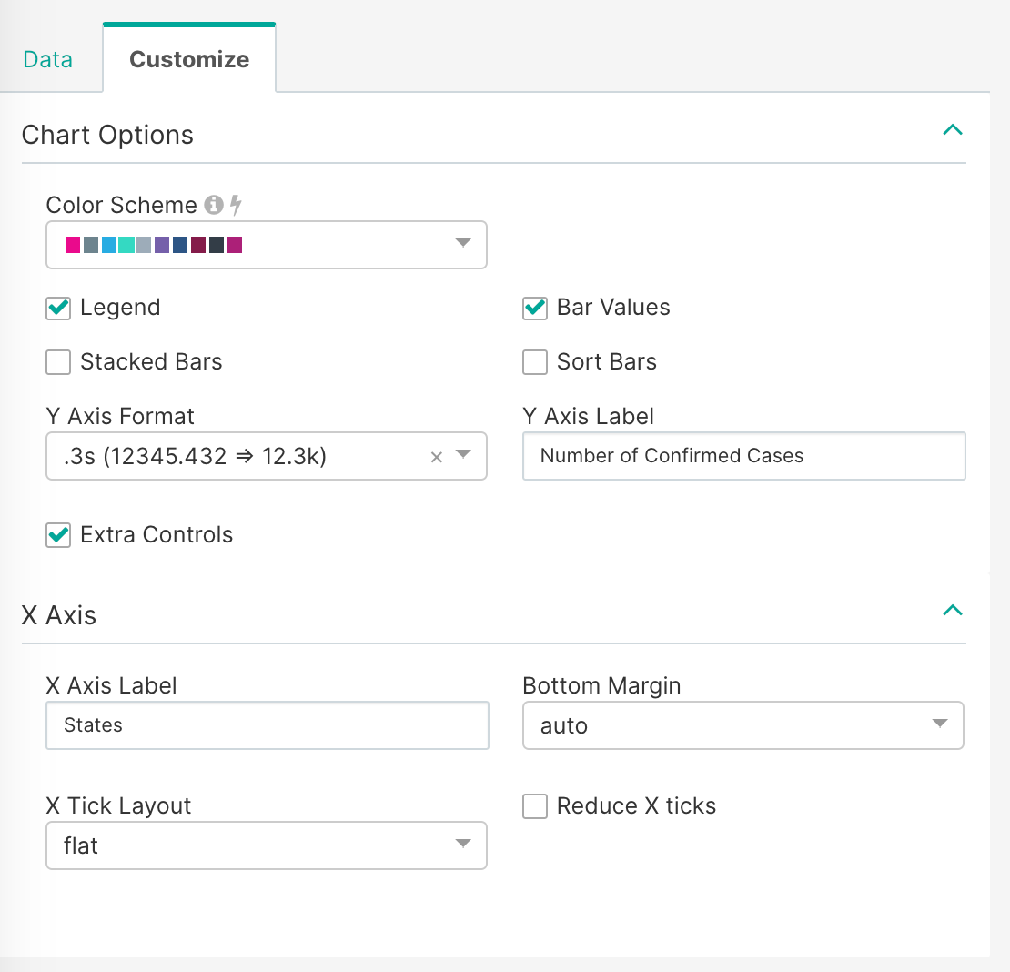
After the above customizations are applied, the chart looks as follows:
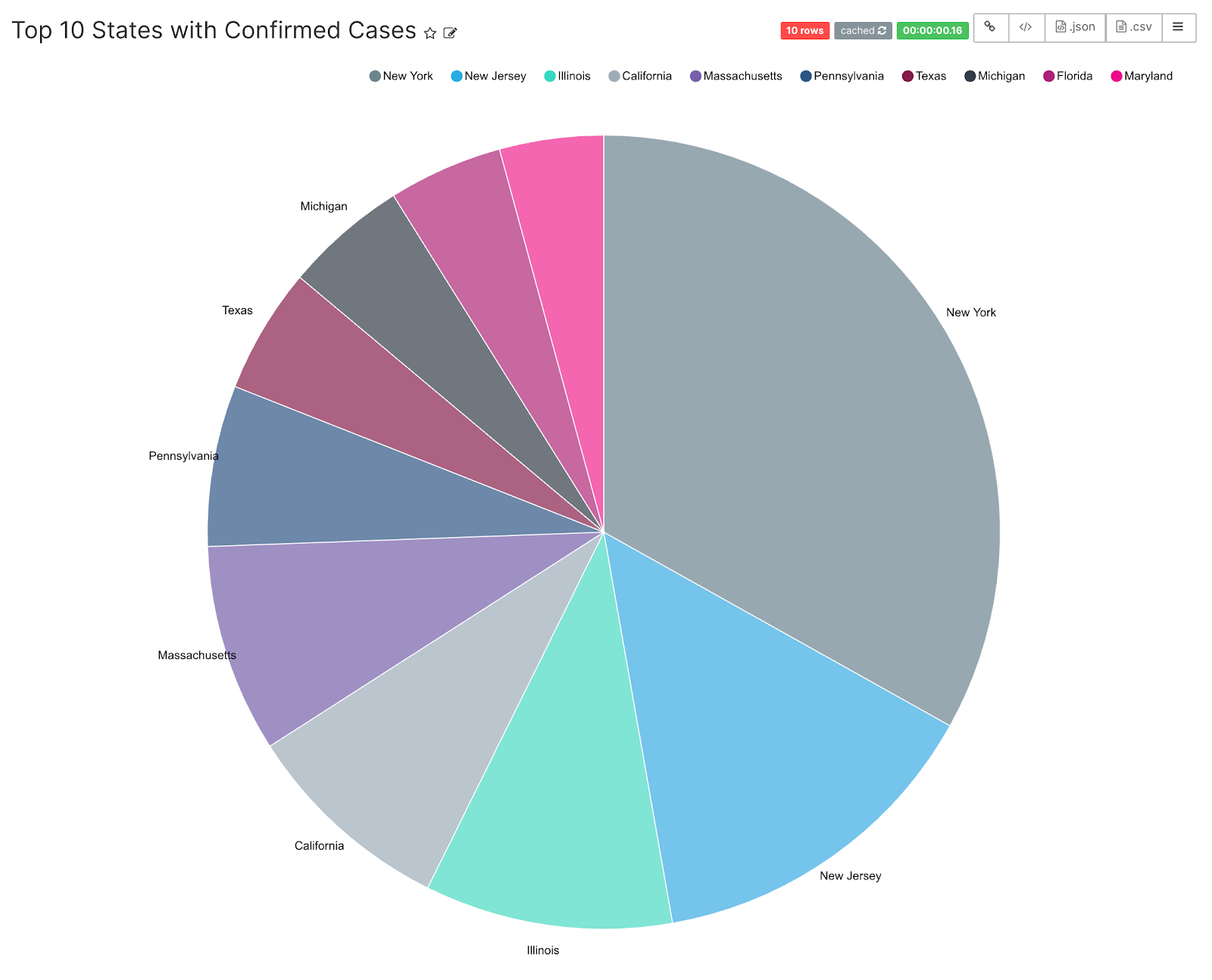
To try a different visualization type, just change the type and all the common fields will be preserved. For example, change the Visualization Type to Pie Chart — if this is the only change we make, the chart looks like this:
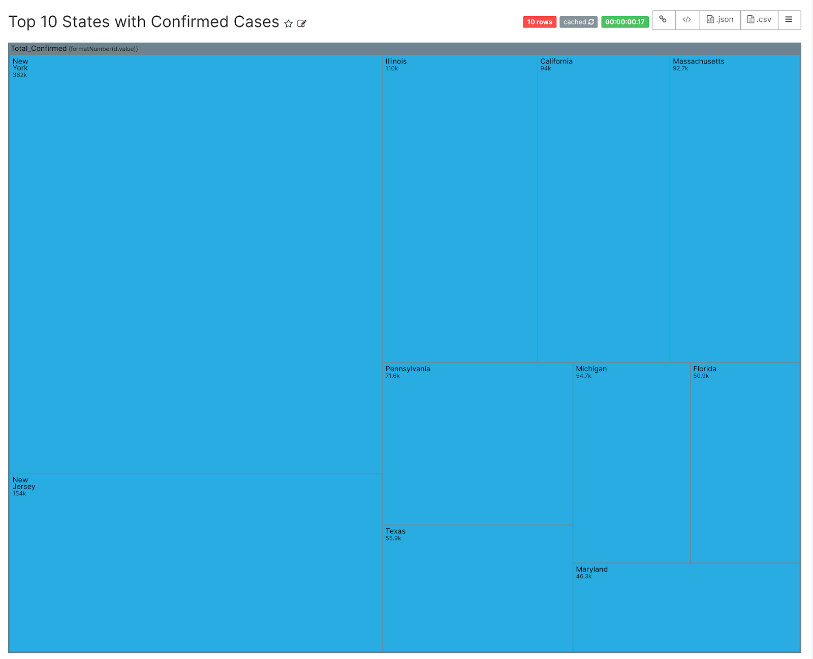
Or you can try a Treemap as your visualization type:
Or simply select a Table for your visualization type:
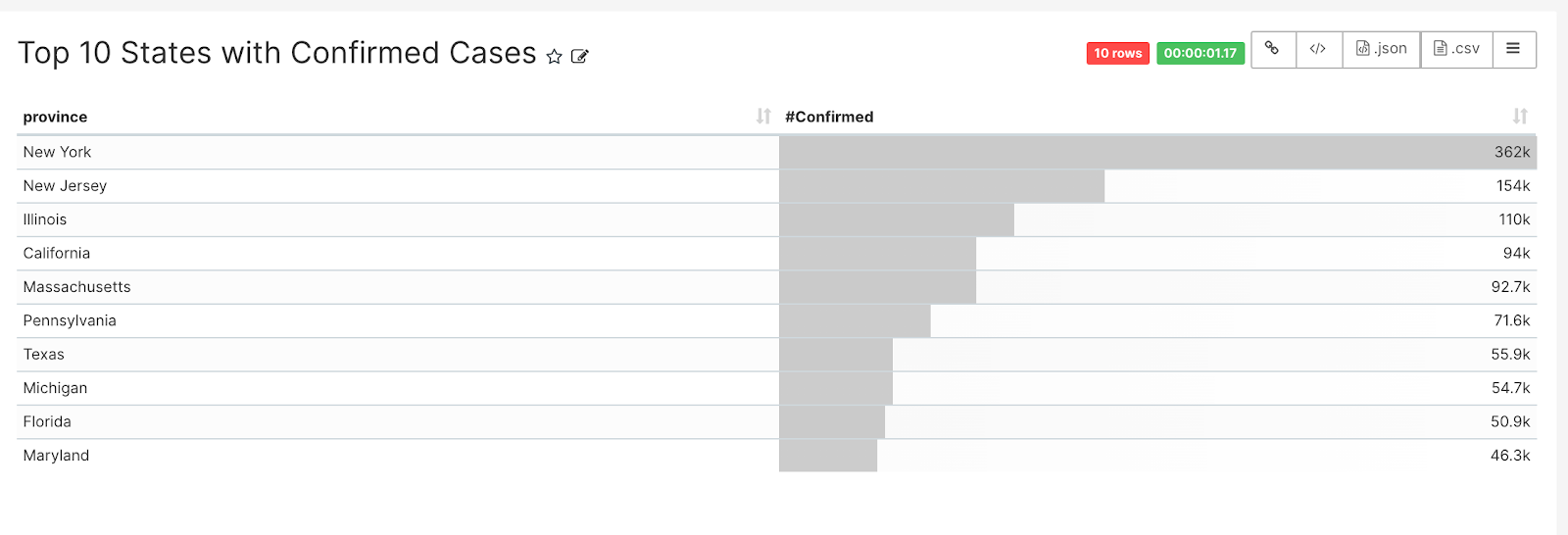
After you find a visualization that satisfies your needs, save the chart by selecting Save at the top of the Chart screen and then select the most appropriate saving option.
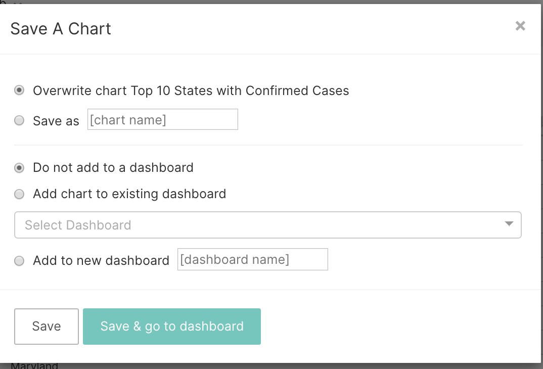
The Chart Name is the same as the Chart Title, so if you save your chart with a different name it will change the Chart Title accordingly. You have the option to add the chart to an existing dashboard or adding it to a new dashboard.
In this case, we will not add the chart to a dashboard yet, since we will create a series of charts first. At the end of this Getting Started with Superset series, we will go through the process of adding them to a dashboard. If you want to skip the setup and start building charts immediately, Preset Cloud provides a fully managed Superset environment.
Summary
This blog showed how to create a basic chart using a question & answer approach; in this case, we sought to answer a simple question, “What are the Top 10 States with the most confirmed cases?”
There are many visualizations that can represent the answer to your question, and it is up to the user to see which visualization best fits their needs. The most important thing to understand is what type of visualization could be used to represent a specific type of question; in this case the answer was a COMPOSITION question. In the next blog of this series, we will talk about how to represent TIME SERIES questions.