


What Is Data Visualization? A Complete Guide


Data visualization is the illustrative representation of information, typically numbers, in a chart, graph, map, or any other type of visual format. Data visualization makes it easier for us to analyze, understand, and derive meaning from data.
Through data visualization tools, people can spot outliers, trends, and patterns faster and more effectively. In this way, complex data becomes more accessible, enabling you to draw insights in ways that are not possible by looking at spreadsheets alone.
In the age of big data, businesses use data visualization tools to track and analyze nearly every process. It can help them discover patterns and measure overall performance. More importantly, it can be used to drive smarter, strategic decisions.
How Can Data Visualization Be Used?
Your business is constantly collecting data and information on everything from sales revenue to customer habits to marketing performance and more.
All this information generates a lot of noise. And it’s practically impossible to derive meaning by simply looking at spreadsheets. In the age of big data, visualization is key in turning raw numbers into intelligible material.
Effective data visualization is so much more than aesthetic charts and thoughtfully designed visuals. Big data visualization works to process raw data, organize figures, and generate complex graphical representations in the most efficient way possible.
Useful information and key findings are highlighted and presented in a way that’s easy to understand. This allows you to derive meaning from numbers and communicate your findings to audiences more effectively.
Nearly every industry imaginable stands to benefit from better data comprehension. This includes STEM, government, banking, education, healthcare, manufacturing, service-based companies, and more.
Private businesses can use data visualization to gain a deeper understanding of their productivity, supply chains, customer relations, marketing activity, and sales trends, and ultimately make data-driven decisions.
Benefits of Visualizing Data
Data visualization software helps to make information more accessible. They’re perhaps the most effective way to break down big data and communicate complex material.
Here’s a glimpse at some of the benefits of data visualization.
- Improving data comprehension by highlighting patterns, trends, outliers, and key points
- Removing excess noise
- Facilitating faster comprehension
- Making data more accessible, especially when it comes to sharing
- Supporting the data storytelling process and helping drive home key ideas
- Allowing a clearer, nuanced understanding of information
- Enabling new actionable insights and conclusions that weren’t possible before
- Capturing and retaining an audience’s attention with engaging charts, maps, etc.
The beauty of visualization tools is that you don’t necessarily need to be a data scientist or statistician to understand your data. The right instrument can take out many of the complexities and even automate certain processes.
Most importantly, the greater understanding that data visualization tools enable can improve decision-making. Indeed, many organizations rely on data visualizations to drive all kinds of decisions.
Take the example of a finance manager, who may review a candlestick chart and redirect investments after noticing an anomaly in an asset’s performance trend. Or consider a business executive, who decides to hone in on a specific marketing strategy, but only after data analysis revealed an uptick in sales represented through infographics.
Different Ways of Visualizing Data
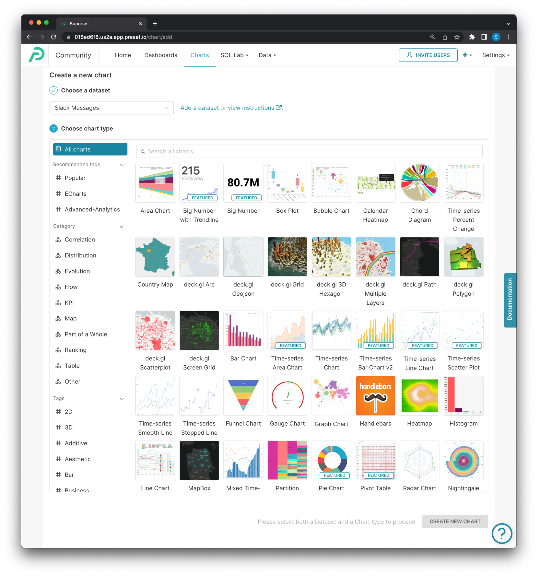
Data visual representation can be thought of as an art. There are no set rules or limitations on the types of formatting you can use. Instead, there are a myriad of options at your disposal. Many times, data presentations can take on one of the more of the following forms:
- Charts
- Tables
- Graphs
- Maps
- Infographics
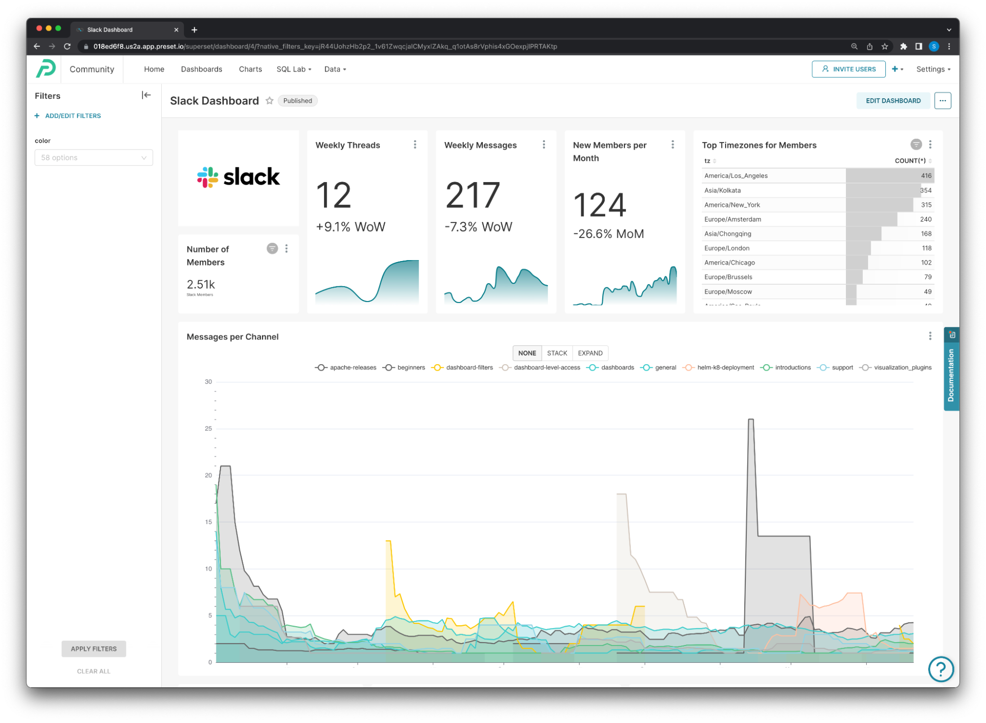
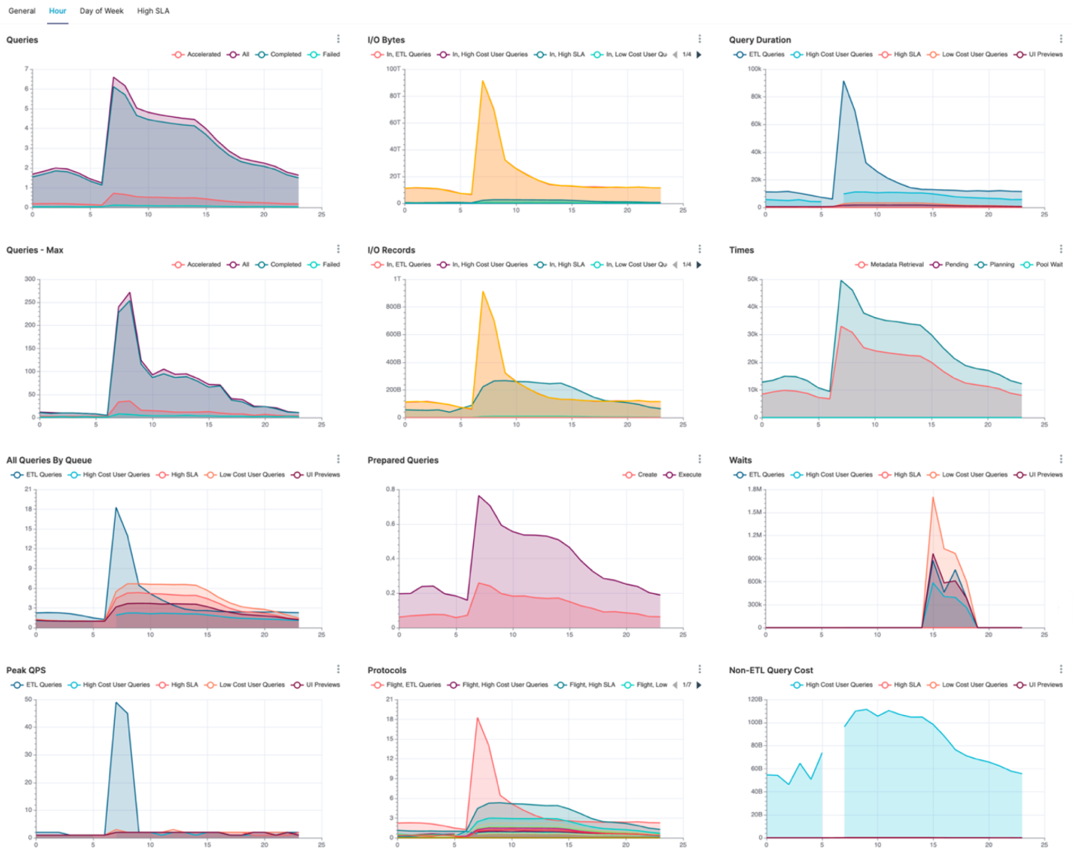
- Dashboards
- Interactive dashboards
It’s important to keep in mind that these formats are only the tip of the iceberg. Data visualization really comes down to pairing information with the most optimal representation. This can mean knowing whether a particular data set would best be presented as a chart, table, graph, interactive dashboard—or a combination of multiple formats.
You may also find value in using several different interactive visualization methods for the same data set. Other times, you may need to use different charts or graphs for different projects. Take a look at some specific data visualization formats.
- Time series charts
- Line charts
- Area charts
- Bar charts
- Pie charts
- Funnel charts
- Scatter plots
- Sankey diagram
- Pivot table
- Box and whisker plots
- Treemaps
- Heat maps
- Dot disruption maps
- Histograms
- Bullet graphs
Best Data Visualization Practices
The field of data visualization is constantly evolving, and users have complete liberty when it comes to their approach. Nevertheless, there are few data visualization practices that are worth taking into account, especially if you’re a beginner.
Consider your audience
Are you presenting visuals to team members fluent in industry lingo? Do you need data visualization tools for your own analysis? Or are you trying to relate information to customers or investors who may need extra clarifications? Knowing your audience will allow you to adapt your techniques and methods for the most optimal presentation.
Choose the right visual
There’s no one-size-fits-all when it comes to data visualization. You’ll have to choose the right format to communicate your data in a clear, straightforward way.
The most common formats could be a bar chart, table, line chart, histogram, scatter plot, map, and even an interactive dashboard. You may need to embark on some trial and error before finding the best visualization type. It’s also important to consider how different formats will complement one another. Ultimately, select your visuals wisely so that they contribute to your story.
Highlight patterns
Human eyes are drawn to leading lines and observable order. As you develop your visual, be conscious of things like sequencing and order. And do your best to highlight connections and patterns.
For example, if you’re using a bar chart to compare the GDP of nations, you wouldn’t want to arrange the countries in alphabetical order. Instead, you’d want to organize each bar from highest to lowest GDP (or vice versa) to highlight disparities in income.
Organizing your data in a meaningful way will help support your thesis and allow your audience to comprehend the material faster.
Use an engaging design
Colors and shapes are critical components of the storytelling process. These should be used to reinforce the data’s message and speed up comprehension.
When comparing different variables, it makes sense to incorporate contrasting colors, since this will make it easier to tell them apart. But if you’re showing a gradual shift (such as changing temperatures over time), you may want to express this through varying shades of the same color.
Shapes can have a similar effect. They can be used to break up traditional data formats or text to make content more engaging. Some examples include bubbles of different sizes or infographics of people when displaying population demographics.
Place text wisely
Text can provide context when strategically placed throughout your visualization. But you want to be careful not to go overboard with too many words. Text that’s seemingly random or not thoughtfully ordered can be a distraction. Instead, focus on being concise and creating guiding points for the story.
You can incorporate a title or the most important piece of text at the very top, as this is where eyes will be drawn.
Individual graphs, charts, etc. may also need their own titles, but try to avoid accompanying sentences. If you’re incorporating an interactive dashboard, make sure there’s text calling viewers to engage with it.
Data Visualization Tools
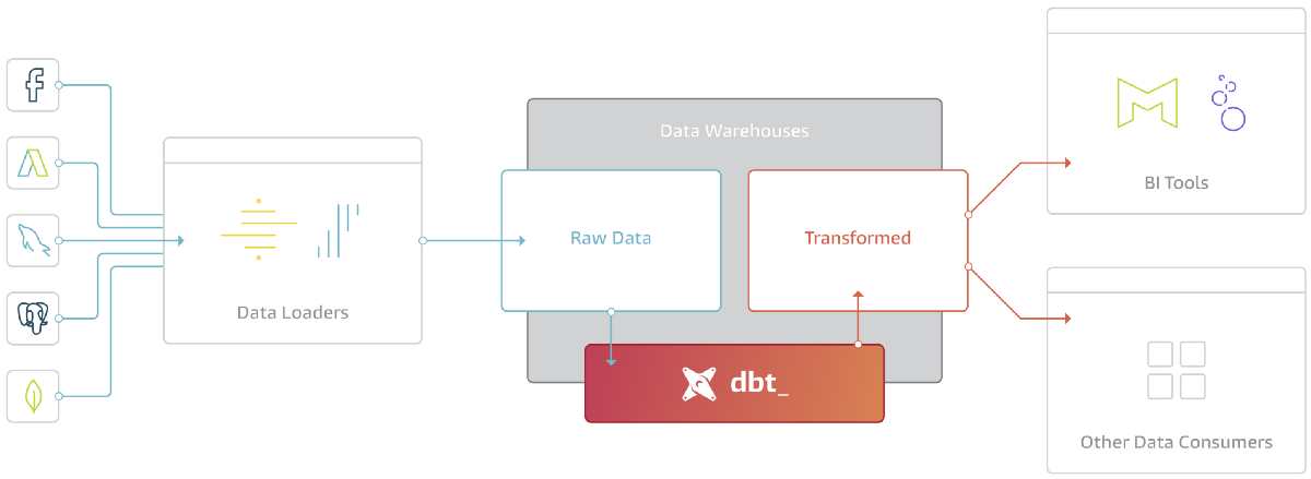
Good old-fashioned Microsoft Excel just doesn’t cut it when it comes to processing big data and developing advanced visualizations. Instead, you’ll need feature-rich tools that are also easy to navigate.
Businesses nowadays will use data visualization software to track and analyze their own key performance indicators (KPIs). This is typically done through interactive dashboards that visibly display information.
Data visualization tools can also help data scientists clean, organize, and monitor data, as well as conduct basic exploratory analysis. Interactive data visualization tools can even be a stepping stone to more advanced data science and analytics.
There are many different types of data visualization tools and vendors available. These include business intelligence (BI), analytic capabilities, enterprise reporting capabilities, and more. Many also feature built-in AI or machine learning capabilities.
As you examine different data visualization tools, make sure to consider:
- Your goals and needs: What kind of insights are you looking to gain from your data?
- Where your data comes from: Not all data visualization tools automatically connect with every system. Some require extra steps to actually import the data.
- The devices you will use: Is it important for you to be able to review your data and analytics on the go? Do you need your software to be compatible with mobile or tablet formats?
- Where you’ll present your data: Are you looking to publish an interactive dashboard on your website? Or maybe you need infographics to share with investors or board members?
How Preset Can Help All Types of Businesses with Data Visualization
Preset is a free data analytics cloud computing service built on Apache Superset™, a leading data visualization platform. Preset enables advanced business intelligence and analytics, within an intuitive interface, that makes it easy for businesses to explore, analyze, and gain deeper insights into their data.
You don’t need to be a data scientist to use Preset. There’s no need to write code either. In just a few clicks, you can generate ad hoc data visualizations and craft interactive dashboards on top of existing sources. You can also opt to work with an SQL editor to build data models, define dimensions, adjust metrics, and create virtual datasets, seamlessly.
Preset is the ideal data visualization tool for making your business data accessible and for gaining new insights with unprecedented ease.
