


Visualize Data in Preset Cloud Without a Database Using Google Sheets


Typically, building charts and dashboards in Preset Cloud requires you to first store data in a supported database and then register that database in Preset for querying. But what if you don't have access to the relevant database in your organization or you want to quickly visualize some data you have in a spreadsheet?
The good news here is that you can upload a spreadsheet to Google Sheets (or use an existing dataset you have in Google Sheets) and tell Preset to treat it as a database! In this blog post tutorial, I"ll showcase how to go from data to dashboard using Google Sheets and Preset.
If you already have a database that's setup for CSV upload in Preset and want to use that feature instead, check out our handy documentation article on CSV upload.
Uploading a Spreadsheet to Google Sheets
To work with CSV or Excel files (XLSX format) that you have on your computer, we recommend going through the following checklist for the best experience:
- Limit the file size to 10 megabytes if possible (Google Sheets struggles with very large spreadsheets)
- Format the dataset in as close to a tidy way as possible.
- Each row should have the same number of columns / values
- The first row should be the "header" row, containing the column names
- Remove anything that isn't a data value (e.g. hypermedia like images)
Databases apply very similar recommended constraints to datasets housed within them and we're asking Preset to treat Google Sheets as a database.
To upload your spreadsheet to Google Sheets, navigate to Google Drive, pick a folder if you'd like, and drag and drop your file(s) in from your operating system's File Explorer or Finder application. You can also select + New and then select File Upload.
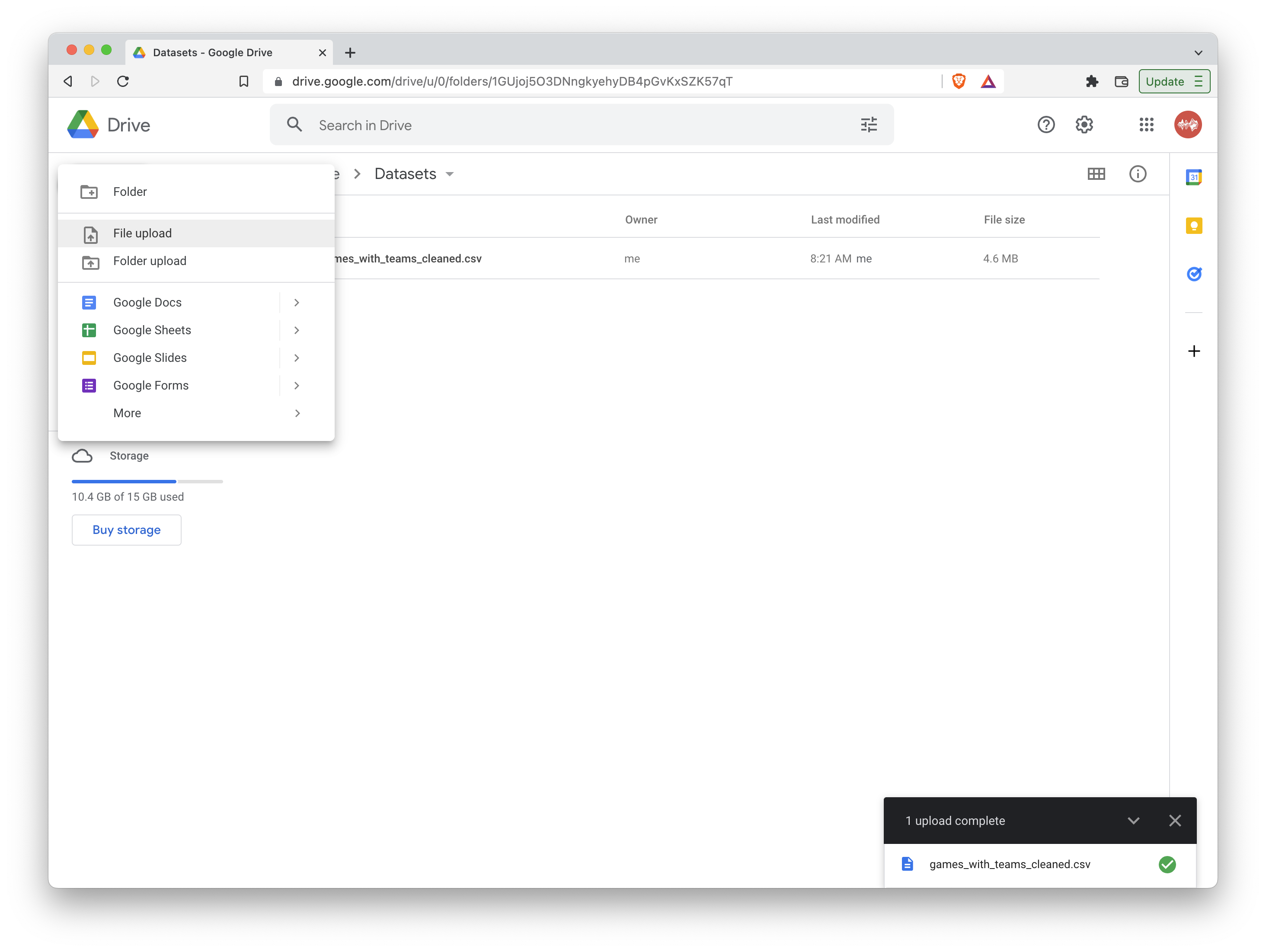
Once the file finishes uploading, right click the file, select Open With, and finalize by clicking Google Sheets. This will convert the file into a format friendly for Google Sheets viewing.
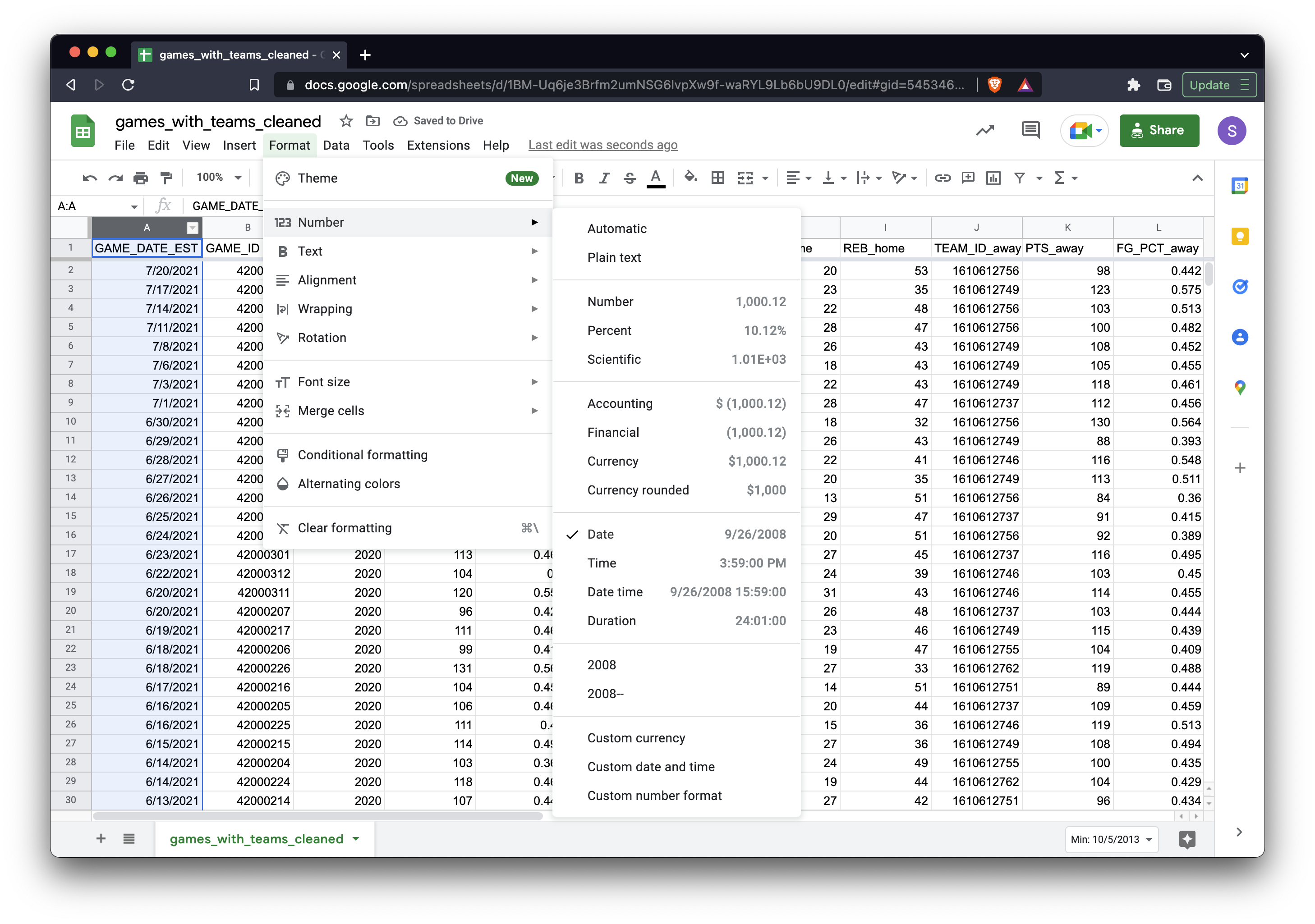
The last step is to manually format the data type for key columns. For example, we recommend identifying the core date or time column in your dataset to the relevant data format in Google Sheets. When Preset fetches the data from Google Sheets, it will rely on the data types Google is handing it. In the following screenshot, we format the GAME_DATE_EST column to the Date type:
Adding your Google Sheet in Preset
In Preset, there are two different flows for connecting to your Google Sheet depending on the sensitivity of the data:
-
Private Google Sheets: if your dataset is sensitive or you're in an organization that restricts how public you can make your dataset, then please read up-to-date instructions on connecting Private Google Sheets to Preset here.
-
Public Google Sheets: if you want to quickly visualize existing public datasets from the web and don't mind your uploaded dataset into Google Sheet being public, then please read up-to-date instructions on connecting Public Google Sheets to Preset here.
To help keep this tutorial flowing, I'll use the following public dataset on NBA games that I've already uploaded to this Google Sheet. You're welcome to register this dataset in Google Sheets and follow along with me.
Here's a quick walkthrough of how to connect a public Google Sheet in Preset.
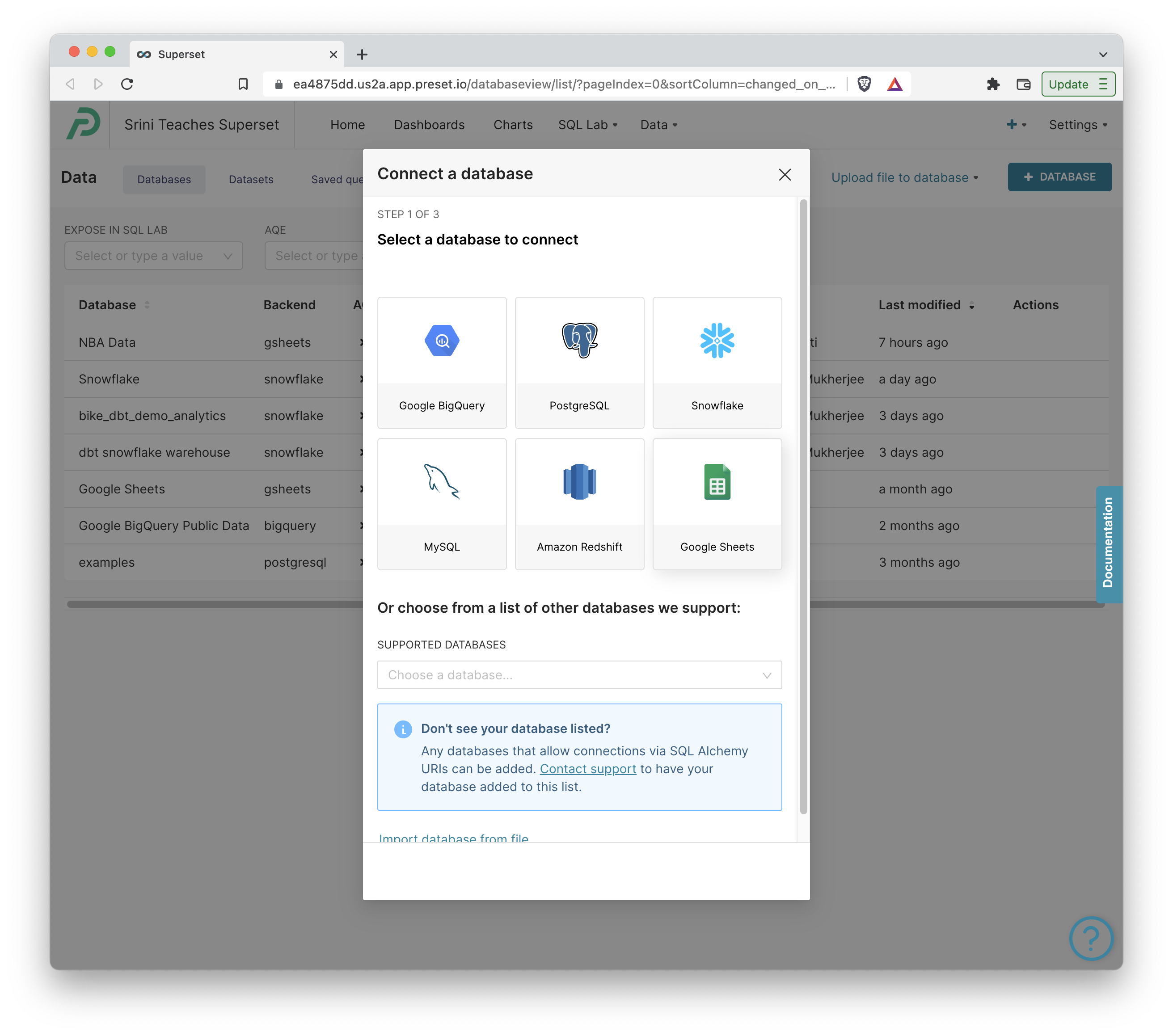
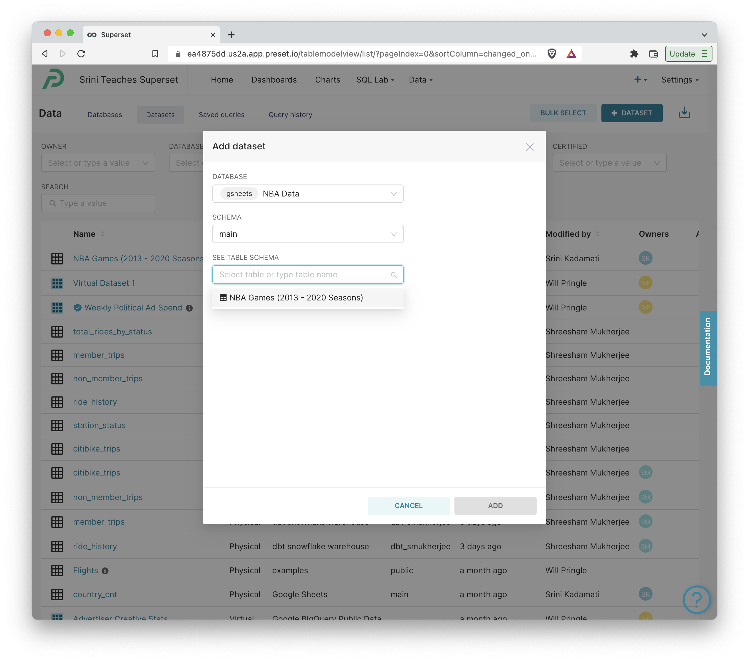
- To add this public NBA games dataset to Preset, click Data > Databases, then the + Database button, and finally click Google Sheets.
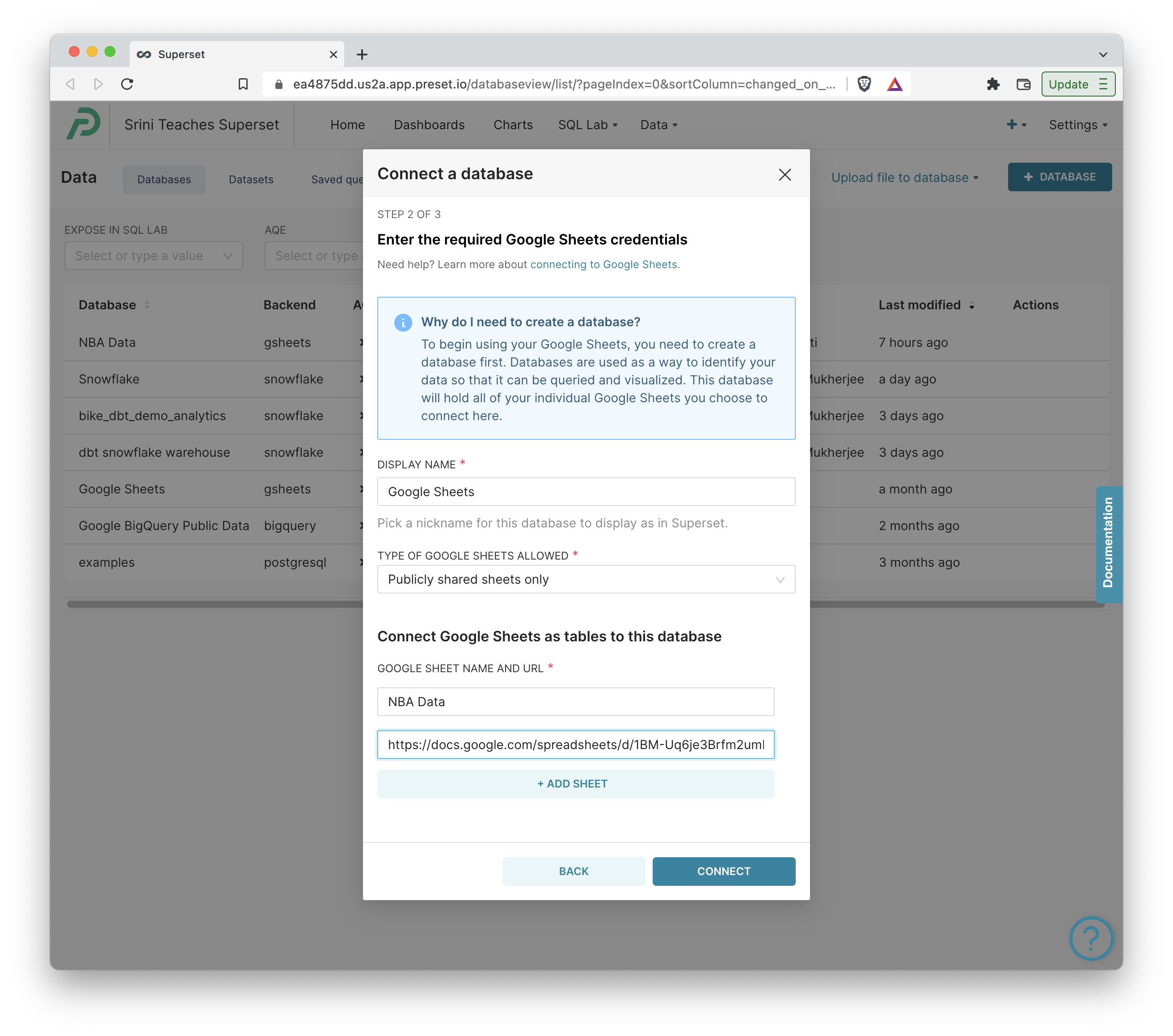
- Name your database object, paste in the following public Google Sheet, and click Connect.
- If you want to use your own Google Sheet, note that each tab in a Google Sheet actually has it's own URL (your browser's URL will automatically change as you switch tabs) and you'll need to add every tab's URL as separate, named tables. (You can also do this later if you'd like)
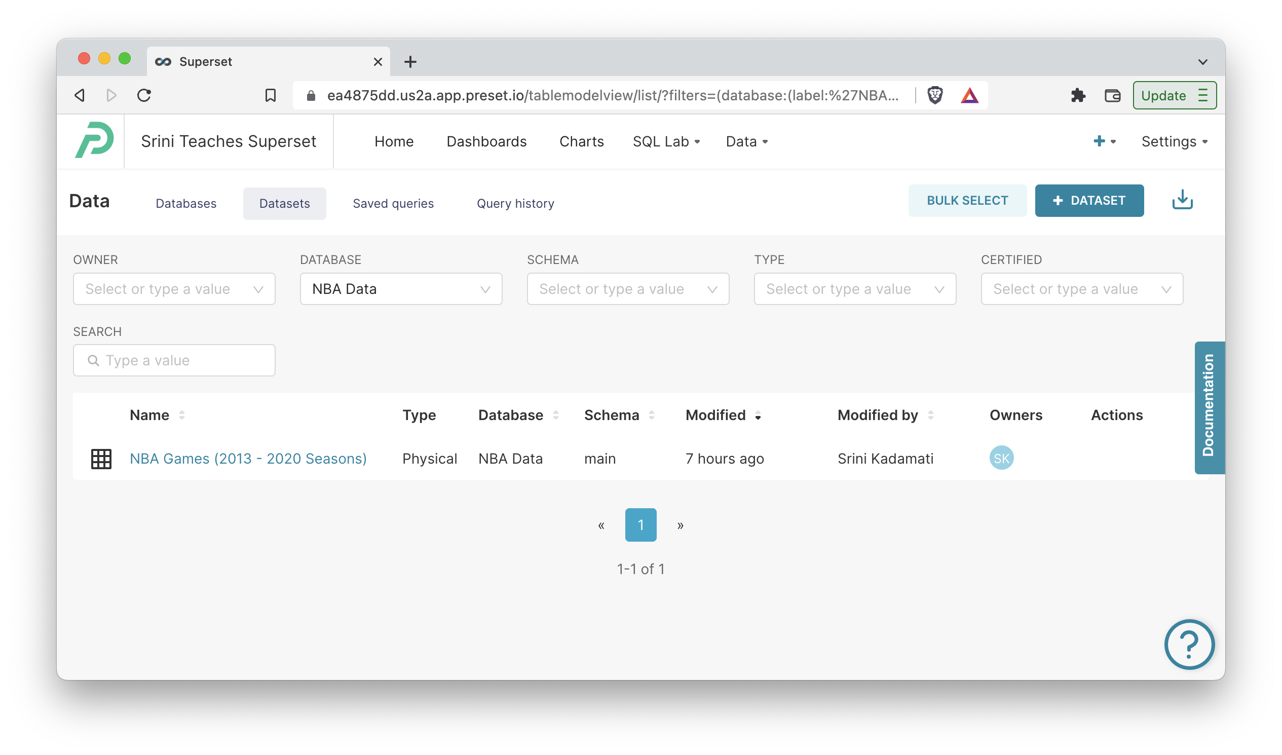
- Next, we need to register individual spreadsheets as datasets. Navigate to Data > Datasets, and click the + Dataset button in the top right corner. Then choose your database name, the main schema, and select your table(s).
You should see your dataset now in the dataset list. Click on the dataset to launch you into the Explore workflow for creating charts.
Creating Charts
To get more familiar with the data, either open the Google Sheet or click the Samples tab in Explore.
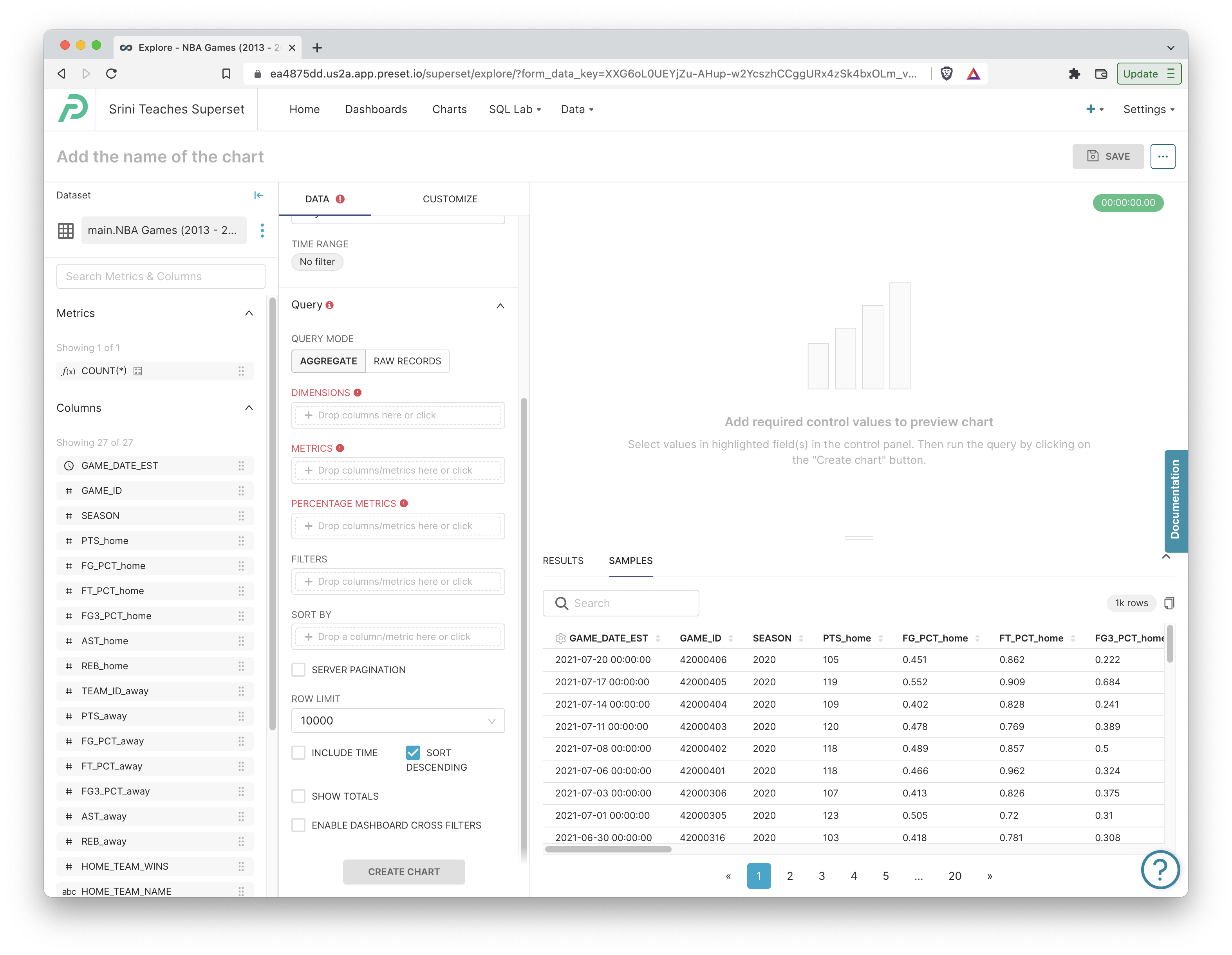
Now we're ready for the fun part -- visualization!
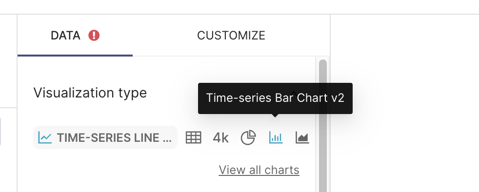
Bar Chart
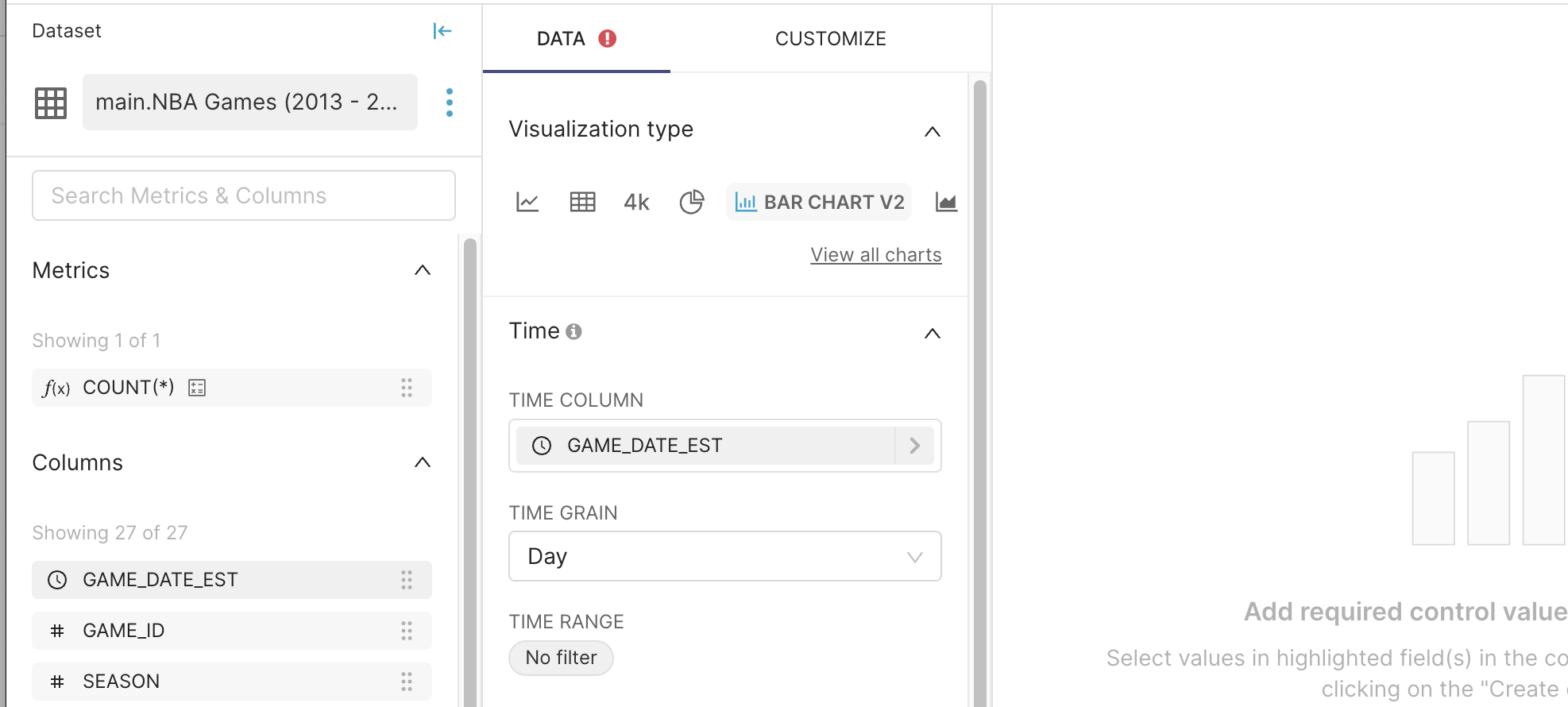
To start, let's switch to the Time Series Bar Chart visualization:
Because of the data type selection for the GAME_DATE_EST column we mentioned earlier in this post, Preset correctly identified this column as a temporal (or datetime) column. This will automatically be set as the Time Column:
To start, let's create a simple chart that visualizes the maximum points scored by any home team on a daily basis.
- Drag in the
PTS_homecolumn from the left-hand metadata browser into the Metrics field. Then in the pop-out window, set the Aggregate to Max. - Run Update Chart to have Preset form a query and run it.
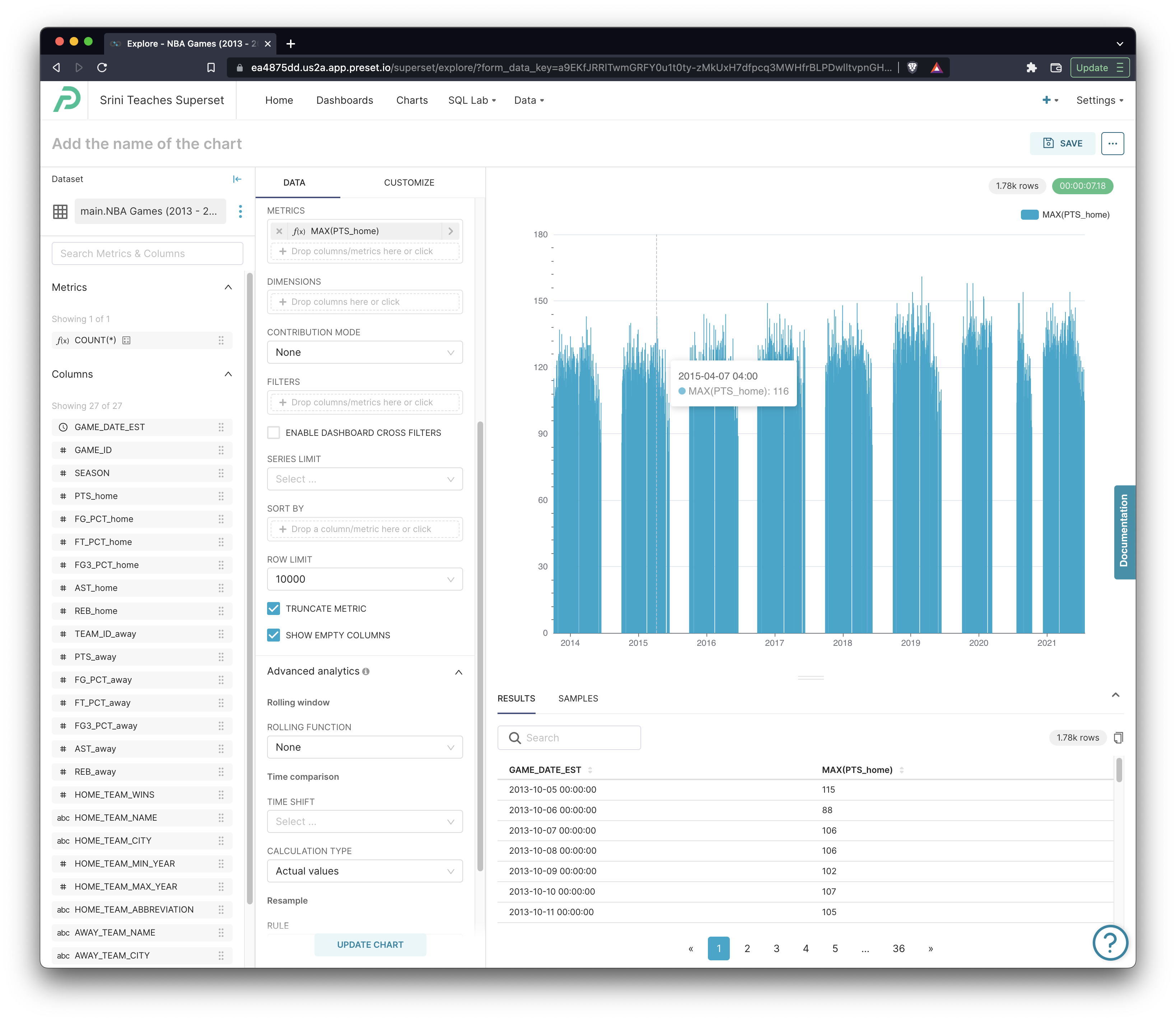
We can tell from this quick chart that the data spans the 2013 to 2022 seasons of NBA. To see the query that was generated, click the ... in the top right corner and then click View Query:

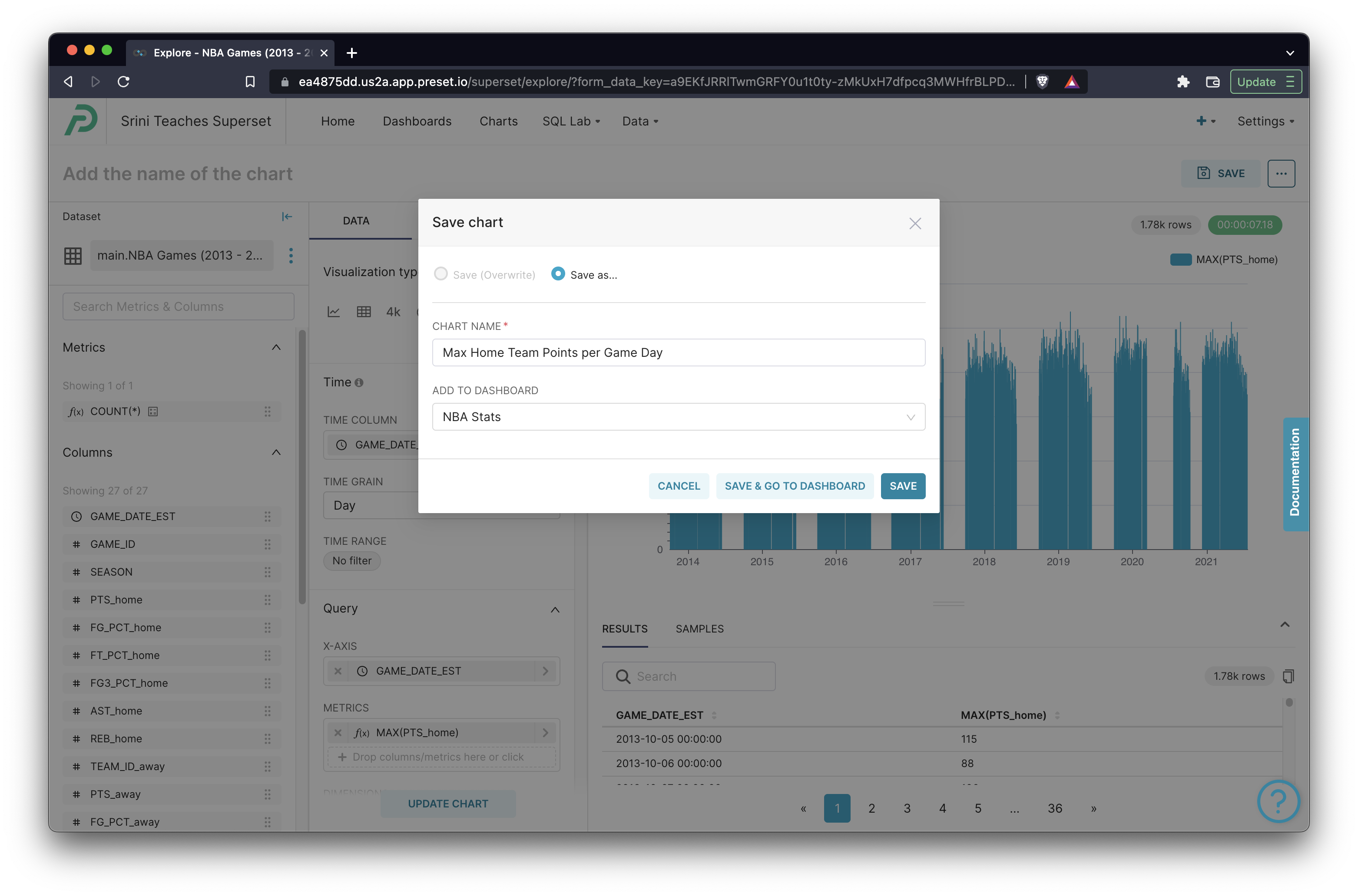
Click Save in the top right corner, give the chart a name, type in a new name for your Dashboard, and then click Save in the modal to persist the chart and link it to a new dashboard!
When interacting with Google Sheets, Preset uses the SQLite dialect of SQL. So in SQL Lab, the SQL IDE within Preset and Apache Superset, you can write and run any valid SQLite queries against your Google Sheets datasets.
Graph Chartm
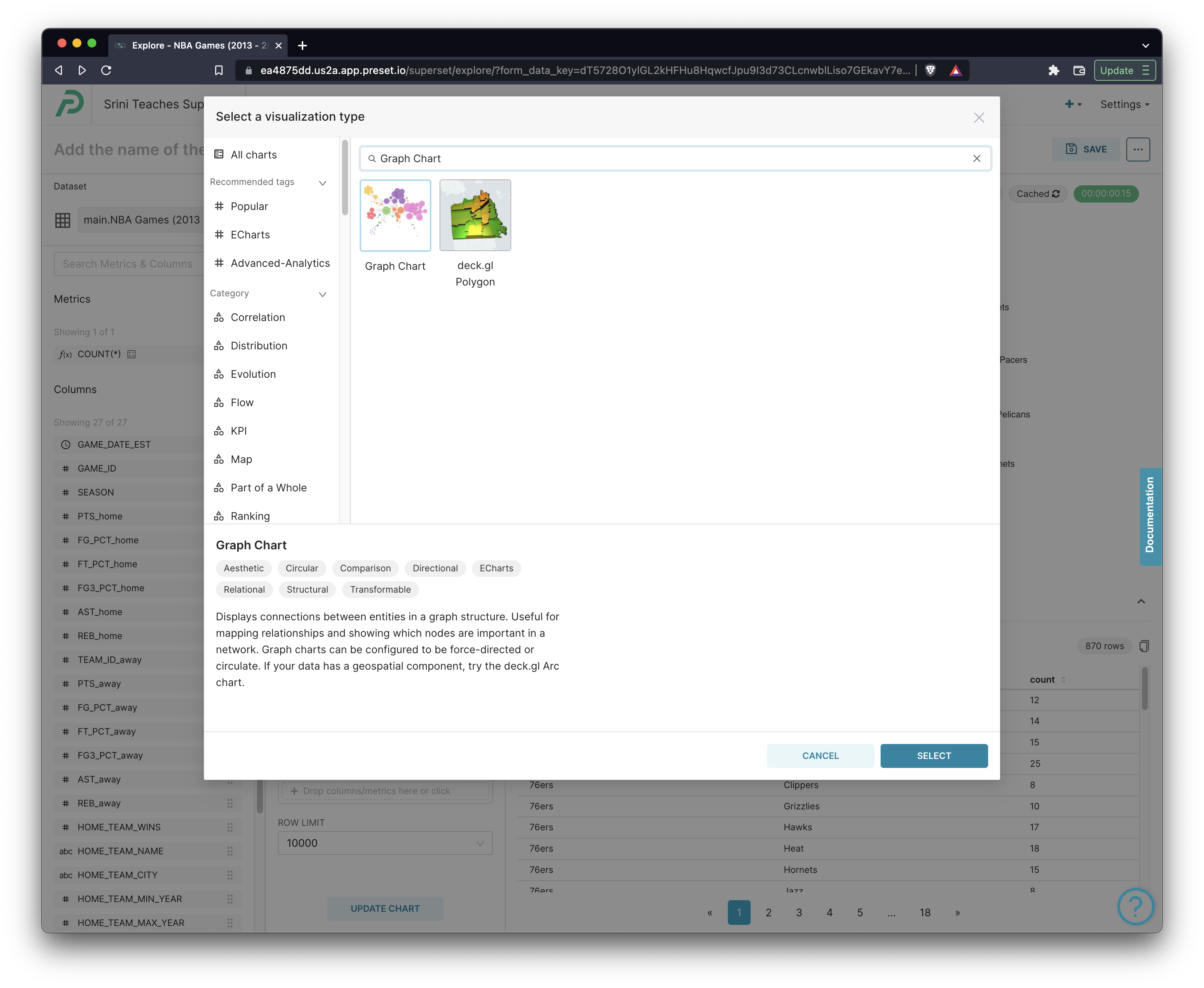
Let's now try creating a Graph chart! To switch to this chart type, click on View all charts first.
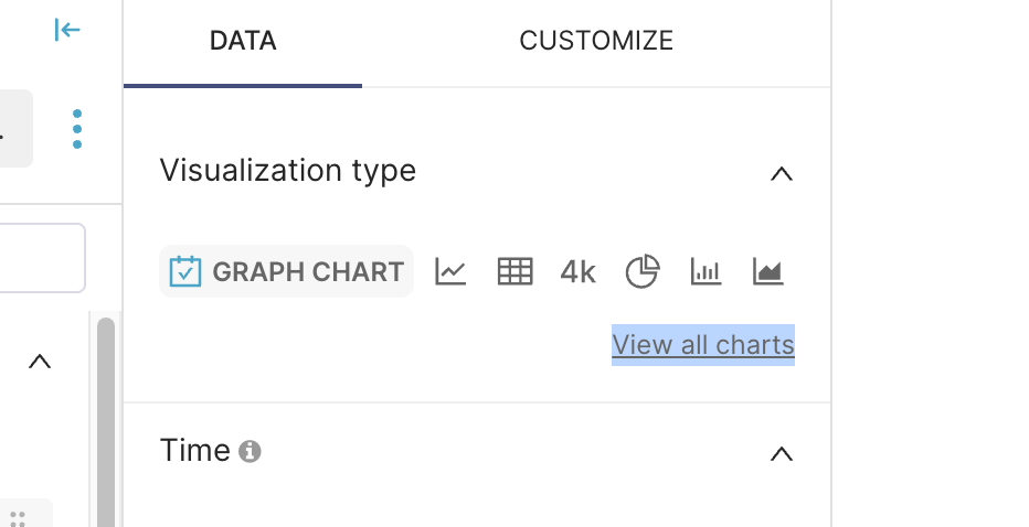
Then, search for "Graph Chart" from the visualization picker.
A chord diagram visualizes the links between pairs of values. To create this chart, you:
- Specify a Source column and Target Column
- Specify a Metric, used for pair-wise group by aggregation between the Source and Target columns
That was a bit of a mouthful so let's look at a concerete example. Choose the following options Set the Source column to HOME_TEAM_NAME and the Target column to AWAY_TEAM_NAME. Then set the Metric to COUNT(*) and run the query.
After a few seconds, you should see the following chart come into view:
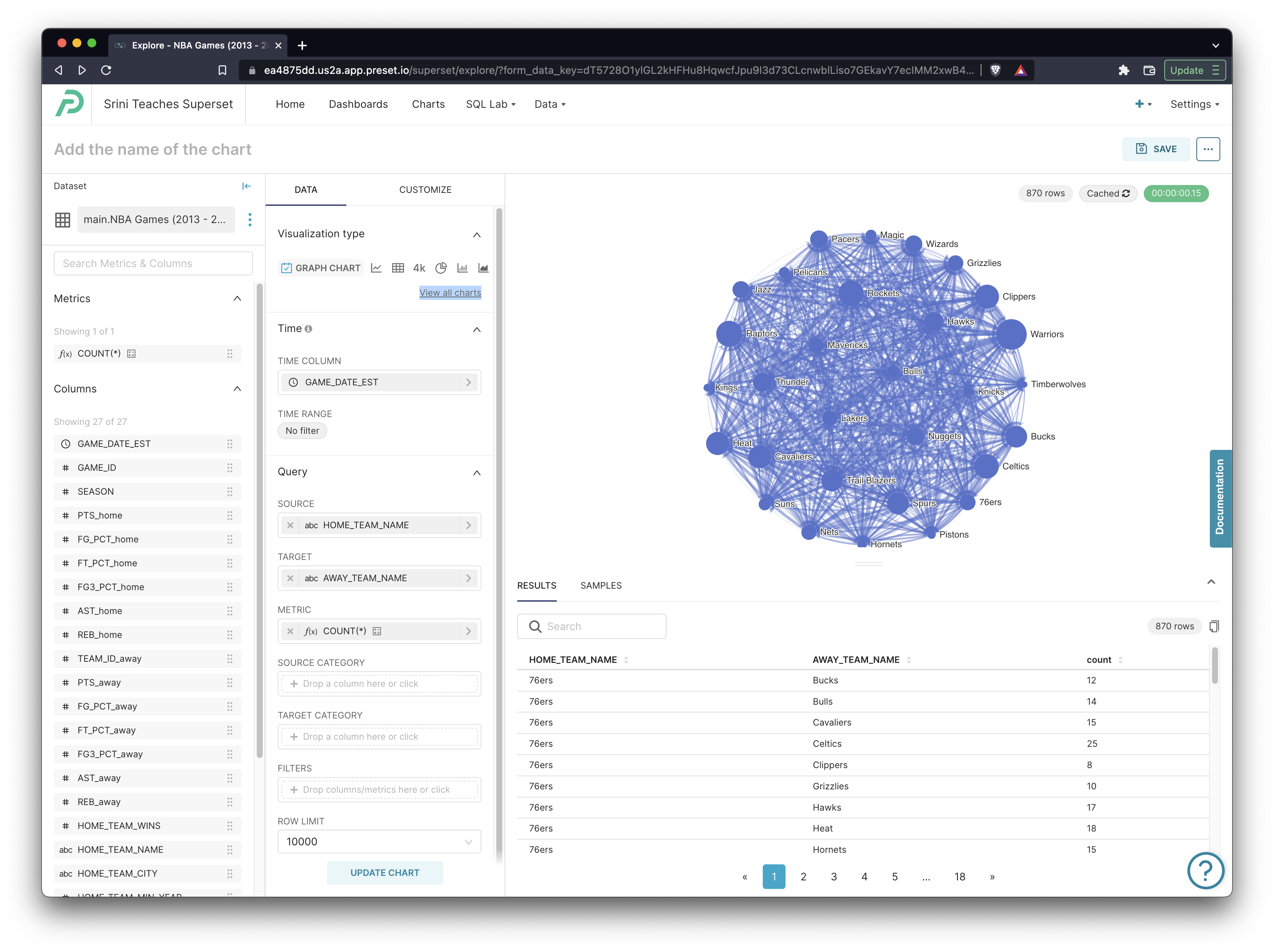
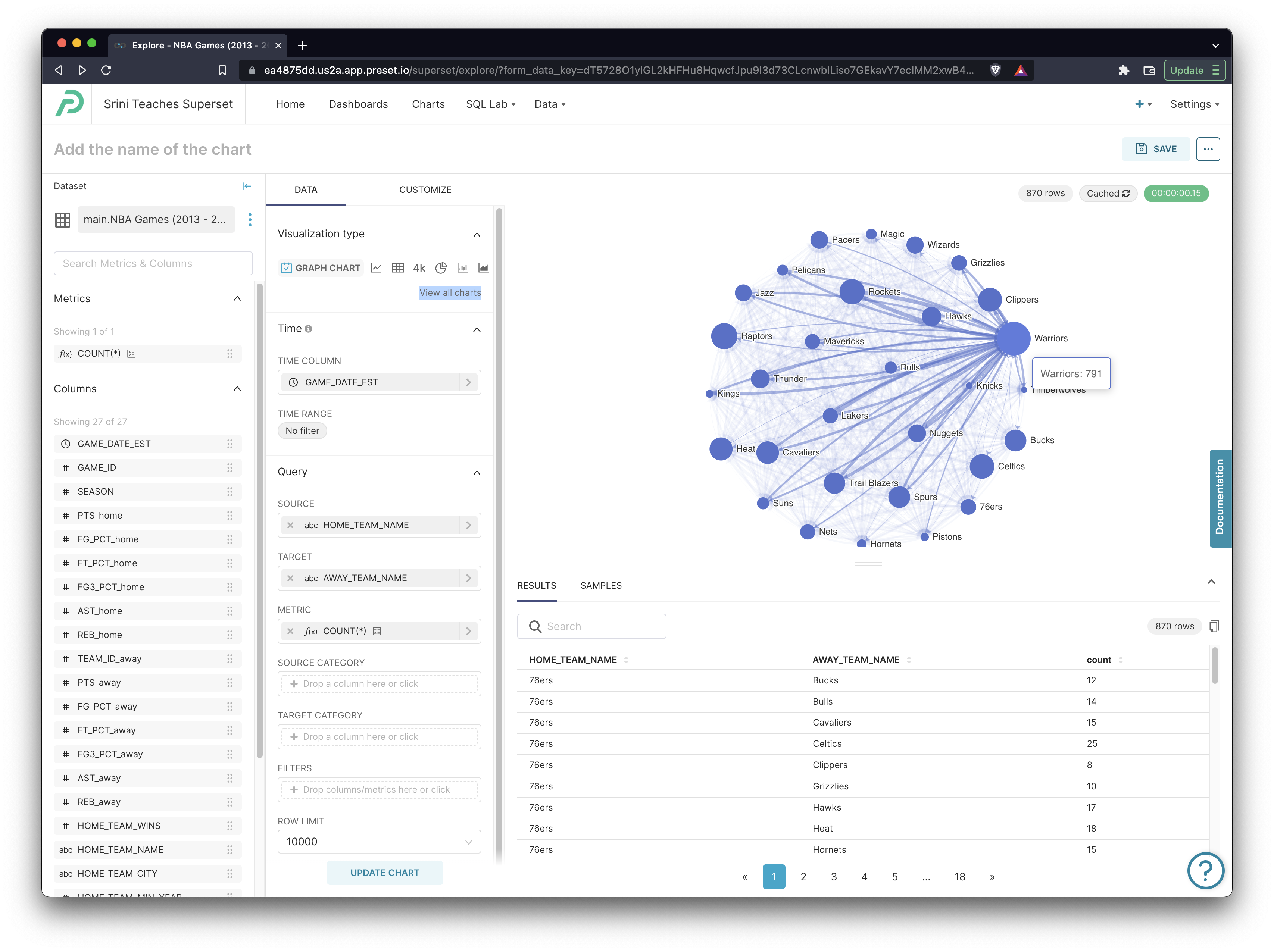
Using this chart, you can visualize which teams commonly played against each other and also which teams played a large number of total games. For example, its no surprise that the Golden State Warriors played a lot of games (they were constantly in the semi-finals and finals the last 6 years):
Here's the resulting query:
SELECT "HOME_TEAM_NAME" AS "HOME_TEAM_NAME",
       "AWAY_TEAM_NAME" AS "AWAY_TEAM_NAME",
       COUNT(*) AS count
FROM main."NBA Games (2013 - 2020 Seasons)"
GROUP BY "HOME_TEAM_NAME",
         "AWAY_TEAM_NAME"
LIMIT 10000
OFFSET 0
Hopefully you can tell how the selections you made in Explore map to the query that Preset generated. Because of the pair-wise group by, both configurations of 2-team matchups are represented in the query results and, thereforce, also the visualization. For example, in the Suns - Pacers matchup, each team is the Home team sometimes and the Away team sometimes:
HOME_TEAM_NAME, AWAY_TEAM_NAME
Suns, Pacers, 9
Pacers, Suns, 7
Customizing Your Dashboard
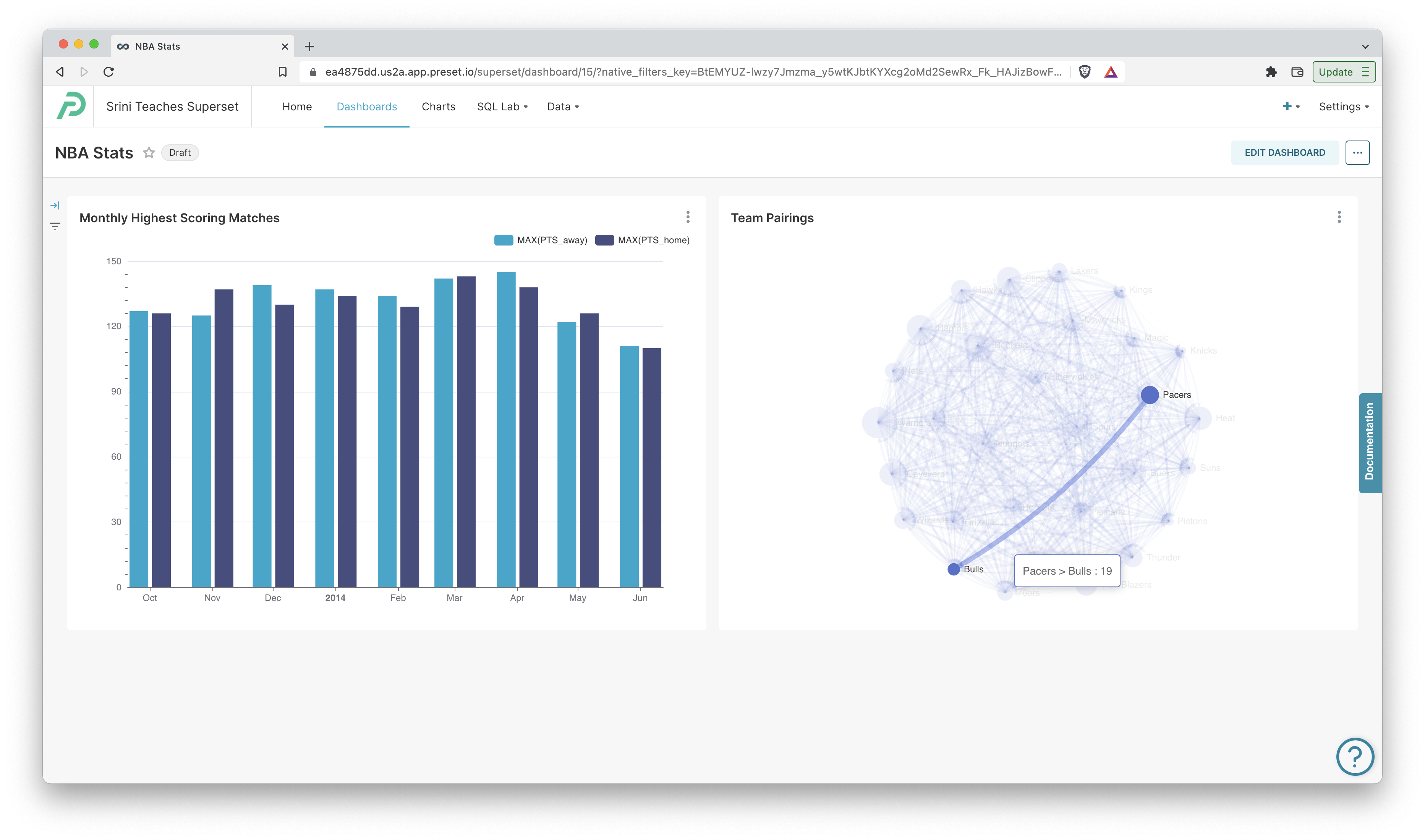
Let's take a peek at our dashboard. Click the Dashboards tab and then click on the dashboard you created. It should resemble the following screenshot:
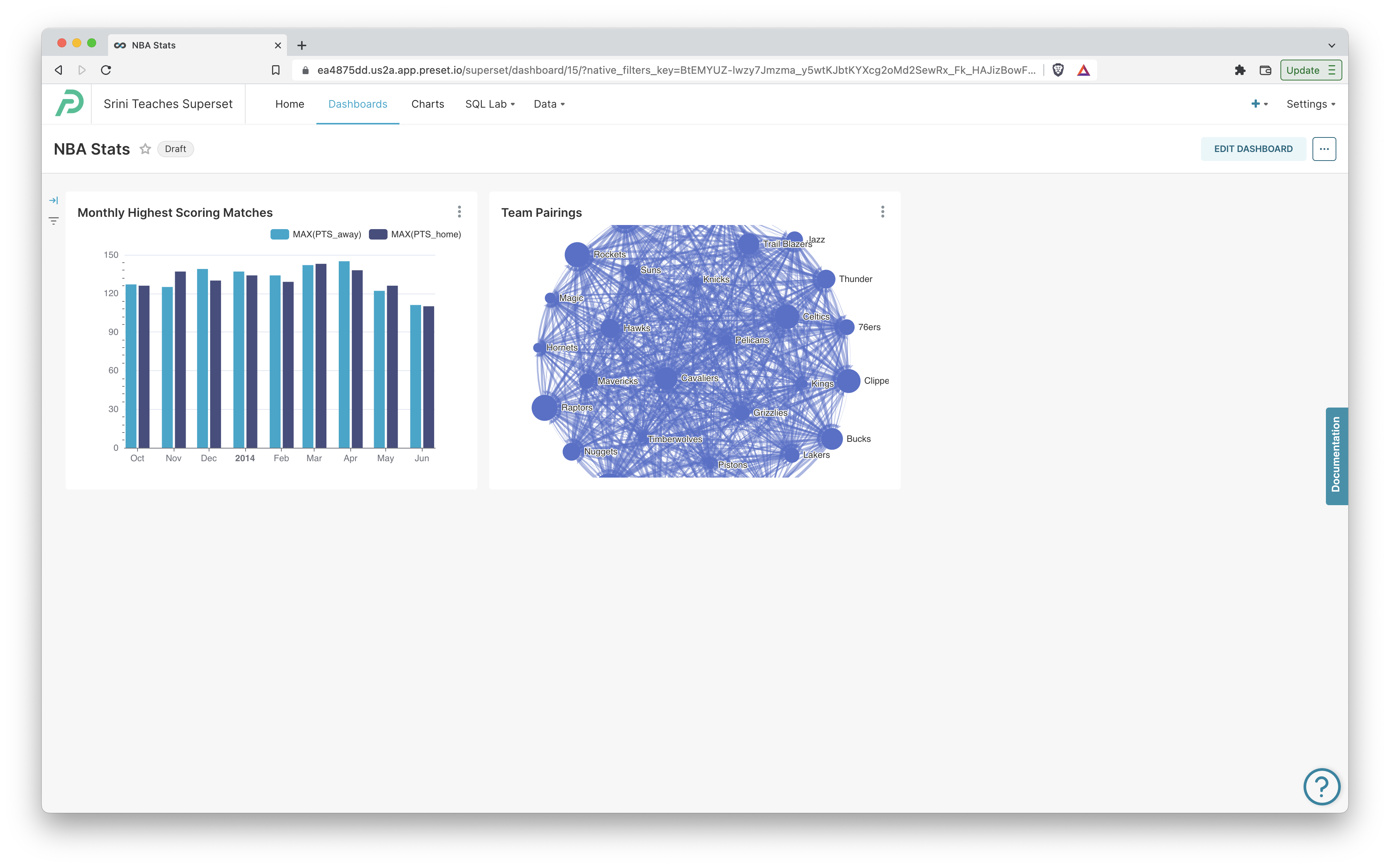
First things first, let's start by resizing the charts and rearranging them so they have more space.
- Click Edit Dashboard and then click & drag the bottom right corner of each chart object to resize them.
- Click Save in the top right corner to persist the new layout.
Dashboard Filter
Next, let's make our dashboard a bit more dynamic. We can add a dashboard filter, which is a component that receives user input and uses it to modify the query, data, and charts that are shown.
To add a filter, click the Add/Edit filters button in the left-hand filter tray. This will pop open a modal window and expose some options for you.
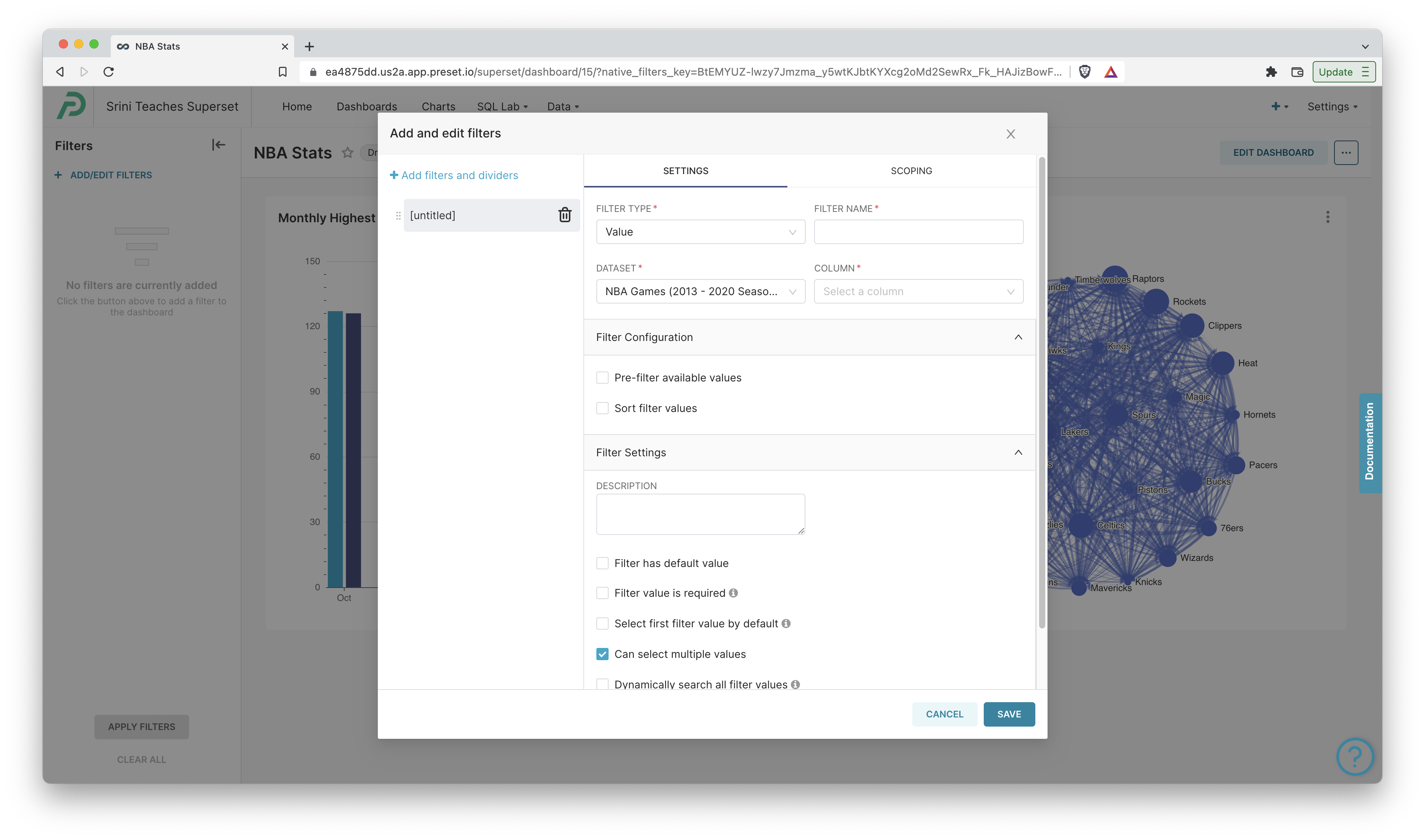
Dashboard filters in Preset are usually tied to a specific column in your dataset. For example, we can create a filter that lets dashboard users choose a specific NBA season (or multiple seasons) and have them apply to the charts in the dashboard. Let's walkthrough those steps now:
- Keep the Filter Type as Value.
- Give your filter a Filter Name like "NBA Season".
- Change the Dataset to the NBA one if it's not there by default.
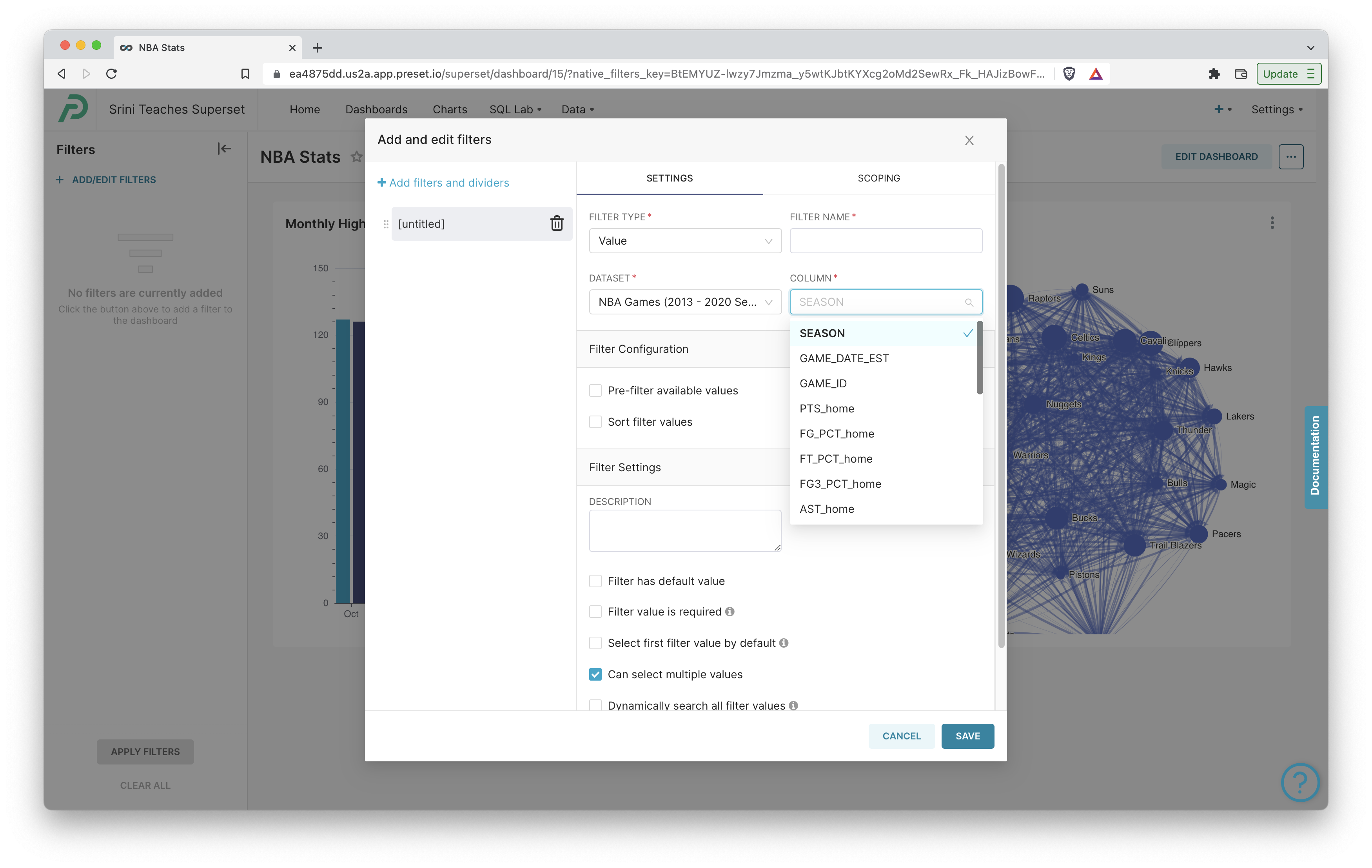
- Set the Column to the "SEASON" column from our dataset.
- Click Save to persist the changes.
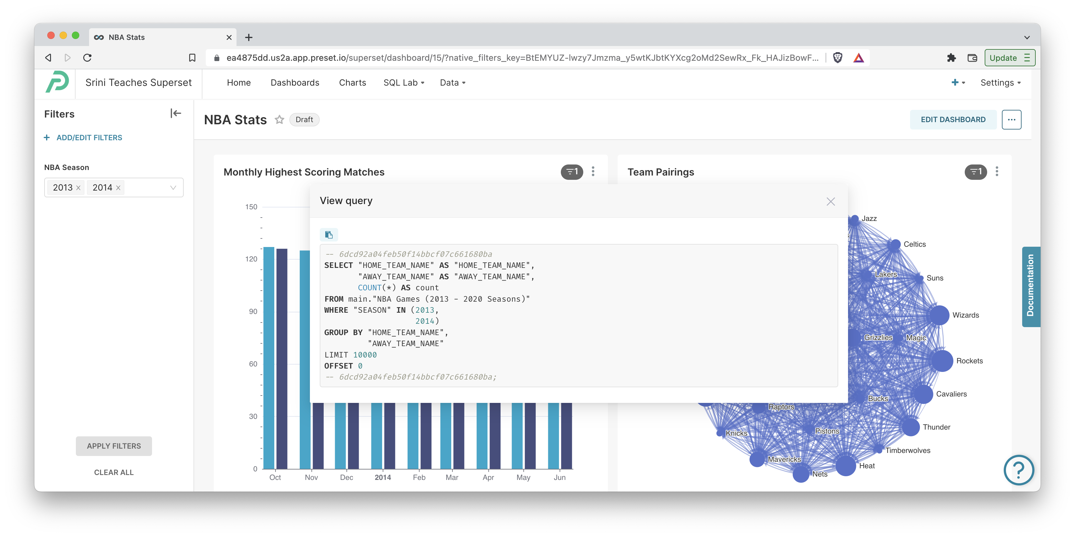
You will now see a filter on the left hand side of the dashboard that will let you choose which seasons you want the data to be filtered around:
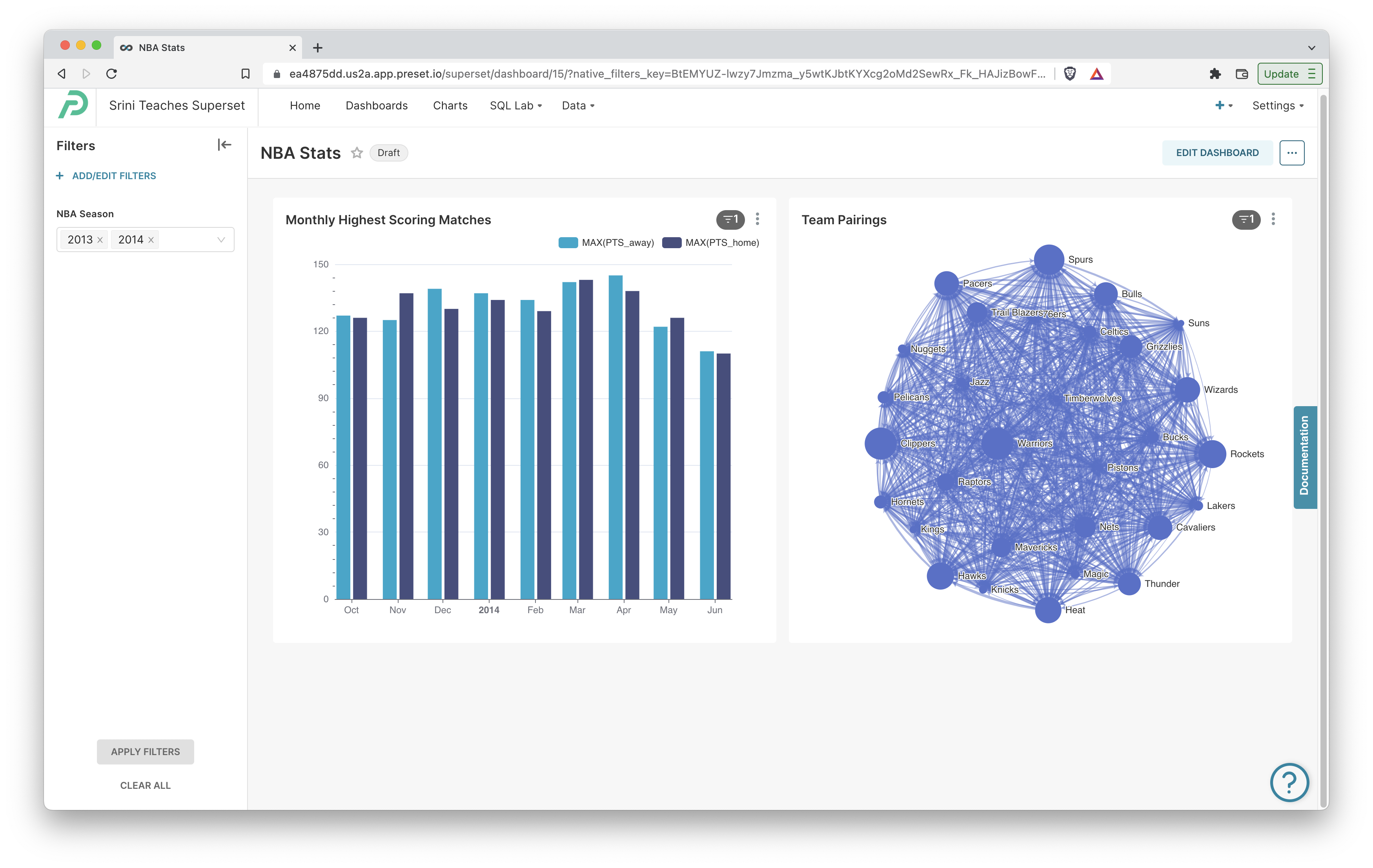
Choose some options for your "NBA Season" filter and click Apply Filters to have Preset generate and run new queries. Afterwards, if we click View Query, we can see that the WHERE clause of the queries were modified to include our options:
Next Steps
In just a few minutes, we were able to build a simple dashboard in Preset from data stored in a Google Sheet. There's so much more to explore and we encourage you to try some of the following:
- Preset ships with over 50 chart types and we encourage you to continue exploring them. You can learn more about the different chart types in our documentation!.
- If you find yourself commonly re-using metrics, you can define them in the lightweight semantic layer included in Preset.
- Write custom SQL queries for more enhanced data processing using the SQL IDE in Preset. You can publish queries as datasets and launch an Explore workflow from these datasets.
- Share your dashboard with other team members by inviting them into your workspace.
