


The State of ECharts Time-Series Visualizations in Superset


Apache ECharts is the future of charting for the Apache Superset project. The ECharts project has a strong governance model (Apache!) that's a good fit for the Superset project, high performance, a powerful, declarative API, and a thriving community.
The Superset contributor community has been steadily migrating old chart types from NVD3 and adding new ECharts visualizations entirely for over a year now. I wrote about the challenges the contributors were facing with NVD3 and why ECharts offered a more promising route in this blog post.
In this blog post, I will focus specifically on the current state of the ECharts time-series visualizations in Superset. This post is relevant for both users of Superset (best for v1.3 or later) and Preset Cloud.
Tour of Time-Series Echarts
Superset now ships with the following time-series ECharts visualizations:
- line chart
- bar chart
- scatter plot
- area chart
- smooth line chart
- stepped line chart
- mixed time-series chart
However, life wasn't always this way. In the first phase of the rollout, the core contributors actually released a single, unified Time-series Chart. To switch between the different time-series chart types, an end-user had to resort to the Customize tab.
Admittedly, the core contributors understood that this was an awkward user experience but they knew it was just a temporary one. After all, all of the other charts in Superset were separated into their own independent chart types in the viz picker.
Since then, however, the core contributors have exploded and transitioned the unified time-series chart into separate visualization types to stick to the design pattern that the rest of Superset followed.

In the rest of this post, I'll walkthrough the different time series ECharts visualizations and the use cases for each of them.
Time-series Line Chart
Line charts are a classic chart type that excel at visualizing how a continuous variable changes over time.
You can also use a time-series line chart for visualizing discrete values, but a bar chart is more effective and less overwhelming. For example, the following line chart requires more work to interpret:
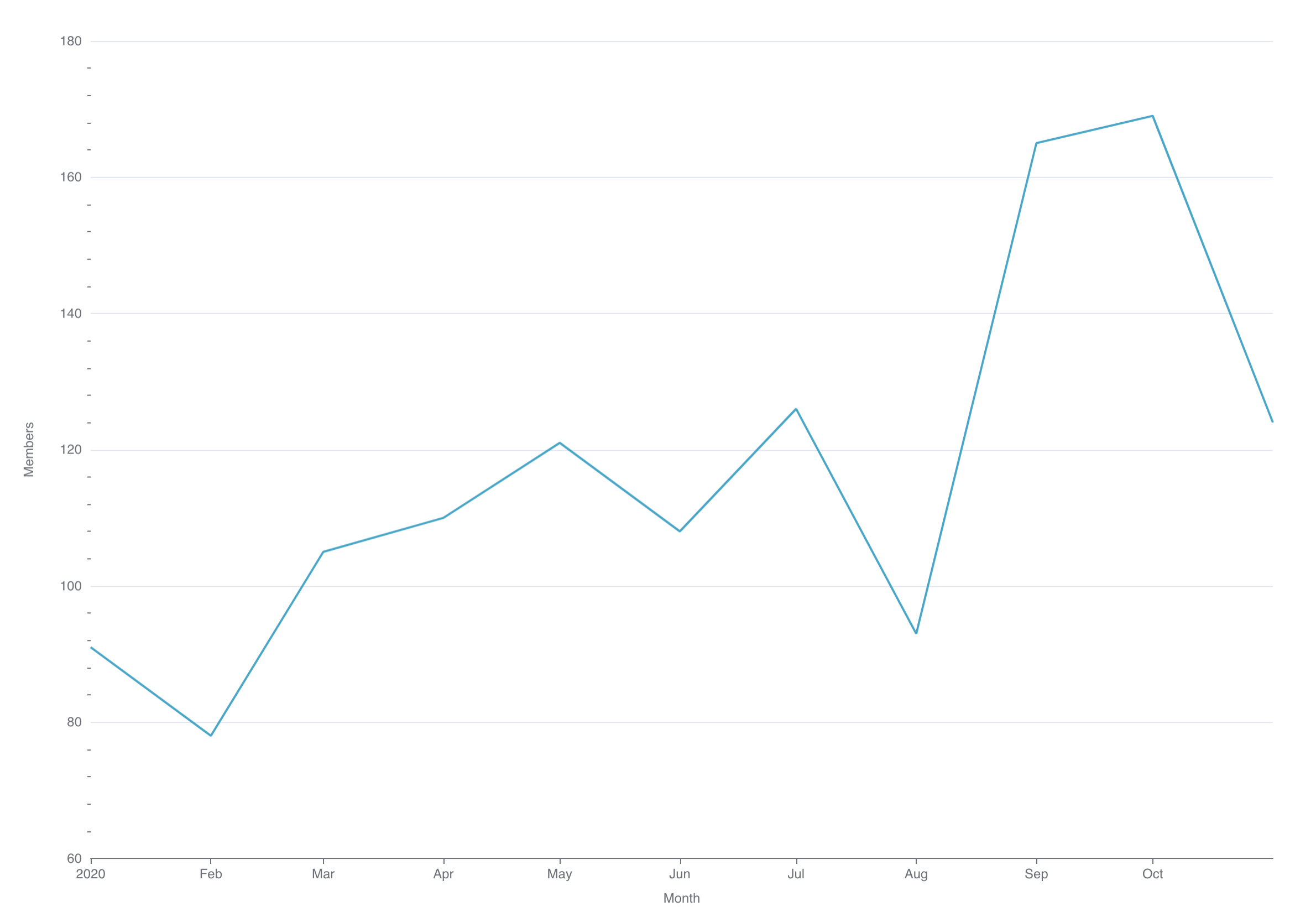
Compare this to the bar chart equivalent:
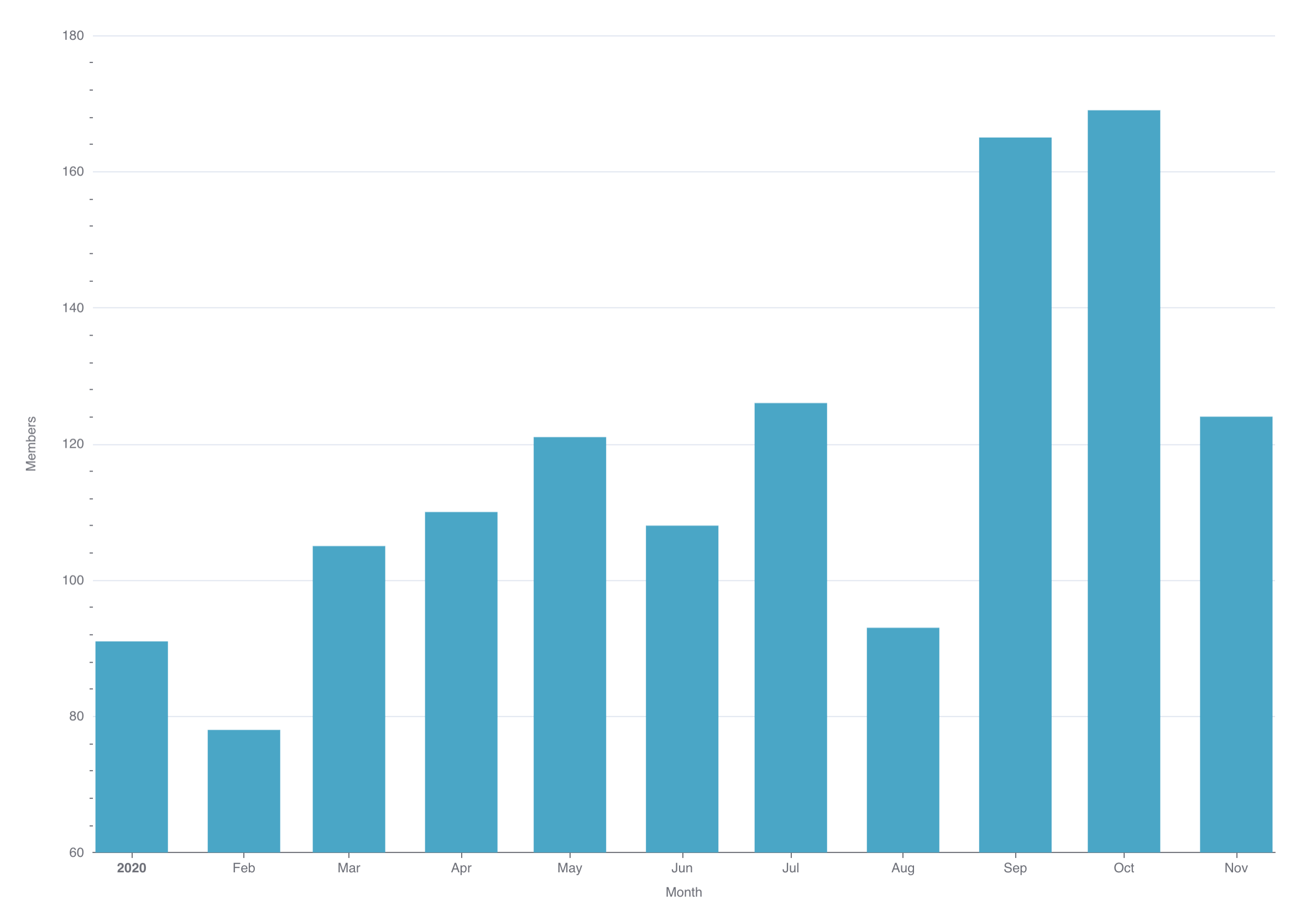
Why is this the case? Essentially, it boils down to the percent of the "ink" dedicated to representing the actual quantities we're interested in.
In the line chart, most of the "ink" goes towards the lines between the data points. In the bar chart, almost 100% of the ink is used on the bars representing the data points themselves.
Time-series Bar Chart
A time-series bar chart also excels at showcasing change over time, but for discrete values instead of continuous values. In many business domains, the distinction between discrete and continuous values is somewhat subtle.
For example, the following chart visualizes daily new members joining a community using a time-series bar chart:
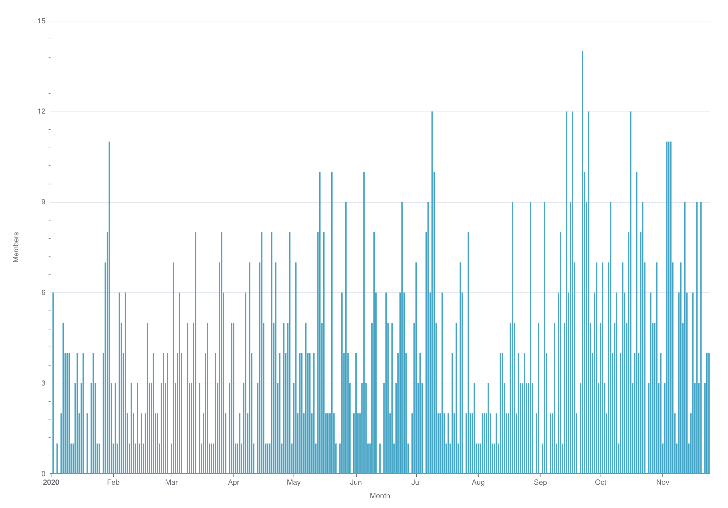
Daily member counts feel like they should be a continuous variable, but in reality each member joins in a specific, discrete timestamp. A better framing may be the amount of binning that's applied to the data before visualization.
If we change the binning from daily to monthly, the chart feels more discrete but also, more importantly, immensely more useful and interpretable.

Time-series Scatter Plot
A scatter plot visualizes specific measures using dots. Time-series scatter plots are especially useful when you want the viewer to be able to quickly interpret every single data point.
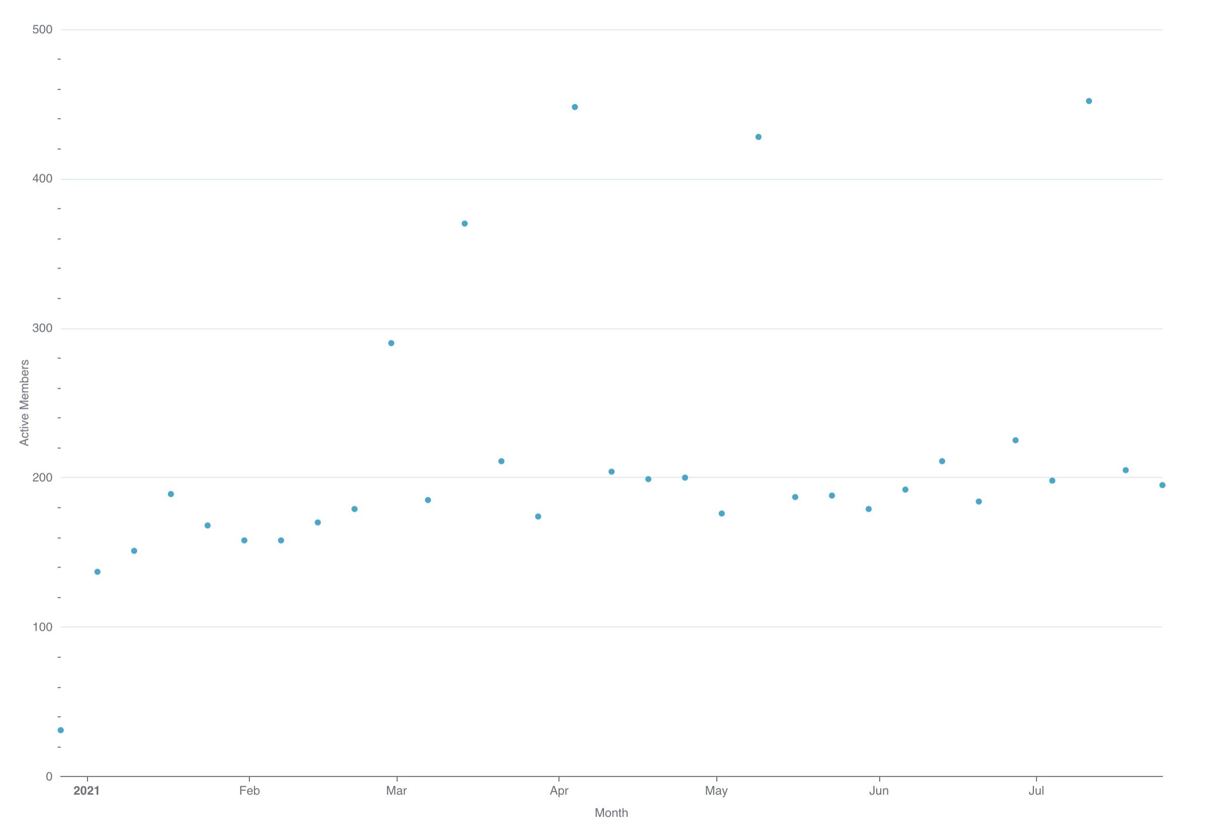
In most cases, time-series bar charts may be better fits for showcasing individual values varying over time. In their current form, time-series scatter plots are one of the least useful charts in this list.
While scatter plots do excel at visualizing how two variables may be correlated, you are limited in Superset currently to time-series scatter plots (where time is the x-axis, and thereforce one of the two variables every time).
Time-series Area Chart
Area charts are best used for understanding how ratios, proportions, or percentages change over time.
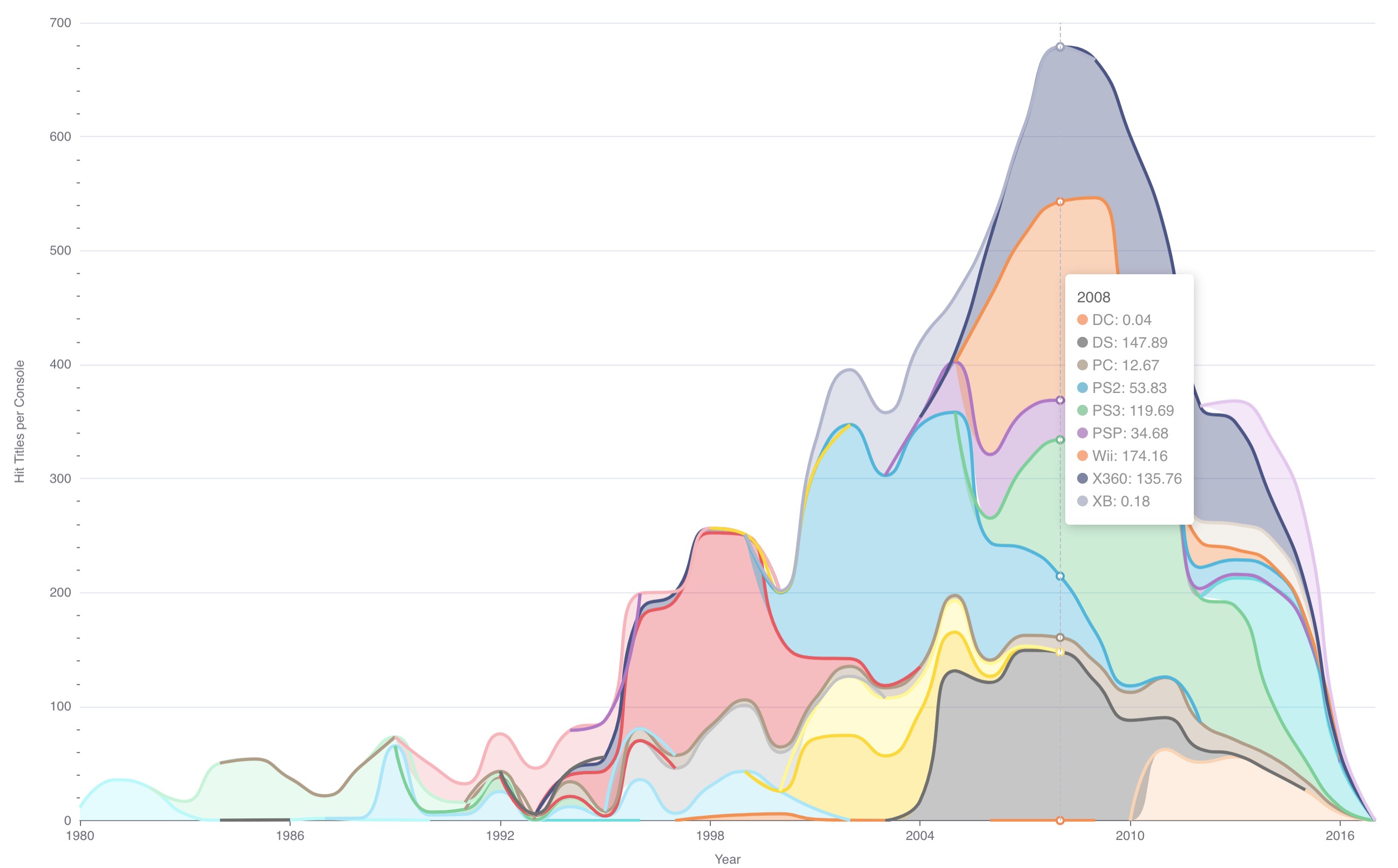
In the following example, we visualize the number of hit games (>100k sales) for each video game console over time. In this case, we aren't visualizing proportions or percentages but instead raw counts (for each console):
Time-series Smooth Line Chart
A smooth line chart is very similar to a traditional line chart but adds some smoothing for easier interpretation. Here's what a traditional line chart looks like for monthly members joining a community:

Here's the same data visualized using a smooth line chart instead:

A smooth line chart seeks to de-emphasize the daily, weekly, monthly, etc changes by (literally) smoothing out the line.
Time-series Stepped Line Chart
The flip side of a smooth line chart is a stepped line chart. A stepped line chart aims to emphasize the rate of change between time bins. As indicated by the name, each data point is connected using a right-angle "step" containing vertical and a horizontal line fragments.
Here's the same chart from the last section visualized using a stepped line chart:

This chart is less useful as a stepped chart. In general, stepped line charts have specific use cases.
For example, we may want to emphasize the time periods when the number of active user spiked and dipped:

Mixed Time-series Chart
Mixed timeseries charts let you mix multiple timeseries objects in a single visualization. Currently, this chart type requires two queries that each map to their own timeseries object.
In the following simple example, we mix the following charts:
- Line chart for current number of members in a community
- Bar chart for daily active members in a community

You can add more intricacy to each chart by specifying multiple metrics or selecting a column to group by. In the following example, we add a secondary metric to the bar chart that adds information on the number of daily members posting messages (subset of daily active members)

Mixed time series charts are useful when:
- Visualizing related metrics (with somewhat similar ranges) along the same time scale (stock prices of two different companies)
- Visualizing raw numbers as bar charts and rolling averages as line charts (weekly active users as line chart, daily active users as bar chart)
- Visualizing cascading subsets of data (weekly active users, daily active users, daily members posting messages)
To take the next step, check out our deep dive tutorial on the Mixed Time-Series chart
