


Cross-Filtering in Apache Superset and Preset: Explore Every Angle


Enabling self-serve analytics is critical for companies that want to scale data-driven decision-making across their organizations. While centralized data teams often prepare charts and dashboards, the consumers of the data want to zoom in on a chart element and conduct their own analyses. Cross-filtering allows individual users to interact with a chart or table and apply immediate ad-hoc filters across visualizations in the dashboard without having to set up dashboard-level filters each time.
Cross-filtering has been available through the Chart Builder (formerly known as Explore) view of Apache Superset and Preset for some time, but our recent release allows all users to readily access the cross-filtering feature in the dashboards. In Preset, users with any workspace role, including Viewer and Dashboard Viewer, can immediately use cross-filters to interact with chart elements, allowing them to get more nuances of data and explore their data from every angle.
In this blog, we’ll explain how to use cross-filters in Preset, but it works similarly in Superset.
Motivation
Before the recent update, cross-filtering was controlled by manually marking a checkbox on each chart, putting the burden on the chart builders. This means that the dashboard consumers with limited access permissions, such as Preset users with Viewer workspace role, could not self-explore their data and visualizations without manual enablement by their colleagues first.
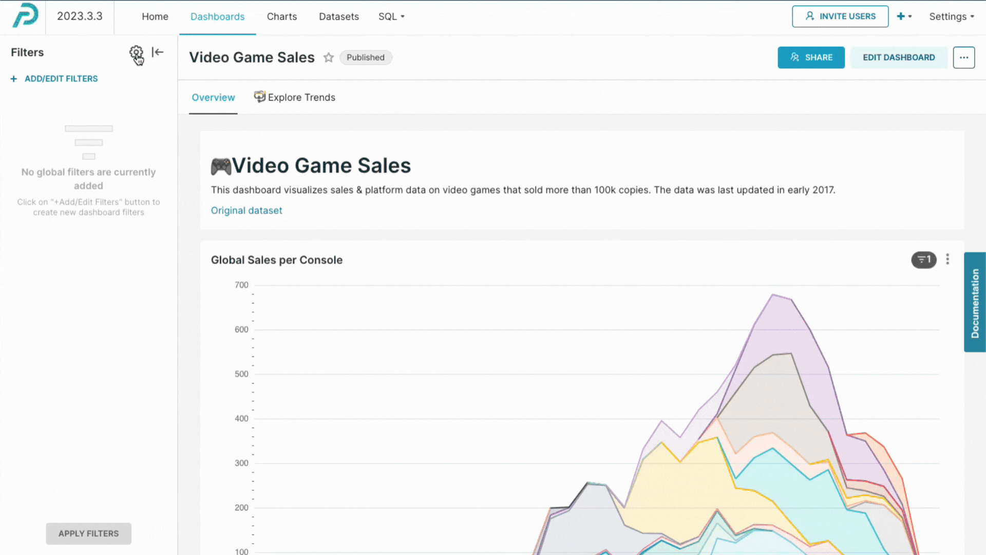
Using cross-filters in Superset and Preset dashboards
Eligible charts
Today, cross-filtering can be used on the following chart types:
- All charts built with ECharts
- All types of time series charts
- Pivot table charts
- Table charts
- Graph charts
- World maps
Applying cross-filters
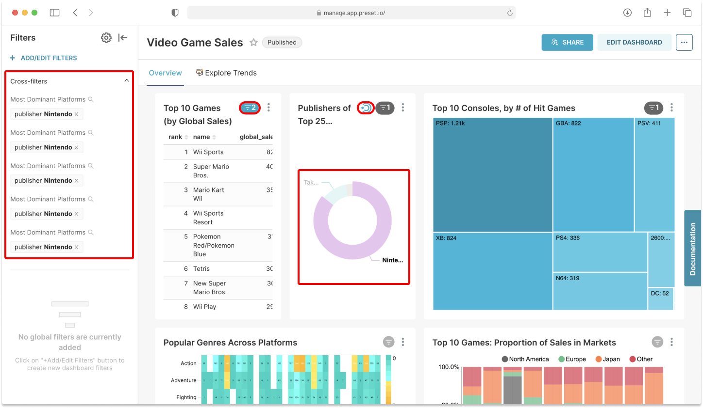
To use cross-filters, open your dashboard and pick a chart or a table you want to filter down. Clicking on a chart or a table element automatically applies cross-filters to compatible visualizations in the dashboard.
In the below example, we applied cross-filtering of “publisher: Nintendo” from a pie chart. You can see that the compatible visualizations reflect the filtered-down datasets (e.g., the table chart on the left of the pie chart). You can also clearly see the active filters through the filter indicators, where the “blue colored indicator” means a cross-filter was applied, and the “double-ringed circle with an arrow” indicator means a cross-filter was emitted from the chart.
It’s also possible to see which filters are active in the horizontal or vertical filter bar.
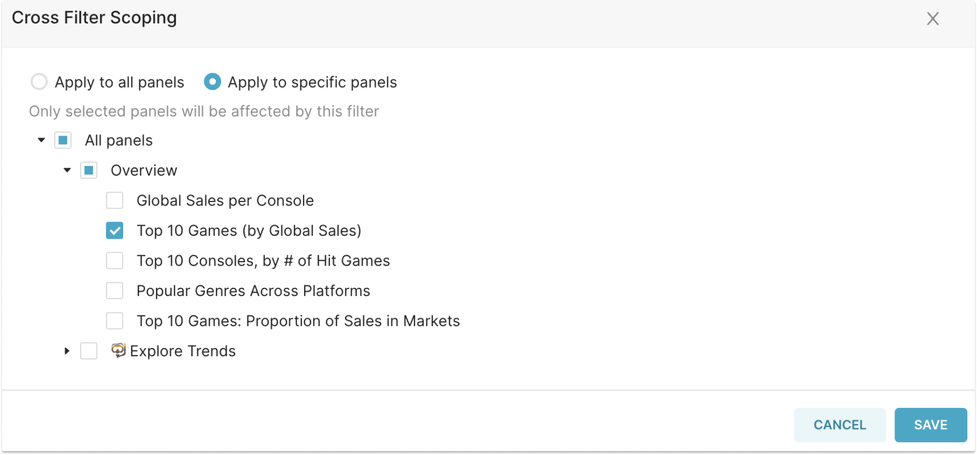
Scoping cross-filters
By default, you will see that the same filters are applied to all other compatible visualizations in the dashboard. If you want to apply a filter to specific visualizations, select “Apply to specific panels” from the “Cross Filter Scoping” option and define which visualizations the filter should be applied to.
Disabling cross-filters
In some situations, you may want to restrict dashboard consumers from applying cross-filters (e.g., when embedding dashboards in customer-facing apps). Dashboard creators can easily disable cross-filtering by unchecking the cross-filtering option in the dashboard filter bar.
Try it yourself!
Cross-filtering is available in the open-source Superset and is included in all Preset subscription plans. Log into Preset, or sign up for a free account to create your first dashboard!
