Nine New ECharts And Apache Superset Visualizations
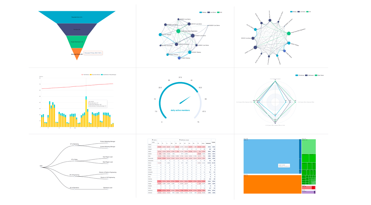
A few months ago, I wrote about why the Apache Superset contributor community was betting on Apache ECharts. Since then, a number of charts built on top of ECharts have found its way into the out-of-the-box charts that ship with Superset:
- Funnel Chart
- Force Directed Graph Chart
- Circular Graph Chart
- Mixed Timeseries Chart
- Gauge Chart
- Radar Chart
- Tree Chart
- Pivot Table v2
- Tree Map v2
All of these chart types are already available in Preset Cloud, as our team deploys Superset from source that's very close to bleeding edge `master.
You will also see these charts if you're running the bleeding edge master branch of the Superset source code.
If you want a more stable and reliable Superset release, most of these charts will make its way into the Superset 1.2 release. This release is currently being voted on.
In this post, I'll provide an overview of each chart type.
Funnel Chart
Funnel charts are extremely common in sales, marketing, product, and operations teams. Here's an example of a sales funnel, visualized using this chart:
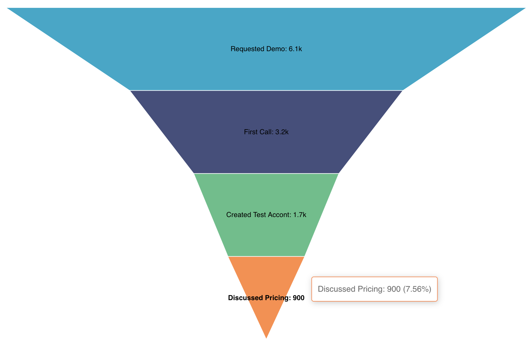
A funnel chart visualizes stages in a pipeline of some sort. A funnel chart is commonly used to visualize stages in a:
- Content marketing pipeline (page view -> read article -> created an account)
- Product flow (created an account -> interacted with onboarding -> completed onboarding)
If you're curious about other ways of visualizing funnels, read my other post on effective funnel visualizations.
Force Directed Graph Chart
The graph chart visualization in Superset lets you visualize many-to-many relationships that would be difficult using traditional plots.
In the following example, we visualize how attendees "flow" from one event to another.
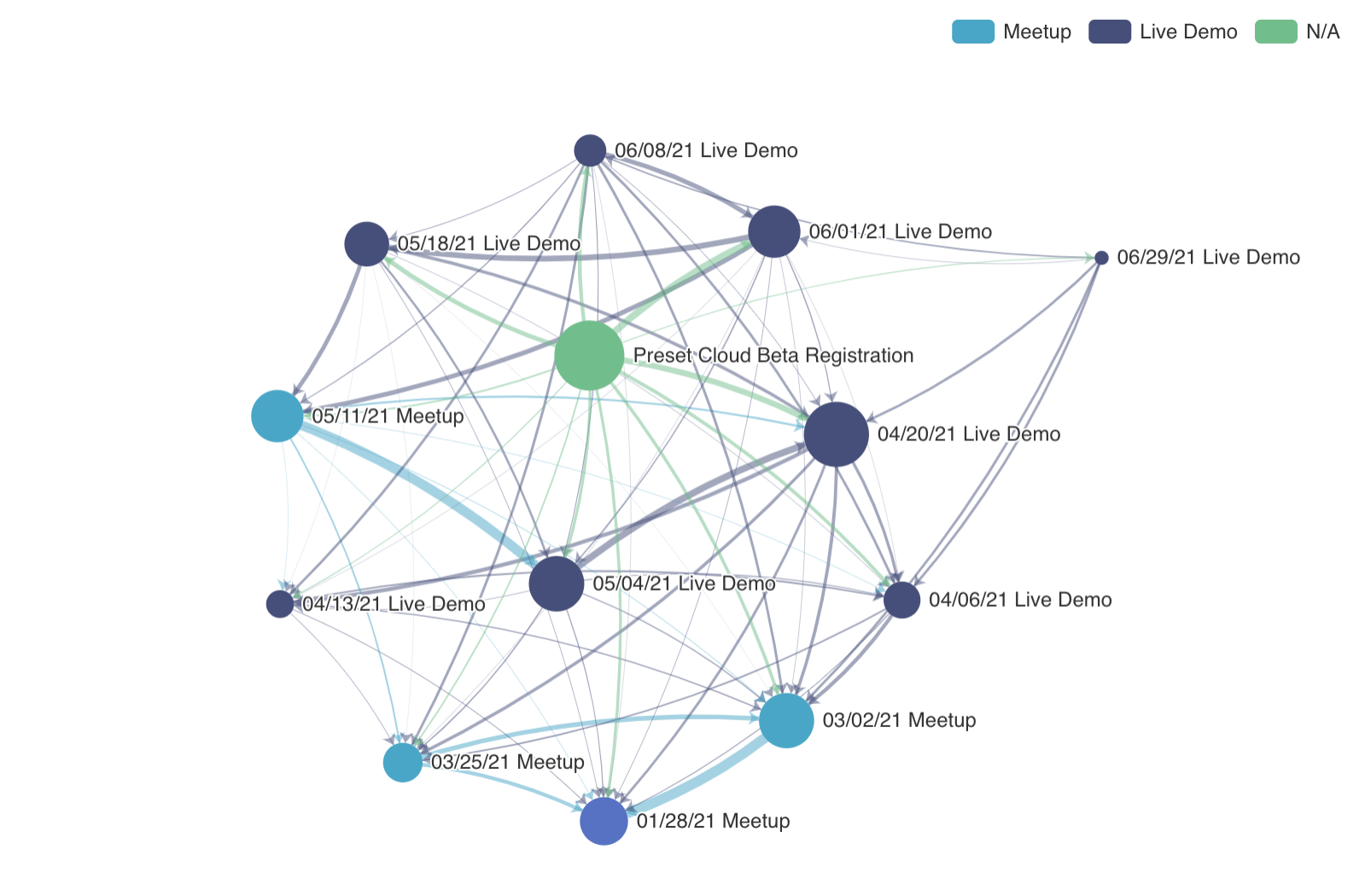
Here's a list of the different pieces of information that are encoded in this chart.
- The nodes (circles) represent a given event
- The size of the nodes (area of each circle) represents the number of attendees at that event
- The arrows represent links between nodes.
- The start of the arrow represents the previous event a person attended and the end of the arrow represents the next event they attended.
- The color of each node represents the event type (Meetup, Live Demo, or N/A)
The hover state in a force directed graph below specifically shows the distribution of the last event and the next event that attendees of the 06/01/21 Live Demo went to.
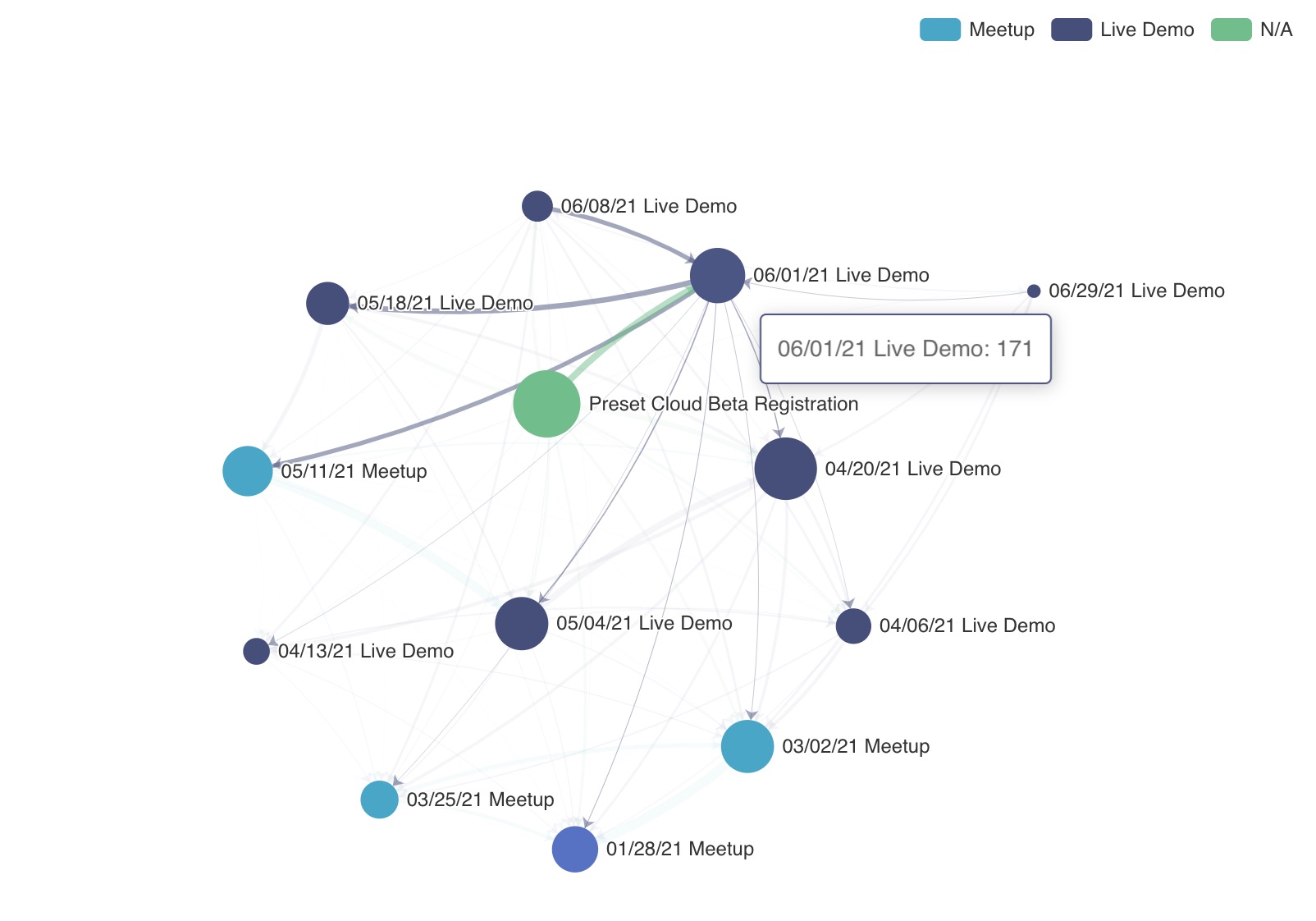
Graph charts in Superset have extensive customization options, tucked under the Customize tab.
Circular Graph Chart
One key customization you can make to a force directed graph is switching to a circular graph:

The hover state in the circular graph above lets you visualize one way flow from an event:
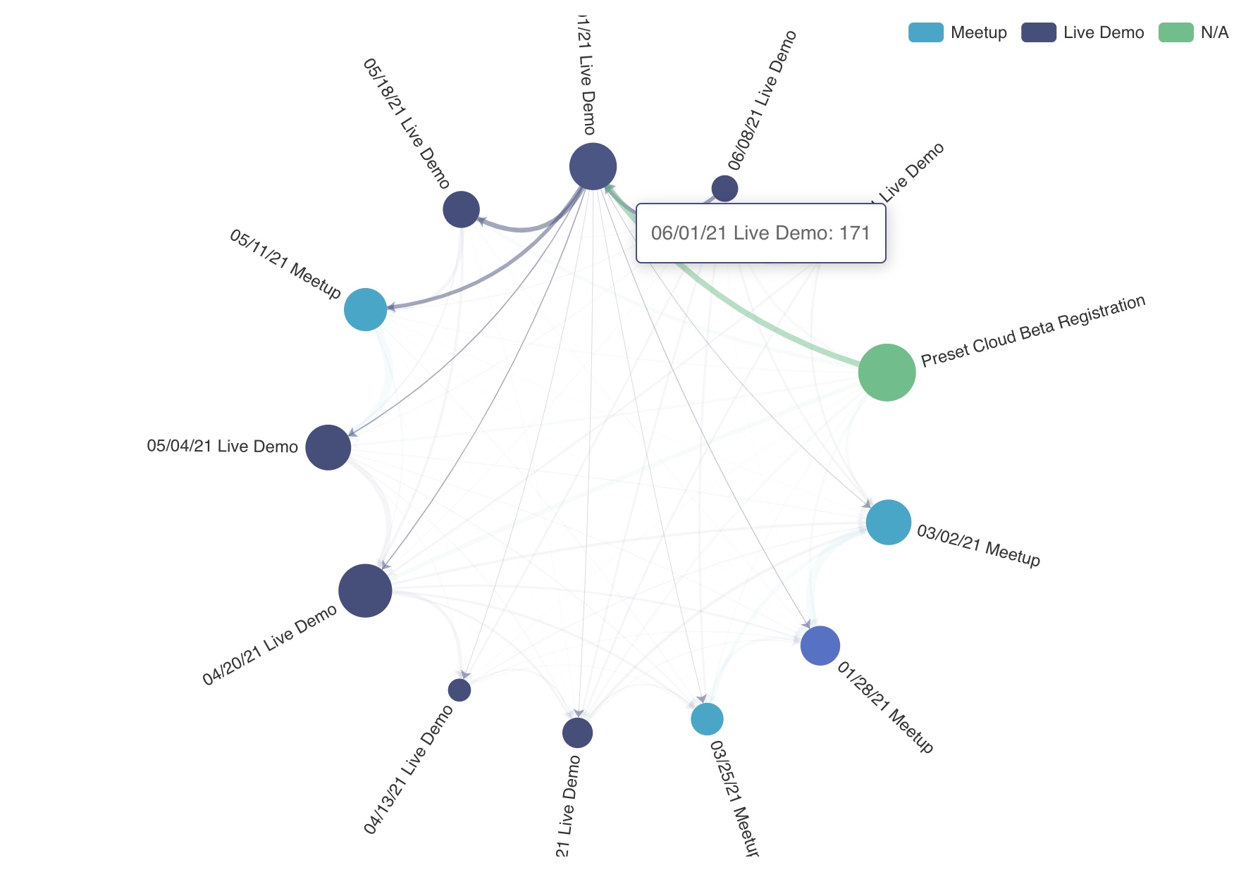
Graph charts are incredibly powerful! You can not only encode many layers of information but let end-users interrogate the data further by hovering over specific nodes and links.
But with great power comes great responsibility! Keep your audience in mind when choosing a graph chart. Here are some helpful points of consideration when thinking about graph charts:
- Graph charts are useful when building an exploratory (or analytical) dashboard, where you really want to enable end-users to go deep and spend lots of time exploring the data.
- Avoid using graph charts in KPI (or strategic) dashboards, because they can overwhelm end-users who want a high level picture
- Graph charts are ideal at highlighting outliers when visualizing a large number of many-to-many relationships (e.g. previous event to next event)
Mixed Timeseries Chart
Mixed timeseries charts let you mix multiple timeseries objects in a single visualization. Currently, this chart type requires two queries that each map to their own timeseries object.
In the following simple example, we mix the following charts:
- Line chart for current number of members in a community
- Bar chart for daily active members in a community
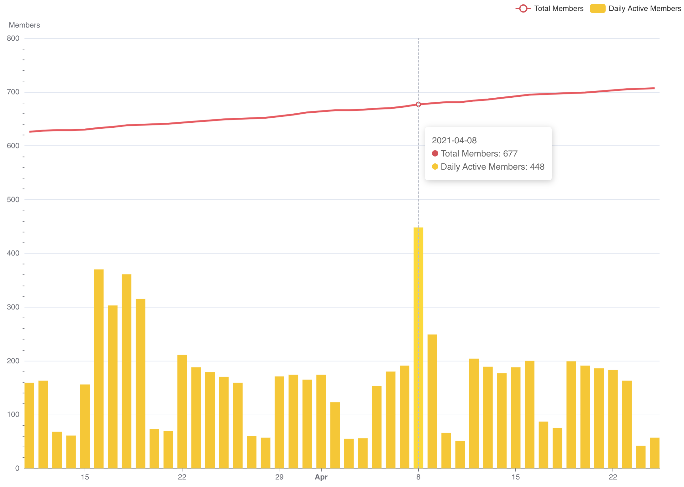
You can add more intricacy to each chart by specifying multiple metrics or selecting a column to group by. In the following example, we add a secondary metric to the bar chart that adds information on the number of daily members posting messages (subset of daily active members)
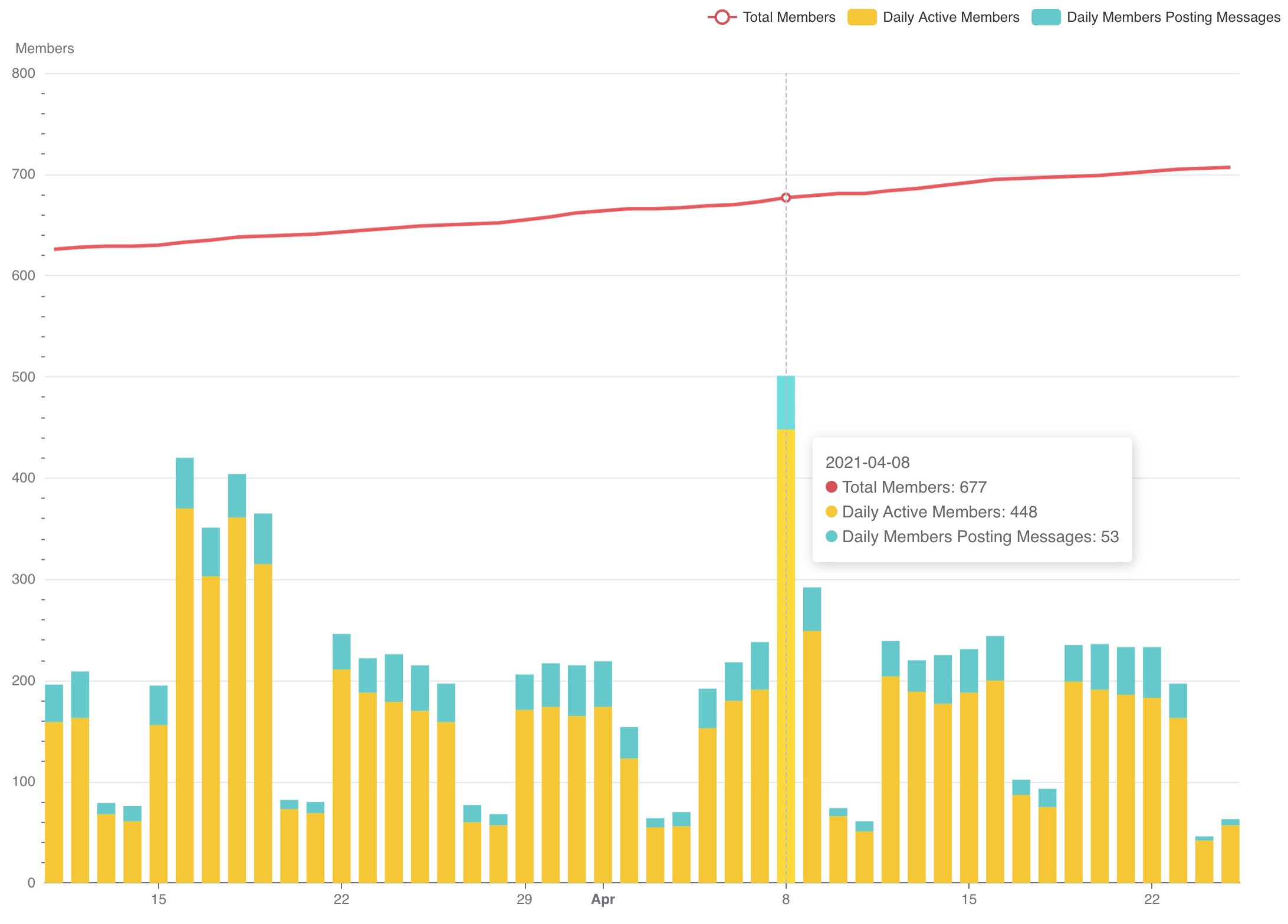
Mixed time series charts are useful when:
- Visualizing related metrics (with somewhat similar ranges) along the same time scale (stock prices of two different companies)
- Visualizing raw numbers as bar charts and rolling averages as line charts (weekly active users as line chart, daily active users as bar chart)
- Visualizing cascading subsets of data (weekly active users, daily active users, daily members posting messages)
To take the next step, check out our deep dive tutorial on the Mixed Time-Series chart
Gauge Chart
This chart type re-uses gauges from the scientific and industrial setting to showcase partial progress towards a specific number. They're also often referred to as speedometer charts (in references to dashboards in cars) or dial charts.
In the following example, the gauge chart visualizes the current average number (53) of daily active members from the previous quarter and the progress towards the goal (75):
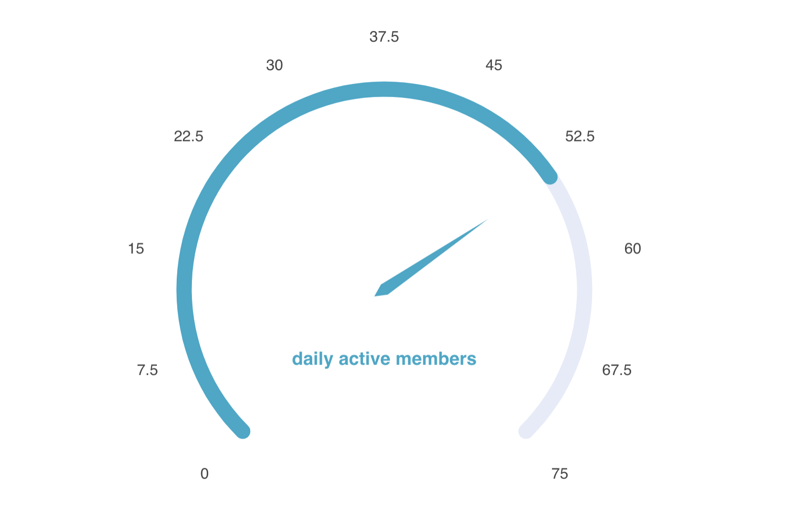
Gauge charts are simple, easy-to-understand charts that visualize one value at a time.
- They shine in KPI (or strategic) dashboards over a standard big number chart, where you want to succinctly communicate the progress towards a goal or KPI of interest (instead of just the metric itself).
Radar Chart
A radar chart lets you visualize a parallel set of metrics across multiple groups or categories. Radar charts are a very unique chart type and we'll start by presenting a concrete example to wrap your head around it.
The following example visualizes the following four metrics from three different promotional marketing campaigns:
- Number of Users Emailed
- Number of Users Who Opened Offer
- Number of Users Who Added Offer to Cart
- Number of Users Who Claimed Offer
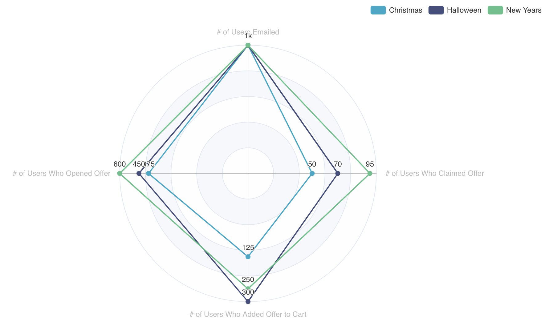
You may have noticed that these metrics resemble a funnel, starting from emailing users to a subset of those users claiming the offer. Visualizing parallel funnels is definitely a use case for this chart.
If you have many group-by categories and metrics you're visualizing, the complexity of a radar chart can easily become unwieldy for some chart consumers. Here's a more complex example that visualizes max monthly temperatures for six hypothetical cities:
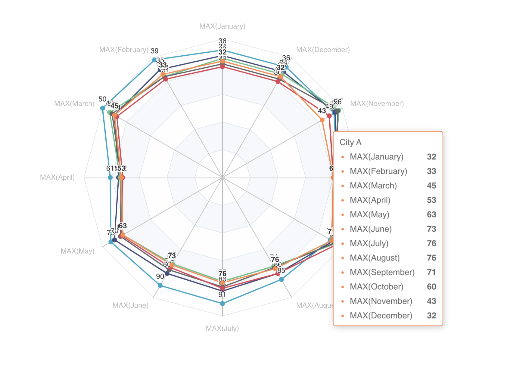
Radar charts work best in exploratory (or analytical) dashboards, where you want to empower your dashboard consumer to dive deeper into the data by hovering.
Tree Chart
A tree chart excels at visualizing hierarchy. In the following example, a people operations team visualizes the management tree structure in their organization:
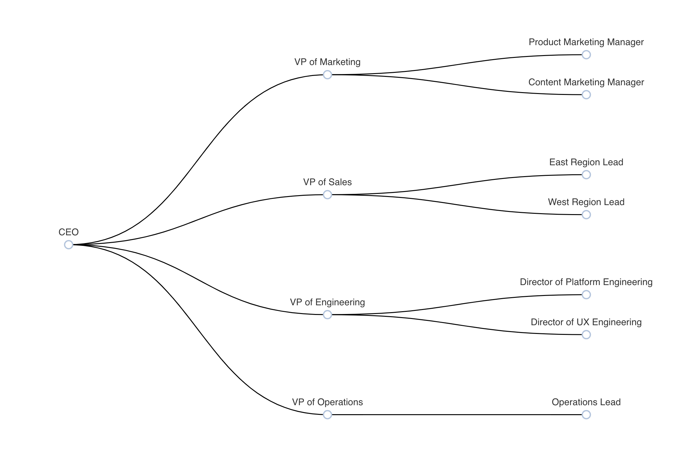
Under the hood, ECharts uses a graph-like structure, with nodes and child nodes, to represent the data. This means that to use this chart, you'll need to format the tree chart's node and child values in a single table.
Tree charts in Superset aren't super useful at visualizing quantitative data. You can include a metric for each node that's shown upon hover:
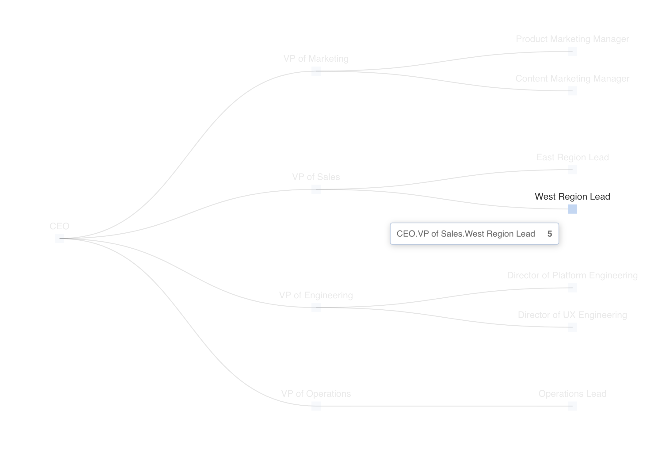
You can also customize your tree chart to take on a radial layout instead:
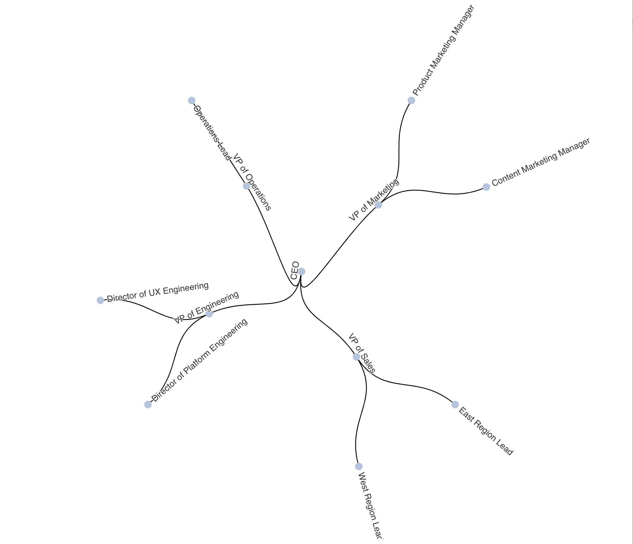
Tree charts are useful for:
- Informational reference - context around the structure of an organization or process
- Decision support - Visualizing possible path forwards and the considerations for powering a decision
Pivot Table v2
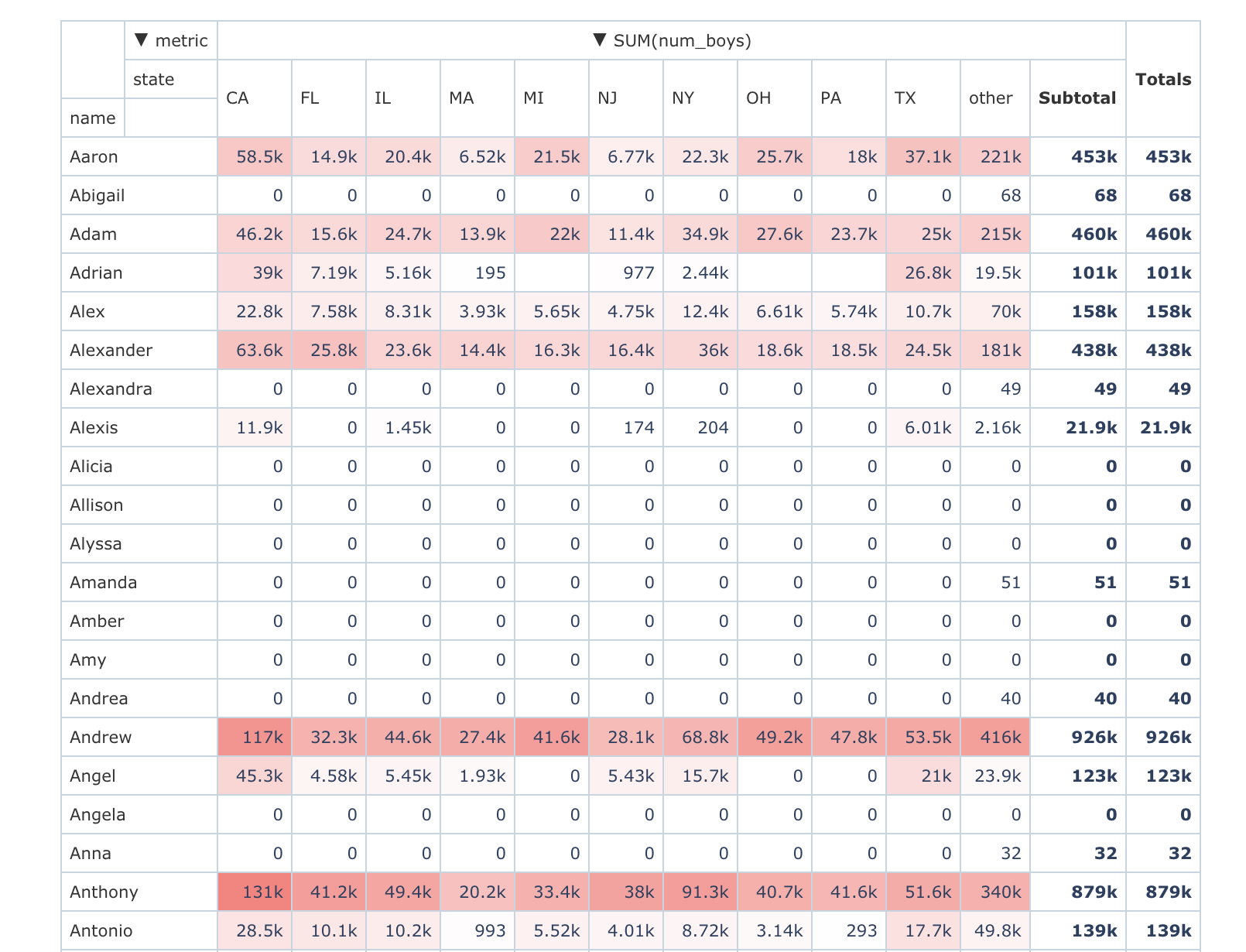
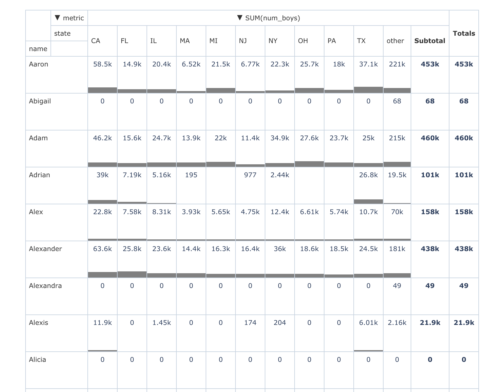
Superset now has a redesigned pivot table that greatly enhances it's capabilities. In addition to the classic pivoting of rows and columns, you can now enable heatmap and bar chart visualizations within the pivot table itself.
Here's an example of a pivot table of popular male baby names in the United States that uses column oriented heatmap coloring:
In the Customize tab, you can easily change the cell level visualization from a heatmap to a bar chart:
Tree Map v2
Last but not least, the tree map chart has been redesigned to better handle visualizing counts from m by n categories.
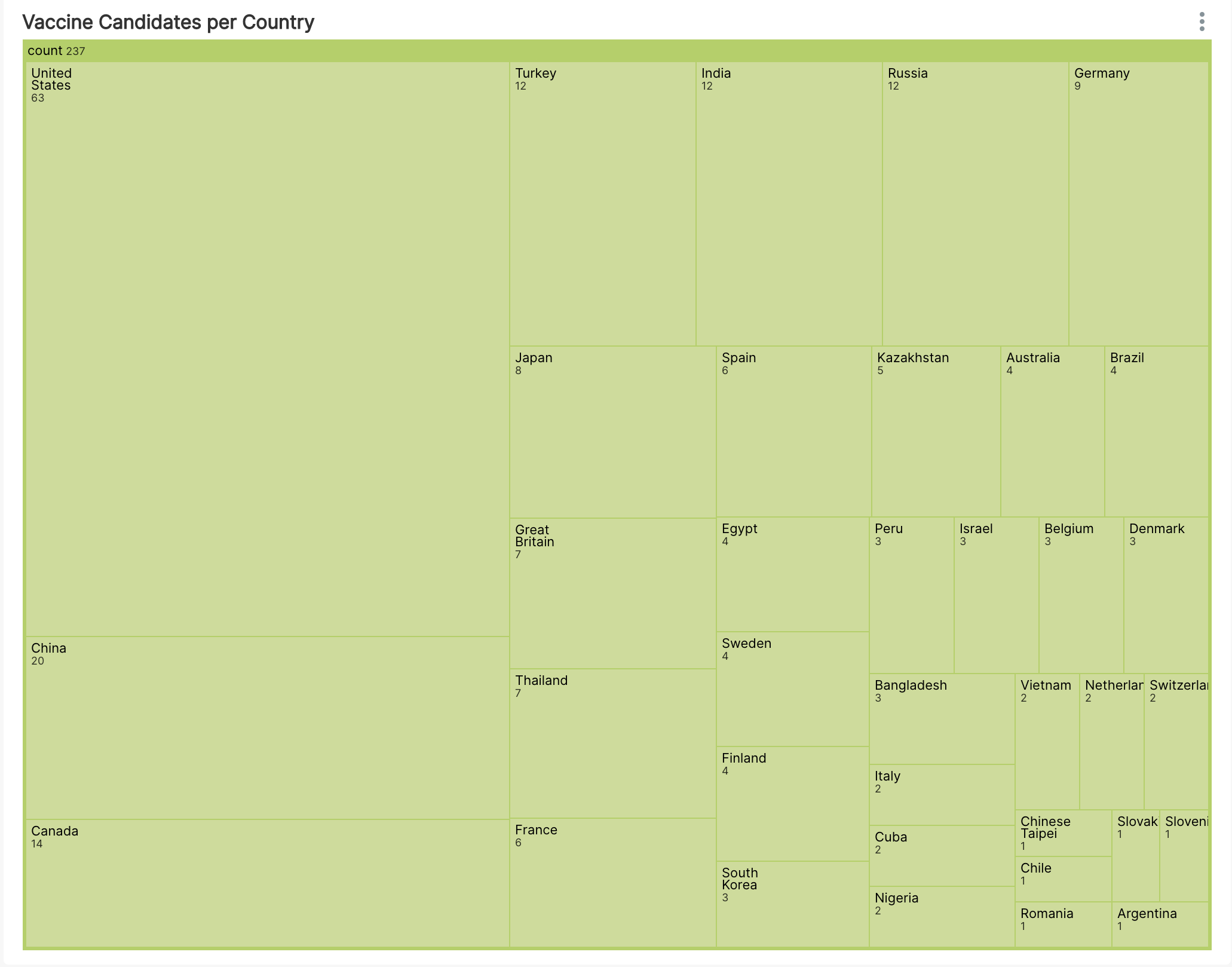
You can nest the categories in a tree map, and the v2 version handles this much more effectively!
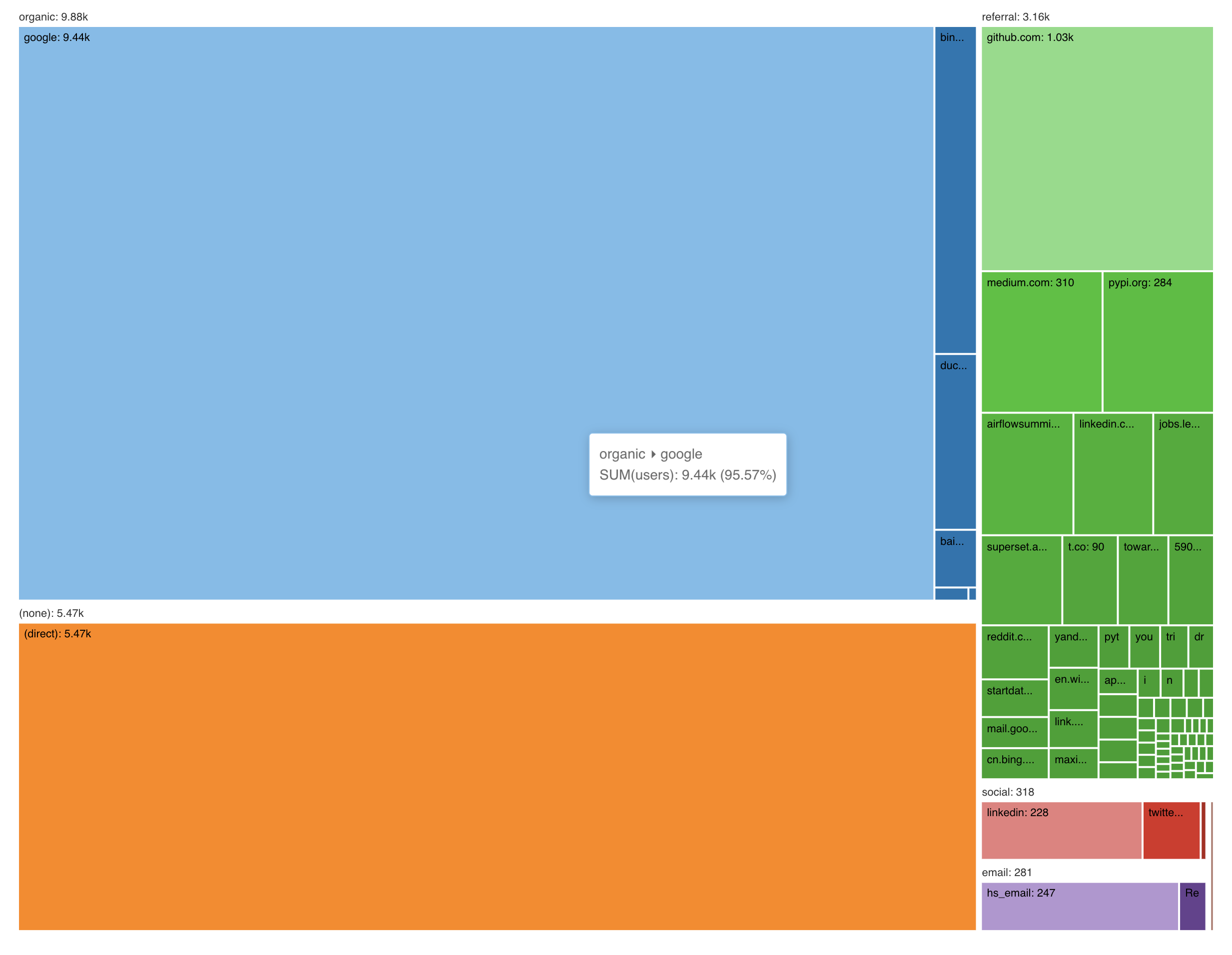
Use a tree map whenever you want to visualize:
- Distributions - the number of categories and the counts in each category
- Hierarchical counts - nested tree maps help you visualize counts / values in m by n categories
Next Steps
If you're a Preset Cloud customer, these chart types are already available to you. I encourage you to start using them and refer our end-user documentation if you get stuck.
Superset is open source! We encourage you to share feedback by opening issues on Github or contribute fixes and enhancements yourself (learn more about contributing here).