


Better Understand Your Geospatial Data - PostGIS GeoJSON


Land doesn't vote - people do
The growing amount and complexity of data made available to businesses nowadays calls for an efficient way to interpret it. Superset geospatial data visualization allows for a simple and clear understanding of large datasets while offering an intuitive way to identify trends & patterns.
In this article, we will see how a visualization of the 2020 Presidential elections can offer a better understanding of the results. We will analyze the repartition of popular votes at the county level for both Democrats and Republicans.
To this end, we will use publicly-available data, drop it in a database, and then use Superset to manipulate and visualize the data with deck.gl.
Lastly, we will use Postgres to store our tables, as it is a well-known open source database and has a powerful geodata extension with PostGIS.
Step 1: Get the data
Download election results data
We obtained election results data from the following repository:
https://github.com/tonmcg/US_County_Level_Election_Results_08-20
The data aggregated at the county level is scraped from results published by Fox News, Politico, and the New York Times.
You can download the data from your terminal with:
wget https://raw.githubusercontent.com/tonmcg/US_County_Level_Election_Results_08-20/master/2020_US_County_Level_Presidential_Results.csv
This data includes the total number of votes by county as well as the number of votes cast for each party and the difference between them. Each county is uniquely identified by its five-digit standardized FIPS code.
In the next step, we will enrich this information with the GeoJSON data that corresponds to each FIPS.
Define spatial dimensions for county visualizations
In order to visualize the data in Superset, we need to define each county’s spatial dimensions in either a GeoJSON, a Polyline, or a Geohash format. This can be done by determining the correlation between each GeoJSON and each county’s FIPS so that we are able to enrich our results table in Superset.
Most of the time, geo datasets can be found in the form of shapefiles.
A shapefile is a vector data format used for storing data that references geographical objects. These files must be converted into a format that your database can read before it is stored and queried.
A shapefile is commonly downloaded as a single .zip file that, once unzipped, contains three mandatory files with the prefixes .shp, .dbf, and .shx:
-
.shp: Contains the geographical data, which includes points, lines, and polygons.
-
.dbf: Contains non-geographic features and attributes that describe the data.
-
.shx: Contains indices of the record sets in the .shp file for quicker lookups.
The US Census Bureau maintains several administrative boundary datasets on its page:
https://www.census.gov/geographies/mapping-files/time-series/geo/carto-boundary-file.html
...and you can download the latest available County Boundary data here:
https://www2.census.gov/geo/tiger/GENZ2018/shp/cb_2018_us_county_20m.zip
The ZIPped file includes several files, including the .shp file mentioned above.
Step 2: Load the data into the database
Your first step should be to create a Postgres database with the name geopostgres
Import election results data
Next, create a table to import the data:
CREATE TABLE results (
id SERIAL,
state_name VARCHAR(50),
county_fips VARCHAR(50),
county_name VARCHAR(50),
votes_gop INTEGER,
votes_dem INTEGER,
total_votes INTEGER,
diff INTEGER,
per_gop DOUBLE PRECISION,
per_dem DOUBLE PRECISION,
per_point_diff DOUBLE PRECISION,
PRIMARY KEY (id)
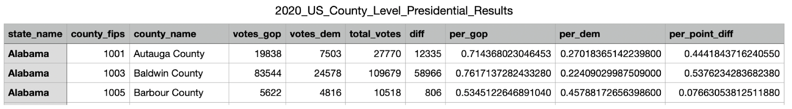
);Then populate the table from the downloaded 2020_US_County_Level_Presidential_Results.csv file:
\COPY results(state_name, county_fips, county_name, votes_gop, votes_dem, total_votes, diff, per_gop, per_dem, per_point_diff)
FROM  '<Path to your CSV>/2020_US_County_Level_Presidential_Results.csv'
DELIMITER ','
CSV HEADER;
We get the table results below:

Import county geodata
In our newly-created database, we will first create the PostGIS extension that will allow us to manipulate geospatial data:
CREATE EXTENSION postgis;Next, we need to install GDAL, which is a library used to convert shapefiles to GeoJSON.
If you're using a Mac, then you can install GDAL using Homebrew:
brew install gdal
We are now able to convert our US County shapefile cb_2018_us_county_20m.shp into a .sql file for ingestion by Postgres:
In the terminal, type:
ogr2ogr -nlt PROMOTE_TO_MULTI -f PGDump -t_srs "EPSG:4326" cb_2018_us_county_20m.sql cb_2018_us_county_20m.shpAt this stage, in your Postgres database, import the newly created .sql file using:
\i /<path to your .sql file>/cb_2018_us_county_20m.sql;
Your newly-created table now contains the following columns:
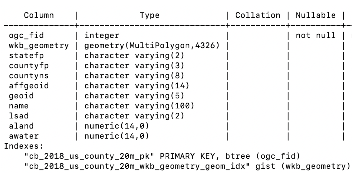
We now need two things:
-
Concatenate the
statefp(2 letters) and thecountyfp(3 letters) columns to get a corresponding column to thecounty_fips(5 letters) in ourresultstable. -
Transform the wkb_geometry column from a geometry data type to a GeoJSON data type.
The code below will provide us with a lookup table, fips_geojson, between the county FIPS and the corresponding GeoJSON data:
CREATE TABLE fips_geojson AS (
SELECT CONCAT(statefp, countyfp) AS county_fips, json_build_object(
'type', 'Polygon',
'geometry', ST_AsGeoJSON(ST_Transform((ST_DUMP(wkb_geometry)).geom::geometry(Polygon, 4326), 4326))::json)::text as geojson
FROM geocounty);
Now that we have the election results by county with their FIPS and this lookup table, we can go to Superset and import both tables, merge them, and then visualize the results.
Step 3: Build our visualization in Superset
Superset ships with the Postgres connection library out of the box.
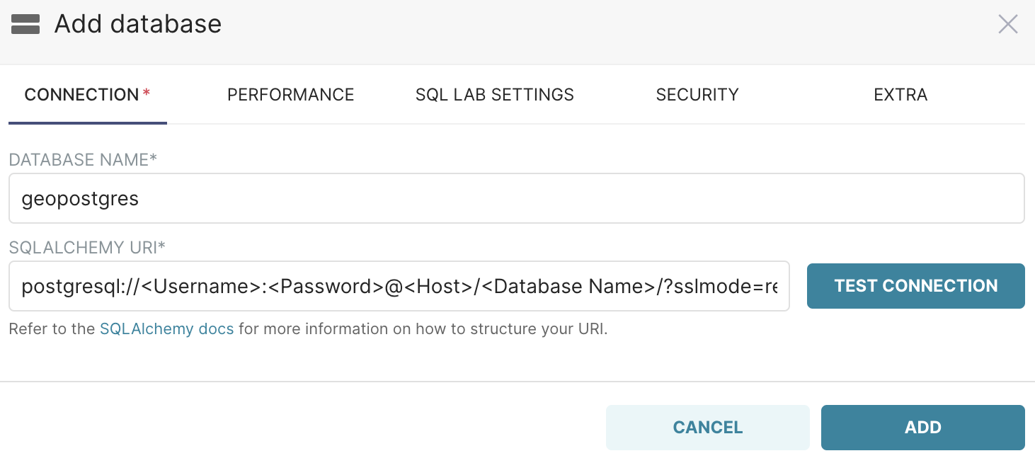
Start by adding a database with the name geopostgres and using the following SQLAlchemy URI connection string:
postgresql://<Username>:<Password>@<Host>/<Database Name>/?sslmode=require
Now you can go to the SQL Editor where we will join our tables results and fips_geojson.
On the left side, we select our database geopostgres and the schema we used to create our tables.
We can now join our data as follows:
SELECT county_name, state_name, results.county_fips,
geojson, votes_gop, votes_dem, total_votes, diff, per_gop, per_dem, per_point_diff FROM fips_geojson
JOIN results
ON fips_geojson.county_fips = results.county_fips;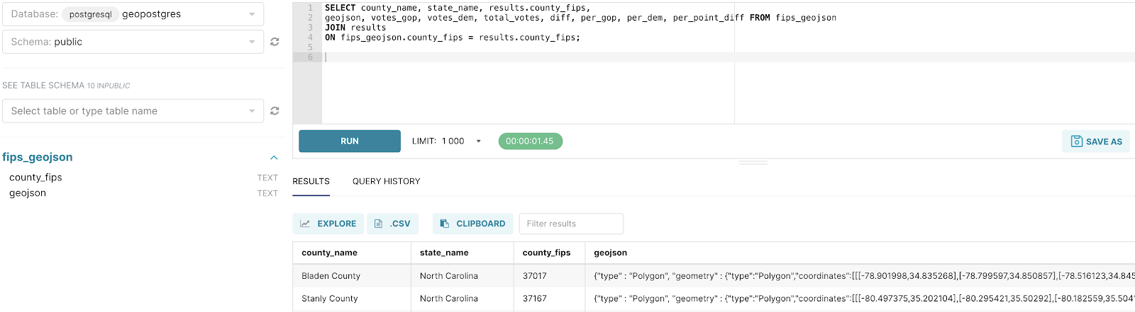
Select Explore and then save the query as a Virtual Dataset.
For the Visualization Type, select deck.gl polygon.
In the Lines Column field, select geojson and then, in the Lines Encoding field, select JSON.
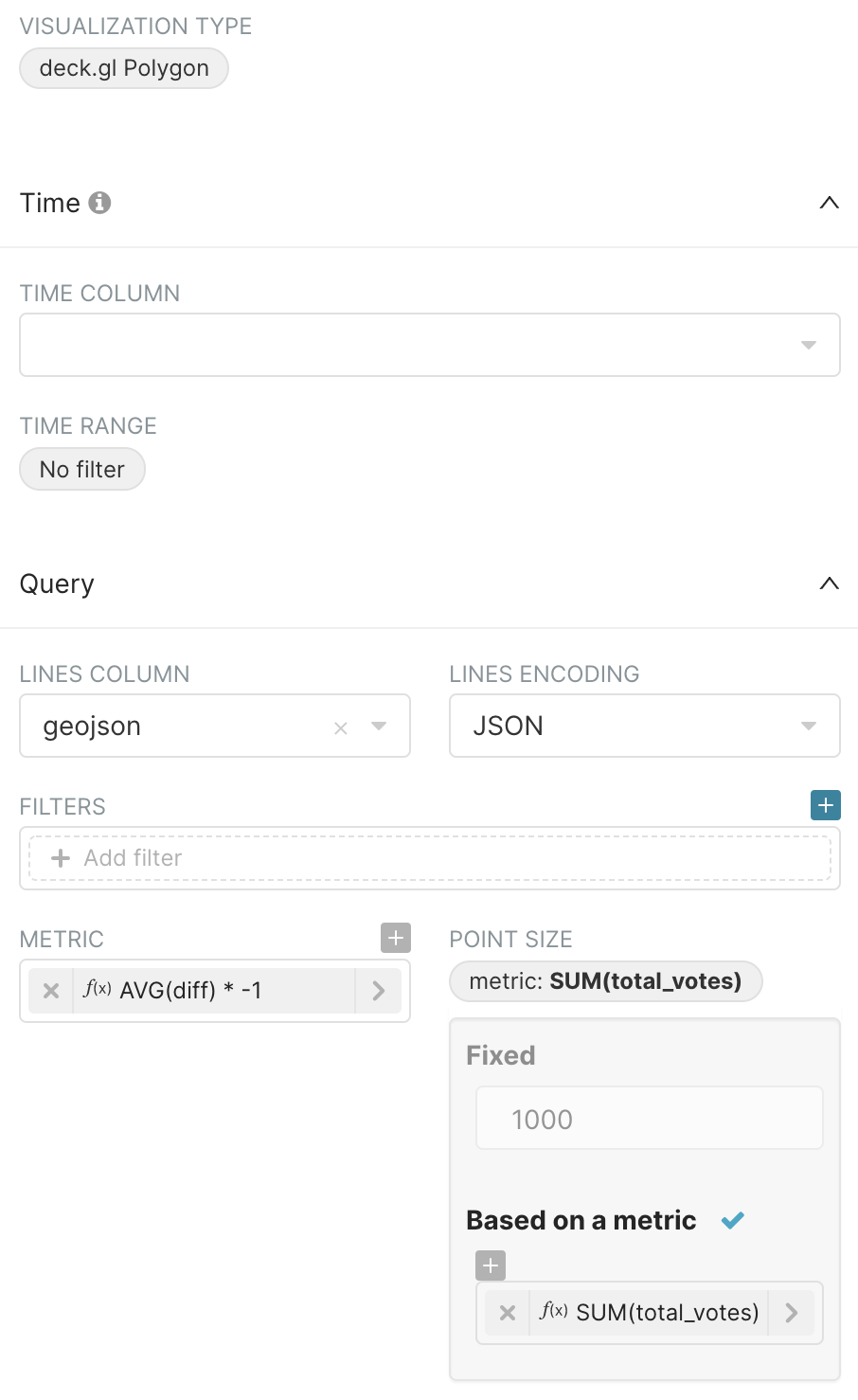
We are going to visualize two metrics:
-
The party that had the majority of votes in each county.
-
The total number of votes.
Our diff column represents the number of votes for the Republicans minus the number of votes for the Democrats.
In the Metric field, select Custom SQL and then enter: AVG(diff) * -1
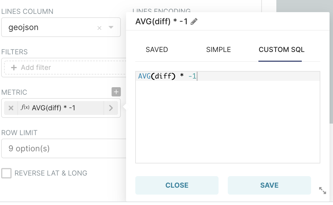
The goal is to display a red color if Republicans win (negative metric) and a blue color if Democrats win (positive metric).
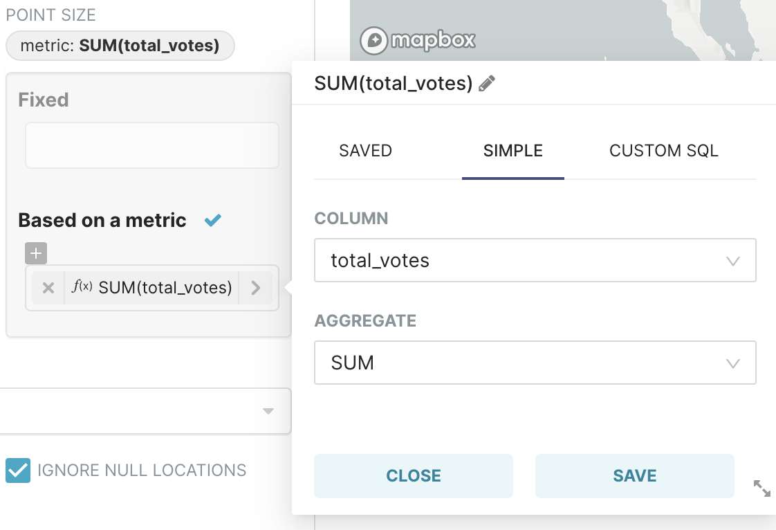
The second metric, total number of votes, can be visualized as the height of each county’s polygon. Let’s see how this is done.
In the Point Size field, select the metric SUM of total_votes — this is done by selecting total_votes in the Column field and then selecting SUM in the Aggregate field, as follows:
Lastly, let’s customize the appearance so that it conveys the data in a meaningful manner.
Select the Customize tab and adjust the parameters as follows:
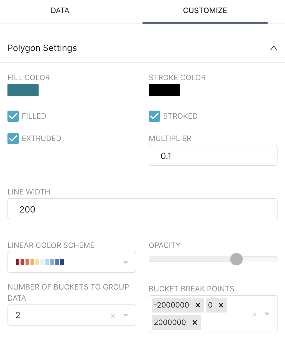
Explanation of selections:
-
The fill color option is necessary to color the map.
-
The stroked option makes geo delimitations visible and you can adjust them with the
LINE WIDTHparameter. -
The extruded option will give volume to the polygon proportional to our
SUM of total_votemetric, and you can adjust the height of the polygons with theMULTIPLIER. -
We are choosing a linear color scheme going from red to blue and dividing the results into two buckets: one between -2,000,000 and 0, and one between 0 and 2,000,000.
A negative value diff will hence be blue (Democrats) and a positive value will be red (Republicans).
Congratulations! Everything is now in place. Try running the query — you should see the following:

You can zoom in and out and modify the angle by clicking on CMD and then clicking & moving your mouse.
Conclusion
As you can see on this map, a simple flat view of the election results wouldn’t tell a complete story. The 3D chart offers some perspective: even though the majority of the land is red, you can see that the more populated areas are generally blue, giving an edge to the Democrat party.
You can also hover over counties to reveal the margin by which each party won.
If you have datasets that contain FIPS data, you can now visualize them easily by joining them with the fips_geojson lookup table we created.
If this geospatial visualization piqued your interest and you want to learn more about what we are building here at Preset, please watch for new articles here on our blog!
Special thanks to Beto Almeida at Preset for helping with this post
