


Slack Dashboard (Part 3): Cross-Channel Data Visualizations


In part 2, we learned how to:
- sync data from Slack to Postgres using Meltano
- create initial charts from the raw synced data
- start sculpting our Slack dashboard visually
In this post, we'll cover how to create some of the more advanced visualizations that require data transformation.
Visualizing Messages per Channel
First, let's visualize the popularity (using messages posted as a proxy) of different Slack channels and how that's evolved over time. An Area Chart is an excellent choice for this purpose, but is our underlying data in the right shape?
Using SQL Lab, we can quickly uncover that the 2 tables of interest for this visualization are messages and channels.
Because the messages table only maintains a foreign key reference to channel_id but not the channel name (which lives in channels), we need to join both tables to obtain the channel that each message was posted in.
-
Run the following query to do just that:
SELECT m.ts, c.name, m.text FROM tap_slack.messages m INNER JOIN tap_slack.channels c ON m.channel_id = c.id -
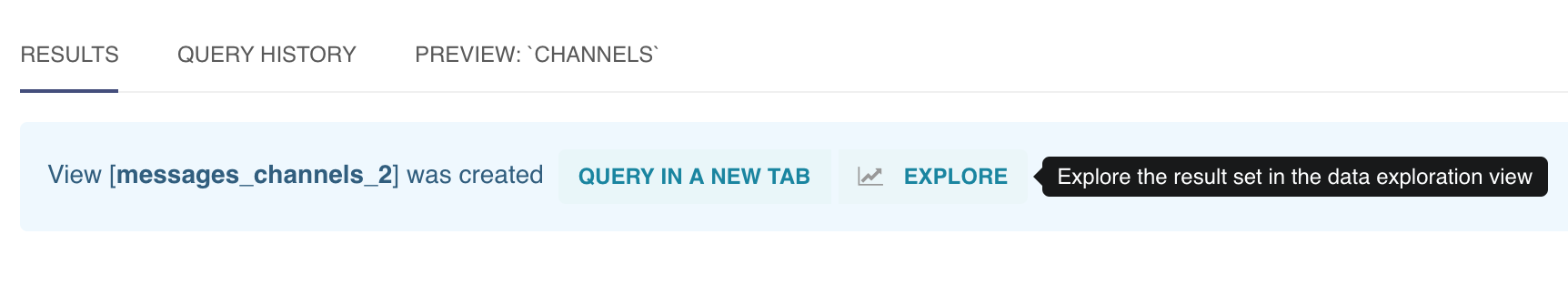
Once you've inspected the results, save it as a View by giving a name and clicking CVAS (short for Create View AS) so this data transformation is applied to all new data we sync (thereby also keeping our charts and dashboards automatically upto date).

- If the View was successfully saved, you should see the ability to activate the Explore panel using this View as the data source.
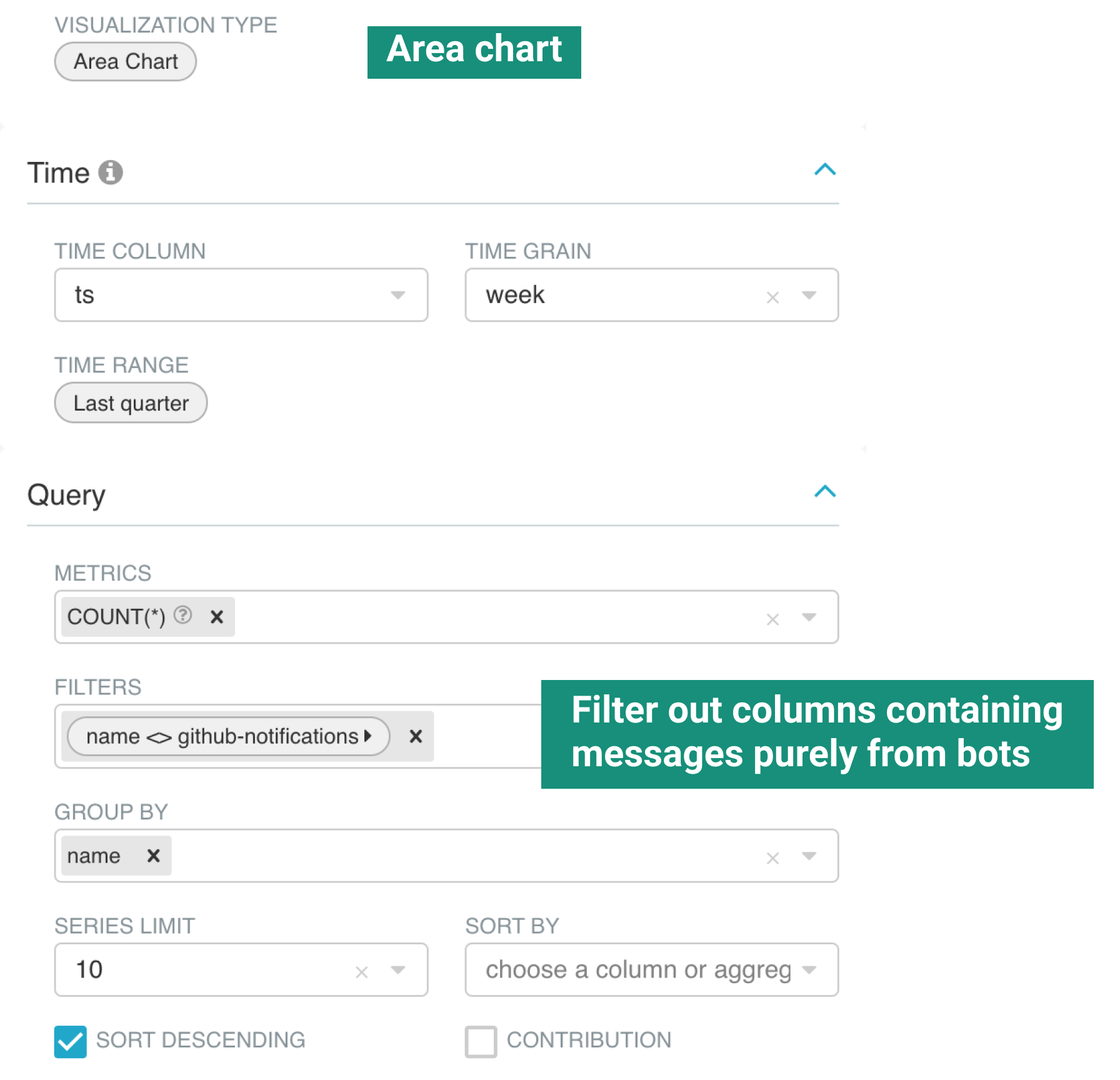
- We recommend making the following selections in the Explore panel, but feel free to be creative and experiment as well!
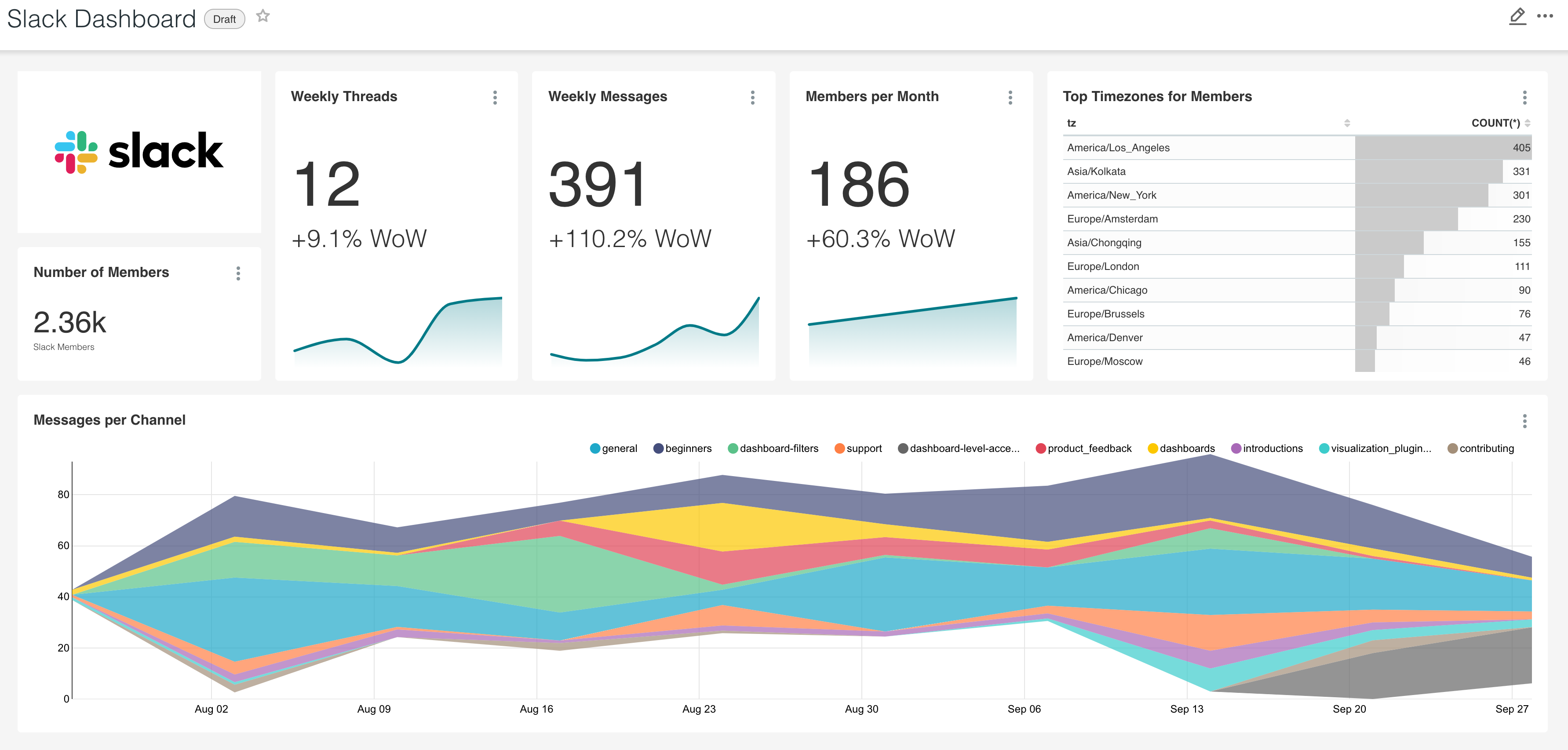
- Once you're satisfied with your chart, save it to the same dashboard from part 2 we've been sculpting.
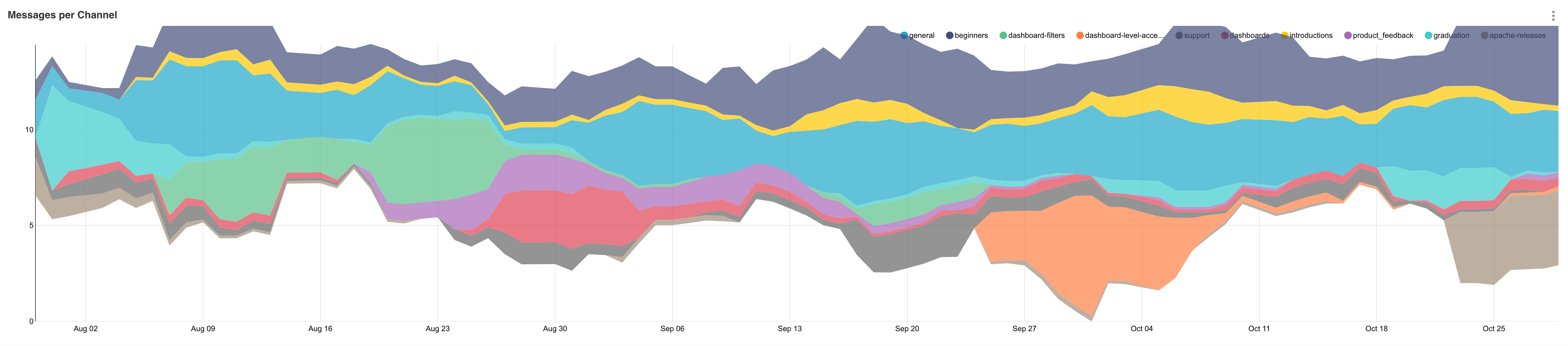
- One way to customize this visualization further is to smooth out the spikes in the data by using a rolling window. Here's what a 7 day rolling mean looks like for the same data.
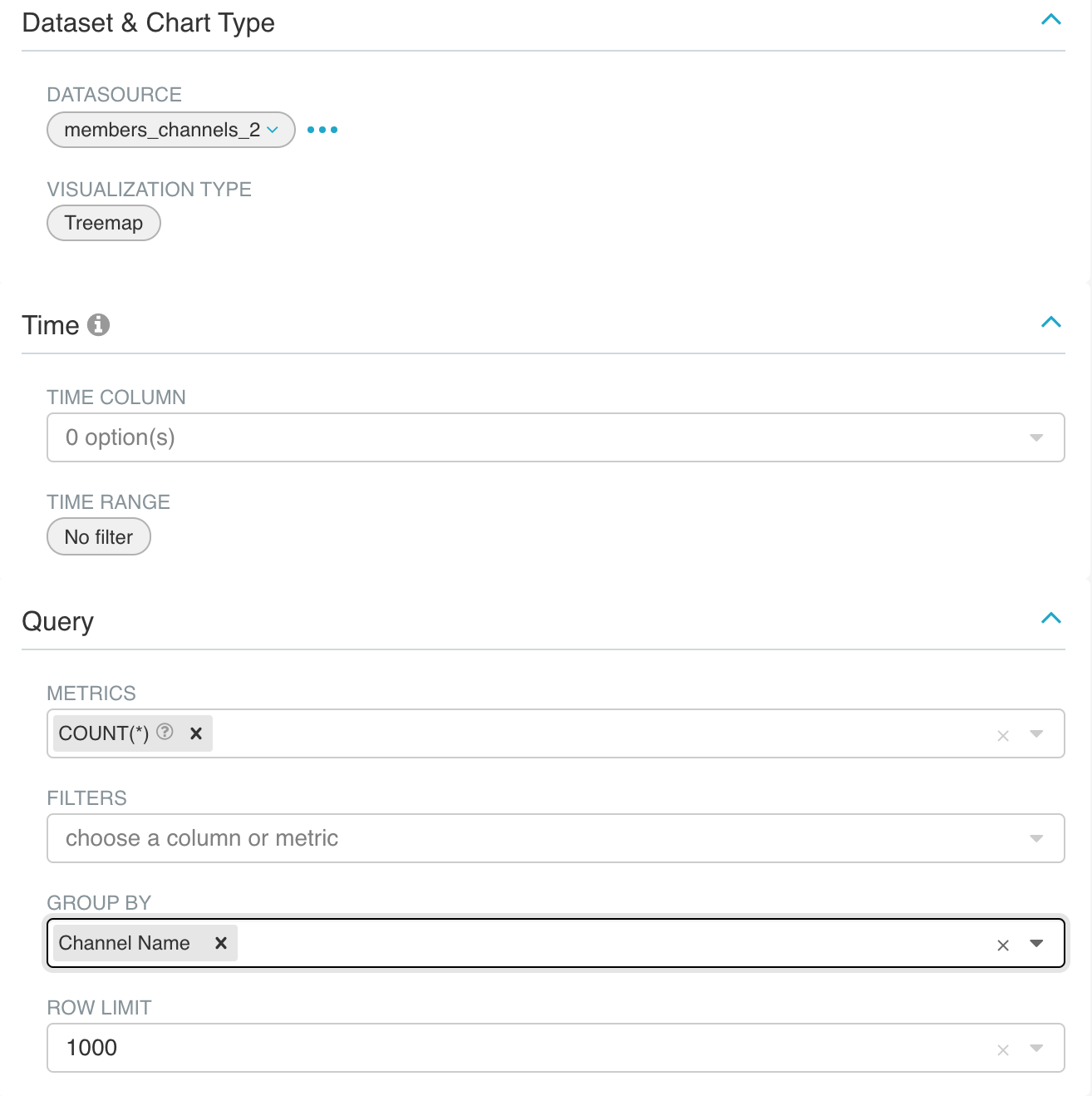
Visualizing Members per Channel
Let's visualize the members per channel to help us identify the most popular channels in the community. We'll use a Treemap, which both visually ranks the most popular channels and also helps us understand each channel's proportional share of popularity.
Every time a user in Slack joins a channel, the pairing of user_id and channel_id is stored in the join table titled channel_members. To visualize the channel names and not just the channel_id values, we'll need to join this table with channels.
-
Run the following query and use the CVAS button to save it as a view (e.g.
member_channels).SELECT c.name as "Channel Name", cm.user_id as "user_id" FROM tap_slack.channel_members cm JOIN tap_slack.channels c ON cm.channel_id = c.id -
From the results of this query, click Explore and fill out the viz panel with the following values.
- Save the chart to your dashboard and resize, organize, and re-arrange your Slack dashboard as you see fit.
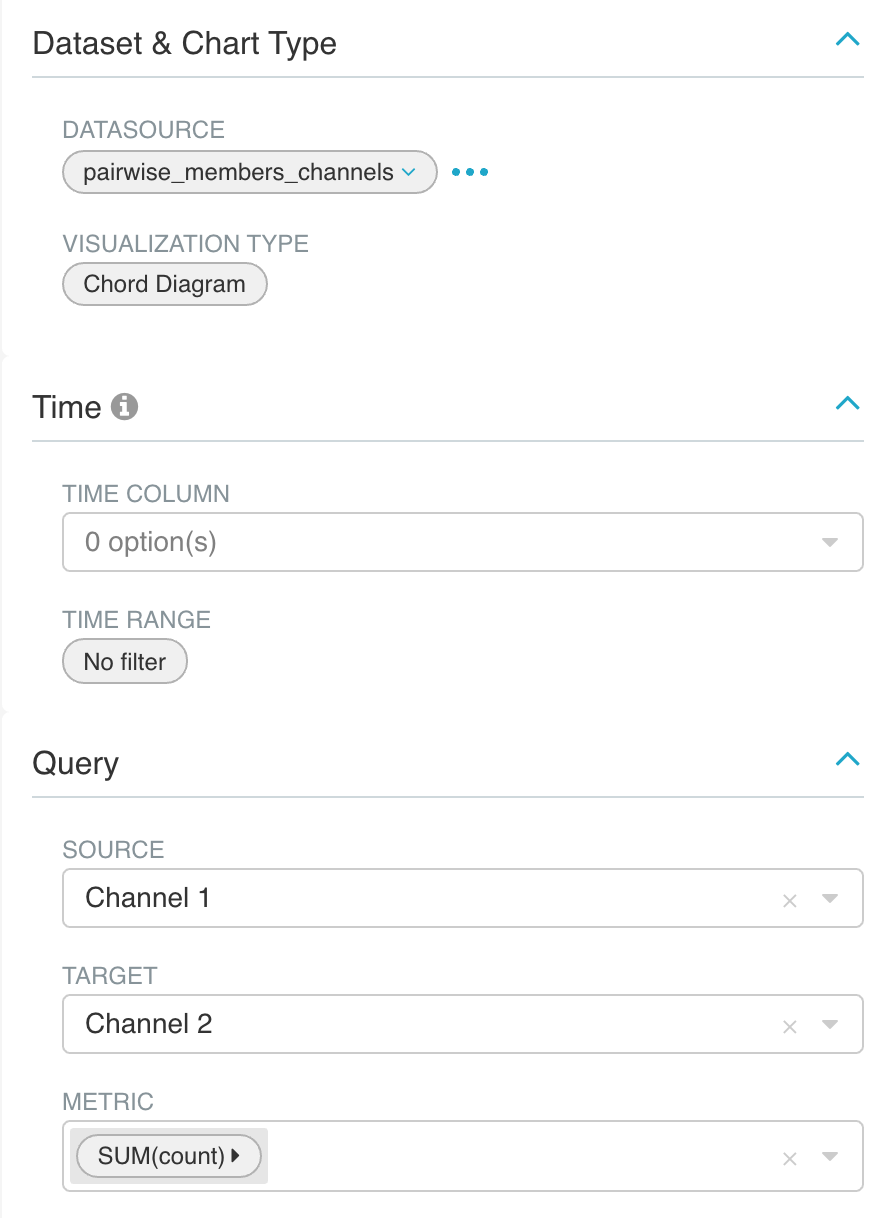
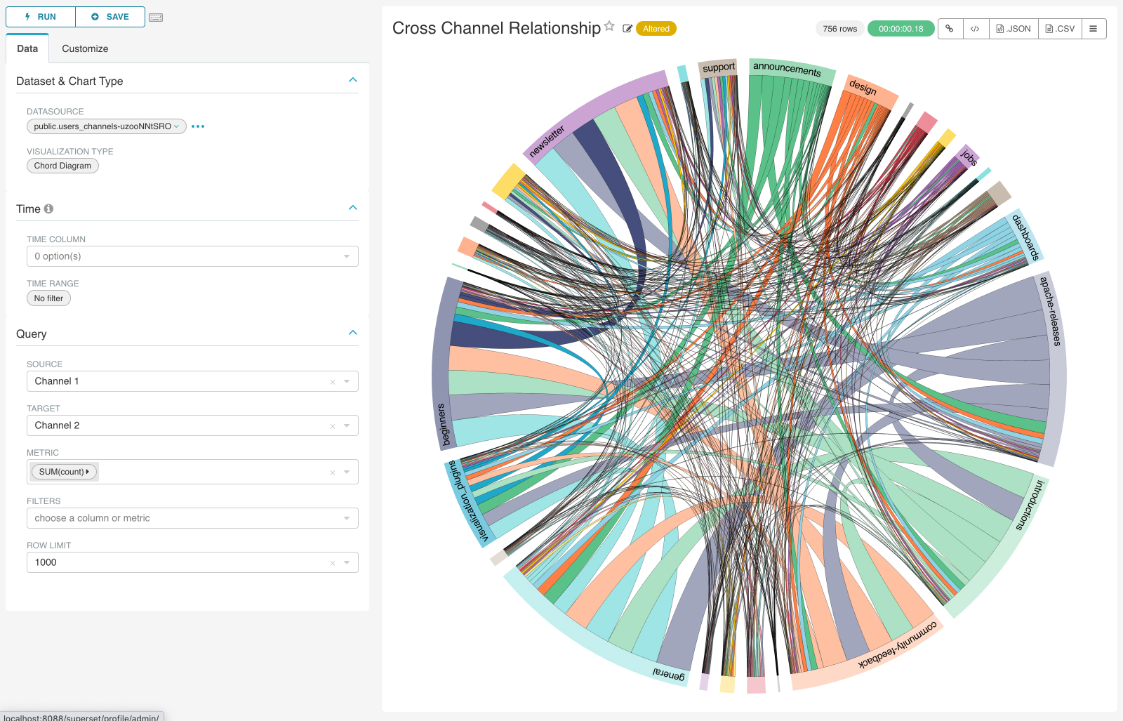
Visualizing Cross Channel Interests Using Chord Diagrams
Slack communities rarely have even distributions in popularity across all of their channels. While visualizing the most popular channels helps us understand where the community's attention is focused, we can't immediately tell the related channels that the members in these popular channels also enjoy spending time in.
To understand the latter, we'll need to create some type of cross-channel, pairwise visualization. Chord diagrams and heatmaps are 2 examples of visualizations that help us understand pairwise channel interests.
A chord diagram feels like a spool of cloth, that visualizes links each pair of channels using strands of wool. For either visualization, we'll need to prep the data using a SQL view.
-
The following query calculates all combinations of channels a member is a part of, along with the counts.
SELECT uc1.name as "Channel 1", uc2.name as "Channel 2", count(*) FROM public.members_channels uc1 JOIN public.members_channels uc2 ON uc1.user_id = uc2.user_id GROUP BY uc1.name, uc2.name HAVING uc1.name <> uc2.name -
Save this as a view, named
pairwise_members_channels. Then, launch an Explore session using this view as the data source.
- Here's what your visualization should look like.
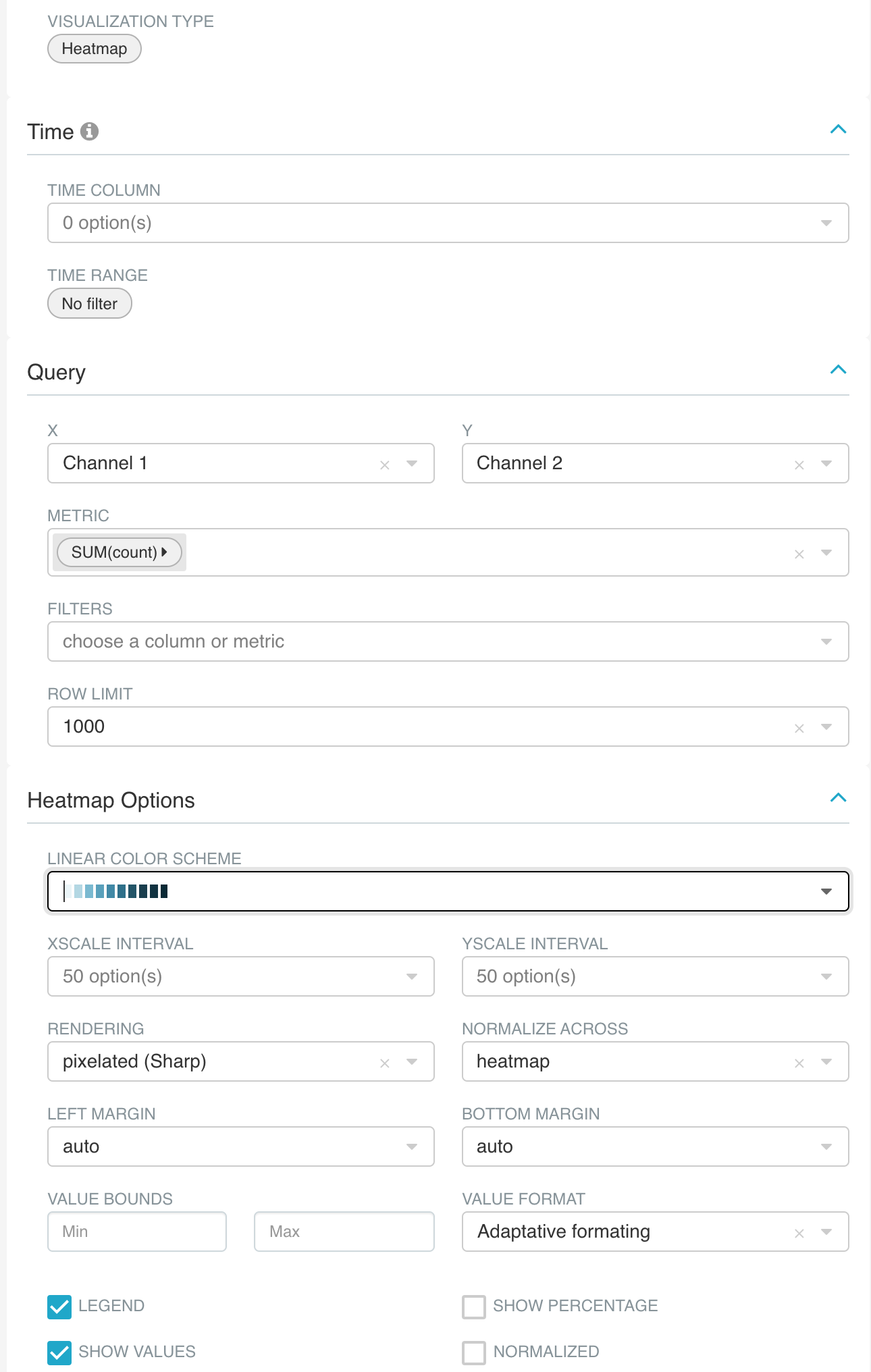
Visualizing Cross Channel Interests Using a Heatmap
While chord diagrams are aesthetically pleasing and can help us obtain a quick overview of patterns, they struggle to help us drill deeper into the pairwise relationships. We can look to the Heatmap as an alternative that trades off geometric visualization and aesthetics for instead showcasing the underlying numerical values more effectively.
Because chord diagrams and heatmap visualizations expect the same underlying data representation, it's very quick to switch from one to the other in Superset.
- Launch an Explore session using the same SQL view you created for the chord diagram.
- Set the X column to "Channel 1" and the Y column to "Channel 2" (similar to Source and Target fields from the chord diagram) and choose a Linear Color Scheme you find compelling. We also recommend enabling the Show Values checkbox.
After some re-arranging and re-sizing, here's how the charts we created in this blog post look like on our dashboard.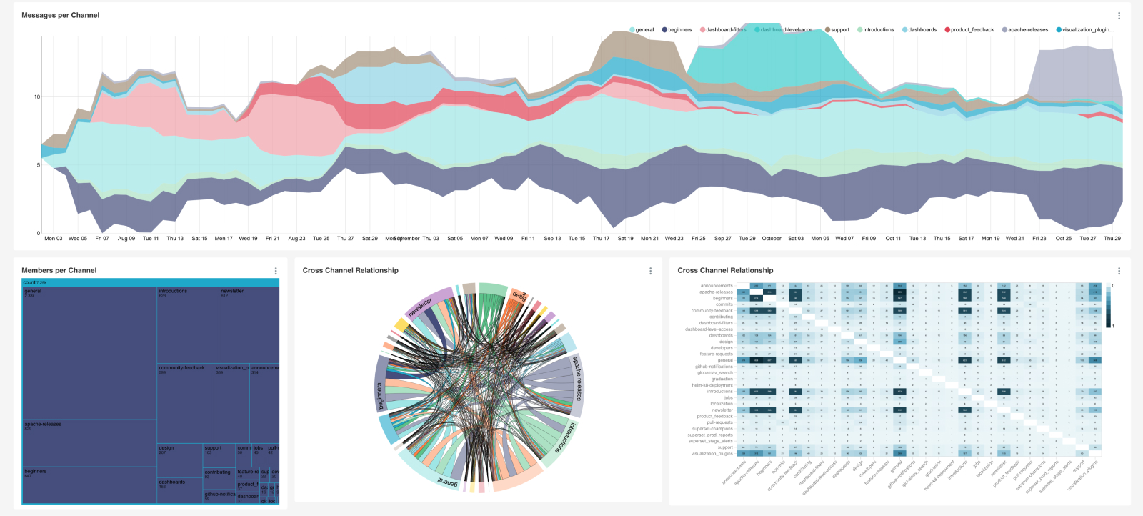
Next Steps
Here are some ideas for next steps, to take your dashboard to the next level:
- Transform the text of the messages in a channel and create a Word Cloud chart to discover the most common topics being discussed
- Create charts that visualize the distribution of the number of replies for each message and how that varies across channels, time, topics, etc.
- Add a dashboard filter to your dashboard that lets you choose specific channels you want to visualize
- Add a new Tab to your dashboard and add charts that help you discover champions in your community (e.g. users that are posting a lot of messages or answering many questions)
