Empower Your Team With Effective Funnel Data Visualizations
Funnels are everywhere. A funnel chart is a very popular model for understanding conversion, drop-off, and general performance in a business setting. Sales teams think about their prospects using a sales funnel chart. Marketing and product teams think about signup and activation funnels.
Visualizing these funnels effectively and making them available to your team can be a powerful way to build shared context, obtain buy-in and ownership, and encourage follow-up discussion. Compared to other common techniques like storytelling (e.g. customer lifecycle journey) and metric setting (e.g. OKR's), funnel visualizations are an underrated and under-utilized technique for building team alignment.
In this post, we want to help you choose the right visualization for the goals at hand, empathize with your audience, and understand the assumptions and tradeoffs with each visualization type.
All of these examples were created in Apache Superset, an open source business intelligence tool that integrates with the majority of popular databases and data engines.
Simple Bar Charts
One of the core goals of data visualization is to enable effective comparisons. A bar chart is one of the most common ways that funnels are visualized and are very approachable for any viewer.
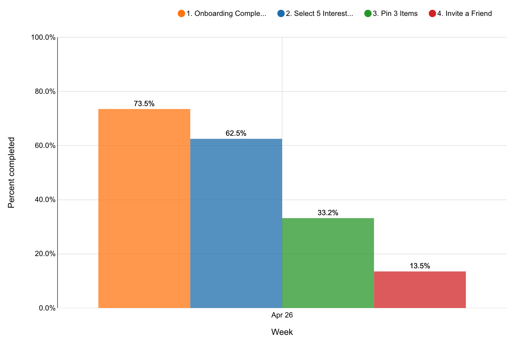
The bar chart representation of a funnel helps the viewer understand:
- Relative drop-off between each funnel step
- Overall drop-off from start to finish (13% of signups ended up inviting a friend)
Here's a rich representation of the comparisons a viewer is likely making in this simple bar chart:
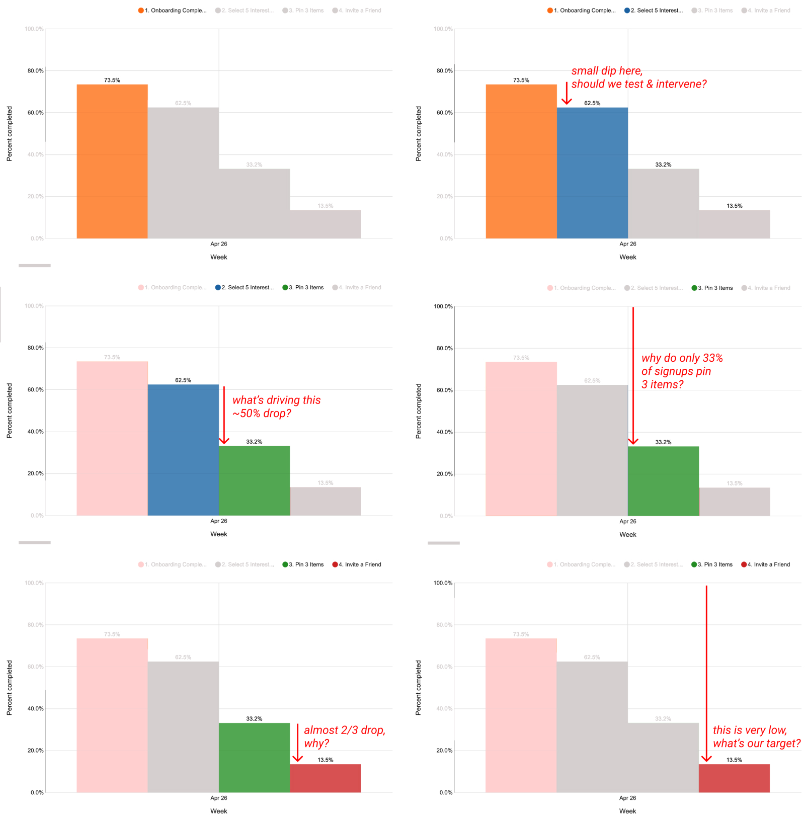
From a simple bar chart, the viewer can only compare locally within the time period the data covers but is disempowered from comparing with other time periods. These limitations prevent the fostering of rich team discussions needed to make actionable changes.
- Are these individual conversion percentages low relative to last week?
- What are our goals and how far off are we?
- Did we improve compared to last week? If so, what are some potential causes?
With this in mind, when does a simple bar chart like this shine? This simple way of representing a sales or marketing funnel is excellent in presentations or reports where you're providing just a high level summary or overview. This could be a good choice for a slideshow presentation for an investor, for example.
Use this funnel visualization when you want your audience to quickly internalize the data without needing them to think critically about what needs to change. Here's a quick recap of the tradeoffs we just discussed.
Pro
- Simple bar charts are easy to understand and internalize very quickly. They're great for a wide audience that's primarily interested in a simple update or summary.
Con
- Simple bar charts hide a lot of the complexity in the system and don't empower the audience to think deeper about the forces causing the changes in the data.
Multiple Bar Charts
The most straightforward way to improve the comparative power of the bar chart is to use a multiple bar chart.
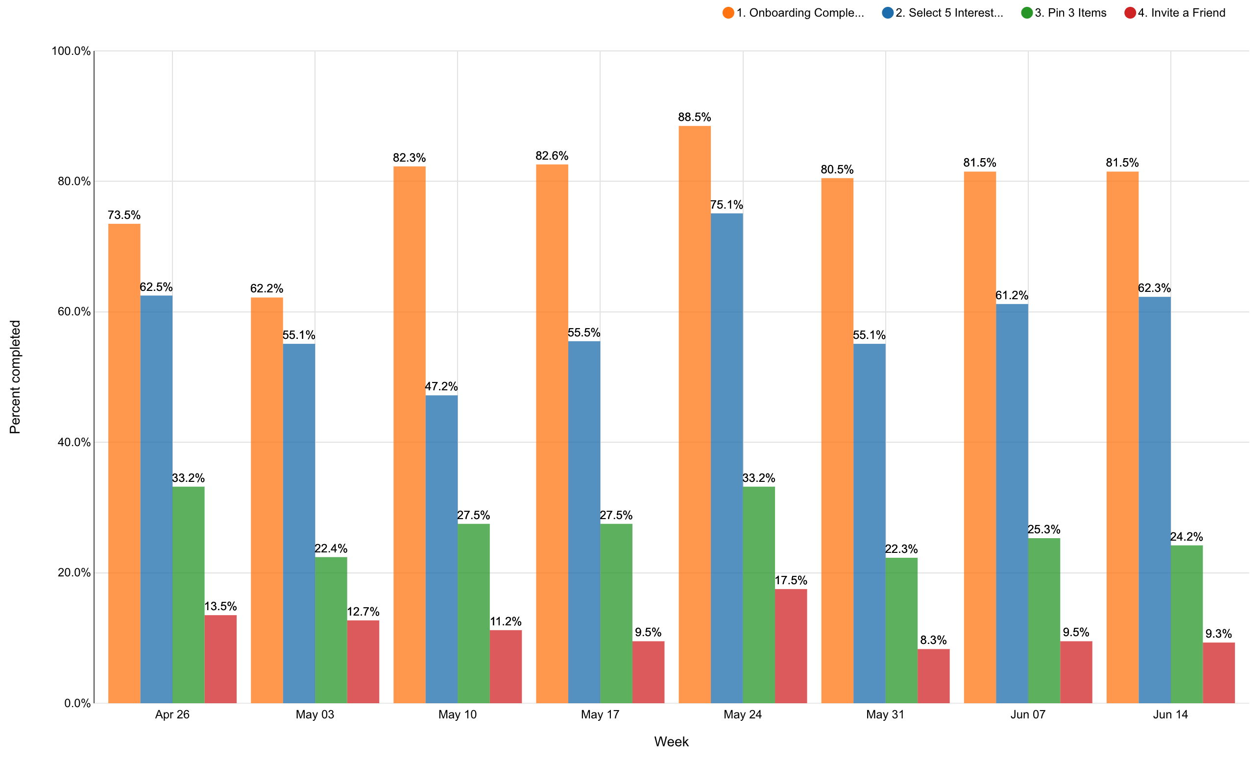
This chart lets the viewer compare the funnel performance for a few different weeks.
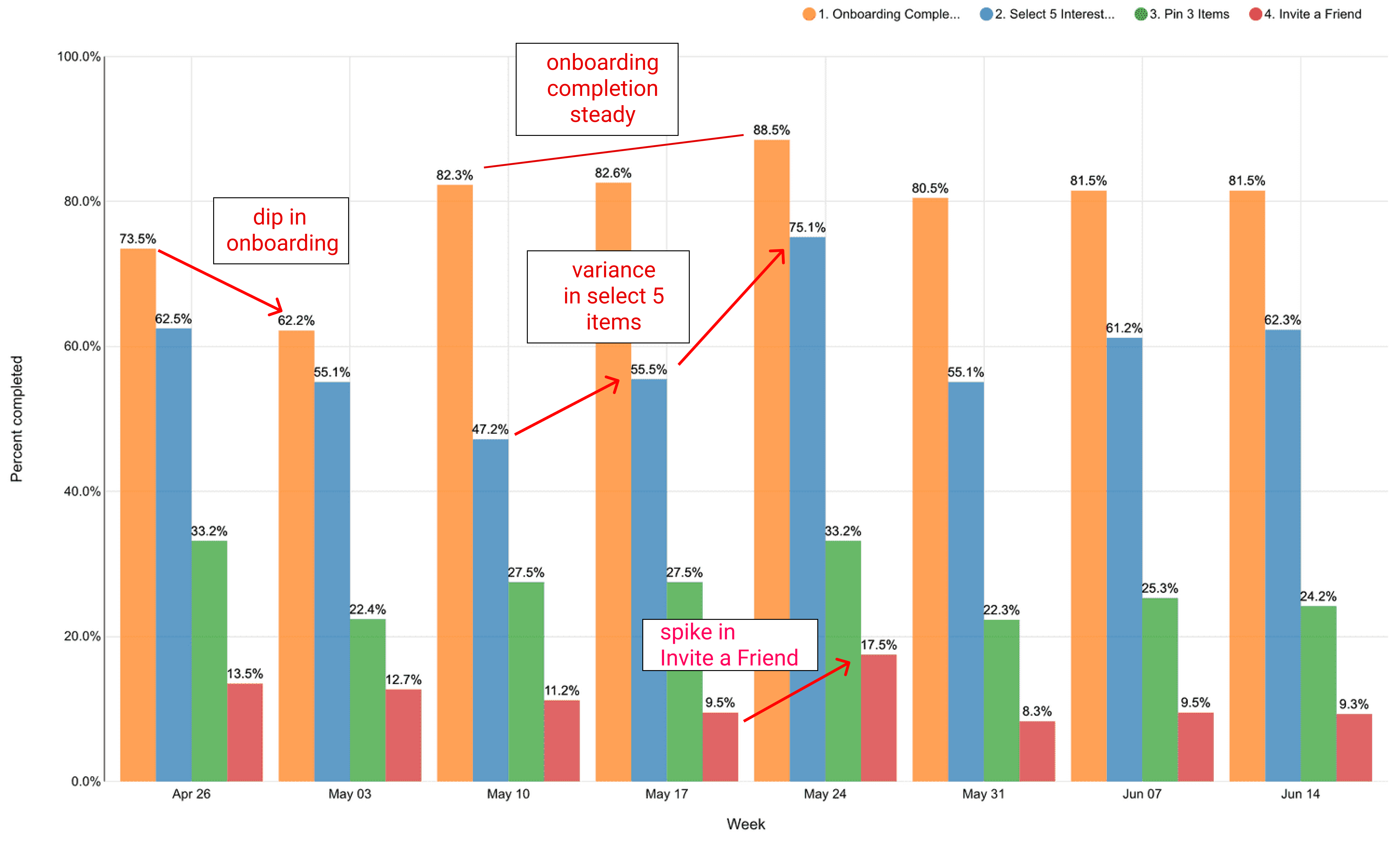
The team is empowered to discuss:
- The dip in onboarding completion between the weeks of April 26th and May 3rd.
- What could have led to the fluctuations in selecting 5 interests in the weeks of May 10th, 17th, and 24th while the onboarding completion stayed roughly in the mid-80s.
- What was responsible for the surge in the % of users that invited a friend during the week of May 24th.
Pros
- Multiple bar charts let you compare high level funnel metrics across many date ranges.
- Multiple bar charts are easy to read, even for beginners.
Cons
- Multiple bar charts still visualize outcomes and can help foster the discussion of initial hypotheses, but they struggle to show the more granular details needed to create actionable next steps.
If you want to create this visualization using your own data, check out our excellent tutorial on creating time series charts.
Sankey Diagram
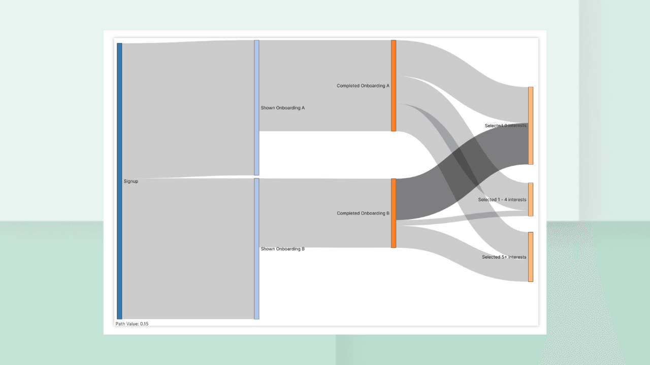
A Sankey diagram is a popular way to represent a large volume of objects flowing through a system. The following Sankey diagram visualizes all the different "routes" that users took through the signup funnel.
Here's an example Sankey diagram that visualizes the flow of users in a more fine-grained way from Signup to Selecting X interests.
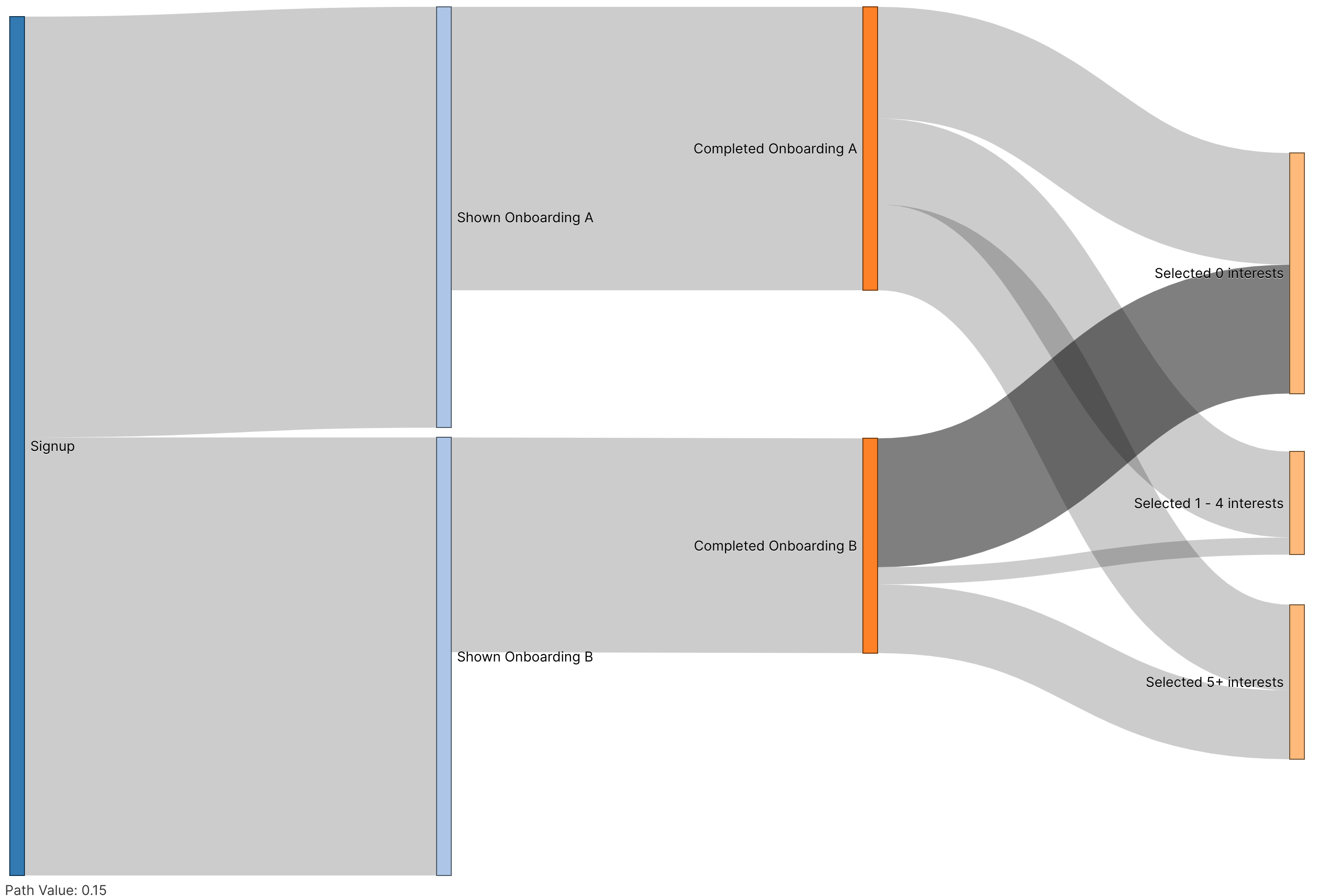
This type of funnel diagram showcases important details.
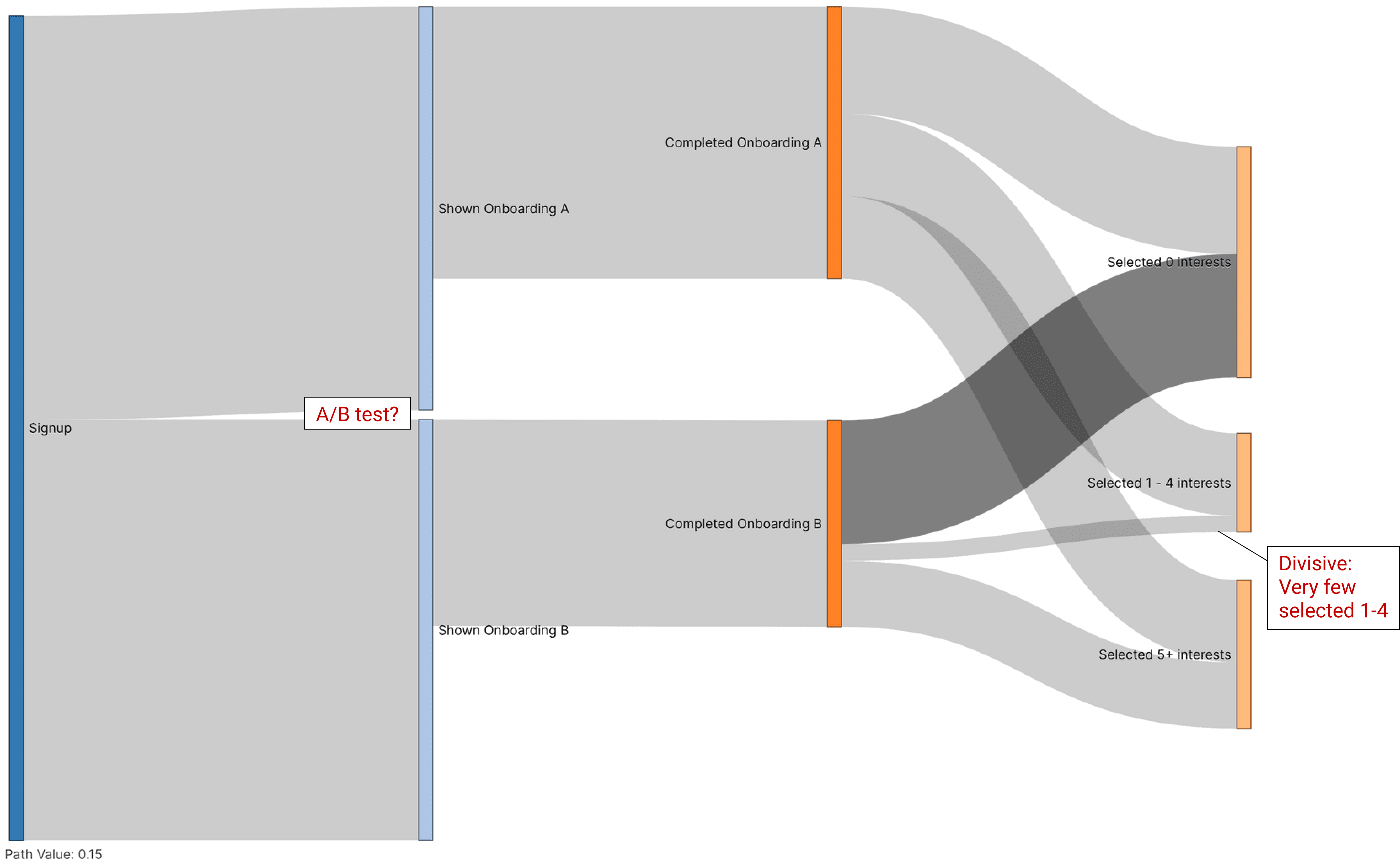
The viewer is encouraged to make the following observations:
- There are 2 potential onboarding sequences
- Since they're both almost at 50%, this seems like an A/B test. What is this test evaluating? How long is this test running?
- What was 'divisive' about Onboarding B?
- Onboarding B users selected 1-4 interests at a minuscule rate and majority selected 0 or 5+ interests.
- Users who went through Onboarding A made up for nearly ~80% (visually guessing) of the users that Selected 1 - 4 interests.
Pros
- Sankey diagrams provide a rich, detailed map. This map can help your team pinpoint surgical actions to take and encourage more nuanced discussions.
- These types of nuanced discussions can lead to more specific interventions that are testable and hopefully lead to a more scientifically rigorous data culture.
Cons
- Poorly designed Sankey diagrams or lack of training can overwhelm readers with too many choices and too much information.
- Sankey diagrams take up a lot of visual space, which makes it more difficult to compare these traffic flows across multiple date ranges out of the box.
Conclusion
Every visualization we explored in this post has its own set of tradeoffs. Choosing a specific chart type should be highly informed by the ideas and questions you hope your audience will have.
In a future post, we’ll discuss how to design effective dashboards that combine a variety of custom visualization types to overcome the limitations of any specific style. Funnel data visualizations, as well as many other styles, can help to more accurately tell your data analytics story.