Open Sourcing a GitHub Engagement Dashboard
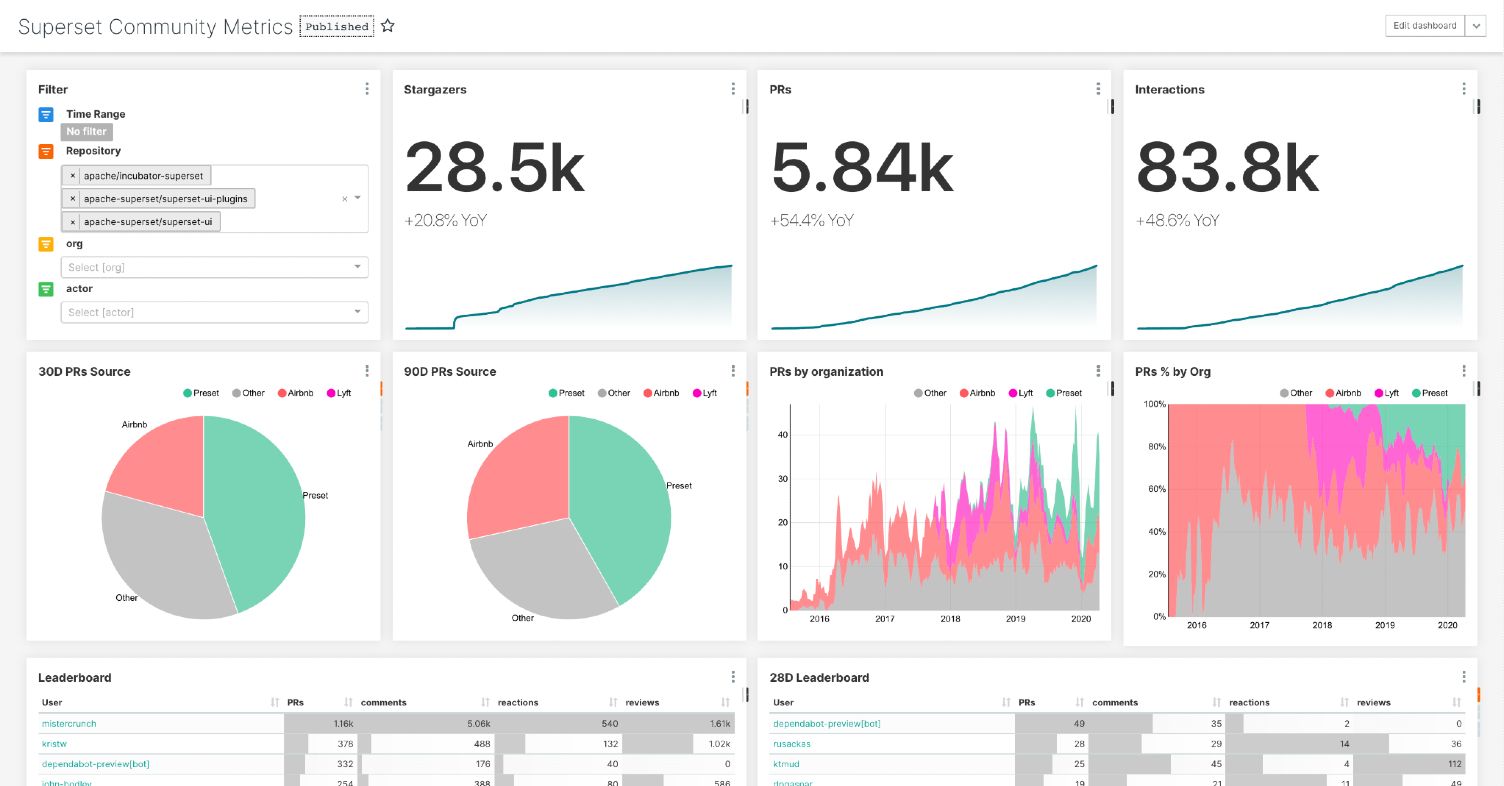
This post details how to leverage a simple data pipeline and other assets that we're open sourcing to deploy a GitHub Engagement Dashboard in your Superset environment. The code and assets shared can be pointed to the GitHub repositories that are interesting to your organization and customized to fit your needs.
The post also details the process of building the dashboard by extracting data out of the GitHub API, loading it into a database, and building a Superset dashboard on top of it.
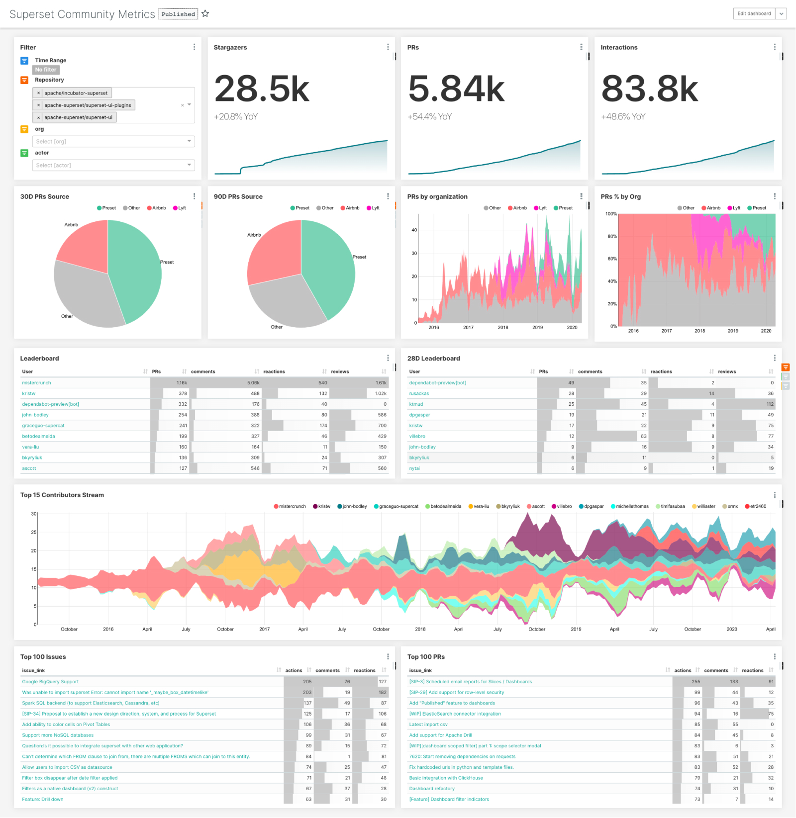
At Preset we’re committed to open source. The health of the Apache Superset community is critical to our business and it’s important for us to understand it well. While it’s easy to get to the few charts made available in the project’s insights tab I couldn’t find a solution to analyze other engagement metrics like the number of comments, reactions, and other actions around issues and pull requests. Beyond that we’re interested in more complex metrics like time-to-first-comment on issues, time until first review, time until merge, or understanding what percentage of issues are closed by bots just to name a few.
Since I couldn’t find a clear solution to our growing needs in this area I decided to build a simple Jupyter notebook to gather data from the GitHub API along with a Superset dashboard. Both are generic and can be used against any GitHub repository. In this blog post we’ll explore the solution that I built and how to use and integrate the different components of that solution.
1 - Understanding the data that the GitHub API has to offer
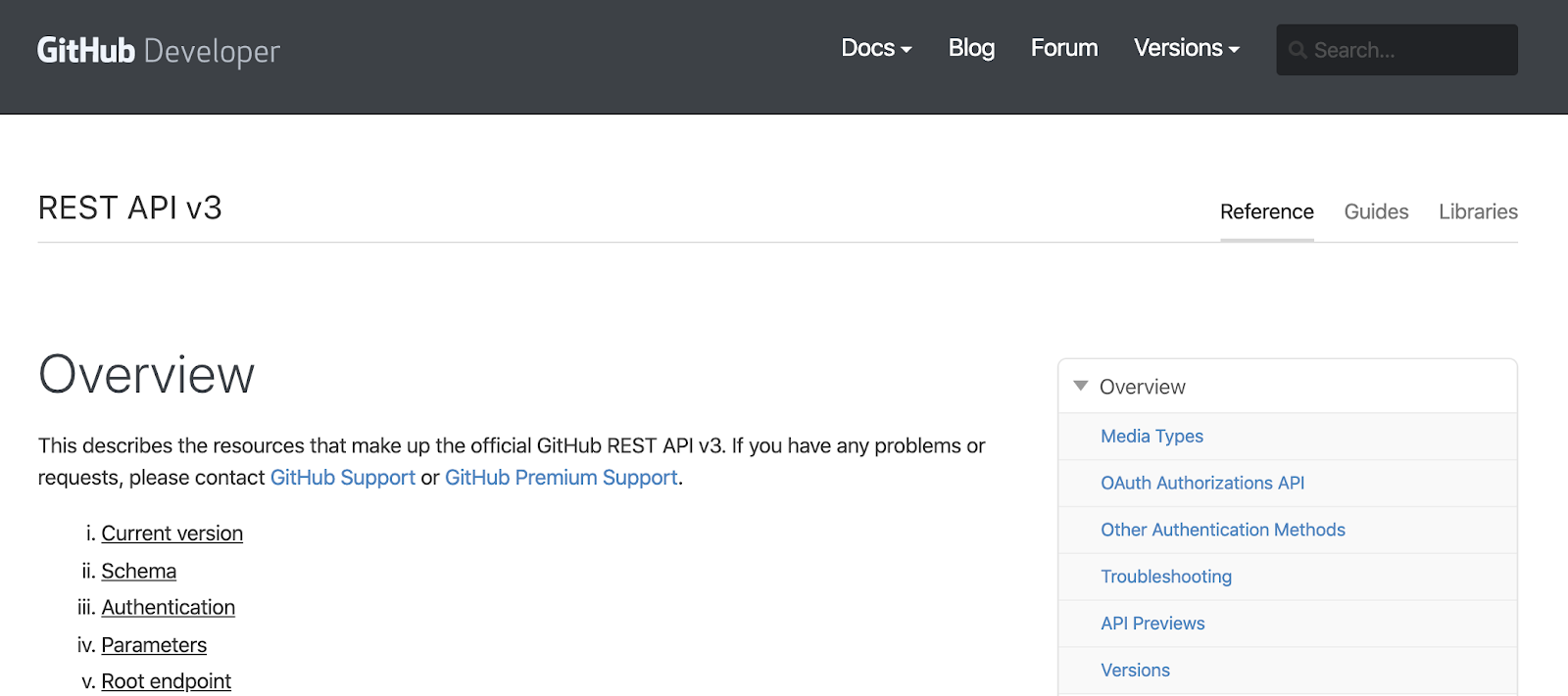
In what I call “the analytics process”, the process by which data is collected and turned into insights, it’s important to involve subject matter experts. Fortunately I am already very familiar with GitHub as a product and with the rich API it offers. I even had used the GitHub Python wrapper pygithub in the past. I knew I was going to be able to easily pull the data I needed out of there easily and had a good understanding of what was going to be possible.
2 - Extracting the data from GitHub
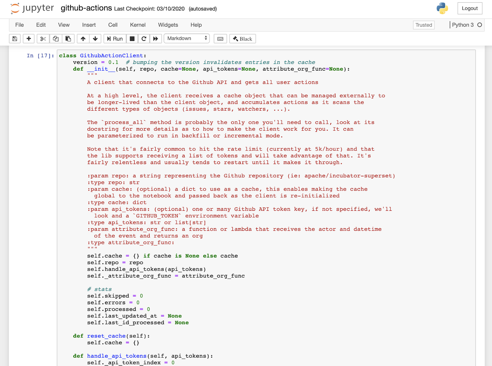
Jupyter notebooks are a great way to share code along with rich content that provides extra context. They're also a great place to iterate on a small library while it settles.
I did hit some minor hurdles around rate limiting and having to do a fair amount of nested REST calls but nothing else that was too hard to handle. Also it turned out that those nested REST calls that fetch details like comments and reactions on a per-issue basis take a fair amount of clock time. Running my notebook on a laptop I ran into issues with my laptop going into sleep / wakeup and failing part way through the process. To address this I added some logic to cache the data in the notebook, handle errors, and execute incremental loads to the database. Also note that the script can be parameterized to perform differential updates - only fetching the items that have changed since the last execution - and merge (aka UPSERT) what changed in the database.
To load the data into a target database Pandas’ Dataframe.to_sql function makes things really easy. Leveraging SQLAlchemy behind the scenes, it can target the database of your choice.
For those interested, it should be easy to fire up Jupyter and get the notebook up and running against the GitHub repositories you are interested in. The mechanics and intricacies around extracting data from GitHub and denormalizing it as a list of actions is detailed in the notebook itself.
3 - Importing assets into Superset
Assuming that you already have a Superset environment set up it should be straightforward to import the assets made available in this blog post.
First, double check that you have a database connection with the specific name “examples” in your environment. The import process requires you to have a connection in place that data sources can latch onto and that you have the table and data generated from the notebook.
Second, import this JSON file using the Superset importer (Menu -> Manage - > Import Dashboards). A new dashboard titled “Superset Community Dashboard” should appear in your dashboard list.
For context, the import process creates Superset's abstraction on top of a tabular structure, called a “Datasource”, and attaches it to the examples database. It will also create the dashboard shown in the image above as well as the collection of underlying charts it contains.
From that point you can easily start exploring the datasource provided, create new charts, and alter the dashboard and charts to your likings.
4 Customizing Superset, because why not!?
If you need a new feature in Superset it’s possible to contribute to the project. In my case, while working on my GitHub dashboard, I identified the need for allowing cumulative sum in the “Big Number with Trendline” visualization and took it on to make this feature a reality.
5 - Tips and tricks
As an engineer who implemented some of the obscure, less discoverable features in Superset I wanted to highlight some of the things I did while building this dashboard.
Pivoting metrics
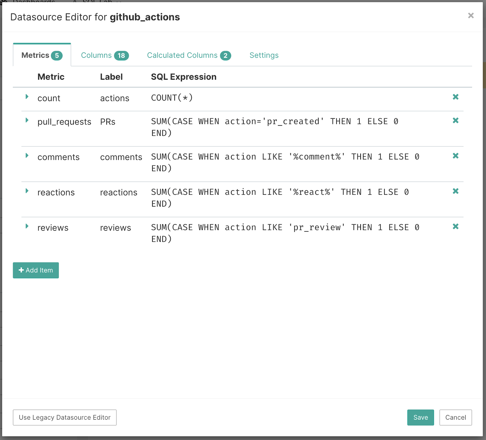
In tools like Superset it’s a fairly common thing to have to “pivot” metrics. In this case, with a table where a simple COUNT() represents a number of actions, we’ll need metrics that represent certain action types like “Issues Opened”, “Reviews”, “Comments” or “Reactions”. While you can always filter on a specific action type, and use COUNT(), you cannot use filtering clauses that would be mutually exclusive.
So you can pivot (group by) on actions (which Superset allows you to do in many visualizations), but sometimes it’s convenient to create individual reusable pivoted metrics - in our case for key action types. To do this, go to the “Datasource Editor” and create new metrics with SQL expressions like SUM(CASE WHEN action=’pr_created’ THEN 1 ELSE 0 END). This enables “filtering” as part of the metric expression as opposed to using the WHERE clause to do it. These metrics become available throughout Superset and can be conveniently reused across charts as needed.
Assigning Colors
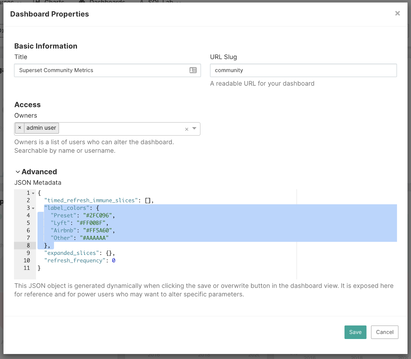
For my dashboard I was interested in breaking down contributions by companies and thought it’d be interesting visually to use company brand colors in charts.
To do this, first navigate to “Edit dashboard properties” and then include a “label_colors” object to your dashboard’s JSON metadata.
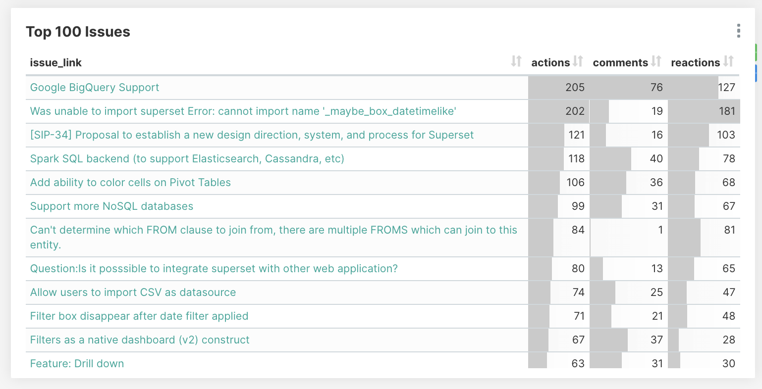
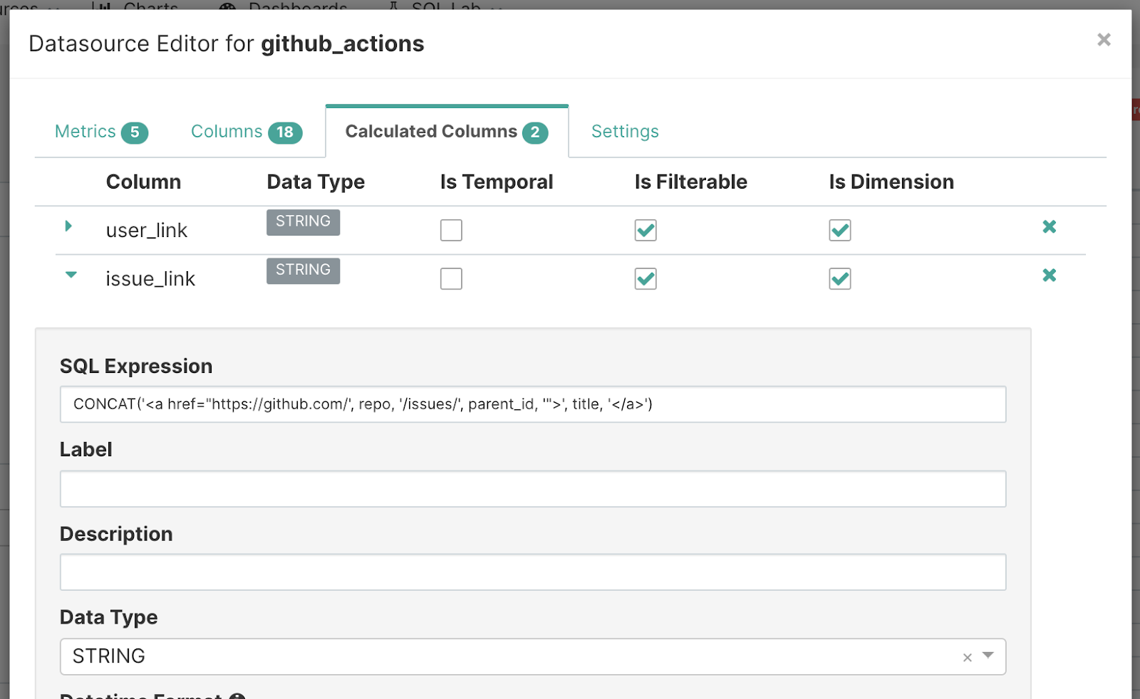
Links in Table Visualizations
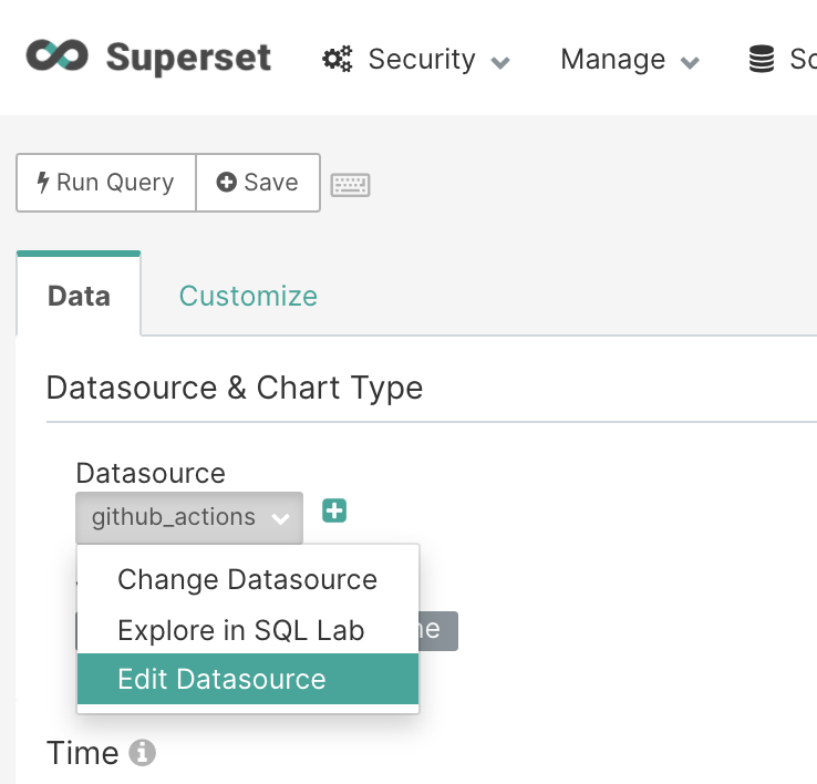
First navigate to “Edit Datasource” from the explore view.
Then, add an entry for a “Calculated Column” as shown here:
Summing Up
This dashboard delivers much value to our team and we hope that others can get value out of the assets and experience exposed in this post.
We’re looking to actively maintain the github-actions GitHub repository that contains all the relevant material behind this blog post. We’re curious to hear your thoughts and committed to improve this small project over time. The team is looking forward to integrating your feedback and contributions!
We're also happy to help people get this to work. We currently have an alpha program at Preset that offers hosted Superset, and frankly the best Superset experience you can get. We'd love to get you setup with your Github data and beyond. Click our "Stay in touch" button to connect with our team!