
Stay informed about Covid-19 with your Superset Dashboard
Dashboard images updated 04/30/2020
I travel thousands of miles per year for business and pleasure. Being the globe-trotter that I am, I have a high risk of exposure to many infectious agents, including more recently, the novel coronavirus (2019-nCoV, specifically).
This week I canceled all my future trips but as Stephen Hawking said, “The greatest enemy of knowledge is not ignorance; it is the illusion of knowledge.” As a data-driven person, I cannot make decisions with the illusion of knowledge, so I decided to look at the facts and make sense of the numbers.
Johns Hopkins CSSE keeps updated data of 2019 Novel Coronavirus COVID-19 (2019-nCoV) in a Github repository; I decided to use this source data to keep my own dashboard. As a data repository; I used Vertica Analytics Database, because it is the database that I know the most and for its in-database Advanced Analytics and Time Series functions.
Steps for Vertica but can be replaced with any other SQL complaint database that have advanced analytics and time series functions:
1. Create a table in Vertica to load the data
CREATE TABLE covid19.cases
(
    province varchar(30),
    country varchar(30),
    lastUpdate timestamp,
    confirmed int,
    deaths int,
    recovered int,
    latitude float,
    longitude float,
    file_date datetime
);
I will use file_date as cases reported date because lastUpdate source data shows inconsistency between dates.
2. Clone Git Repository
# git clone https://github.com/CSSEGISandData/COVID-19.git
Cloning into 'COVID-19'...
remote: Enumerating objects: 40, done.
remote: Counting objects: 100% (40/40), done.
remote: Compressing objects: 100% (24/24), done.
remote: Total 9903 (delta 14), reused 33 (delta 8), pack-reused 9863
Receiving objects: 100% (9903/9903), 39.71 MiB | 4.55 MiB/s, done.
Resolving deltas: 100% (4760/4760), done.
3. Load Data to Vertica
dbadmin=> copy covid19.cases (province, country, lastUpdate, confirmed, deaths, recovered, latitude, longitude, file_date as left(right(CURRENT_LOAD_SOURCE(),14),10)::datetime)
from local '<<GIT_FOLDER>>/COVID-19/csse_covid_19_data/csse_covid_19_daily_reports/*.csv' delimiter ',' enclosed '"' ;

DELIMITER ',' ENCLOSED '"' ;

 Rows Loaded
-------------
        5715
(1 row)
4. Source Data is organized one file per day with Province/State, Country/Region, Last Update, Confirmed, Deaths, Recovered, Latitude, Longitude. The data source presents characteristics that could affect the data analysis.
a- If Province, Country did not report new data it won’t have an entry on the day.
b- Confirmed, Death and Recovered are cumulative, data needs to be processed to get the number of new cases per day to identify the growth ratio.
c- GeoSpatial information is incesistent between files. Created a view covid19.cases_geo to use the lastest Latitude and Longitude.
CREATE OR REPLACE VIEW covid19.cases_geo AS
SELECT a.latitude
	,a.longitude
	,a.confirmed
	,a.deaths
	,a.recovered
	,a.province
	,a.country
FROM (
	SELECT cases.province
		,cases.country
		,cases.latitude
		,cases.longitude
		,max(cases.confirmed) AS confirmed
		,max(cases.deaths) AS deaths
		,max(cases.recovered) AS recovered
		,rank() OVER (
			PARTITION BY cases.province
			,cases.country ORDER BY cases.file_date DESC
			) AS rank
	FROM covid19.cases
	GROUP BY cases.province
		,cases.country
		,cases.latitude
		,cases.longitude
		,cases.file_date
	) a
WHERE (a.rank = 1)
In order to be able to have data for all the days and see the new cases per day I created a view using Vertica Advanced Analytics and Time Series functions.
CREATE OR REPLACE VIEW covid19.cases_ts AS
SELECT a.province
	,a.country
	,a.latitude
	,a.longitude
	,a.date_trunc
	,a.confirmed
	,a.deaths
	,a.recovered
	,a.last_confirmed
	,(a.confirmed - NVL(a.last_confirmed, 0)) AS new_cases
FROM (
	SELECT c.province
		,c.country
		,c.latitude
		,c.longitude
		,c.date_trunc
		,c.confirmed
		,c.deaths
		,c.recovered
		,LAG(c.confirmed) OVER (PARTITION BY c.province ,c.country,c.latitude,c.longitude ORDER BY c.date_trunc) AS Last_confirmed
	FROM (
		SELECT c.province
			,c.country
			,g.latitude
			,g.longitude
			,slice_time AS date_trunc
			,ts_last_value(c.confirmed, false, 'CONST') AS confirmed
			,ts_last_value(c.deaths, false, 'CONST') AS deaths
			,ts_last_value(c.recovered, false, 'CONST') AS recovered
		FROM (
			covid19.cases c JOIN covid19.cases_geo g ON (
					(
						(coalesce(c.province, 'a') = coalesce(g.province, 'a'))
						AND (c.country = g.country)
						)
					)
			) TIMESERIES slice_time AS '1 Day' OVER (
				PARTITION BY c.province
				,c.country
				,g.latitude
				,g.longitude ORDER BY c.file_date
				)
		) c
	) a
5. With all the data already processed in the desired format, add a database in Superset; under Sources, using Vertica SQL Alchemy driver as the source. If it is the first time connecting to a Vertica data install the appropriate SQLAlchemy driver
pip install sqlalchemy-vertica-python
With Preset as a fully managed Superset instance it won't be necessary to install any driver.
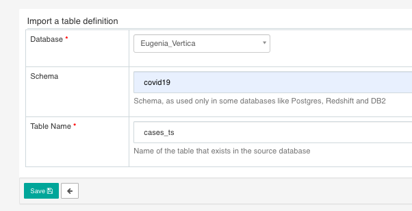
6. Add Table that refers to covid19.cases_ts view
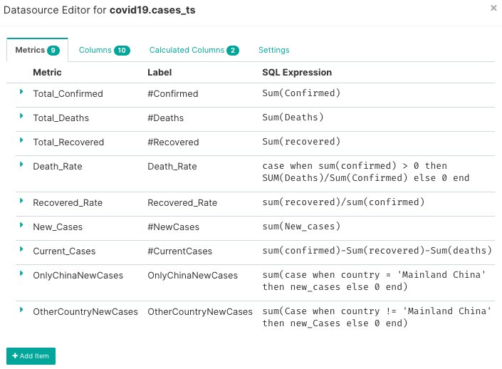
Optional Add Metrics so data is already defined when preparing charts.
7. Create Charts that Interest you and add them to a dashboard
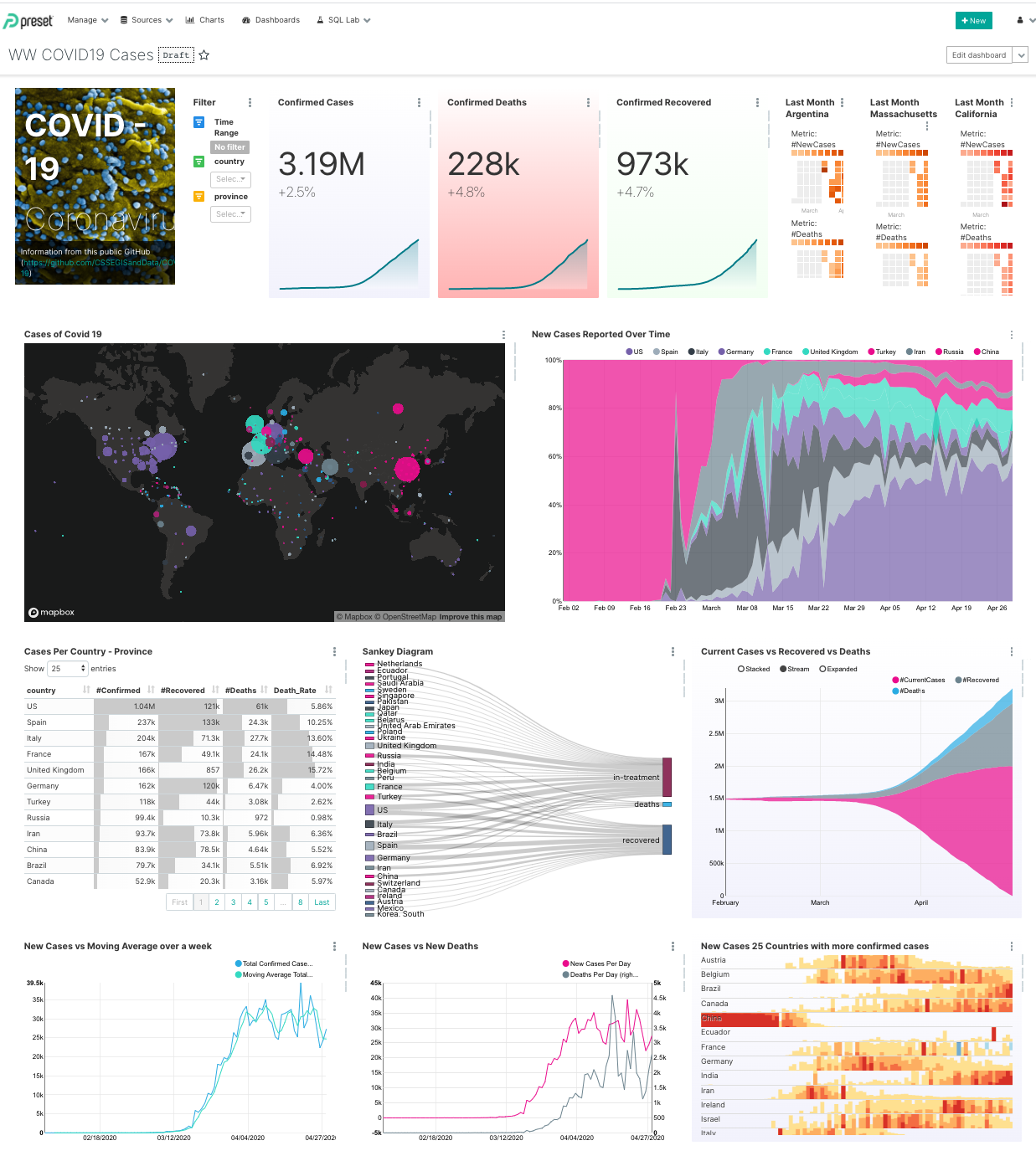
The picture says it all. Now before planning my next trip, I will check my dashboard and see if my destination is still safe for travel.
My Charts preference for this dashboard
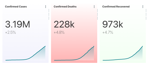
- Big Numbers and Trendline to see the last counts of Covid-19 and the progress over time.
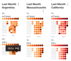
- Calendar HeatMaps Allows to check changes per day over the last months on the regions of my interest; Massachusetts, my home town; Argentina, where my family lives and California to monitor my office HQ.
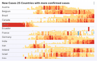
- Horizon Chart to visualize the behavior of new cases per day in the countries with more confirmed cases.
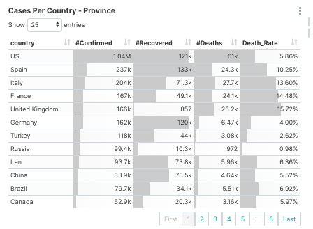
- Simple Table shows the numerical data of cases Confirmed, Recovered, Death and Death Rate per Country
- Sankey Diagram shows a better representation of the Recovered, Deaths and In-Treatment populations of the top 50 countries with confirmed cases
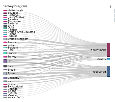
Note that to do a Sankey Diagram, the data has to be prepared differently. I created a view to prepare the data. CREATE VIEW covid19.cases_sunkey AS
WITH /*+ENABLE_WITH_CLAUSE_MATERIALIZATION*/ totals AS
(SELECT cases.country
,MAX(cases.confirmed) AS confirmed
,MAX(cases.deaths) AS deaths
,MAX(cases.recovered) AS recovered
FROM covid19.cases
GROUP BY cases.country)
SELECT country AS country ,'deaths' AS target ,deaths AS value_final FROM totals
UNION
SELECT country AS country, 'recovered' AS target,recovered AS value_final FROM totals
UNION
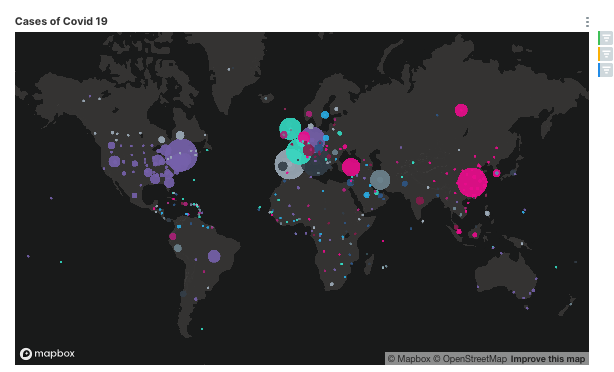
SELECT country AS country,'in-treatment' AS target,(confirmed - deaths - recovered) AS value_final FROM totals; - Scatterplot Map represents the cases by geolocation with the bubble size corresponding with the amount of confirmed cases and each country is shown in a different color.
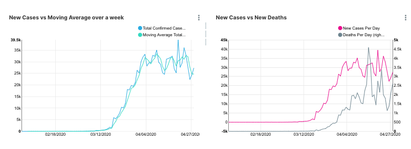
- Multiple Line Charts Represent 2 datasets in the same graph. New Cases vs Moving Average over a week shows original data vs the trends using the average of seven days, this helps to smooth the curve and see better trends. In this case, both data sets use the same Y-Axis as the numbers. New Cases vs New Deaths compares both datasets to see if there is a correlation between the numbers. Two Y-Axis are needed as the number of cases is relative bigger than the number of Deaths.
- Area Chart to see the impact on metrics in reference with others metrics. Current Cases vs Recovered vs Death shows the growth count of current cases vs recovered and deaths. New Cases Reported Over Time shows the impact of each country over the cases reported.

To keep the data updated, I run in a cron job because of the simplicity of the use case.
# crontab -l
0 12 * * * /Users/eugenia/load_corona_data.sh

#cat load_corona_data.sh

#/usr/bash
cd /<<Path to github repository>>/COVID-19
git pull
/Applications/vertica/bin/vsql -Ati -U dbadmin  -h <vertica_host> -f /Users/eugenia/load_corona_data.sql
During these uncertain times, it is especially important to arm yourself with up-to-date data to keep yourself, your family, and community safe.
If you are interested in learning more about how to create dashboards like these and what we are building here at Preset, please stay in touch and subscribe above!